🔥 Today Only: Save 30% on Premium — Offer Ends Soon! - Upgrade Now!
Pie Chart

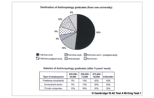
Band 4+: The chart below shows what Anthropology graduates from one university did after finishing their undergraduate degree course. The table shows the salaries of the anthropologists in work after five years. Summaries the information by selecting and reporting the main features and make comparisons where relevant

Image for topic: The chart below shows what Anthropology graduates from one university did after finishing their undergraduate degree course. The table shows the salaries of the anthropologists in work after five years. Summaries the information by selecting and reporting the main features and make comparisons where relevant
Our system will evaluate the answer based on this AI-generated description.
The image shows a pie chart and a table displaying data on Anthropology graduates from one university. The pie chart indicates that 52% of graduates are in full-time work, 15% in part-time work, 8% in part-time work with postgrad study, 5% in full-time postgrad study, 12% unemployed, and 8% not known. The table lists salaries after 5 years of work, with four types of employment: self-employment, freelance consultants, government sector, and private companies. Salary ranges include $25,000 - $40,000, $40,000 - $50,000, $50,000 - $75,000, and $75,000 - $100,000+. The percentage of graduates in each salary range varies by type of employment, with self-employment having the highest percentage (40%) in the $75,000 - $100,000+ range, and the government sector having the highest percentage (50%) in the $50,000 - $75,000 range. Freelance consultants have the lowest percentage (5%) in the $75,000 - $100,000+ range, and private companies have the lowest percentage (10%) in the $25,000 - $40,000 range.
Given the complexity of the image, the above description may not be entirely accurate.
Note: Both the topic and the answer were created by one of our users.

The pie diagram expresses activity distribution between Anthropology students after they graduated. The table intruduces Antropology graduate painments in 5 years emploied in 3 different sector.

After graduation Anthropology major about half of students took full-time jobs, while 15% got part time job. 8% of graduated were involved in full-time postgrad study and 5% managed to enroll postgrad study and part-time job at the same time. 12% remained unemploied and the activities of 8% of graduated students were unknown.

In 5 years Antropology graduate salary who were involved in Goverment sector skyrocketed, making half of the employees highest paied as their salary was more than 100 000 dollars. On the other hand 35% of private company workers only get around 50-80 000 dollars. Most of Freelance consultant salary is second best paied as 40% workers get the highest pay.

Word Count: 139

Answers On The Same Topic:

The chart below shows what Anthropology graduates from one university did after finishing their undergraduate degree course. The table shows the salaries of the anthropologists in work after five years. Summaries the information by selecting and reporting the main features and make comparisons where relevant

The pie chart illustrates the destination of Anthropology graduates who complete their under graduate degree several course and table display the salaries of Anthropology worker in three sectors namely,Freelance consultants , government and private companies over the five years. Overall,it is evident that the largest percentages was full time work , while the smallest had […]

The chart below shows what Anthropology graduates from one university did after finishing their undergraduate degree course. The table shows the salaries of the anthropologists in work after five years. Summaries the information by selecting and reporting the main features and make comparisons where relevant

The pie chart illustrates the destinations of Anthropology graduates from a particular university after completing their degree, while the table shows their salaries after five years of work in three different employment sectors. Overall, full-time work was the most common outcome for graduates, whereas only a small proportion were unemployed or had unknown destinations. In […]

The chart below shows what Anthropology graduates from one university did after finishing their undergraduate degree course. The table shows the salaries of the anthropologists in work after five years. Summaries the information by selecting and reporting the main features and make comparisons where relevant

The rendered pie chart illustrates that when the histroy students complete their graduation degree from a university of UK, what they do after completing studies. However, the table represents the employements sectors of these graduates and also describe the average salary of these students after finish their degree. To commence with, it is readily apparent […]

The chart below shows what Anthropology graduates from one university did after finishing their undergraduate degree course. The table shows the salaries of the anthropologists in work after five years. Summaries the information by selecting and reporting the main features and make comparisons where relevant

The pie chart illustrates the destination of Anthropology students after completing their undergraduate degree from a particular university. The table provides information about the earnings of the Anthropologists after five years working. Overall, it can be seen that the highest number of graduates were involved in full-time work. After 5 years’ work most of the […]

See All

Other Topics:

The pie charts below give information about world population in 1900 and 2000. Summarise the information by selecting and reporting the main features, and make comparisons where relevant.

The pie charts compare the distribution of the world population by location in the years 1900 and 2000. Overall, from the data provided, it is evident that Asia had the largest proportion in both **years**, whereas **the** others category made up the **smallest proportion** in both **years**. The population was **more evenly distributed** among the […]

You should spend about 20 minutes on this task.The pie charts show the electricity generated in Germany and France from all sources and renewables in the year 2009. Summarize the information by selecting and reporting the main features and make comparisons where relevant.

The pie charts illustrates the electricity generated in Germany and France from all sources and renewables energy, for instance hydroelectric, nuclear. Overall, Germany used in 2009 all types of energies than renewables electricity. The main electricity generation was Conventional Thermal, this type of generation had 59,6 proportion. Then, the second place had nuclear 23 percentage. […]

The charts below show the main modes of transport used by commuters to travel to work in the city of Newbridge in 2005 and 2025. Summarise the information by selecting and reporting the main features, and make comparisons where relevant.

The pie charts depict the proportion on 5 different modes of transportation used by working commuters in the city of Newbridge in 2005 and 2025. Overall, private car was the leading main way of travel by the citizens of Newbridge for both years, while walking stayed the least option used. Within the period of 2005 […]

The pie charts illustrate leisure time between boys and girls

The pie charts illustrate the rate of participation in different cultural and leisure activities among girls and boys. Overall, it is clear that while boys dominate in computer games, dancing takes up the highest proportion among the girls. Another striking point is that reading takes up negligible proportion among boys, whereas listening to music is […]

The pie charts illustrate leisure time between boys and girls

The pie charts illustrate the result of the research about children’s activities and compare information in terms of boys’ and girls’ cultural and free time activities in separate graphs. Overall, it is obvious that while computer games accounted for the largest share for boys, dancing was the most popular activity among girls. Another striking point […]

The pie charts below show the different types of courses, which were followed by the students during the years of 1984, 1994 and 2004. Summarise the information by describing the main features of the charts and making comparisons where appropriate.

The pie charts illustrate different mediums of courses followed by students in the years 1984, 1994 and 2004. Overall, face to face courses were the most popular medium in the given timeframe. Online courses were introduced in the later years. The preference for mixed media courses increased in the following decades. On the contrary, a […]

See All
We have detected unusual activity on your device.
Please verify your identity to continue.
Note: This verification step won't sign you in. If you have a premium account, please log in to access the service as usual.
Google/Gmail Verification
Or verify using Email/Code
We've sent a verification code to:
youremail@gmail.com (Not your email?)
Enter it below to complete the verification process.
Ensure your email address is correct, your inbox is not full, and you check your spam folder. If no email arrives, consider using an alternative email.
You will need a Premium plan to perform your action!
Note: If you already have a premium account, please log in to access our services as usual.

Plans & Pricing

Our mission is to make quality education accessible for everyone.
However, to keep our hardworking team running and this service alive, we genuinely need your support!
By opting for a premium plan, not only do you sustain us in achieving the mission, but you also unlock advanced features to enrich your learning experience.

Free

For learners who aren't pressed for time

What's included on Free
100+ Cambridge IELTS Tests
Instant IELTS Writing Task 1 & 2 Evaluation (2 times/month)
Instant IELTS Speaking Part 1, 2, & 3 Evaluation (2 times/month)
Instant IELTS Writing Task 1 & 2 Essay Generator (2 times/month)
500+ Dictation & Shadowing Exercises
100+ Pronunciation Exercises
Flashcards
Other Advanced Tools

Premium

For those serious about advancing their English proficiency, and for IELTS candidates aspiring to boost their band score by 1-2 points (especially in writing & speaking) in just 30 days or less

What's included on Premium
Save Your IELTS Test Progress & Analyze Mistakes By Question Type
Save Your Own Flashcard Sets & Use Them On Any Device
Unlock All Courses, IELTS Tests, Section & Part Practice
Unlimited AI Conversations
Unlimited AI Writing Enhancement Exercises
Unlimited IELTS Writing Task 1 & 2 Evaluation
Unlimited IELTS Speaking Part 1, 2, & 3 Evaluation
Checked Answers Will Not Be Published
Unlimited IELTS Writing Task 1 & 2 Essay Generator
Unlimited IELTS Speaking Part 1, 2, & 3 Sample Generator
Unlimited Usage Of Advanced Tools & AI Features
Priority Support within 24h (12-month plan only)

Due to the nature of our service and the provided free trials, payments are non-refundable.