🔥 Today Only: Save 30% on Premium — Offer Ends Soon! - Upgrade Now!
Pie Chart

Band 7+: The chart below shows what Anthropology graduates from one university did after finishing their undergraduate degree course. The table shows the salaries of the anthropologists in work after five years. Summaries the information by selecting and reporting the main features and make comparisons where relevant

Image for topic: The chart below shows what Anthropology graduates from one university did after finishing their undergraduate degree course. The table shows the salaries of the anthropologists in work after five years. Summaries the information by selecting and reporting the main features and make comparisons where relevant
Our system will evaluate the answer based on this AI-generated description.
The image shows a pie chart and a table displaying data on Anthropology graduates from one university. The pie chart indicates that 52% of graduates are in full-time work, 15% in part-time work, 8% in part-time work with postgrad study, 5% in full-time postgrad study, 12% unemployed, and 8% not known. The table lists salaries after 5 years of work, with four types of employment: self-employment, freelance consultants, government sector, and private companies. Salary ranges include $25,000 - $40,000, $40,000 - $50,000, $50,000 - $75,000, and $75,000 - $100,000+. The percentage of graduates in each salary range varies by type of employment, with self-employment having the highest percentage (40%) in the $75,000 - $100,000+ range, and the government sector having the highest percentage (50%) in the $50,000 - $75,000 range. Freelance consultants have the lowest percentage (5%) in the $75,000 - $100,000+ range, and private companies have the lowest percentage (10%) in the $25,000 - $40,000 range.
Given the complexity of the image, the above description may not be entirely accurate.
Note: Both the topic and the answer were created by one of our users.

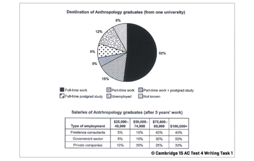
The pie chart illustrates the destination of Anthropology students after completing their undergraduate degree from a particular university. The table provides information about the earnings of the Anthropologists after five years working.

Overall, it can be seen that the highest number of graduates were involved in full-time work. After 5 years’ work most of the employees in every sector were able to earn more than 1,00,000.

Looking at the pie chart in more detail, it is evident that 52% of anthropology graduates did full-time work after finishing their undergraduate course, which was the highest. Part-time work did by 15% of students, whereas the least amount of students were involve1,00,000d part-time work and postgrade study, which was 5%. Full-time postgrade study and unemployed were at 8% and 12% respectively. Rest of the 8% of anthropology graduates were not known.

Turning to the table data, anthropologists earned the most from doing the government service. Only 5% of them were earning $25,000 to $49,999 range, whereas half of individuals earned more than $1,00,000 Freelance consultants earned almost the same as the government sector. In private companies, only 30% of employees were paid handsomely, which was above $1,00,000.

Word Count: 194

Answers On The Same Topic:

The chart below shows what Anthropology graduates from one university did after finishing their undergraduate degree course. The table shows the salaries of the anthropologists in work after five years. Summaries the information by selecting and reporting the main features and make comparisons where relevant

The pie diagram expresses activity distribution between Anthropology students after they graduated. The table intruduces Antropology graduate painments in 5 years emploied in 3 different sector. After graduation Anthropology major about half of students took full-time jobs, while 15% got part time job. 8% of graduated were involved in full-time postgrad study and 5% managed […]

The chart below shows what Anthropology graduates from one university did after finishing their undergraduate degree course. The table shows the salaries of the anthropologists in work after five years. Summaries the information by selecting and reporting the main features and make comparisons where relevant

The pie chart illustrates the destinations of Anthropology graduates from a particular university after completing their degree, while the table shows their salaries after five years of work in three different employment sectors. Overall, full-time work was the most common outcome for graduates, whereas only a small proportion were unemployed or had unknown destinations. In […]

The chart below shows what Anthropology graduates from one university did after finishing their undergraduate degree course. The table shows the salaries of the anthropologists in work after five years. Summaries the information by selecting and reporting the main features and make comparisons where relevant

The rendered pie chart illustrates that when the histroy students complete their graduation degree from a university of UK, what they do after completing studies. However, the table represents the employements sectors of these graduates and also describe the average salary of these students after finish their degree. To commence with, it is readily apparent […]

The chart below shows what Anthropology graduates from one university did after finishing their undergraduate degree course. The table shows the salaries of the anthropologists in work after five years. Summaries the information by selecting and reporting the main features and make comparisons where relevant

The provided pie diagram demonstrates the career of graduates of Anthropology faculty from one university in percentage. Looking from an overall perspective, it’s noticeably apparent that largest proportion went to the full-time work, while the part time work combined with postgraduate study accounted for the smallest share. In detail, the full-time occupation made up 52%, […]

See All

Other Topics:

the charts below show changes in the proportion of energy produced from different resources in a country in 1985 an 2003

The pie charts illustrate the percentage of energy produced from different resources in 1985 and 2003.Overall,oil was the primary source of energy in both years,although it is percentage dropped.Meanwhile,the use of natural gas and coal grew significantly by 2003 In 1985, oil was the clear leader of energy production at 52%,which was more than all […]

The chart and table below give information about tourists at a particular holiday resort in Australia. Summarise the information by selecting and reporting the main features, and make comparisons where relevant. You should write at least 150 words.

The pie charta compare the proportions of visitors to the United States from Canada, Mexico, China and other countries in 1988,1990 and 1992. Overall, Canada remained the largest source of visitors throughout the period, although its share declined steadily. In contrast, the proportion of Chinese tourists rose considerably, while the percentage of visitors from other […]

Using devices to watch TV in Canada in two different years

The two pie charts illustrate six gadgets used to watch television by young people in Canada in the years 2009 and 2019. They are measured in percentages. In general, conventional television recorded the highest viewership at first, but its popularity dipped to become the least favorite by the end. Furthermore, the least used device was […]

The two pie charts show the distribution of world population and people's spending on education

The two pie charts illustrate the distribution of world population in different regions and the amount of money people spent on education in 2000. Overall, the Asia Pacific is the region where a huge amount of humans in the world lives while the minimum population lives in other regions. Meanwhile, the high amount of money […]

The charts below show the results of a survey conducted by a university library to find out the opinions of full-time and part-time students about its services.

The pie charts compare the results of a university survey regarding the opinions of full-time and part-time students about library service. Overall, the disparity between the views of full-time and part-time students about IT support was more pronounced, with the former showing greater satisfaction whereas the latter were considerably less satisfied. In terms of opening […]

The pie charts show how a city's budget was spent in 2000 and 2020 across five categories.

The two charts illustrate a city’s budget wich was allocated among five different categiries over 20-year period between 2000 and 2020. Overall, education made up the largest figure at the beginning of the period, while transport became the highest share of city’s budget by 2020. By comparison, housing and healthcare demonstrated a decline over tha […]

See All
We have detected unusual activity on your device.
Please verify your identity to continue.
Note: This verification step won't sign you in. If you have a premium account, please log in to access the service as usual.
Google/Gmail Verification
Or verify using Email/Code
We've sent a verification code to:
youremail@gmail.com (Not your email?)
Enter it below to complete the verification process.
Ensure your email address is correct, your inbox is not full, and you check your spam folder. If no email arrives, consider using an alternative email.
You will need a Premium plan to perform your action!
Note: If you already have a premium account, please log in to access our services as usual.

Plans & Pricing

Our mission is to make quality education accessible for everyone.
However, to keep our hardworking team running and this service alive, we genuinely need your support!
By opting for a premium plan, not only do you sustain us in achieving the mission, but you also unlock advanced features to enrich your learning experience.

Free

For learners who aren't pressed for time

What's included on Free
100+ Cambridge IELTS Tests
Instant IELTS Writing Task 1 & 2 Evaluation (2 times/month)
Instant IELTS Speaking Part 1, 2, & 3 Evaluation (5 times/month)
Instant IELTS Writing Task 1 & 2 Essay Generator (2 times/month)
500+ Dictation & Shadowing Exercises
100+ Pronunciation Exercises
Flashcards
Other Advanced Tools

Premium

For those serious about advancing their English proficiency, and for IELTS candidates aspiring to boost their band score by 1-2 points (especially in writing & speaking) in just 30 days or less

What's included on Premium
Save Your IELTS Test Progress
Unlock All Courses & IELTS Tests
Unlimited AI Conversations
Unlimited AI Writing Enhancement Exercises
Unlimited IELTS Writing Task 1 & 2 Evaluation
Unlimited IELTS Speaking Part 1, 2, & 3 Evaluation
Checked Answers Will Not Be Published
Unlimited IELTS Writing Task 1 & 2 Essay Generator
Unlimited IELTS Speaking Part 1, 2, & 3 Sample Generator
Unlimited Usage Of Advanced Tools
Priority Support within 24h (12-month plan only)

Due to the nature of our service and the provided free trials, payments are non-refundable.
Nếu bạn là người Việt Nam và không có hoặc không muốn trả bằng credit/debit cards, bạn có thể thanh toán bằng phương thức chuyển khoản:


Chọn gói:
419,000₫ 277,000 ₫ cho gói 1 tháng (chỉ 9,233₫/ngày)
1,239,000₫ 597,000 ₫ cho gói 3 tháng (chỉ 6,633₫/ngày)
2,469,000₫ 1,027,000 ₫ cho gói 6 tháng (chỉ 5,706₫/ngày)
4,929,000₫ 1,417,000 ₫ cho gói 12 tháng (chỉ 3,936₫/ngày)


Sau khi chuyển khoản, vui lòng đợi trình duyệt tự động điều hướng bạn trở lại Engnovate và bạn sẽ ngay lập tức nhận được mã kích hoạt tài khoản premium.
Nếu có lỗi xảy ra, bạn có thể liên hệ với team thông qua một trong các phương thức: email đến helloengnovate@gmail.com hoặc nhắn tin qua facebook.com/engnovate.
Vì toàn bộ công cụ trên website đều có thể sử dụng thử miễn phí, Engnovate không hỗ trợ hoàn tiền.