🔥 Today Only: Save 30% on Premium — Offer Ends Soon! - Upgrade Now!
Pie Chart

Band 6+: The chart below shows what Anthropology graduates from one university did after finishing their undergraduate degree course. The table shows the salaries of the anthropologists in work after five years. Summaries the information by selecting and reporting the main features and make comparisons where relevant

Image for topic: The chart below shows what Anthropology graduates from one university did after finishing their undergraduate degree course. The table shows the salaries of the anthropologists in work after five years. Summaries the information by selecting and reporting the main features and make comparisons where relevant
Our system will evaluate the answer based on this AI-generated description.
The image shows a pie chart and a table displaying data on Anthropology graduates from one university. The pie chart indicates that 52% of graduates are in full-time work, 15% in part-time work, 8% in part-time work with postgrad study, 5% in full-time postgrad study, 12% unemployed, and 8% not known. The table lists salaries after 5 years of work, with four types of employment: self-employment, freelance consultants, government sector, and private companies. Salary ranges include $25,000 - $40,000, $40,000 - $50,000, $50,000 - $75,000, and $75,000 - $100,000+. The percentage of graduates in each salary range varies by type of employment, with self-employment having the highest percentage (40%) in the $75,000 - $100,000+ range, and the government sector having the highest percentage (50%) in the $50,000 - $75,000 range. Freelance consultants have the lowest percentage (5%) in the $75,000 - $100,000+ range, and private companies have the lowest percentage (10%) in the $25,000 - $40,000 range.
Given the complexity of the image, the above description may not be entirely accurate.
Note: Both the topic and the answer were created by one of our users.

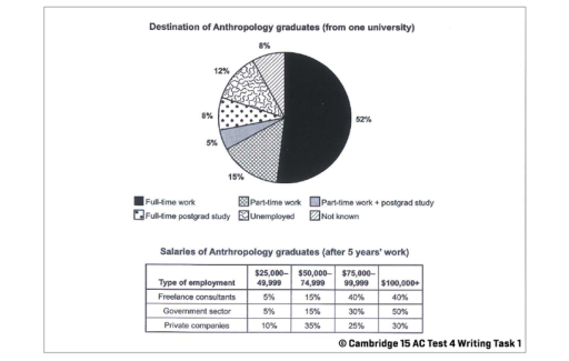
The provided pie diagram demonstrates the career of graduates of Anthropology faculty from one university in percentage.

Looking from an overall perspective, it’s noticeably apparent that largest proportion went to the full-time work, while the part time work combined with postgraduate study accounted for the smallest share.

In detail, the full-time occupation made up 52%, followed by part-time work with 15%. Whereas, 12% of alumni resulted in unemployment. Meanwhile, full-time postgraduate study and unknown status comprised 8% each. Finally, the part-time work combined with postgraduate study constituted 5%.

Regarding occupation 5 years post graduation of Anthropology graduates, it is divided into three parts – freelance consulting, government sector and private companies. In terms of salary, the government sector shows the highest proportion of 50% of employees receiving over 100 thousand, while only 30% of private sector employees earn the same amount. Concerning the smallest income ranged from 25 to 50 thousand, freelance consultants and the government sector both account for 5%, while private companies offer this salary up to 10% of its employees.

Word Count: 173

Answers On The Same Topic:

The chart below shows what Anthropology graduates from one university did after finishing their undergraduate degree course. The table shows the salaries of the anthropologists in work after five years. Summaries the information by selecting and reporting the main features and make comparisons where relevant

The pie diagram expresses activity distribution between Anthropology students after they graduated. The table intruduces Antropology graduate painments in 5 years emploied in 3 different sector. After graduation Anthropology major about half of students took full-time jobs, while 15% got part time job. 8% of graduated were involved in full-time postgrad study and 5% managed […]

The chart below shows what Anthropology graduates from one university did after finishing their undergraduate degree course. The table shows the salaries of the anthropologists in work after five years. Summaries the information by selecting and reporting the main features and make comparisons where relevant

The pie chart illustrates the destinations of Anthropology graduates from a particular university after completing their degree, while the table shows their salaries after five years of work in three different employment sectors. Overall, full-time work was the most common outcome for graduates, whereas only a small proportion were unemployed or had unknown destinations. In […]

The chart below shows what Anthropology graduates from one university did after finishing their undergraduate degree course. The table shows the salaries of the anthropologists in work after five years. Summaries the information by selecting and reporting the main features and make comparisons where relevant

The rendered pie chart illustrates that when the histroy students complete their graduation degree from a university of UK, what they do after completing studies. However, the table represents the employements sectors of these graduates and also describe the average salary of these students after finish their degree. To commence with, it is readily apparent […]

The chart below shows what Anthropology graduates from one university did after finishing their undergraduate degree course. The table shows the salaries of the anthropologists in work after five years. Summaries the information by selecting and reporting the main features and make comparisons where relevant

The pie chart illustrates the destination of Anthropology students after completing their undergraduate degree from a particular university. The table provides information about the earnings of the Anthropologists after five years working. Overall, it can be seen that the highest number of graduates were involved in full-time work. After 5 years’ work most of the […]

See All

Other Topics:

The charts below show the proportion of holidaymakers using four different types of accommodation in three different years. Summarize the information by selecting and reporting the main features, and make comparisons where relevant.

The pie charts illustrate how many holidaymakers used four various types of accommadition in 1988,1998 and 2006. Overall, in three years, staying with family was contributed the largest segment. In comparison, at the beginning of the period, rented apartment became the least sector and at the end of the period, it was made up rise […]

The charts below show the average percentages in typical meals of three types of nutrients all of which may be unhealthy if eating too much.

The pie charts illustrate a typical propotion in staple dishes of three types of nutrients – sodium, saturated fat and added sugar-, all of which could be pose health risks when consumed excessively. Overall, dinner accounts for the highest propotion of both sodium and saturated fat, whereas snacks contain the largest share of added sugar. […]

The cahrts below show the percentage of water used for different purposes in six areas of the world.

The given pie charts highlight data about how many percent of water was spent in the world, in six areas on different purposes Overall, in most of the areas water was spent on agricultural purposes, while only in two areas percentage of water on industrial purpose was more than on agricultural. In comparison, the usage […]

IELTS Academic Writing Task 1/ Graph Writing - Pie Chart + Bar Graph: » You should spend about 20 minutes on this task. The chart below shows Morocco's income from different economic sectors in 2003 as well as its income from fishing from 1982 to 2003. Write a report for a university lecturer describing the information in the charts below. Write at least 150 words.

The given pie chart illustrates the percentage of Morocco’s earning from various financial sources and fishing over a 21 years period from 1982 to 2003. Overall, it is clear that the country’s maximum income source was tourism and only a small amount of money came from cultivation. About 26% of the income came from tourist […]

The charts below show the percentage of water used for different purposes in six areas of the world. Summaries the information by selecting and reporting the main features, and make comparisons where relevant.

The charts indicate the proportion of water used for various purposes in six areas of the world. In general, the biggest share of usage was agricultural use in every area except for Europe and North America, where the industrial consumption was the dominant one. It’s also clear that, domestic water use represented the smallest or […]

The pie chart shows the sources of electricity in the four countries from 2003 to 2008.

The charts below provide data on different kinds of the electricity sources in four countries in 5 year interval, from 2003 to 2008. Overall, the main electricity base for all of participants was hydro power, except for India which had predominantly fossil fuel. In general, the most common source of electricity was hydro power, which […]

See All
We have detected unusual activity on your device.
Please verify your identity to continue.
Note: This verification step won't sign you in. If you have a premium account, please log in to access the service as usual.
Google/Gmail Verification
Or verify using Email/Code
We've sent a verification code to:
youremail@gmail.com (Not your email?)
Enter it below to complete the verification process.
Ensure your email address is correct, your inbox is not full, and you check your spam folder. If no email arrives, consider using an alternative email.
You will need a Premium plan to perform your action!
Note: If you already have a premium account, please log in to access our services as usual.

Plans & Pricing

Our mission is to make quality education accessible for everyone.
However, to keep our hardworking team running and this service alive, we genuinely need your support!
By opting for a premium plan, not only do you sustain us in achieving the mission, but you also unlock advanced features to enrich your learning experience.

Free

For learners who aren't pressed for time

What's included on Free
100+ Cambridge IELTS Tests
Instant IELTS Writing Task 1 & 2 Evaluation (2 times/month)
Instant IELTS Speaking Part 1, 2, & 3 Evaluation (5 times/month)
Instant IELTS Writing Task 1 & 2 Essay Generator (2 times/month)
500+ Dictation & Shadowing Exercises
100+ Pronunciation Exercises
Flashcards
Other Advanced Tools

Premium

For those serious about advancing their English proficiency, and for IELTS candidates aspiring to boost their band score by 1-2 points (especially in writing & speaking) in just 30 days or less

What's included on Premium
Save Your IELTS Test Progress & Analyze Mistakes By Question Type
Unlock All Courses & IELTS Tests
Unlimited AI Conversations
Unlimited AI Writing Enhancement Exercises
Unlimited IELTS Writing Task 1 & 2 Evaluation
Unlimited IELTS Speaking Part 1, 2, & 3 Evaluation
Checked Answers Will Not Be Published
Unlimited IELTS Writing Task 1 & 2 Essay Generator
Unlimited IELTS Speaking Part 1, 2, & 3 Sample Generator
Unlimited Usage Of Advanced Tools
Priority Support within 24h (12-month plan only)

Due to the nature of our service and the provided free trials, payments are non-refundable.
Nếu bạn là người Việt Nam và không có hoặc không muốn trả bằng credit/debit cards, bạn có thể thanh toán bằng phương thức chuyển khoản:


Chọn gói:
419,000₫ 277,000 ₫ cho gói 1 tháng (chỉ 9,233₫/ngày)
1,239,000₫ 597,000 ₫ cho gói 3 tháng (chỉ 6,633₫/ngày)
2,469,000₫ 1,027,000 ₫ cho gói 6 tháng (chỉ 5,706₫/ngày)
4,929,000₫ 1,417,000 ₫ cho gói 12 tháng (chỉ 3,936₫/ngày)


Sau khi chuyển khoản, vui lòng đợi trình duyệt tự động điều hướng bạn trở lại Engnovate và bạn sẽ ngay lập tức nhận được mã kích hoạt tài khoản premium.
Nếu có lỗi xảy ra, bạn có thể liên hệ với team thông qua một trong các phương thức: email đến helloengnovate@gmail.com hoặc nhắn tin qua facebook.com/engnovate.
Vì toàn bộ công cụ trên website đều có thể sử dụng thử miễn phí, Engnovate không hỗ trợ hoàn tiền.