🔥 Today Only: Save 30% on Premium — Offer Ends Soon! - Upgrade Now!
Multiple Graphs

Band 5+: The charts above show the percentage of food budget the average family spent on restaurant meals in different years. The graph shows the number of meals eaten in fast food restaurants and sit-down restaurants.

Image for topic: The charts above show the percentage of food budget the average family spent on restaurant meals in different years. The graph shows the number of meals eaten in fast food restaurants and sit-down restaurants.
Our system will evaluate the answer based on this AI-generated description.
The image presents two sets of visual data representations; the top consists of four pie charts showing the percentage of food budget spent on home cooking and restaurant meals for 1970, 1980, 1990, and 2000 while the bottom is a line graph depicting the trend in percentage of fast food meals and sit-down restaurant meals from 1970 to 2000. In 1970, home cooking accounted for 90%, decreasing to 85% in 1980, 65% in 1990, and 50% in 2000, while restaurant meals went from 10% in 1970, to 15% in 1980, 35% in 1990, and 50% in 2000. On the line graph, the percentage of fast food meals started approximately at 20% in 1970, increasing steadily to around 40% in 1980, approximately 60% in 1990, and reaching nearly 80% in 2000, while sit-down restaurant meals started at approximately 10% in 1970, reaching about 20% in 1980, close to 35% in 1990, and nearly 50% in 2000.
Given the complexity of the image, the above description may not be entirely accurate.
Note: Both the topic and the answer were created by one of our users.

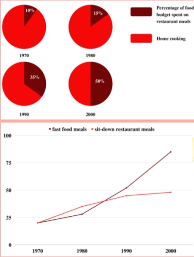
The graphs below illustrate information about the food expenditure on different meals that happens when standard family go to the restaurants, make self food, buy fast food meals in percentage and years between 1970 and 2000.

Overall, those charts depict only one major trend is that restaurant meals and fast food had a much bigger role than cooking at home during these years. And line chart has an upward trend and was increasing from 1970 to 2000. Nevertheless, only fast food meals got their fast popularity.

Firstly, in 1970 the percentage of food budget spent on restaurants meals was only a tenth of the whole diagram, home cooking got the vast majority of it. This trend was observed to 1980, but change was not so dramatic, it reached only 5% since 1970. The line graph depicted a small change from twenty-five to more than thirty for sit-down restaurants meals, and for fast food – slightly more than twenty-five.

However, people in 1990 started spending money much more on restaurant food than in previous years, that was more than 30% percent. Then, in 2000, the popularity of this type of meal increased and got a half of diagram and peak in line chart.

Word Count: 202

Answers On The Same Topic:

The charts above show the percentage of food budget the average family spent on restaurant meals in different years. The graph shows the number of meals eaten in fast food restaurants and sit-down restaurants.

The given charts represent the proportion of a typical family’s food budget spent on dining meals; however, the line graph compares the figures for two different types of meals throughout the four-decade period. Overall, it is evident that the share spent on restaurant meals grew over the years, while the popularity of home-cooked food declined, […]

The charts above show the percentage of food budget the average family spent on restaurant meals in different years. The graph shows the number of meals eaten in fast food restaurants and sit-down restaurants.

The given charts represent the proportion of food budget which a typical family spent on dining meals; however, the line graph compare the figure of two different types of meals throughout the fourty-decades period. Overall, it is evident that the share which was spent on restaurant meals was growing over the years, while the popularity […]

The charts above show the percentage of food budget the average family spent on restaurant meals in different years. The graph shows the number of meals eaten in fast food restaurants and sit-down restaurants.

The first pie chart gives information about the proportion, over the year between 1970 to 2000, of budget that family spent to cook in house and the proportion of households spent for eat in resturants. The line graph shows the amount of meals that people eat in fast food or in normal resturant. Overall, in […]

The charts above show the percentage of food budget the average family spent on restaurant meals in different years. The graph shows the number of meals eaten in fast food restaurants and sit-down restaurants.

a detailed breakdown of food budget of an average family spent on restaurant meals in different years is illustrated in the chart, while the line graph compares the number types of food eaten in fast food and sit-down restaurants. Overall, although home cooking was common initially the spending on restaurant dishes rose as the years […]

The charts above show the percentage of food budget the average family spent on restaurant meals in different years. The graph shows the number of meals eaten in fast food restaurants and sit-down restaurants.

The graphs present data about how much cash people spend on restaurant meals in different periods of time and the popularity of fast food. As it can be seen in the first chart, the demand for fast food a little bit increased from 20% in 1970 to 26% in 1980 and after that there was […]

See All

Other Topics:

The charts below give information about levels of education in Glasgow, a city in Scotland, in 2010

The charts illustrate levels of educational attainment in Glasgow, a city in Scotland, in 2010, categorised by age group and gender. Overall, younger age groups had a much higher proportion of university graduates, while older groups showed significantly lower levels of education. In contrast, differences between males and females were relatively small. Looking first at […]

WRITING TASK 1 You should spend about 20 minutes on this task. The bar chart below describes some changes about the percentage of people were born in Australia and who were born outside Australia living in urban, rural and town between 1995 and 2010. Summarise the information by selecting and reporting the main features and make comparisons where relevant. You should write at least 150 words.

The bar chart illustrates the percentages of people born in Australia and people born outside Australia living in cities, towns, and rural areas in 1995 and 2010. Overall, cities had the highest percentages for both people born in Australia and people born outside Australia in both years, while rural areas showed a downward trend over […]

The charts below shows information about various professions in the U.K. and their salaries. The table shows the average working hours per week for each profession.

The graph illustrates the various professions in the United Kingdom and their salaries between 10000£ to 60000£. The nurses have the most minimum salaries of all works. This is above 15000£ per 38 hours. The biggest salaries have the underground drivers. It is near 50000£ per 36 hours per week. Their wages bigger in the […]

The charts below show the percentage of water used for different purposes in six ares of the world. Summarise the information by selecting and reporting the main features and make comparisons where relevant.

The pie charts demonstrate the proportion of liquid utilized in six locations of the worldwde for various functions. Overall, it can be seen that majority of the areas used water for agricultural needs, meanwhile the least percentage accounted for the domestic. However, North America and Europe utilization in industrial purposes were the highest among the […]

The chart below gives information about doctors practicing in Australia over a 30-year period, including their gender and country of origin. Summarize the information by selecting and reporting the main features, and make comparisons where relevant.

The chart provides details about doctors practicing in Australia over a 30-year period, including the gender ratio and the representation of different nationalities displayed in various bar charts. Overall, 2006 saw a significant number of doctors in Australia, totaling 800,000. Throughout the entire period, the percentage of male doctors remained higher, and Australian doctors consistently […]

The graphs below show the types of music albums purchased by people in Britain. Write a report for a university lecturer describing the information shown below.

The bar graphs presented elucidate the demographic variations in album purchases across different music genres in Britain. In summary, Pop and Rock music exhibit comparable purchasing trends among various demographics, whereas Classical music appeals predominantly to older populations. Analyzing the gender distribution, it is evident that Pop music purchases are dominated by males, constituting approximately […]

See All
We have detected unusual activity on your device.
Please verify your identity to continue.
Note: This verification step won't sign you in. If you have a premium account, please log in to access the service as usual.
Google/Gmail Verification
Or verify using Email/Code
We've sent a verification code to:
youremail@gmail.com (Not your email?)
Enter it below to complete the verification process.
Ensure your email address is correct, your inbox is not full, and you check your spam folder. If no email arrives, consider using an alternative email.
You will need a Premium plan to perform your action!
Note: If you already have a premium account, please log in to access our services as usual.

Plans & Pricing

Our mission is to make quality education accessible for everyone.
However, to keep our hardworking team running and this service alive, we genuinely need your support!
By opting for a premium plan, not only do you sustain us in achieving the mission, but you also unlock advanced features to enrich your learning experience.

Free

For learners who aren't pressed for time

What's included on Free
100+ Cambridge IELTS Tests
Instant IELTS Writing Task 1 & 2 Evaluation (2 times/month)
Instant IELTS Speaking Part 1, 2, & 3 Evaluation (5 times/month)
Instant IELTS Writing Task 1 & 2 Essay Generator (2 times/month)
500+ Dictation & Shadowing Exercises
100+ Pronunciation Exercises
Flashcards
Other Advanced Tools

Premium

For those serious about advancing their English proficiency, and for IELTS candidates aspiring to boost their band score by 1-2 points (especially in writing & speaking) in just 30 days or less

What's included on Premium
Save Your IELTS Test Progress
Unlock All Courses & IELTS Tests
Unlimited AI Conversations
Unlimited AI Writing Enhancement Exercises
Unlimited IELTS Writing Task 1 & 2 Evaluation
Unlimited IELTS Speaking Part 1, 2, & 3 Evaluation
Checked Answers Will Not Be Published
Unlimited IELTS Writing Task 1 & 2 Essay Generator
Unlimited IELTS Speaking Part 1, 2, & 3 Sample Generator
Unlimited Usage Of Advanced Tools
Priority Support within 24h (12-month plan only)

Due to the nature of our service and the provided free trials, payments are non-refundable.
Nếu bạn là người Việt Nam và không có hoặc không muốn trả bằng credit/debit cards, bạn có thể thanh toán bằng phương thức chuyển khoản:


Chọn gói:
419,000₫ 277,000 ₫ cho gói 1 tháng (chỉ 9,233₫/ngày)
1,239,000₫ 597,000 ₫ cho gói 3 tháng (chỉ 6,633₫/ngày)
2,469,000₫ 1,027,000 ₫ cho gói 6 tháng (chỉ 5,706₫/ngày)
4,929,000₫ 1,417,000 ₫ cho gói 12 tháng (chỉ 3,936₫/ngày)


Sau khi chuyển khoản, vui lòng đợi trình duyệt tự động điều hướng bạn trở lại Engnovate và bạn sẽ ngay lập tức nhận được mã kích hoạt tài khoản premium.
Nếu có lỗi xảy ra, bạn có thể liên hệ với team thông qua một trong các phương thức: email đến helloengnovate@gmail.com hoặc nhắn tin qua facebook.com/engnovate.
Vì toàn bộ công cụ trên website đều có thể sử dụng thử miễn phí, Engnovate không hỗ trợ hoàn tiền.