🔥 Today Only: Save 30% on Premium — Offer Ends Soon! - Upgrade Now!
Line Graph

Band 5+: The charts below show the number of visitors arriving in a particular country for a short trip, and the number of residents leaving that country for a short trip, from 2009 to 2011. Summarise the information by selecting and reporting the main features, and make comparisons where relevant.

Image for topic: The charts below show the number of visitors arriving in a particular country for a short trip, and the number of residents leaving that country for a short trip, from 2009 to 2011. Summarise the information by selecting and reporting the main features, and make comparisons where relevant.
Our system will evaluate the answer based on this AI-generated description.
The image shows two line graphs tracking "Visitor arrivals" and "Resident departures" over time. The x-axis represents time from October 2009 (Oct-09) to June 2011 (Jun-11). The y-axis measures numbers in thousands from 480,000 to 660,000. "Visitor arrivals" shows an increasing trend starting around 500,000 in Oct-09, slightly decreasing in Feb-10, then continually rising to just above 660,000 by Jun-11. "Resident departures" remain relatively stable, starting near 500,000 in Oct-09, experiencing minor fluctuations and ending slightly above 500,000 by Jun-11. Specific plot points include visitor arrivals at approximately 500,000 in Oct-09, near 510,000 in Feb-10, around 540,000 in Jun-10, approximately 580,000 in Oct-10, about 620,000 in Feb-11, and just above 660,000 in Jun-11; resident departures are near 500,000 in Oct-09, approximately 510,000 in Feb-10, about 500,000 in Jun-10, roughly 500,000 in Oct-10, close to 520,000 in Feb-11, and slightly above 500,000 in Jun-11.
Given the complexity of the image, the above description may not be entirely accurate.
Note: Both the topic and the answer were created by one of our users.

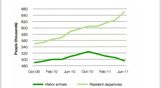
The chart illustrates the number of tourists arriving in a particular country for short trips and number of local residents departing from that country for similar trips on the period from October 2017 to June 2019.

Overall, the line in the graphs indicate that more local residents are leaving the country than tourist visiting it. In the end of the period, this gap widens significantly to more than 120,000 people.

Initially, tourist arrivals began at 500,000 in October 2017 and increased to 530,000 in October 2018. Nonetheless, from October 2018 to June 2019, tourist arrivals decreased back to 500,000 by the end of period, nearly the same level as at the beginning.

In contrast, the number of resident departures started slightly higher, at 530,000 people. The trend of resident departures gradual increase with minor fluctuations. The number remained relatively stable ini Februari 2018 and October 2018. Resident departing reached a peak of approximately 650,000 people in June 2019 with a difference around 120,000 to tourist arrivals

Word Count: 166

Answers On The Same Topic:

The charts below show the number of visitors arriving in a particular country for a short trip, and the number of residents leaving that country for a short trip, from 2009 to 2011. Summarise the information by selecting and reporting the main features, and make comparisons where relevant.

The chart illustrates the number of tourists arriving in a particular country for a short trip, and the number of local people departing from that country for a short trip, from October 2017 until June 2019. Overall, the line graphs show that more local residents are leaving the country than tourists are visiting, beginning with […]

The charts below show the number of visitors arriving in a particular country for a short trip, and the number of residents leaving that country for a short trip, from 2009 to 2011. Summarise the information by selecting and reporting the main features, and make comparisons where relevant.

The chart illustrates the number of people visiting an unknown country for a short period as well as the number of residents departing from the country for a short trip from 2009 until 2011. Overall, the line graphs show that more people are leaving the country than visiting it, starting with a small difference of […]

The charts below show the number of visitors arriving in a particular country for a short trip, and the number of residents leaving that country for a short trip, from 2009 to 2011. Summarise the information by selecting and reporting the main features, and make comparisons where relevant.

the chart illustrates the number of traveller arrived in a particular country for a short excursion and the number of inhabitant leaving that country for a short trip between 2009 and 2011. Overall, it is clear that there was a considerable upward trends in the number of visitors arrivals. By contrast, the number of resident, […]

The charts below show the number of visitors arriving in a particular country for a short trip, and the number of residents leaving that country for a short trip, from 2009 to 2011. Summarise the information by selecting and reporting the main features, and make comparisons where relevant.

The shown charts present details and information on the arrival of visitors and departure of locals in a particular country for a short trip, from the period 2009 to 2011. The departures of residents since October 2009 is sharply increasing and reached its peak in June 2011 while the arrivals of voyagers faced different trends, […]

See All

Other Topics:

The graph below shows people's level of satisfaction with the health care system in 4 countries between 1991 and 2007.

The line graph illustrates resident’s degree of satisfaction with the medical care system in four countries such as, the Canada, the Netherlands, United Kingdom and the USA from 1991 to 2006. Overall, the medical care system of residents’ degree of satisfaction is in two countries; for instance, the United Kingdom and the USA increased, while […]

Changes in the amount of fast food consumption by Australian teenagers

The graph provides information on changes in the amount of fast food consumption by Australian teenagers. Overall, from my point of view, the consumption of three types of fast food, like pizza and hamburgers, increased, and fish & chips decreased from 1975 to 2000. From 1975 to 1980, pizza consumption grew approximately 18%. In the […]

Changes in the amount of fast food consumption by Australian teenagers

The graph provides tne information changes in the amount of fast food consumption by Australian teenagers. Overall from my point of view three type of fast food like Pizza and Hamburgers increasaed and Fish & Chips decreased from 1975 to 2000. Pizza number of grams 1975 to 1980 approximately 18% grow this five year Pizza […]

The line graph and pie chart below show information on crime in the UK for the last year. Summarise the information by selecting and reporting the main features, and make comparisons where relevant. You should write at least 150 words.

The following data analyzes the line graph and pie chart depicted the information happned crimes in the UK in last year. The line graph illustrates the crimes happaned in UK the highest rate of the crime the ages of 16 to 20 and the ages of 56 to 60 the ratio declined, however the ages […]

The graph below shows the number of library books read by boys and girls at Starmouth School from 2006 to the present. Summarize the information by selecting and reporting the main features, and make comparisons where relevant.

The chart illustrates the number of library books read by boys and girls at Starmouth School from 2006 to the present. Overall, the boys had a general upward trend at the beginning and decreased minimally at the end. Besides that, the girls increased dramatically over the period. In 2009, the girls read about 25 books. […]

The graph below shows average carbon dioxide (CO2) emissions per person in the Uk, sweden, portugal and italy

The line graph demonstrates the average carbon footprint per individual in the United Kingdom, Sweden, Italy and Portugal in 1967 to 2007. Overview, United Kingdom was releasing CO2 most over the years but after a decade, emission got decreased as year passed. Whereas Portugal was ejecting CO2 gas comparatively low than other countries. Initially, Portugal […]

See All
We have detected unusual activity on your device.
Please verify your identity to continue.
Note: This verification step won't sign you in. If you have a premium account, please log in to access the service as usual.
Google/Gmail Verification
Or verify using Email/Code
We've sent a verification code to:
youremail@gmail.com (Not your email?)
Enter it below to complete the verification process.
Ensure your email address is correct, your inbox is not full, and you check your spam folder. If no email arrives, consider using an alternative email.
You will need a Premium plan to perform your action!
Note: If you already have a premium account, please log in to access our services as usual.

Plans & Pricing

Our mission is to make quality education accessible for everyone.
However, to keep our hardworking team running and this service alive, we genuinely need your support!
By opting for a premium plan, not only do you sustain us in achieving the mission, but you also unlock advanced features to enrich your learning experience.

Free

For learners who aren't pressed for time

What's included on Free
100+ Cambridge IELTS Tests
Instant IELTS Writing Task 1 & 2 Evaluation (2 times/month)
Instant IELTS Speaking Part 1, 2, & 3 Evaluation (5 times/month)
Instant IELTS Writing Task 1 & 2 Essay Generator (2 times/month)
500+ Dictation & Shadowing Exercises
100+ Pronunciation Exercises
Flashcards
Other Advanced Tools

Premium

For those serious about advancing their English proficiency, and for IELTS candidates aspiring to boost their band score by 1-2 points (especially in writing & speaking) in just 30 days or less

What's included on Premium
Save Your IELTS Test Progress
Unlock All Courses & IELTS Tests
Unlimited AI Conversations
Unlimited AI Writing Enhancement Exercises
Unlimited IELTS Writing Task 1 & 2 Evaluation
Unlimited IELTS Speaking Part 1, 2, & 3 Evaluation
Checked Answers Will Not Be Published
Unlimited IELTS Writing Task 1 & 2 Essay Generator
Unlimited IELTS Speaking Part 1, 2, & 3 Sample Generator
Unlimited Usage Of Advanced Tools
Priority Support within 24h (12-month plan only)

Due to the nature of our service and the provided free trials, payments are non-refundable.
Nếu bạn là người Việt Nam và không có hoặc không muốn trả bằng credit/debit cards, bạn có thể thanh toán bằng phương thức chuyển khoản:


Chọn gói:
419,000₫ 277,000 ₫ cho gói 1 tháng (chỉ 9,233₫/ngày)
1,239,000₫ 597,000 ₫ cho gói 3 tháng (chỉ 6,633₫/ngày)
2,469,000₫ 1,027,000 ₫ cho gói 6 tháng (chỉ 5,706₫/ngày)
4,929,000₫ 1,417,000 ₫ cho gói 12 tháng (chỉ 3,936₫/ngày)


Sau khi chuyển khoản, vui lòng đợi trình duyệt tự động điều hướng bạn trở lại Engnovate và bạn sẽ ngay lập tức nhận được mã kích hoạt tài khoản premium.
Nếu có lỗi xảy ra, bạn có thể liên hệ với team thông qua một trong các phương thức: email đến helloengnovate@gmail.com hoặc nhắn tin qua facebook.com/engnovate.
Vì toàn bộ công cụ trên website đều có thể sử dụng thử miễn phí, Engnovate không hỗ trợ hoàn tiền.