🔥 Today Only: Save 30% on Premium — Offer Ends Soon! - Upgrade Now!
Multiple Graphs

Band 8+: The charts provide information about people's travel in one country. Summarise the information by selecting and reporting the main features and make comparisons where relevant.

Image for topic: The charts provide information about people's travel in one country. Summarise the information by selecting and reporting the main features and make comparisons where relevant.
Our system will evaluate the answer based on this AI-generated description.
The image contains two graphs related to travel. The top graph titled "Travel Over Time" displays data from 1990 to 2015, with y-axes for both Time Taken (minutes) ranging from 355 to 395 and Distance Traveled (miles) ranging from 6300 to 7300. In 1990, the time taken was 365 minutes and distance traveled was 6300 miles; in 1995 both increased to 370 minutes and 6850 miles; 2000 saw further increase to 385 minutes and 7100 miles; in 2005 time increased to 390 minutes but distance decreased to 7000 miles; 2010 had a time of 380 minutes and distance of 6900 miles; and 2015 saw the time decrease to 365 minutes and distance to 6400 miles. The bottom graph titled "Mode of Travel" shows the percentage breakdown of travel methods for the years 1995, 2000, 2005, 2010, and 2015. Walking/Cycling percentages were 28%, 27%, 24%, 24%, and 24%, respectively. Other Private Transport percentages were 62%, 64%, 65%, 66%, and 65%, respectively. Public Transport percentages were 9%, 9%, 11%, 11%, and 11%, respectively.
Given the complexity of the image, the above description may not be entirely accurate.
Note: Both the topic and the answer were created by one of our users.

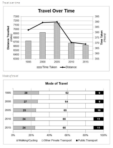
The two charts illustrate changes in travel patterns in one country between 1995 and 2015. The first chart shows the total distance travelled and the time spent travelling, while the second chart examines the popularity of different modes of transport used.

Both the distance travelled and the time spent travelling increased steadily from 1995 to 2005; however, they declined sharply by 2015. In terms of transport modes, private transport remained the dominant choice throughout the period, while walking/cycling and public transport showed only slight fluctuations.

Between 1995 and 2000, the total distance travelled increased rapidly, from about 6,000 miles to nearly 7,200 miles. This figure plateaued until 2005. By 2010, the decline was significant, to approximately 6,700 miles, followed by a modest decrease to around 6,600 miles by 2015. The time spent travelling followed a similar trend, rising steadily until 2005 and then dropping sharply by 2015.

Regarding modes of transport, private transport consistently accounted for the largest share of all journeys, fluctuating slightly between 62% and 65% over the 20-year period. Walking and cycling experienced a gradual decline, decreasing from 28% in 1995 to 24% in 2015. Furthermore, public transport usage increased marginally from 9% to 11% during the same period.

Word Count: 202

Other Topics:

The table and pie chart illustate popution in Australia according to different nationalities and areas.

The pie chart illustrated the proportion of people who lived in Australia, while the table indicated that people tend to live in urban or rual areas. Overall, the majority of the population in Australia was Australian, and most of them lived in the city, especially individuals from China. The pie chart described that in Australia […]

The charts below show the average percentages in typical meals of three nutrients.All of which may be unhealthy if eaten too much

The pie chart illustrates the consumption of 3 different nutrients-classified as unhealthy- in usual meals. Overall, dinner contained the highest amount of sodium and saturated fat, despite breakfast gathering the least figure of three consumptions. Snacks present a greater portion in added sugar than the remaining 3. On the regard of sodium consumption, dinner collected […]

The charts below show the proportion of income spent on different areas by on university, in 2005 and 2015

The pie chart displays the percentages of earnings in a tertiary institution in six different departments from 2005 to 2015. Overall, it can be seen that all of the sections’ proportion of spending in university has changed, except the campus remained the same over the ten years. Training and research study accounted for over 50% […]

The diagrams below show the main reasons workers chose to work from home and the hours males and females worked at home for the year 2019. Summarise the information by selecting and reporting the main features, and make comparisons where relevant.

The diagram illustrates the underlying reasons why employees opted for work from home and the workload of both males and females in the year 2019. Overall, it is clear that the main reason for staying at home was to economise money for both genders. Strikingly, males’ workload was significantly higher than their counterparts. To start […]

The first chart below shows the value of goods that australia imported from china and those exported to china from australia. The second chart shows the types of good imported from china. Summarise the information by selecting and reporting the main features, and make a comparisons where relevant.

The charts illustrate the value of goods imported to and exported from Australia to China over a period of seven years (1998-2004), as well as the value of five different types of goods for the years 2003 and 2004. The values are measured in billions of dollars. Overall, it is evident that the worth of […]

percentage of the average families food budget spent on restaurant meal, and popularity of fast-food and sit-down restaurant meals

The provided pie chart and line graph illustrate the percentage of food budget allocated to restaurant meals by an average middle-class family and the frequency of meals eaten out over a four-decade period. Overall, it is noticeable that while expenditure on home cooking declined consistently, dining out saw a significant rise. Additionally, fast food emerged […]

See All
We have detected unusual activity on your device.
Please verify your identity to continue.
Note: This verification step won't sign you in. If you have a premium account, please log in to access the service as usual.
Google/Gmail Verification
Or verify using Email/Code
We've sent a verification code to:
youremail@gmail.com (Not your email?)
Enter it below to complete the verification process.
Ensure your email address is correct, your inbox is not full, and you check your spam folder. If no email arrives, consider using an alternative email.
You will need a Premium plan to perform your action!
Note: If you already have a premium account, please log in to access our services as usual.

Plans & Pricing

Our mission is to make quality education accessible for everyone.
However, to keep our hardworking team running and this service alive, we genuinely need your support!
By opting for a premium plan, not only do you sustain us in achieving the mission, but you also unlock advanced features to enrich your learning experience.

Free

For learners who aren't pressed for time

What's included on Free
100+ Cambridge IELTS Tests
Instant IELTS Writing Task 1 & 2 Evaluation (2 times/month)
Instant IELTS Speaking Part 1, 2, & 3 Evaluation (5 times/month)
Instant IELTS Writing Task 1 & 2 Essay Generator (2 times/month)
500+ Dictation & Shadowing Exercises
100+ Pronunciation Exercises
Flashcards
Other Advanced Tools

Premium

For those serious about advancing their English proficiency, and for IELTS candidates aspiring to boost their band score by 1-2 points (especially in writing & speaking) in just 30 days or less

What's included on Premium
Save Your IELTS Test Progress
Unlock All Courses & IELTS Tests
Unlimited AI Conversations
Unlimited AI Writing Enhancement Exercises
Unlimited IELTS Writing Task 1 & 2 Evaluation
Unlimited IELTS Speaking Part 1, 2, & 3 Evaluation
Checked Answers Will Not Be Published
Unlimited IELTS Writing Task 1 & 2 Essay Generator
Unlimited IELTS Speaking Part 1, 2, & 3 Sample Generator
Unlimited Usage Of Advanced Tools
Priority Support within 24h (12-month plan only)

Due to the nature of our service and the provided free trials, payments are non-refundable.
Nếu bạn là người Việt Nam và không có hoặc không muốn trả bằng credit/debit cards, bạn có thể thanh toán bằng phương thức chuyển khoản:


Chọn gói:
419,000₫ 277,000 ₫ cho gói 1 tháng (chỉ 9,233₫/ngày)
1,239,000₫ 597,000 ₫ cho gói 3 tháng (chỉ 6,633₫/ngày)
2,469,000₫ 1,027,000 ₫ cho gói 6 tháng (chỉ 5,706₫/ngày)
4,929,000₫ 1,417,000 ₫ cho gói 12 tháng (chỉ 3,936₫/ngày)


Sau khi chuyển khoản, vui lòng đợi trình duyệt tự động điều hướng bạn trở lại Engnovate và bạn sẽ ngay lập tức nhận được mã kích hoạt tài khoản premium.
Nếu có lỗi xảy ra, bạn có thể liên hệ với team thông qua một trong các phương thức: email đến helloengnovate@gmail.com hoặc nhắn tin qua facebook.com/engnovate.
Vì toàn bộ công cụ trên website đều có thể sử dụng thử miễn phí, Engnovate không hỗ trợ hoàn tiền.