🔥 Today Only: Save 30% on Premium — Offer Ends Soon! - Upgrade Now!
Multiple Graphs

Band 4+: The charts show where people get their news and how much they trust these sources. Summarise the information by selecting and reporting the main features, and make comparisons where relevant.

Image for topic: The charts show where people get their news and how much they trust these sources. Summarise the information by selecting and reporting the main features, and make comparisons where relevant.
Our system will evaluate the answer based on this AI-generated description.
The image contains two bar graphs, the first titled "Trust in News Sources" and the second "News Sources Used". The first graph shows the percentage of responses for "Highly Trust" and "Don't Trust" for six news sources. Local TV news has 52% Highly Trust, 41% Don't Trust; National network has around 50% Highly Trust, 44% Don't Trust; Newspapers have 47% Highly Trust, 45% Don't Trust; Radio news has around 47% Highly Trust, 46% Don't Trust; Online-only sources have around 40% Highly Trust, 54% Don't Trust; Magazines have 38% Highly Trust, 58% Don't Trust. The second graph displays the percentage of "News Sources Used in Past Week". Local TV news has around 85% usage; National network around 65% usage; Newspapers around 58% usage; Radio news around 52% usage; Online-only sources around 75% usage; Magazines around 40% usage. The exact percentages are not visible; estimations are made based on the bar length in the graph.
Given the complexity of the image, the above description may not be entirely accurate.
Note: Both the topic and the answer were created by one of our users.

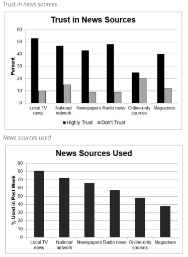
The chart displays where individuals access their news and how much they believe thee sources displayed in two diagrams below.

Overall, people trust the News sources used news than the Trust in new sources. Lack of trust is highest in the first news.

In local tv news, the news sources used has the highest number of trust with a percentage of 80 percent. while in trust news services, price is least with a proportion of 55 percent. in National network, for news source used it has the highest score of about 90 percent while Trust in news sources is 46 percent. in radio news people trust it up to 42 percent and dislike it with 10 percent. in online only sources people trust it with about 25 percent and dislike it with a 10 percent difference. in magazines price is trusted for about 40 percent and not with 15 percent.

Word Count: 150

Answers On The Same Topic:

The charts show where people get their news and how much they trust these sources. Summarise the information by selecting and reporting the main features, and make comparisons where relevant.

The bar graphs illustrate the percentage of people’s news sources in the past week and the credibility of the sources for them. Overall, it can clearly be seen that citizens predominantly received information from local television news. Additionally, most of them trusted the origin of their news. In terms of media for news, the local […]

The charts show where people get their news and how much they trust these sources. Summarise the information by selecting and reporting the main features, and make comparisons where relevant.

The given charts illustrate the percentage of people’s news sources in the past week and how credible the sources were for them. Units are measured in percent. Overall, it can clearly be seen that people mainly obtain their news from local television news. Moreover, the level of trust in each news source is high. In […]

See All

Other Topics:

total percentge of films and ticket sales in different periods of time

The two bra graphs compare the percentage of four genres of films released with their respective sales in 1996 and 2006. Overall, it is interesting to note that even though more drama than comedy films were released, the sales of comedy films was the maximum, and Romantic films was always consist of tiny figure among […]

The four bar charts compare the percentage of male and female students who achieved high grades (A and B) in five subjects at Parston School and the national average. Summarize the information by selecting and reporting the main features and make comparisons where relevant.

The bar charts compare the proportion of students receiving high grades (A and B) in five different subjects, including Math, Science, Humanities Subjects, Arts and Languages, in terms of gender at Parston School and the national average. Overall, it is immediately obvious that Math is prominent in the number of students obtaining high scores. Furthermore, […]

The given charts give information about the number of students at university in the UK from 1991 to 2001, government spending and the types of family economic background they came from in 1991. Summarize the information by selecting and reporting the main features and make comparisons where relevant.

The charts provide information on the total number of students at a particular university in the UK from 1991 to 2001 and the percentage of students from three different family economic backgrounds (high-income, middle-income, and low-income families) in 1991. Overall, the total number of students increased significantly. Students from middle-income families made up the largest […]

The diagrams below show changes of a cinema from 1980 until now. Summarize the information by selecting and reporting the main features, and make comparisons where relevant.

The maps depict how a cinema changed between 1980 and the present day. Overall, the cinema has undergone a significant transformation, with the addition of three extra cinemas, a DVD shop, and a relaxation room. In 1980, there was a ticket office and a shop for drinks on the right side of the entrance and […]

The pie charts below show the leading causes of insomnia, in percentages, as reported by two groups of people. The people in group A were between the ages of 20 and 40 and those in group B were between 60 and 80. Summarise the information by selecting and reporting the main features, and make comparisons where relevant.

The pie chart illustretes how the leading reasons of insomnia,in proportions,as reported by two different teams of peope.The peole in group A were from 20 to 40 ages and those in group from 60 to 80. Overall,the percentage of Group B had higher figures in all categories,except for depression and stress,where Group A outnumbered.Notably,the proportion […]

percentage of full workers holding a university degree and average salary of graduates

The line graph shows the proportions of math students and all students at a certain university who got full time employment after graduation while the table compares their average salaries between 2004 and 2012. Overall, students with math degree showed higher percentages in getting full time job after university and even they earned more money […]

See All
We have detected unusual activity on your device.
Please verify your identity to continue.
Note: This verification step won't sign you in. If you have a premium account, please log in to access the service as usual.
Google/Gmail Verification
Or verify using Email/Code
We've sent a verification code to:
youremail@gmail.com (Not your email?)
Enter it below to complete the verification process.
Ensure your email address is correct, your inbox is not full, and you check your spam folder. If no email arrives, consider using an alternative email.
You will need a Premium plan to perform your action!
Note: If you already have a premium account, please log in to access our services as usual.

Plans & Pricing

Our mission is to make quality education accessible for everyone.
However, to keep our hardworking team running and this service alive, we genuinely need your support!
By opting for a premium plan, not only do you sustain us in achieving the mission, but you also unlock advanced features to enrich your learning experience.

Free

For learners who aren't pressed for time

What's included on Free
100+ Cambridge IELTS Tests
Instant IELTS Writing Task 1 & 2 Evaluation (2 times/month)
Instant IELTS Speaking Part 1, 2, & 3 Evaluation (5 times/month)
Instant IELTS Writing Task 1 & 2 Essay Generator (2 times/month)
500+ Dictation & Shadowing Exercises
100+ Pronunciation Exercises
Flashcards
Other Advanced Tools

Premium

For those serious about advancing their English proficiency, and for IELTS candidates aspiring to boost their band score by 1-2 points (especially in writing & speaking) in just 30 days or less

What's included on Premium
Save Your IELTS Test Progress
Unlock All Courses & IELTS Tests
Unlimited AI Conversations
Unlimited AI Writing Enhancement Exercises
Unlimited IELTS Writing Task 1 & 2 Evaluation
Unlimited IELTS Speaking Part 1, 2, & 3 Evaluation
Checked Answers Will Not Be Published
Unlimited IELTS Writing Task 1 & 2 Essay Generator
Unlimited IELTS Speaking Part 1, 2, & 3 Sample Generator
Unlimited Usage Of Advanced Tools
Priority Support within 24h (12-month plan only)

Due to the nature of our service and the provided free trials, payments are non-refundable.
Nếu bạn là người Việt Nam và không có hoặc không muốn trả bằng credit/debit cards, bạn có thể thanh toán bằng phương thức chuyển khoản:


Chọn gói:
419,000₫ 277,000 ₫ cho gói 1 tháng (chỉ 9,233₫/ngày)
1,239,000₫ 597,000 ₫ cho gói 3 tháng (chỉ 6,633₫/ngày)
2,469,000₫ 1,027,000 ₫ cho gói 6 tháng (chỉ 5,706₫/ngày)
4,929,000₫ 1,417,000 ₫ cho gói 12 tháng (chỉ 3,936₫/ngày)


Sau khi chuyển khoản, vui lòng đợi trình duyệt tự động điều hướng bạn trở lại Engnovate và bạn sẽ ngay lập tức nhận được mã kích hoạt tài khoản premium.
Nếu có lỗi xảy ra, bạn có thể liên hệ với team thông qua một trong các phương thức: email đến helloengnovate@gmail.com hoặc nhắn tin qua facebook.com/engnovate.
Vì toàn bộ công cụ trên website đều có thể sử dụng thử miễn phí, Engnovate không hỗ trợ hoàn tiền.