🔥 Today Only: Save 30% on Premium — Offer Ends Soon! - Upgrade Now!
Multiple Graphs

Band 8+: The first chart below gives information about the money spent by British parents on their children’s sports between 2008 and 2014. The second chart shows the number of children who participated in three sports in Britain over the same time period.

Image for topic: The first chart below gives information about the money spent by British parents on their children’s sports between 2008 and 2014. The second chart shows the number of children who participated in three sports in Britain over the same time period.
Our system will evaluate the answer based on this AI-generated description.
The image contains two charts displaying data from 2008 to 2014. The first chart, "Average monthly spend on children's sports," shows a steady increase in spending in pounds, starting at approximately 20 in 2008, rising to about 25 in 2010, around 30 in 2012, and reaching just over 35 in 2014. The second chart, "Participation in three different sports," illustrates the number of children in millions participating in Football, Athletics, and Swimming. Football participation starts at roughly 8.75 million in 2008, decreases slightly to approximately 8.5 million in 2010, then increases to just over 8.75 million in 2012, and maintains that level in 2014. Athletics begins at about 2.75 million in 2008, rises to nearly 5 million in 2010, then shows a slight decline to slightly under 5 million in 2012, and decreases to around 4 million in 2014. Swimming displays a constant participation of roughly 2.75 million from 2008 to 2014.
Given the complexity of the image, the above description may not be entirely accurate.
Note: Both the topic and the answer were created by one of our users.

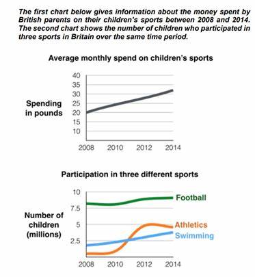
The line graphs show the average monthly amount that parents in Britain spent on their children’s sporting activities and the number of British children who took part in three di¬erent sports from 2008 to 2014.

It is clear that parents spent more money each year on their children’s participation in sports over the six-year period. In terms of the number of children taking part, football was significantly more popular than athletics and swimming.

In 2008, British parents spent an average of around £20 per month on their children’s sporting activities. Parents’ spending on children’s sports increased gradually over the following six years, and by 2014 the average monthly amount had risen to just over £30. Looking at participation numbers, in 2008 approximately 8 million British children played football, while only 2 million children were enrolled in swimming clubs and less than 1 million practised athletics. The figures for football participation remained relatively stable over the following 6 years. By contrast, participation in swimming almost doubled, to nearly 4 million children, and there was a near fivefold increase in the number of children doing athletics.

Word Count: 184

Answers On The Same Topic:

The first chart below gives information about the money spent by British parents on their children’s sports between 2008 and 2014. The second chart shows the number of children who participated in three sports in Britain over the same time period.

The provided charts elucidate the financial expenditures of British parents on their children’s sports and the concurrent participation levels in three specific sports from 2008 to 2014. Overall, there is a discernible upward trend in parental spending on children’s sports, while football consistently emerged as the most participated sport, despite fluctuations in the numbers for […]

The first chart below gives information about the money spent by British parents on their children’s sports between 2008 and 2014. The second chart shows the number of children who participated in three sports in Britain over the same time period.

The first line chart depict information about the money expenditure by the UK parents on their children’s exercise measured in pounds. The next chart gives information about the children participated in three categories of sports in the United Kingdom measured in millions. Overall, the lines of spending increased over the time, while the children participation […]

The first chart below gives information about the money spent by British parents on their children’s sports between 2008 and 2014. The second chart shows the number of children who participated in three sports in Britain over the same time period.

The line graphs illustrate the average monthly amount spent by British parents on their children’s sporting activities and the number of British children parttaking in three different sports from 2008 to 2014. Overall, parents spent more money each year on their children’s participation in sports over the six-year period. In terms of the number of […]

The first chart below gives information about the money spent by British parents on their children’s sports between 2008 and 2014. The second chart shows the number of children who participated in three sports in Britain over the same time period.

The charts below illustrate the amount of money that British parents spent on their children’s sporting activities and the count of British children taking part in three sports over a period of 7 years, starting from 2008. Overall, British parents’ spending on sports for their children increased consistently throughout the period. It can also be […]

See All

Other Topics:

You should spend about 20 minutes on this task. The charts below show the number of French adults whose parents spoke a French regional language to them when they were children and the number who speak a French regional language to their own children. Write a report for a university lecturer describing the information below. Write at least 150 words.

The bar chart depicts the number of French adults, in thousands, whose parents spoke a regional language to them in childhood, as well as the numbers who currently speak a regional language to their own children. Overall, the use of regional languages has decreased over time. Occitan and Alsatian were the most common languges in […]

The charts below show the percentage of visitors from the USA to Canada in different age groups in 2000 and 2020.

The two pie charts provide a comparison of the age distribution of international tourists travelling from the United States to Canada. This data was represented for the years 2000 and 2020, in addition, with percentages serving as the primary unit of measurement. In terms of overall contributions, individuals aged 35-54 emerged as the dominant figure […]

The charts below show the percentage of visitors from the USA to Canada in different age groups in 2000 and 2020.

The two pie charts provide a comparison of the age distribution of international tourists travelling from the United States to Canada. This data was represented for the years 2000 and 2020, in addition, with percentages serving as the primary unit of measurement. In terms of overall contributions, individuals 35-54 aged emerged as the dominant figure […]

Writing task 1 The graph below shows the viewership of different TV programs among three different age groups. Summarise the information by selecting and reporting the main features, and make comparisons where relevant.

Pie charts compare three age range watching different TV programs, in percentages. Overall, films, drama, and cartoons are the most preferable programs, regardless of people’s age. Additionally, other programs varied as the age groups changed. As for the greatest numbers first, 30% of people from 15-20 age group watched drama, followed by the youngest group […]

Writing Task 1: Pie Chart & Table You should spend about 20 minutes on this task The charts below show the distribution of the world's water and the use of water in three countries.

The provided charts illustrate the distribution of water worldwide as well as its usage in three different countries. Overall, the majority of the world’s water is salt water, with only a small fraction being fresh water. Of the fresh water available, the largest portion is found in ice and glaciers, while surface water accounts for […]

The charts below show UK and USA energy consumption in 2000 and 2006. Summarise the information by selecting and reporting the main features, and make comparisons where relevant.

The bar charts compare the proportions of energy consumed from five different sources in the UK and the USA in 2000 and 2006. Overall, oil and coal were the dominant energy sources in both countries throughout the period. However, while the USA relied more heavily on oil and coal, the UK showed a significantly greater […]

See All
We have detected unusual activity on your device.
Please verify your identity to continue.
Note: This verification step won't sign you in. If you have a premium account, please log in to access the service as usual.
Google/Gmail Verification
Or verify using Email/Code
We've sent a verification code to:
youremail@gmail.com (Not your email?)
Enter it below to complete the verification process.
Ensure your email address is correct, your inbox is not full, and you check your spam folder. If no email arrives, consider using an alternative email.
You will need a Premium plan to perform your action!
Note: If you already have a premium account, please log in to access our services as usual.

Plans & Pricing

Our mission is to make quality education accessible for everyone.
However, to keep our hardworking team running and this service alive, we genuinely need your support!
By opting for a premium plan, not only do you sustain us in achieving the mission, but you also unlock advanced features to enrich your learning experience.

Free

For learners who aren't pressed for time

What's included on Free
100+ Cambridge IELTS Tests
Instant IELTS Writing Task 1 & 2 Evaluation (2 times/month)
Instant IELTS Speaking Part 1, 2, & 3 Evaluation (5 times/month)
Instant IELTS Writing Task 1 & 2 Essay Generator (2 times/month)
500+ Dictation & Shadowing Exercises
100+ Pronunciation Exercises
Flashcards
Other Advanced Tools

Premium

For those serious about advancing their English proficiency, and for IELTS candidates aspiring to boost their band score by 1-2 points (especially in writing & speaking) in just 30 days or less

What's included on Premium
Save Your IELTS Test Progress
Unlock All Courses & IELTS Tests
Unlimited AI Conversations
Unlimited AI Writing Enhancement Exercises
Unlimited IELTS Writing Task 1 & 2 Evaluation
Unlimited IELTS Speaking Part 1, 2, & 3 Evaluation
Checked Answers Will Not Be Published
Unlimited IELTS Writing Task 1 & 2 Essay Generator
Unlimited IELTS Speaking Part 1, 2, & 3 Sample Generator
Unlimited Usage Of Advanced Tools
Priority Support within 24h (12-month plan only)

Due to the nature of our service and the provided free trials, payments are non-refundable.
Nếu bạn là người Việt Nam và không có hoặc không muốn trả bằng credit/debit cards, bạn có thể thanh toán bằng phương thức chuyển khoản:


Chọn gói:
419,000₫ 277,000 ₫ cho gói 1 tháng (chỉ 9,233₫/ngày)
1,239,000₫ 597,000 ₫ cho gói 3 tháng (chỉ 6,633₫/ngày)
2,469,000₫ 1,027,000 ₫ cho gói 6 tháng (chỉ 5,706₫/ngày)
4,929,000₫ 1,417,000 ₫ cho gói 12 tháng (chỉ 3,936₫/ngày)


Sau khi chuyển khoản, vui lòng đợi trình duyệt tự động điều hướng bạn trở lại Engnovate và bạn sẽ ngay lập tức nhận được mã kích hoạt tài khoản premium.
Nếu có lỗi xảy ra, bạn có thể liên hệ với team thông qua một trong các phương thức: email đến helloengnovate@gmail.com hoặc nhắn tin qua facebook.com/engnovate.
Vì toàn bộ công cụ trên website đều có thể sử dụng thử miễn phí, Engnovate không hỗ trợ hoàn tiền.