Our system will evaluate the answer based on this AI-generated description.
The image displays three line graphs labeled respectively as "Number of train passengers from 2000 to 2009 (in millions)", "Percentage of trains running on time compared with the target", and "Standard Iron Target" vs. "Percentage of trains running on time". The first graph portrays a range approximately between 15 to 30 million passengers, peaking around 2006 while showing a rise in 2000 and 2009 and a dip around 2002 and 2007. In the second graph, the target percentage for trains running on time fluctuates close to the peak around 95%, with the actual percentage varying below this line, notably declining between 2004 and 2006. The third graph presents data points represented by two lines; the 'Standard Iron Target' line remains constant at 95% throughout, juxtaposed against a line representing the actual 'Percentage of trains running on time' which descends sharply after 2003, reaching its lowest near 80% in 2006 before recovering slightly towards 2009.
Given the complexity of the image, the above description may not be entirely accurate.
Skyrocket your IELTS band score by 1-2 points in under a month with our premium plan!
Note: Both the topic and the answer were created by one of our users.
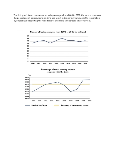
From the first graph, we can see the slight growth in the number of train passengers from 2000 to 2009, which increases from 36 million to 43 million, there is a peak on 2025 with 47 million passengers.
From the second graph, we can see unstable changes in the train running on time. In the period from 2002 to 2024 and from 2008 to 2009, train running on time is higher than average percentage. Meanwhile, from 2000 to 2001 & from 2005 to 2028, the train running on time is lower than average percentage.
On the purpose of comparing the relevance between train running on time and number of passengers, i can find nothing.
Word Count: 114
