🔥 Today Only: Save 30% on Premium — Offer Ends Soon! - Upgrade Now!
Multiple Graphs

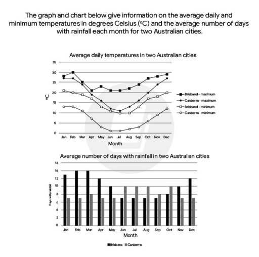
Band 8+: The graph and chart below give information on the average daily maximum and minimum temperatures in degrees Celsius and the average number of days with rainfall each month for two Australian cities. Summarise the information by selecting and reporting the main features and make comparisons where relevant

Image for topic: The graph and chart below give information on the average daily maximum and minimum temperatures in degrees Celsius and the average number of days with rainfall each month for two Australian cities. Summarise the information by selecting and reporting the main features and make comparisons where relevant
Our system will evaluate the answer based on this AI-generated description.
The image contains two graphs; the top graph shows average daily temperatures in two Australian cities with data points for Brisbane maximum (Jan-29, Feb-29, Mar-28, Apr-26, May-23, Jun-21, Jul-21, Aug-22, Sep-24, Oct-26, Nov-27, Dec-29), Canberra maximum (Jan-28, Feb-27, Mar-25, Apr-20, May-16, Jun-12, Jul-11, Aug-13, Sep-16, Oct-19, Nov-23, Dec-26), Brisbane minimum (Jan-21, Feb-21, Mar-20, Apr-17, May-14, Jun-11, Jul-9, Aug-10, Sep-13, Oct-16, Nov-18, Dec-20), Canberra minimum (Jan-13, Feb-13, Mar-11, Apr-7, May-3, Jun-1, Jul-0, Aug-1, Sep-3, Oct-6, Nov-9, Dec-11). The bottom graph shows average number of days with rainfall in two Australian cities with bars representing Brisbane (Jan-11, Feb-12, Mar-14, Apr-11, May-9, Jun-6, Jul-5, Aug-5, Sep-5, Oct-8, Nov-9, Dec-11) and Canberra (Jan-9, Feb-9, Mar-9, Apr-6, May-7, Jun-7, Jul-6, Aug-7, Sep-7, Oct-8, Nov-8, Dec-7).
Given the complexity of the image, the above description may not be entirely accurate.
Note: Both the topic and the answer were created by one of our users.

The graph and chart show the average daily maximum and minimum temperatures and the average number of rainy days per month in Brisbane and Canberra, Australia.

Overall, Brisbane has warmer and more stable temperatures, while Canberra experiences greater seasonal variation. Brisbane also has more rainy days at the beginning and end of the year, whereas Canberra has a relatively stable pattern.

In January, Brisbane’s maximum and minimum temperatures are approximately 28°C and 21°C, respectively, compared with 27°C and 13°C in Canberra. Brisbane’s maximum temperature peaks at 32°C in February before falling to 21°C in July and rising gradually to 28°C in December. Its minimum temperature follows a similar pattern, dropping to 10°C in July. In contrast, Canberra’s maximum falls to 11°C in July, while its minimum reaches just 1°C.

Regarding rainfall, Brisbane has 13-14 rainy days from January to March, before declining to 7 days in June and remaining stable until September. It then increases to 12 days in December. Canberra records around 7-8 rainy days in most months, although this rises to 10 days from June to August and again in October.

Word Count: 183

Answers On The Same Topic:

The graph and chart below give information on the average daily maximum and minimum temperatures in degrees Celsius and the average number of days with rainfall each month for two Australian cities. Summarise the information by selecting and reporting the main features and make comparisons where relevant

The provided charts compare the mean highest and lowest temperatures per day in Celsius degrees recorded in Brisbane and Canberra while delineating the typical number of days with precipitation. Overall, both Australian cities typically see dips in temperature mid-year and recover by the end of the year then remain relatively warmer for the first quarter […]

The graph and chart below give information on the average daily maximum and minimum temperatures in degrees Celsius and the average number of days with rainfall each month for two Australian cities. Summarise the information by selecting and reporting the main features and make comparisons where relevant

The data illustrate the highest and the lowest temperature daily in degrees Celsius (*C) and the average number of days in each month where was a rainfall in Australian cities (Brisbane and Canberra). Overall, from the high vision, it is obvious that in both data Brisbane had more average temperature and more days with rainfall. […]

The graph and chart below give information on the average daily maximum and minimum temperatures in degrees Celsius and the average number of days with rainfall each month for two Australian cities. Summarise the information by selecting and reporting the main features and make comparisons where relevant

The graph compares the maximum and the minimum temperatures between two cities, namely Brisbane and Canberra. The given chart presents data on the average precipitation in these two mentioned Australian cities. Generally, the maximum and minimum degrees in Brisbane are higher than those in Canberra. Interestingly, whereas Brisbane is the city exhibiting a higher pattern […]

The graph and chart below give information on the average daily maximum and minimum temperatures in degrees Celsius and the average number of days with rainfall each month for two Australian cities. Summarise the information by selecting and reporting the main features and make comparisons where relevant

The line ghaph illustrates the daily average temperatures, while the bar chart illustrates the the same days average number of rainfall in two Australian cities. Looking from an overall perspective, it is evident that the temperatures showed downward trend beginning of the period, whereas then an upward trend end of the time period. However the […]

See All

Other Topics:

The graph below shows the weekly working hours or men and women omen in in government institutions and private institutions. Summarise the information by selecting and repairing the main features, and make comparisons where relevant.

The pie charts compare the weekly hours of men and women who worked in government and private institutions. Overall, it is clear that regarding government sector for men, the highest amount of hours worked by themselves, while women worked the least. Similarly, in private sector, men worked higher than women. Looking first at the government […]

The pie chart below show the percentage of volunteers by organizations in the years 2008 and 2014.

The pie chart illustrates the changes in volunteer organizations in 5 different categories over the period from 2008 to 2014. From an overall perspective, it is clear that education recorded the highest proportion at the beginning, while health care was the least choosen voluntary organization throughout the period. Education experienced the highest increase over time. […]

The pie chart below show the percentage of volunteers by organizations in the years 2008 and 2014.

The pie chart illustrates the changes in volunteers organisations in 5 different categories over the period from 2008 to 2014. From an overall perspective, it is clear that educational recorded the highest proportion at the begining, while health care is the least choosed voluntary company throughout the period. Educational experienced the highest increase by the […]

The charts below show average age of men and women who retired from work in seven countries in 2004 and 2008. Summarise the information by selecting and reporting the main features, and make comparisons where relevant.

The bar charts compare the average age at which men and women retired across seven different nations between 2004 and 2008. Overall, it is clear that between 2004 and 2008, the average retirement age for both men and women saw an upward trend in most countries over the period. Additionally, Sweden registered the highest retirement […]

the charts show about internet usage in five countries in europe in 2000

The provided bar chart compare the proportion of population using internet in five countries, namely-UK, Germany, Sweden, France, Spain, while the pie chart illustrates the average amount of money, which was spending on shopping on the internet. Overall, the highest proportion of using internet was in Sweden, while the online shopping is more common in […]

You should spend about 20 minutes on this taskThe charts show the main methods of people travelling to one university in 2004 and 2009.Summarise the information by selecting and reporting the main features, and make comparisons where relevant.Write at least 150 words

The pie charts gave information about the percentage of five ways for people to approach one university between 2004 and 2009. Overall, it was evident that public transportation increased considerably, while fewer people chose cars to go to university. Moreover, the figure for Train remained the lowest throughout the period. With public amenities, that proportion […]

See All
We have detected unusual activity on your device.
Please verify your identity to continue.
Note: This verification step won't sign you in. If you have a premium account, please log in to access the service as usual.
Google/Gmail Verification
Or verify using Email/Code
We've sent a verification code to:
youremail@gmail.com (Not your email?)
Enter it below to complete the verification process.
Ensure your email address is correct, your inbox is not full, and you check your spam folder. If no email arrives, consider using an alternative email.
You will need a Premium plan to perform your action!
Note: If you already have a premium account, please log in to access our services as usual.

Plans & Pricing

Our mission is to make quality education accessible for everyone.
However, to keep our hardworking team running and this service alive, we genuinely need your support!
By opting for a premium plan, not only do you sustain us in achieving the mission, but you also unlock advanced features to enrich your learning experience.

Free

For learners who aren't pressed for time

What's included on Free
100+ Cambridge IELTS Tests
Instant IELTS Writing Task 1 & 2 Evaluation (2 times/month)
Instant IELTS Speaking Part 1, 2, & 3 Evaluation (2 times/month)
Instant IELTS Writing Task 1 & 2 Essay Generator (2 times/month)
500+ Dictation & Shadowing Exercises
100+ Pronunciation Exercises
Flashcards
Other Advanced Tools

Premium

For those serious about advancing their English proficiency, and for IELTS candidates aspiring to boost their band score by 1-2 points (especially in writing & speaking) in just 30 days or less

What's included on Premium
Save Your IELTS Test Progress & Analyze Mistakes By Question Type
Save Your Own Flashcard Sets & Use Them On Any Device
Unlock All Courses, IELTS Tests, Section & Part Practice
Unlimited AI Conversations
Unlimited AI Writing Enhancement Exercises
Unlimited IELTS Writing Task 1 & 2 Evaluation
Unlimited IELTS Speaking Part 1, 2, & 3 Evaluation
Checked Answers Will Not Be Published
Unlimited IELTS Writing Task 1 & 2 Essay Generator
Unlimited IELTS Speaking Part 1, 2, & 3 Sample Generator
Unlimited Usage Of Advanced Tools & AI Features
Priority Support within 24h (12-month plan only)

Due to the nature of our service and the provided free trials, payments are non-refundable.