Our system will evaluate the answer based on this AI-generated description.
The image shows a line graph with four different lines representing the Philippines, Malaysia, Thailand, and Indonesia, with data points from 1970 to 2040 projected, illustrating the percentage of their population living in cities. The Philippines' line is a dashed line with squares, starting around 35% in 1970 and reaching approximately 70% by 2040. Malaysia's line is a dotted line with circles, starting around 30% in 1970 and reaching approximately 75% by 2040. Thailand's line is a dashed line with asterisks, starting around 15% in 1970 and reaching approximately 60% by 2040. Indonesia's line is a solid line with triangles, starting just below 20% in 1970 and reaching approximately 65% by 2040. The y-axis shows the percentage of total population, scaling from 0% to 90%, and the x-axis represents the years in increments of ten.
Given the complexity of the image, the above description may not be entirely accurate.
Skyrocket your IELTS band score by 1-2 points in under a month with our premium plan!
Note: Both the topic and the answer were created by one of our users.
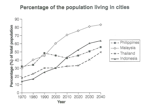
The graph shows information about proportion of people who live in cities in four Asian countries between 1970 and 2020, including predictions for 2030 and 2040.
Overall, while Philippines has some fluctuation between 1970 and 2010, all of these countries have increasing trend in terms of percentage of the population living in cities from 1970 to 2040.
It is shown that Indonesia has the highest increasing population in cities which will reach four times more in 2040 than 1970. Similarly Malaysia and Thailand have raising trend which will approximately three times more proportion of urban population in 2040 than the beginning of research. While there was fluctuation in some period, Philippines is one of the country which has increasing number of people who lives in cities as well.
Word Count: 128
