🔥 Today Only: Save 30% on Premium — Offer Ends Soon! - Upgrade Now!
Line Graph

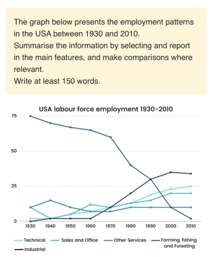
Band 6+: The graph below presents the employment patterns in the USA between 1930 and 2010. Summarise the information by selecting and report in the main features, and make comparisons where relevant. Write at least 150 words.

Image for topic: The graph below presents the employment patterns in the USA between 1930 and 2010. Summarise the information by selecting and report in the main features, and make comparisons where relevant. Write at least 150 words.
Our system will evaluate the answer based on this AI-generated description.
The image depicts USA labor force employment trends from 1930 to 2010 across five categories: Technical, Sales and Office, Other Services, Farming, Fishing, and Forestry, and Industrial. In 1930, Farming, Fishing, and Forestry constituted 75%, Technical approximately 0%, Sales and Office around 10%, Other Services about 10%, and Industrial near 7.5%. By 1940, Technical stayed constant, Sales and Office slightly over 15%, Other Services remained unchanged, Farming, Fishing, and Forestry decreased to approximately 70%, and Industrial rose marginally. In 1950, Technical remained near 0%, Sales and Office approximated 17.5%, Other Services near 10%, Farming, Fishing, and Forestry further dropped to around 60%, and Industrial exceeded 10%. By 1960, Technical remained minimal, Sales and Office rose to about 20%, Other Services over 10%, Farming, Fishing, and Forestry continued its decline to approximately 50%, and Industrial just below 20%. In 1970, Technical showed little change, Sales and Office increased slightly above 22.5%, Other Services grew to nearly 15%, Farming, Fishing, and Forestry close to 40%, and Industrial reached nearly 20%. By 1980, Technical began showing a rise at around 2.5%, Sales and Office reached over 25%, Other Services slightly above 15%, Farming, Fishing, and Forestry decreasing further to around 25%, and Industrial surpassing 20%. In 1990, Technical climbed to about 5%, Sales and Office slightly below 30%, Other Services over 17.5%, Farming, Fishing, and Forestry near 15%, and Industrial just above 22.5%. By 2000, Technical grew to around 12.5%, Sales and Office slightly above 30%, Other Services just over 20%, Farming, Fishing, and Forestry approximately 10%, and Industrial fell to nearly 15%. In 2010, Technical reached nearly 15%, Sales and Office peaked close to 35%, Other Services maintained over 22.5%, Farming, Fishing, and Forestry declined to about 5%, and Industrial remained roughly at 10%.
Given the complexity of the image, the above description may not be entirely accurate.
Note: Both the topic and the answer were created by one of our users.

The line graph demonstrates the distribution of the American workforce across five different sectors from 1930 to 2010 Overall, it is clear that except for the proportion of workforce in farming, fishing and foresting, all remaining domains including industry, technology, sales and offices witnessed an upward trend. Noticeably, while farming, fishing and foresting was the most common sectors initially, industry came top of the list at the end of the given timeframe.

Regarding the proportion of workers in the farming, fishing and foresting sector, starting at just under 80% in 1930, it decreased steadily to exactly 60% after 40 years before experiencing a plunge to nearly 0% at the end of the period. In contrast, the opposite pattern was observed in the rate of industrial workers, which remained at a relatively low rate at about 2% in the first three decades. After that, this percentage surged to around 30%, surpassing that of the farming, fishing and foresting sector in 1990 to top the chart with roughly 40% in 2010.

In terms of the technical employment rate, it increased gradually from roughly 2% to 24% throughout the period. Likewise, at 15%, the proportion for sales and offices reached its bottom at a mere 2% after 10 years, before recovering gradually to reach a high of 20% in the final year. Meanwhile, after peaking at just under 20%, the rate of employees working in other services remained constant at approximately 15% throughout the period.

Word Count: 242

Answers On The Same Topic:

The graph below presents the employment patterns in the USA between 1930 and 2010. Summarise the information by selecting and report in the main features, and make comparisons where relevant. Write at least 150 words.

The data presents information about engagment in USA: technical, sales and office, farming, fishing and foresting, industrial and other services between 1930 to 2010. Overall, all employment usage changed in given period. The most in demand workforce was farming, fishing and foresting and dimish moderately and stayed on top for long time, while technical showed […]

The graph below presents the employment patterns in the USA between 1930 and 2010. Summarise the information by selecting and report in the main features, and make comparisons where relevant. Write at least 150 words.

The graph illustrates the changes of employment patterns in the USA between the years 1930 and 2010. Overall, technical, sales and office and industrial labour force employment increased in different amounts. On the other hand, the farming, fishing and foresting employment decreased dramatically, while other services employment decreased slightly from 1930 to 2010. To begin […]

The graph below presents the employment patterns in the USA between 1930 and 2010. Summarise the information by selecting and report in the main features, and make comparisons where relevant. Write at least 150 words.

The line graph shows the employment pattern in the United States from 1930 to 2010, divided into five different sectors. Overall, it can be seen that farming, fishing and foresting decreased significantly throughout the period, while technical, sales and office, other services and industrial increased over the years. In 1930, farming, fishing and foresting was […]

See All

Other Topics:

The chart below shows the percentage of households with different kinds of technology in the UK from 1997 to 2001. Summarise the information by selecting and reporting the main features, and make comparisons where relevant.

On my way The line graph shows the proportion of UK households with a diverse range of technology in the uk between 1997 and 2011 Overall, the percentage of households increased in all categories of technology with CD players consistently higher, while other items like mobile for telephone, internet and DVD player witnessed more upward […]

Money spent on apparels on the internet in the usa and japan

The line graph illustrate the amounts of money spent on clothes on the Internet in two countries(USA and Japan) from 1999 to 2003, measured in millions dollars. Overall, spending on online apparel increased in both countries over the five-years period, despite on a slight decline in 2001. Be 2003, the spending in the two nations […]

The given line graph demonstrates information about the number of employee worked as labour in the United States in a over eighty-year period between 1930 and 2010.

The line graph varies the relative percentages of labour force employment in United States from 1930 to 2010 in five key sectors. Over the whole time period, empoyment in farming, fishing and foresting showed up an only significant decline, whilts industrial proportion grew dramatically starting from zero percents. Farming, fishing and foresting activity had its […]

The line graph below shows how much money was spent on cars in four different countries in Asia. Summarise the information by selecting and reporting the main features, and make comparisons where relevant

The line graph depicts the quantity of money spent on cars between 1995 and 2005. The information is given for four countries: China, Vietnam, Thailand, and Indonesia. Firstly, China’s spending on cars went up from nearly 80 million US dollars in 1995 to 90 million US dollars in 1999, and after a slight decline in […]

The line graph illustrates the percentage of employed Australian men and women aged between 18 and 34 in 1971 and 2011.

The line graph presented illustrates the percentage of men and women (aged 18-34) employed in Australia in 1976 and 2011. Overall, it is clear from the graph that the number of males represented the largest proportion of employment in each of the two years. As they got older, the percentage of women employed became considerably […]

The line graph shows the percentage of travel by four different transport types in one country between 1985 and 2015. Summarise the information by selecting and reporting the main features, and make comparisons where relevant.

The line graph compares the proportion of travel by four distinct transport types in one country from 1985 to 2015. Overall, it is that the proportion of journay by car experienced the most dramatic increase, whereas the percentage of journay by bus saw a noticeable decline over the given period. Meanhile, the figures for the […]

See All
We have detected unusual activity on your device.
Please verify your identity to continue.
Note: This verification step won't sign you in. If you have a premium account, please log in to access the service as usual.
Google/Gmail Verification
Or verify using Email/Code
We've sent a verification code to:
youremail@gmail.com (Not your email?)
Enter it below to complete the verification process.
Ensure your email address is correct, your inbox is not full, and you check your spam folder. If no email arrives, consider using an alternative email.
You will need a Premium plan to perform your action!
Note: If you already have a premium account, please log in to access our services as usual.

Plans & Pricing

Our mission is to make quality education accessible for everyone.
However, to keep our hardworking team running and this service alive, we genuinely need your support!
By opting for a premium plan, not only do you sustain us in achieving the mission, but you also unlock advanced features to enrich your learning experience.

Free

For learners who aren't pressed for time

What's included on Free
100+ Cambridge IELTS Tests
Instant IELTS Writing Task 1 & 2 Evaluation (2 times/month)
Instant IELTS Speaking Part 1, 2, & 3 Evaluation (2 times/month)
Instant IELTS Writing Task 1 & 2 Essay Generator (2 times/month)
500+ Dictation & Shadowing Exercises
100+ Pronunciation Exercises
Flashcards
Other Advanced Tools

Premium

For those serious about advancing their English proficiency, and for IELTS candidates aspiring to boost their band score by 1-2 points (especially in writing & speaking) in just 30 days or less

What's included on Premium
Save Your IELTS Test Progress & Analyze Mistakes By Question Type
Save Your Own Flashcard Sets & Use Them On Any Device
Unlock All Courses, IELTS Tests, Section & Part Practice
Unlimited AI Conversations
Unlimited AI Writing Enhancement Exercises
Unlimited IELTS Writing Task 1 & 2 Evaluation
Unlimited IELTS Speaking Part 1, 2, & 3 Evaluation
Checked Answers Will Not Be Published
Unlimited IELTS Writing Task 1 & 2 Essay Generator
Unlimited IELTS Speaking Part 1, 2, & 3 Sample Generator
Unlimited Usage Of Advanced Tools & AI Features
Priority Support within 24h (12-month plan only)

Due to the nature of our service and the provided free trials, payments are non-refundable.