🔥 Today Only: Save 30% on Premium — Offer Ends Soon! - Upgrade Now!
Line Graph

Band 7+: The graph below shows information from a 2011 report about energy consumption in the UK since 1978 with projections until 2038. Summarise the information by selecting and reporting the main features, and make comparisons where relevant.

Image for topic: The graph below shows information from a 2011 report about energy consumption in the UK since 1978 with projections until 2038. Summarise the information by selecting and reporting the main features, and make comparisons where relevant.
Our system will evaluate the answer based on this AI-generated description.
The image presents a line graph, 'UK Energy Consumption by Fuel (1978-2038)', measured in Quadrillion units, divided into History and Projections. Petrol and Oil values are 1978: 35, 1983: 31, 1988: 34, 1993: 33, 1998: 40, 2003: 40, 2008: 42, 2013: 43, 2018: 45, 2023: 46, 2033: 49, 2038: 50. Coal values are 1978: 20, 1983: 17, 1988: 18, 1993: 23, 1998: 22, 2003: 21.5, 2008: 23, 2013: 24, 2018: 25, 2023: 26, 2033: 28, 2038: 29. Natural Gas values are 1978: 16, 1983: 17, 1988: 18, 1993: 18, 1998: 22.5, 2003: 23, 2008: 21, and 25 from 2013 to 2038. Nuclear values are 1978: 3, 1983: 4, 1988: 5, 1993: 6, 1998: 6, 2003: 6, and 7 from 2008 to 2038. Solar and Wind values are 1978: 2.5, 1983: 2.5, 1988: 3, 1993: 2, 1998: 3, 2003: 4, 2008: 4, 2013: 5, 2018: 5, 2023: 5.5, 2033: 6.5, 2038: 7.5. Hydropower values are 1978: 2.5, 1983: 2.5, 1988: 4, 1993: 3, 1998: 2, 2003: 2, 2008: 3, and 2.5 from 2013 to 2038.
Given the complexity of the image, the above description may not be entirely accurate.
Note: Both the topic and the answer were created by one of our users.

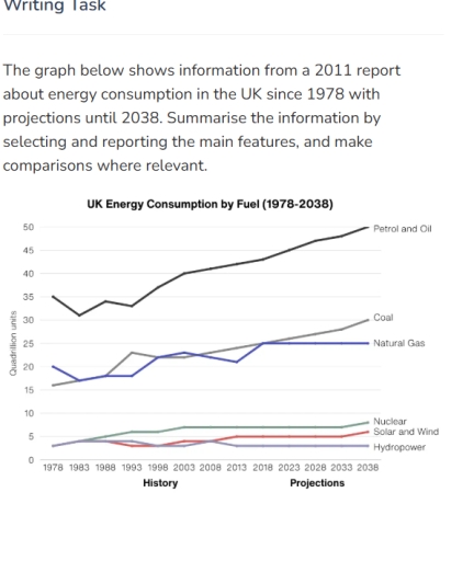
The line graph illustrates the annual consumption of energy in six different categories for the United Kingdom from 1978 to 2011, with projections extending to 2038.

Overall, the consumption of petrol and oil, coal, and natural gas rose and were projected to rise significantly, whereas nuclear, solar and wind, and hydropower remained relatively stable, only slightly increased and were predicted to increase.

Petrol and Oil, Coal, and Natural Gas climbed from around 35, 15, and 20 quadrillion units to around 41, 24, and 25 quadrillion units respectively between 1978 and 2011. By 2038, the demand for these three energy sources was projected to rise further, reaching about 50, 30, and 25 respectively.

The figures for Nuclear, Solar and Wind, and Hydropower did not change much, from around 3 quadrillion units to about 7,5, and 4 quadrillion units respectively. Moreover, the consumption of these energy sources were predicted to increase or decline modestly. In quadrillion units, nuclear will reach about 9 units, Solar and Wind will climb to approximately 6 units, and hydropower will drop back to 3 units.

Word Count: 178

Answers On The Same Topic:

The graph below shows information from a 2011 report about energy consumption in the UK since 1978 with projections until 2038. Summarise the information by selecting and reporting the main features, and make comparisons where relevant.

The line graph from a 2011 report compares the usage of energy in the UK from 1978 to 2038 with projections. Overall, the largest amount of fuel to produce energy throughout the entire period is petrol and oil, while the opposite is true for hydropower. In 1978, energy consumption was mainly produced by petrol and […]

The graph below shows information from a 2011 report about energy consumption in the UK since 1978 with projections until 2038. Summarise the information by selecting and reporting the main features, and make comparisons where relevant.

The line graph illustrates the energy consumption by fuel in the UK from a 2011 report for 60 years of period. Overall, the petrol and oil, coal and natural gas show the upward trend whilst nuclear, solar and wind, and hydropower remain steady in this figure. During this 60 years of period, the petrol and […]

The graph below shows information from a 2011 report about energy consumption in the UK since 1978 with projections until 2038. Summarise the information by selecting and reporting the main features, and make comparisons where relevant.

The graph illustrates the patterns of energy consumption in the UK by different types of fuel from 1978, with future estimates up to 2038. It highlights changes in the use of petrol, coal, natural gas, nuclear energy, solar and wind, and hydropower over this period. Overall, petrol and oil consistently remain the dominant energy sources, […]

See All

Other Topics:

The chart below shows the price in Euros of 800 grams of four types of bread in one European country from 2001 to 2006

The line graph shows the price fluctuations of four different types of bread – wholegrain bread, brown bread, white bread, and rye bread – calculated per 800-gram serving in a European country from 2001 to 2005. Overall, the prices of brown bread and white bread tended to increase significantly, while wholegrain bread experienced considerable volatility. […]

Summarize the formation by selecting and reporting the main feature and make comparisons where relevant.

The provided line graph compares a production rate of various fuels in UK between 1981 and 2000 Overall, what stands out is that the amount of production Petroleum and Natural gas are increased through out given perod. While reverse could be said about Coal. Of paricular note is that petroleum remained the most produced fuel […]

The line graph shows the average monthly temperature in 3 cities between January and December summarise information by selecting and reporting the main features and make comparison where relevant

The provided linear chart illustrates the temperature of Dubai, London and New York during all months. Moving towards the detail of chart, Dubai temperature is highest from January to December, which accounts as 20°C in January. Afterwards the temperature surges rapidly and is on its peak in July at 38°C. However, after this period significant […]

: The graph below gives information about one company's unit sales of 5 different types of jam from 2009 to 2014

The provided line graph illustrates one company’s unit sales of 5 several kinds of jam between 2009 and 2014. Overall, it is clear that albeit to degrees, all figures experienced an upward trend except for plum trade. Turning to the details, starting at just under 3 unit in 2009, sale of strawberry increased steadily to […]

The graph show the different types of fast food eaten by British teenagers over a 35-year period. Summarise the information by selecting and reporting the main features, and maike comparions where relevant.

The line graph illustrates information about the changes in the different types of fast food, namely fish and chips, hamburgers, and pizza, eaten by British teenagers over the period from 1980 to 2015. Overall, it is immediately apparent that pizza experienced the most significant growth, whereas fish and chips showed a noticeable decline throughout the […]

The graph shows the quantities of goods transported in the uk between 1974 and 2002 by four different modes of transport

The line chart illustrates the quantities of goods transported using four transport modes in the United Kingdom from 1978 to 2002. Overall, all transportation forms fluctuated over the period, and roads saw the most pronounced increase in usage until the last period. The amount of goods transported by road in 1974 started at around 70 […]

See All
We have detected unusual activity on your device.
Please verify your identity to continue.
Note: This verification step won't sign you in. If you have a premium account, please log in to access the service as usual.
Google/Gmail Verification
Or verify using Email/Code
We've sent a verification code to:
youremail@gmail.com (Not your email?)
Enter it below to complete the verification process.
Ensure your email address is correct, your inbox is not full, and you check your spam folder. If no email arrives, consider using an alternative email.
You will need a Premium plan to perform your action!
Note: If you already have a premium account, please log in to access our services as usual.

Plans & Pricing

Our mission is to make quality education accessible for everyone.
However, to keep our hardworking team running and this service alive, we genuinely need your support!
By opting for a premium plan, not only do you sustain us in achieving the mission, but you also unlock advanced features to enrich your learning experience.

Free

For learners who aren't pressed for time

What's included on Free
100+ Cambridge IELTS Tests
Instant IELTS Writing Task 1 & 2 Evaluation (2 times/month)
Instant IELTS Speaking Part 1, 2, & 3 Evaluation (5 times/month)
Instant IELTS Writing Task 1 & 2 Essay Generator (2 times/month)
500+ Dictation & Shadowing Exercises
100+ Pronunciation Exercises
Flashcards
Other Advanced Tools

Premium

For those serious about advancing their English proficiency, and for IELTS candidates aspiring to boost their band score by 1-2 points (especially in writing & speaking) in just 30 days or less

What's included on Premium
Save Your IELTS Test Progress
Unlock All Courses & IELTS Tests
Unlimited AI Conversations
Unlimited AI Writing Enhancement Exercises
Unlimited IELTS Writing Task 1 & 2 Evaluation
Unlimited IELTS Speaking Part 1, 2, & 3 Evaluation
Checked Answers Will Not Be Published
Unlimited IELTS Writing Task 1 & 2 Essay Generator
Unlimited IELTS Speaking Part 1, 2, & 3 Sample Generator
Unlimited Usage Of Advanced Tools
Priority Support within 24h (12-month plan only)

Due to the nature of our service and the provided free trials, payments are non-refundable.
Nếu bạn là người Việt Nam và không có hoặc không muốn trả bằng credit/debit cards, bạn có thể thanh toán bằng phương thức chuyển khoản:


Chọn gói:
419,000₫ 277,000 ₫ cho gói 1 tháng (chỉ 9,233₫/ngày)
1,239,000₫ 597,000 ₫ cho gói 3 tháng (chỉ 6,633₫/ngày)
2,469,000₫ 1,027,000 ₫ cho gói 6 tháng (chỉ 5,706₫/ngày)
4,929,000₫ 1,417,000 ₫ cho gói 12 tháng (chỉ 3,936₫/ngày)


Sau khi chuyển khoản, vui lòng đợi trình duyệt tự động điều hướng bạn trở lại Engnovate và bạn sẽ ngay lập tức nhận được mã kích hoạt tài khoản premium.
Nếu có lỗi xảy ra, bạn có thể liên hệ với team thông qua một trong các phương thức: email đến helloengnovate@gmail.com hoặc nhắn tin qua facebook.com/engnovate.
Vì toàn bộ công cụ trên website đều có thể sử dụng thử miễn phí, Engnovate không hỗ trợ hoàn tiền.