🔥 Today Only: Save 30% on Premium — Offer Ends Soon! - Upgrade Now!
Line Graph

Band 5+: The graph below shows the average monthly change in the princes of three metals during 2014. Summarize the information by selecting and reporting the main features, and make comparisons where relevant.

Image for topic: The graph below shows the average monthly change in the princes of three metals during 2014. Summarize the information by selecting and reporting the main features, and make comparisons where relevant.
Our system will evaluate the answer based on this AI-generated description.
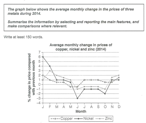
The image presents a line graph showing the average monthly change in percentage for copper, nickel, and zinc prices in 2014. Copper is represented by a dashed line, nickel by a solid line with diamond markers, and zinc by a dotted line with X markers. For January, copper begins around +1%, nickel at approximately +3%, and zinc slightly above +1%. In February, copper drops to about -0.5%, nickel increases to nearly +6%, and zinc falls to around -1%. March sees all metals decrease; copper at -2%, nickel just above +3%, and zinc close to -2%. April's data shows copper at around -2.5%, nickel just below +1%, and zinc around -3%. Copper stabilizes around -2.5% in May and June, whereas nickel drops to about 0%, and zinc declines further to below -3%. By July, copper stands slightly below -2%, nickel approaches -1%, and zinc decreases further to near -3.5%. August figures see copper recover to around -1.5%, nickel at about -0.5%, and zinc rising slightly to about -3%. In September, copper increases slightly to -1%, nickel rises to just below +1%, and zinc sees a significant recovery to just below 0%. October's data shows all metals improving: copper to just above 0%, nickel to nearly +3.5%, and zinc close to +1%. November shows copper at just below +2%, nickel at nearly +5%, and zinc at around +1%. December ends with copper climbing to about +3%, nickel decreasing slightly to around +4%, and zinc improving to just above +2%.
Given the complexity of the image, the above description may not be entirely accurate.
Note: Both the topic and the answer were created by one of our users.

The graph illustrates the average monthly change in the princes of three metals ( Copper, Nickel, and Zinc) during 2014.

Overall, there was a strong variation in percentage in price of the three metals.

In January, Nickel had the highest amount at 6%, followed by Copper at 2%, while the percentage of Zink had the lowest at just 1%.

In February, Zinc showed an increased in the price by 2%, while Nickel and Copper dropped at 4 and 1 percent respectively. In March, all kinds of metals decreased. After that, from March to April, the percentage of Zinc increased to 1.5%, while Nickel and Copper remained stable at 1 and 0.5 in sequence. After that all metals fell and recorded their lowest point in June at -3% for Nickel, Zink at -1, and Copper at -0.5. After bottoming out in June, all metals fluctuated for several months, finishing at 2% for Zinc, followed by Copper at 1.5%, while Nickel at just 1% of the price at the end of the year.

Word Count: 171

Answers On The Same Topic:

The graph below shows the average monthly change in the princes of three metals during 2014. Summarize the information by selecting and reporting the main features, and make comparisons where relevant.

The line graph delineates the average monthly shifts in the valuation of copper, nickel, and zinc throughout 2014. In general, the data provides the current changes in metal prices of 2014, which are quite similar to each other at certain times in the rise and fall due to possible common economic reasons. But if copper […]

The graph below shows the average monthly change in the princes of three metals during 2014. Summarize the information by selecting and reporting the main features, and make comparisons where relevant.

The provided line graph reveals how the prices of three metals which are Copper, Nickel and Zinc, changed in percentages during 2014. In general, it can be clearly seen that only the percentages of change in price of zinc experienced an upward trend while those of Nickel and Copper saw downward trends during 2014. Looking […]

See All

Other Topics:

The graph below gives information about the percentage of the population in four Asian countries living in cities from 1970 to 2020, with predictions for 2030 and 2040. Summarise the information by selecting and reporting the main features, and make comparisons where relevant.

The graph shows the changes in the percentage of the population of citizens in four Asian countries between 1970 and 2020. Moreover,it predicts the population from 2030 to 2040. Overall, there is a rising trend for figures for the population living in cities in four Asian nations, with the biggest change shown in the proportion […]

The line graph illustrates how many armed robberies, assaults and murders happened in London from 2003 to 2012

The given line graph illustrates how many major crimes, namely armed robbery, assault, and murder happened in London from the year 2003 to 2012. Overall, armed robbery was the most reported crime at the start of the period, yet it experienced a continuous plunge over the years, before it plateaued at the end. Conversely, assault […]

You should spend about 20 minutes on this task. The line graph below shows the percentage of spending in Turkey, from 1960 to 2000. Summarise the information by selecting and reporting the main features, and make comparisons where relevant. You should write at least 150 words.

The line graph illustrates the percentage of total expenditure on five categories in Turkey, namely food, leisure, clothing, transport and energy, between 1960 and 2000. Overall, food experienced a sharp decline throughout the period, whereas spending on clothing increased significantly. Meanwhile, the proportions spent on leisure, transport and energy also followed downward trends. Looking first […]

The line graph below shows the percentage of spending in Turkey from 1960 to 2000

The line graph illustrates the proportion of the expenditure in Turkey, over the 40-year period from 1960 to 2000. Overall, there were downward trend for Food, Leisure, Transport and Energy, whereas Clothing was the only upward trend over this period. In addition, Food was ranked first at the start of the period, then experienced a […]

The graph below gives historical information and projections about changes in population in the United States, Nigeria and Japan.

The line graph indicates over 100-year period of changes in number of people in three different countries. Overall, at the beginning Nigeria had the least millions of people, while Unaited States had the biggest population. However, in the end of the duration it was the largest amount living in Nigeria, when millions of people living […]

The chart below shows the percentage of households with different kinds of technology in the UK from 1997 to 2001. Summarise the information by selecting and reporting the main features, and make comparisons where relevant.

On my way The line graph shows the proportion of UK households with a diverse range of technology in the uk between 1997 and 2011 Overall, the percentage of households increased in all categories of technology with CD players consistently higher, while other items like mobile for telephone, internet and DVD player witnessed more upward […]

See All
We have detected unusual activity on your device.
Please verify your identity to continue.
Note: This verification step won't sign you in. If you have a premium account, please log in to access the service as usual.
Google/Gmail Verification
Or verify using Email/Code
We've sent a verification code to:
youremail@gmail.com (Not your email?)
Enter it below to complete the verification process.
Ensure your email address is correct, your inbox is not full, and you check your spam folder. If no email arrives, consider using an alternative email.
You will need a Premium plan to perform your action!
Note: If you already have a premium account, please log in to access our services as usual.

Plans & Pricing

Our mission is to make quality education accessible for everyone.
However, to keep our hardworking team running and this service alive, we genuinely need your support!
By opting for a premium plan, not only do you sustain us in achieving the mission, but you also unlock advanced features to enrich your learning experience.

Free

For learners who aren't pressed for time

What's included on Free
100+ Cambridge IELTS Tests
Instant IELTS Writing Task 1 & 2 Evaluation (2 times/month)
Instant IELTS Speaking Part 1, 2, & 3 Evaluation (2 times/month)
Instant IELTS Writing Task 1 & 2 Essay Generator (2 times/month)
500+ Dictation & Shadowing Exercises
100+ Pronunciation Exercises
Flashcards
Other Advanced Tools

Premium

For those serious about advancing their English proficiency, and for IELTS candidates aspiring to boost their band score by 1-2 points (especially in writing & speaking) in just 30 days or less

What's included on Premium
Save Your IELTS Test Progress & Analyze Mistakes By Question Type
Save Your Own Flashcard Sets & Use Them On Any Device
Unlock All Courses, IELTS Tests, Section & Part Practice
Unlimited AI Conversations
Unlimited AI Writing Enhancement Exercises
Unlimited IELTS Writing Task 1 & 2 Evaluation
Unlimited IELTS Speaking Part 1, 2, & 3 Evaluation
Checked Answers Will Not Be Published
Unlimited IELTS Writing Task 1 & 2 Essay Generator
Unlimited IELTS Speaking Part 1, 2, & 3 Sample Generator
Unlimited Usage Of Advanced Tools & AI Features
Priority Support within 24h (12-month plan only)

Due to the nature of our service and the provided free trials, payments are non-refundable.