🔥 Today Only: Save 30% on Premium — Offer Ends Soon! - Upgrade Now!
Line Graph

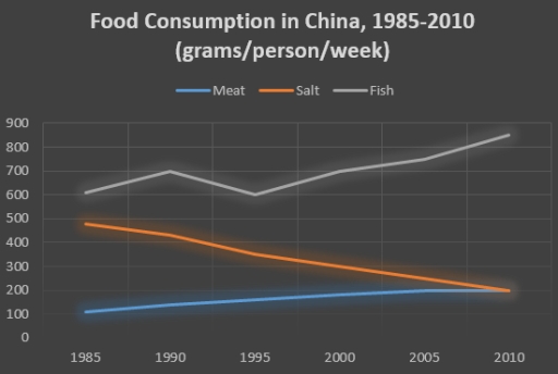
Band 5+: The graph below shows the changes in food consumption by Chinese people between 1985 and 2010.

Image for topic: The graph below shows the changes in food consumption by Chinese people between 1985 and 2010.
Our system will evaluate the answer based on this AI-generated description.
The image depicts a line graph titled 'Food Consumption in China, 1985-2010 (grams/person/week)'. There are three lines representing Meat, Salt, and Fish. In 1985, Meat starts just above 200g, Salt at roughly 500g, and Fish near 300g. By 1990, Meat increases to nearly 300g, Salt decreases to slightly below 500g, and Fish remains near 300g. In 1995, Meat rises above 400g, Salt drops to around 400g, and Fish stays constant. By 2000, Meat exceeds 600g, Salt continues descent to 350g, and Fish maintains around 300g. In 2005, Meat approaches 800g, Salt falls below 300g, and Fish shows a minor increase. Lastly, in 2010, Meat remains close to 800g, Salt levels off slightly above 200g, and Fish climbs to approximately 350g. The horizontal axis ranges from 1985 to 2010 in increments of 5 years, and the vertical axis measures consumption from 0 to 900 grams in increments of 100 grams.
Given the complexity of the image, the above description may not be entirely accurate.
Note: Both the topic and the answer were created by one of our users.

The line chart illustrates the differences in the amount of meat, salt and fish usage in China over a 25-year period starting from 1985.

Overall, it is obvious that Chinese individuals always preferred to consume seafood in comparison with other mentioned food during the whole period. Although the consumption of salt declined sharply, the quantity of meat increased significantly until the end.

Looking at the details, the figure for fish depicts that the public of China consumed it by 600 grams in 1985, then the line had a fluctuation until the next decade. Afterwards it began to soar to almost 900 grams by the year 2010. The amount of salt which was eaten by Chinese ranked the second by about 500 grams at first, the people there tended to decrease their consumption to more than its half until 2010. Even though meat assumed as a less preferable food by 100 grams at the beginning, its usage doubled gradually by the year 2010.

Word Count: 162

Answers On The Same Topic:

The graph below shows the changes in food consumption by Chinese people between 1985 and 2010.

The line graph illustrates the main information about three types of food ate by Chinese people between 1985 and 2010. Overall, fish and meat figures experienced upward trend while salt witnessed the decline. All years, the most common food was fish wheras meat represented the least one. In 1985, 600 grams fish ate by per […]

The graph below shows the changes in food consumption by Chinese people between 1985 and 2010.

The graph illustrates the changes in food consumption by Chinese people between 1985 and 2010. Overall, fish was fluctuating but in the middle it has dramatically increased from 600 to almost 900, followed distantly by meat which was growing slowly from 100 slightly increased to 200. However salt has shown a noticeable decrease from 500 […]

The graph below shows the changes in food consumption by Chinese people between 1985 and 2010.

The chart gives information about number of food eaten by the Chinese people from 1985 to 2010.The figures are given in grams per person per week. Overall, rise in numbers was not always steady.More fish than meat eaten between 1985 and 2010. Salt eating has decreased significantly. A more detailed look reveals that in 1985 […]

The graph below shows the changes in food consumption by Chinese people between 1985 and 2010.

The line graph illustrates the trends in food consumption among the Chinese population over a span of 25 years, specifically from 1985 to 2010. Overall, meat and fish consumption demonstrated a marked increase, while salt consumption exhibited a significant decline throughout the observed period. In 1985, meat consumption commenced at just above 200 grams per […]

The graph below shows the changes in food consumption by Chinese people between 1985 and 2010.

The line graph presents a comprehensive analysis of food consumption patterns in China from 1985 to 2010, specifically focusing on the weekly consumption of meat, salt, and fish measured in grams per person. It is evident that there were significant fluctuations across the categories over the given period, with a notable decline in salt consumption […]

See All

Other Topics:

The graph below shows the number of tourists visiting 4 places between 2017 and 2020 and the predicted numbers from 2021-2022. Summarize the information by selecting and reporting the main features and make comparisons where relevant.

The given line chart show the data of tourist visiting four different places in 2017 to 2020 and also been predicting that the number of tourists will visit by the year 2021 to 2022. Overall, it has been seen that most of the tourist visits Yellow Brook in 2018 and predicting the number of tourist […]

The graph below shows how people in one city in Australia buy music from 2015 to 2020.

The graph shows how people in one Australian city bought music from 2015 to 2020. There are three ways: streaming, downloads, and CDs. Overall, streaming went up a lot and became the most popular way. CD sales went down all the time. Downloads stayed low and did not change much. In 2015, CDs were the […]

The line graph shows the percentages of Australian exports with four countries. The graph below shows the percentage of Australian exports to 4 countries from 1990 to 2012.

The line graph compares sugar which was consumed and generated in India between 2001 and 2011. Overall, both categories increased throughout the period. It is also clear that the figure for production experienced a dramatic fluctuation, while that of consumption remained relatively unchanged over the period. Focusing on production, overall, the figure oscillated considerably over […]

The given line graph shows the percentage of total population in the UK.

The line chart gives information about the proportions of the whole population between 1960 and 2040 in the United Kingdom. Overall, the total values of people aged 0-14 years old were the highest percentage all over the years. In addition, there was a decline in the population who were aged between 25-64 years old, while […]

The given line graph shows the percentage of total population in the UK.

The line chat gives information about proportions of whole population between 1960 and 2040 in the United Kingdom. Overall, the total values of people aged 0-14 years old was the highest percentage all over the years. In addition, there was a decline in all population who aged between 25-64 years old, while there was a […]

The line graph depicts the proportion of four various materials (paper & cardboard, glass containers, aluminium cans, and plastics) were recycled from 1982 to 2010 in a country.

A quick glance at the line-graph depicts data on the proportion of 4 various materials which were reprocessed in an unknown nation over 32 years. By and large, what stands out from data is that the highest share of paper and cardboard was reprocessed in 1990 compared to glass container in 2010 while there was […]

See All
We have detected unusual activity on your device.
Please verify your identity to continue.
Note: This verification step won't sign you in. If you have a premium account, please log in to access the service as usual.
Google/Gmail Verification
Or verify using Email/Code
We've sent a verification code to:
youremail@gmail.com (Not your email?)
Enter it below to complete the verification process.
Ensure your email address is correct, your inbox is not full, and you check your spam folder. If no email arrives, consider using an alternative email.
You will need a Premium plan to perform your action!
Note: If you already have a premium account, please log in to access our services as usual.

Plans & Pricing

Our mission is to make quality education accessible for everyone.
However, to keep our hardworking team running and this service alive, we genuinely need your support!
By opting for a premium plan, not only do you sustain us in achieving the mission, but you also unlock advanced features to enrich your learning experience.

Free

For learners who aren't pressed for time

What's included on Free
100+ Cambridge IELTS Tests
Instant IELTS Writing Task 1 & 2 Evaluation (2 times/month)
Instant IELTS Speaking Part 1, 2, & 3 Evaluation (2 times/month)
Instant IELTS Writing Task 1 & 2 Essay Generator (2 times/month)
500+ Dictation & Shadowing Exercises
100+ Pronunciation Exercises
Flashcards
Other Advanced Tools

Premium

For those serious about advancing their English proficiency, and for IELTS candidates aspiring to boost their band score by 1-2 points (especially in writing & speaking) in just 30 days or less

What's included on Premium
Save Your IELTS Test Progress & Analyze Mistakes By Question Type
Save Your Own Flashcard Sets & Use Them On Any Device
Unlock All Courses, IELTS Tests, Section & Part Practice
Unlimited AI Conversations
Unlimited AI Writing Enhancement Exercises
Unlimited IELTS Writing Task 1 & 2 Evaluation
Unlimited IELTS Speaking Part 1, 2, & 3 Evaluation
Checked Answers Will Not Be Published
Unlimited IELTS Writing Task 1 & 2 Essay Generator
Unlimited IELTS Speaking Part 1, 2, & 3 Sample Generator
Unlimited Usage Of Advanced Tools & AI Features
Priority Support within 24h (12-month plan only)

Due to the nature of our service and the provided free trials, payments are non-refundable.