🔥 Today Only: Save 30% on Premium — Offer Ends Soon! - Upgrade Now!
Bar Chart

Band 6+: The graph below shows the contribution of three sectors - agriculture, manufacturing and business and financial services - to the UK economy in the twentieth century.

Image for topic: The graph below shows the contribution of three sectors - agriculture, manufacturing and business and financial services - to the UK economy in the twentieth century.
Our system will evaluate the answer based on this AI-generated description.
The image displays a bar graph showing the percentage contribution of three sectors (Agriculture, Manufacturing, and Business and Financial) to the UK economy in the 20th century, with data points at 1900, 1950, 1975, and 2000. Agriculture is represented in blue, Manufacturing in green, and Business and Financial in purple. In 1900, Agriculture contributed approximately 10%, Manufacturing 55%, and Business and Financial 5%. In 1950, Agriculture decreased to just below 5%, Manufacturing also decreased to around 45%, and Business and Financial increased to approximately 32%. In 1975, all three sectors show a substantial decline, with Agriculture around 3%, Manufacturing just below 30%, and Business and Financial around 27%. In 2000, Agriculture is minimal at around 1%, Manufacturing further decreased to approximately 22%, and Business and Financial rose significantly to around 38%.
Given the complexity of the image, the above description may not be entirely accurate.
Note: Both the topic and the answer were created by one of our users.

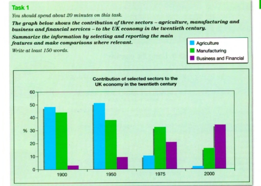
The graph illustrates the proportion of three sectors – agriculture, manufacturing and business and financial servies – to the UK economy from 1900 to 2000.

At first glance, it is apparent that the agriculture and manufacturing made up the majority in the first half of twentieth century, but then saw a steady decrease during the entire period, while the business and financial showed a noticeable increase.

Looking at the chart in more detail, one can see that the data for agriculture started at approximately 47% then climbed to around 51% gradually. However, after 1950 it descent dramatically from 51% to around 10% and finally it stopped at only 2% in 2000. We can see the difference in the figure for business and financial when it began at 4% approximately then burgeoned to 10%. Futhermore, after 1950 it proliferated from that to 20% rapidly and finally it stopped at 30% with a steady increase.

The opposite trend was true for the data for manufacturing when it started at roughly 45% and then decreased to 40% gradually in the first hallf of twentieth century. Moreover, after 1950 it experienced a moderate decline from around 40% to 35% in 1975 and finally it ended at 25% in 2000.

Word Count: 205

Answers On The Same Topic:

The graph below shows the contribution of three sectors – agriculture, manufacturing and business and financial services – to the UK economy in the twentieth century.

At first we look at the contribution of agriculture in 1900. it is placed a bit lower than 50%. To 1950 it rose to above 50%. Then it was getting lower, In 1975 it hit a little more than 10% and to 2000 it hit almost 0%. As we look to the manufacturing sector, we […]

The graph below shows the contribution of three sectors – agriculture, manufacturing and business and financial services – to the UK economy in the twentieth century.

The graph illustrates how the three categories – agriculture, manufacturing, business, and financial services contributed the UK economy in the 20th century. Overall, while Agriculture and Manufacturing followed a similarly downward trend, the opposite was true for Business and financial services. Noticeably, Agriculture had the least contribution to the economy in 2000. It can be […]

The graph below shows the contribution of three sectors – agriculture, manufacturing and business and financial services – to the UK economy in the twentieth century.

The bar chart illustrates the contribution of three sectors to the UK economy in the twentieth century. Overall, it is clear that manufacturing and agriculture had the highest scores from 1900 to 1975, but they decreased in 2000. In contrast, the business and financial sector increased by the end of the period. On the other […]

The graph below shows the contribution of three sectors – agriculture, manufacturing and business and financial services – to the UK economy in the twentieth century.

Task 1 Unit 2 The graph compares how the contribution of agriculture, manufacturing, and business and financial services had changed between 1900 and 2000. Overall, non-financial sectors appear to decline over the years, while financial services seemed to be the trend until 2000. Both agriculture and manufacturing started out strong in the early 1900s at […]

See All

Other Topics:

The chart below shows the number of male and female students studying six art related subjects at a UK university in 2011.

Information about students who pursuing six art related subjects in the UK in 2011 are provided in the chart above.Overall, English languange and literature was the highest subject-choosen by the students during the given period. Female students, by all trends, indicate the highest enrolment. However, two subjects such as Philosphy and History, contribute to the […]

The bar chart shows the rate of participation in top ten most popular sports in Canada in 1998 and 2005

The bar chart compares the percentage of people who participated in different sports in 1998 and 2005. Overall, golf was the most popular sport in both years, whereas tennis was the least played. In 1998, physical activities were more common. There was a noticeable contrast between the proportions of baseball players, with older participants being […]

The bar chart shows the rate of participation in top ten most popular sports in Canada in 1998 and 2005

The bar chart compares the percentage of people who participated in different sports in 1998 and 2005. Overall, golf was the most popular game in both years, whereas tennis was the least played. In 1998, physical activities were more common, respectively. There was a noticeable contrast between the proportions of baseballers, with olds being significantly […]

The chart below gives information about how families in one country spend their weekly income in 1968 and in 2018. Summarize the information by selecting and reporting the main features, and make comparisons where relevant.

The picture below compares average weekly spending by families between 1968 and 2018. Overall,the food consumption always requires a significant amount of money,especially in 2018,while fuel and power were the cheapest need for families.In addition,household goods are spent the same outlay through the period. In 1968,the food ranked 1st place in terms of expenses,demanding 35% […]

You should spend about 20 minutes on this task. The bar chart below gives information about vehicle ownership in China. Write a report for a university lecturer describing the information. You should write at least 150 words.

The bar chart illustrates the number of vehicles per thousand people in China between 1987 and 1999. Overall, the number of vehicles increase significantly throughout the period. In addition, the growth became much faster after 1995. The highest figure was recorded in 1999 While the lowest was in 1987. In 1987 there were only about […]

The bar chart below shows the percentage of government spending on roads and transport in 4 countries in the years 1990, 1995, 2000, 2005. Summarise the information by selecting and reporting the main features, and make comparisons where relevant.

Overall, while Italy, Portugal, and the UK decreased albeit at varying rates, the US remained stable throughout the period. It is also evident that Portugal recorded the highest figure throughout the period. Meanwhile, the UK showed the lowest proportion. Focusing fisrt on larger figures, the percentage of spending on roads in Portugal started at 27% […]

See All
We have detected unusual activity on your device.
Please verify your identity to continue.
Note: This verification step won't sign you in. If you have a premium account, please log in to access the service as usual.
Google/Gmail Verification
Or verify using Email/Code
We've sent a verification code to:
youremail@gmail.com (Not your email?)
Enter it below to complete the verification process.
Ensure your email address is correct, your inbox is not full, and you check your spam folder. If no email arrives, consider using an alternative email.
You will need a Premium plan to perform your action!
Note: If you already have a premium account, please log in to access our services as usual.

Plans & Pricing

Our mission is to make quality education accessible for everyone.
However, to keep our hardworking team running and this service alive, we genuinely need your support!
By opting for a premium plan, not only do you sustain us in achieving the mission, but you also unlock advanced features to enrich your learning experience.

Free

For learners who aren't pressed for time

What's included on Free
100+ Cambridge IELTS Tests
Instant IELTS Writing Task 1 & 2 Evaluation (2 times/month)
Instant IELTS Speaking Part 1, 2, & 3 Evaluation (5 times/month)
Instant IELTS Writing Task 1 & 2 Essay Generator (2 times/month)
500+ Dictation & Shadowing Exercises
100+ Pronunciation Exercises
Flashcards
Other Advanced Tools

Premium

For those serious about advancing their English proficiency, and for IELTS candidates aspiring to boost their band score by 1-2 points (especially in writing & speaking) in just 30 days or less

What's included on Premium
Save Your IELTS Test Progress
Unlock All Courses & IELTS Tests
Unlimited AI Conversations
Unlimited AI Writing Enhancement Exercises
Unlimited IELTS Writing Task 1 & 2 Evaluation
Unlimited IELTS Speaking Part 1, 2, & 3 Evaluation
Checked Answers Will Not Be Published
Unlimited IELTS Writing Task 1 & 2 Essay Generator
Unlimited IELTS Speaking Part 1, 2, & 3 Sample Generator
Unlimited Usage Of Advanced Tools
Priority Support within 24h (12-month plan only)

Due to the nature of our service and the provided free trials, payments are non-refundable.
Nếu bạn là người Việt Nam và không có hoặc không muốn trả bằng credit/debit cards, bạn có thể thanh toán bằng phương thức chuyển khoản:


Chọn gói:
419,000₫ 277,000 ₫ cho gói 1 tháng (chỉ 9,233₫/ngày)
1,239,000₫ 597,000 ₫ cho gói 3 tháng (chỉ 6,633₫/ngày)
2,469,000₫ 1,027,000 ₫ cho gói 6 tháng (chỉ 5,706₫/ngày)
4,929,000₫ 1,417,000 ₫ cho gói 12 tháng (chỉ 3,936₫/ngày)


Sau khi chuyển khoản, vui lòng đợi trình duyệt tự động điều hướng bạn trở lại Engnovate và bạn sẽ ngay lập tức nhận được mã kích hoạt tài khoản premium.
Nếu có lỗi xảy ra, bạn có thể liên hệ với team thông qua một trong các phương thức: email đến helloengnovate@gmail.com hoặc nhắn tin qua facebook.com/engnovate.
Vì toàn bộ công cụ trên website đều có thể sử dụng thử miễn phí, Engnovate không hỗ trợ hoàn tiền.