🔥 Today Only: Save 30% on Premium — Offer Ends Soon! - Upgrade Now!
Bar Chart

Band 7+: The graph below shows the information from 2008 report about consumption of energy in the USA since 1980 with projections until 2030.

Image for topic: The graph below shows the information from 2008 report about consumption of energy in the USA since 1980 with projections until 2030.
Our system will evaluate the answer based on this AI-generated description.
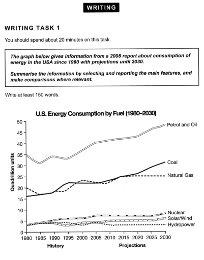
The image portrays a line graph detailing U.S. Energy Consumption by Fuel from 1980 to 2030, including both historical data and future projections. Data lines represent consumption values of Petrol and Oil, Coal, Natural Gas, and a combined category for Nuclear, Solar/Wind, and Hydropower. From 1980 to the early 2000s, Petrol and Oil demonstrate a steady increase, starting close to 35 quadrillion units and rising to just over 40. Coal consumption also increases during this period, beginning near 15 and peaking around 25 before a gradual decline. Natural Gas shows a more variable trend, initially at 15, rising to nearly 25, dipping and then recovering to just under 25 by 2005. The combined category remains consistently below 10 quadrillion units. Projection lines suggest Petrol and Oil will plateau around 45, Coal will decline to below 20, Natural Gas will surpass Coal, reaching close to 30, and the combined category will see a slight increase, remaining under 15 quadrillion units.
Given the complexity of the image, the above description may not be entirely accurate.
Note: Both the topic and the answer were created by one of our users.

The graph illustrates data from a report written in 2008 about the consumption of energy in the USA, commencing in 1980 with future estimates to 2030.

Overall, there were six documented energy sources: petrol and oil, coal, natural gas, nuclear, solar/wind, and hydropower. Despite there being a general decline in petrol and oil fuel consumption in earlier years, it was predicted that there would be a significant increase in this matter in future years. However, for alternative energy sources, this prediction cannot be noted. Petrol and oil command the biggest share, with 35 quadrillion units (35q) in 1980, rising to approximately 40q in 2008, and this trend is set to continue with a projected value of nearly 50q in 2030. In 1980, natural gas and coal came second and third, with 20q and 16q, respectively. However, coal overtook natural gas in 1990 and has been increasing since then. It is predicted that natural gas will level off and remain relatively constant at around 25q.

Nuclear and renewable energies all represented around 4q in 1980 and fluctuated up until 2008. It is supposed that nuclear energy will reach 10q by 2030, and solar/wind around 5q, with hydropower dropping and remaining constant at around 3q.

Word Count: 203

Answers On The Same Topic:

The graph below shows the information from 2008 report about consumption of energy in the USA since 1980 with projections until 2030.

The graph underneath illustrates the distribution of energy usage in the US from 1980, generated in 2008 and complete with predictions to as far as 2030. Overall, an upward trend is present in the graph, with the big three being ‘coal’, ‘natural gas’, and ‘petrol and oil’. Out of the six energy types present, it […]

The graph below shows the information from 2008 report about consumption of energy in the USA since 1980 with projections until 2030.

The line graph illustrates the consumption of six different energy sources in the United States from 1980 to 2030, measured in quadrillion units. Overall, petrol and oil remain by far the most dominant source of energy throughout the period, while coal and natural gas form the second tier. In contrast, nuclear, solar/wind, and hydropower contribute […]

The graph below shows the information from 2008 report about consumption of energy in the USA since 1980 with projections until 2030.

The line graph illustrates energy consumption trends in the US from 1980 to 2030 across six different fuel types, measured in quadrillion units. Overall, fossil fuels heavily dominate US energy consumption throughout the entire fifty-year period. While petrol and oil, coal, and nuclear power show upward trends, natural gas plateaus, and renewable sources remain low […]

The graph below shows the information from 2008 report about consumption of energy in the USA since 1980 with projections until 2030.

The line graph illustrates an information from an account in 2008 regarding to the usage of two types of energy which are fossil fuels (petrol and oil, coal, natural gas, nuclear) and non-fossil energy sources (solar/wind and hydropower) in North America since 1980 and the predictions up to 2030. Units are measured in quadrillion units […]

The graph below shows the information from 2008 report about consumption of energy in the USA since 1980 with projections until 2030.

The given line graph depicts data from a 2008 survey about expenditures in the USA since 1980 and provides projections until 2030. From an overall perspective, petrol and oil had the highest usage in the USA, while hydropower had the least from 1980 to 2030 in the USA. In 1980, petrol and oil were at […]

See All

Other Topics:

The bar chart shows the percentage of students in Country X who participated in football, basketball, tennis, and swimming in 2010 and 2020.

The bar chart illuatrates the percentage of students in X country who participated in different sports from 2010 – 2020. Obseved that football was tie most greated proportion in 2010 and 2020 in the other hands tennis shows the lowest percentage over that years. Furthermore, students who participate in basketball were 40% compare to swimming […]

The bar chart below shows the percentage of Australian men and women in different age groups who did regular physical activity in 2010.Summarize the information by selecting and reporting the main features and make comparisons where relevant.Write at least 150 words.

The bar chart illustrates the proportion of Australian males and females across various age groups who engaged in regular physical activity in 2010. Overall, women generally exhibited higher participation rates than men in most age cohorts, with the most notable gap observed in the 45-54 age bracket. Conversely, men showed a clear advantage only among […]

The bar chart below shows the percentage of Australian men and women in different age groups who did regular physical activity in 2010.Summarize the information by selecting and reporting the main features and make comparisons where relevant.Write at least 150 words.

The given graph provide information about the percentage of Australian males and femalies in varies age groups who in regular physical activities in 2010. Overall, womans engaged in activities from 25 to 65 and over more than mans in similar ages,but mans particulary training more at 15 to 24 ages. Accorging to the bar chart […]

The chart below shows the main reasons for deforestation in three different regions of the world during two separate decades. Summarise the information by selecting and reporting the main features and make comparisons where relevant.

The bar chart illustrates the percentage of forest loss for five reasons (cattle ranching, commercial agriculture, logging, subsistence farming and other) in three different regions (South America, Southeast Asia and Central Africa.) Cattle ranching is considered a huge reason for forest loss in South America and the highest bar in the chart, Southeast Asia’s primary […]

the bar chart shows the number of cars per 1000 people in 5 European countries in 3 years and compares with the European average.

The number of vehicles per 1000 in 5 countries and the overall. Overall, Country five had the highest number of cars throughout the period, while Country 1 had the lowest number of cars all three years. Also, all countries’ figures fluctuated apart from Country 4 because it levelled off same level. Country five the had […]

The charts below show the amount of money spent on advertising in the UK and Australia across five different media types in 2010 and 2020. Summarise the information by selecting and reporting the main features, and make comparisons where relevant.

Two bar charts illustrate the money spent on five distict media types in the UK and Australia, for 2010 and 2020. Overall both countries showed same spending patterns, in 2010 television accounted for the greatest expenditure and in 2020 the biggest expense was internet advertisement for the countries. In 2010, advertising mediums in the UK […]

See All
We have detected unusual activity on your device.
Please verify your identity to continue.
Note: This verification step won't sign you in. If you have a premium account, please log in to access the service as usual.
Google/Gmail Verification
Or verify using Email/Code
We've sent a verification code to:
youremail@gmail.com (Not your email?)
Enter it below to complete the verification process.
Ensure your email address is correct, your inbox is not full, and you check your spam folder. If no email arrives, consider using an alternative email.
You will need a Premium plan to perform your action!
Note: If you already have a premium account, please log in to access our services as usual.

Plans & Pricing

Our mission is to make quality education accessible for everyone.
However, to keep our hardworking team running and this service alive, we genuinely need your support!
By opting for a premium plan, not only do you sustain us in achieving the mission, but you also unlock advanced features to enrich your learning experience.

Free

For learners who aren't pressed for time

What's included on Free
100+ Cambridge IELTS Tests
Instant IELTS Writing Task 1 & 2 Evaluation (2 times/month)
Instant IELTS Speaking Part 1, 2, & 3 Evaluation (2 times/month)
Instant IELTS Writing Task 1 & 2 Essay Generator (2 times/month)
500+ Dictation & Shadowing Exercises
100+ Pronunciation Exercises
Flashcards
Other Advanced Tools

Premium

For those serious about advancing their English proficiency, and for IELTS candidates aspiring to boost their band score by 1-2 points (especially in writing & speaking) in just 30 days or less

What's included on Premium
Save Your IELTS Test Progress & Analyze Mistakes By Question Type
Save Your Own Flashcard Sets & Use Them On Any Device
Unlock All Courses, IELTS Tests, Section & Part Practice
Unlimited AI Conversations
Unlimited AI Writing Enhancement Exercises
Unlimited IELTS Writing Task 1 & 2 Evaluation
Unlimited IELTS Speaking Part 1, 2, & 3 Evaluation
Checked Answers Will Not Be Published
Unlimited IELTS Writing Task 1 & 2 Essay Generator
Unlimited IELTS Speaking Part 1, 2, & 3 Sample Generator
Unlimited Usage Of Advanced Tools & AI Features
Priority Support within 24h (12-month plan only)

Due to the nature of our service and the provided free trials, payments are non-refundable.