🔥 Today Only: Save 30% on Premium — Offer Ends Soon! - Upgrade Now!
Line Graph

Band 6+: The graph below shows the number of enquiries received by the Tourist Information Office in one city over a six- month in 2011.

Image for topic: The graph below shows the number of enquiries received by the Tourist Information Office in one city over a six- month in 2011.
Our system will evaluate the answer based on this AI-generated description.
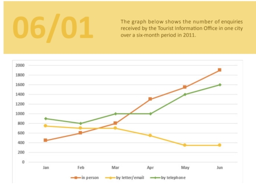
The image displays a line graph illustrating the number of enquiries received by a Tourist Information Office over six months in 2011: in January, telephone enquiries numbered at approximately 400, letter/email enquiries at just under 800, and in-person enquiries at around 450; February saw telephone enquiries remain just below 400, letter/email decrease slightly to 700, and in-person reach 600; March data shows telephone remained around 400, letter/email dropped further to 600, while in-person rose to 800; April noted telephone at 500, letter/email decreasing to 400, and in-person climbing to 1250; May showcased telephone reaching 800, letter/email decreasing to 350, and in-person increasing further to 1600; June recorded telephone peaking at 1600, letter/email remaining steady at 350, and in-person enquiries culminating at 1900.
Given the complexity of the image, the above description may not be entirely accurate.
Note: Both the topic and the answer were created by one of our users.

The line graph illustrates the number of enquires received by the tourist information office in one city over a six-month period in 2011.

Overall, it is clear that face-to-face interaction was the most popular by the end of the period,and the figure for telephone enquires showed a slight decline before stabilising, while letter/email were the least used by the end of the period.

Focusing first on the face-to-face enquiries, in January the number of enquires received in person was 400. After that the figure witnessed a gradual increase in March rising to 800 and reached a peak at almost 2000 in June.

Whereas letter and email did not show a significant change over a six-month period. In January , the figure stood at about 900 and the figure saw some fluctuations over the following four month and reached 1600 in June.

Turning to the telephone enquiries, the figure went up to 800 in January and it decreased gradually falling to 600 in April and remained stable until the end of the period.

Word Count: 172

Answers On The Same Topic:

The graph below shows the number of enquiries received by the Tourist Information Office in one city over a six- month in 2011.

Given the graph shows the amount of inquiries that came to the Tourist Information Office in one unspecified city during the half year interval in 2011. Overall, it can be seen from the line graph that, while contacting by letter or email became an outdated method of enquiring, whereas the other two methods became much […]

The graph below shows the number of enquiries received by the Tourist Information Office in one city over a six- month in 2011.

The line graph illustrates the number of enquiries made to a Tourist Information Office in a specific city via three different methods over a six-month period in 2011. Overall, it is clear that while the number of enquiries made in person and by telephone saw a significant increase, the popularity of writing letters or emails […]

The graph below shows the number of enquiries received by the Tourist Information Office in one city over a six- month in 2011.

The line chart provides the number of enquiries received by the Tourist Information Office in one city between January and June 2011. Overall, the number of enquiries made in person and by telephone had risen over time, whereas the figure for letter/email had seen a decline. In January 2011, more than 400 enquiries were made […]

The graph below shows the number of enquiries received by the Tourist Information Office in one city over a six- month in 2011.

The line graph illustrates how many enquiries were received by the Tourist Information Office in a city from January to June in the year 2011. Overall, there are increases in the number of enquiries being sent in person and by telephone, while a decline was seen in the figure for questions by letter or email. […]

See All

Other Topics:

The graph below shows the number of tourists visiting a particular Caribbean island between 2010 and 2017. Summaries the information by selecting and reporting the main features and make comparisons where relavant.

The line graph demonstrates the number of tourists visiting a Caribbean island from 2010 to 2017. Overall, the total number of tourists increased significantly over the period. In addition, visitors staying on cruise ships showed a considerable rise, while the number of tourists staying on the island remained relatively stable after 2013. The first group […]

The line graph below shows change in the number of participants in four different sports between 2021 and 2025

The line graph shows the changes in the number of participants in the four diffrent activties (Football, Basketball, Tennis, swimming) between the year of 2021 and 2025. In 2021, Tennis registered 110 particpants which was the highest of all sports, Swimming had a 100 participants and Fotball had 75 participants, while Basketball had the lowest […]

The graph below shows average carbon dioxide (CO2) emissions per person in the Uk, sweden, portugal and italy

The line graph depicts the total amount of emissions released by carbon dioxide (CO2) each person in four different European countries from 1967 to 2007. Overall, while others experienced varying tonnes, the UK maintained its dominance in the quantity of CO2 emissions despite following a moderate decline at the end. Although the amount of emissions […]

The line graph below gives information about the rates of unemployment between 1991 and 2005 in three different countries. The table shows the percentage of men and women in the workforce in the three countries. Summarize the information by selecting and reporting the main features, and make comparisons where relevant.

The statistical representation of the rates of unemployment in Spain, Germany and Italy between 1991 and 2005 is delineated by the given line chart. It is readily apparent that Germany and Italy exhibited an accretive trajectory . However, a significant drop was noticeable in Spain. In terms of 1991, the percentage of unemployment from Spain […]

The graph below shows the amount of goods transported in the United Kingdom by four different types of transport between 1980 and 2008. Summarise the information by selecting and reporting the main features, and make comparisons

The graph illustrates the amount of goods transported in the United Kingdom by four different types of transport between 1980 and 2008. It separates the transportation on the road, in the water, through the rail and the pipeline. As we can see, the significantly important transportation route was the road which grew steadily and reached […]

the chart shows the proportion of renewable energy in the total energy supply in 4 countries from 1997 to 2010

the line graph illustrates the proportion of alternative energy in the total Energy provision in three different countries from 1997 to 2010.Overall,the company C has a most amount of westing garbage in tonnes more then company A and company B.Mainly the proportion of company B and company A experienced a decrease during the whole period. […]

See All
We have detected unusual activity on your device.
Please verify your identity to continue.
Note: This verification step won't sign you in. If you have a premium account, please log in to access the service as usual.
Google/Gmail Verification
Or verify using Email/Code
We've sent a verification code to:
youremail@gmail.com (Not your email?)
Enter it below to complete the verification process.
Ensure your email address is correct, your inbox is not full, and you check your spam folder. If no email arrives, consider using an alternative email.
You will need a Premium plan to perform your action!
Note: If you already have a premium account, please log in to access our services as usual.

Plans & Pricing

Our mission is to make quality education accessible for everyone.
However, to keep our hardworking team running and this service alive, we genuinely need your support!
By opting for a premium plan, not only do you sustain us in achieving the mission, but you also unlock advanced features to enrich your learning experience.

Free

For learners who aren't pressed for time

What's included on Free
100+ Cambridge IELTS Tests
Instant IELTS Writing Task 1 & 2 Evaluation (2 times/month)
Instant IELTS Speaking Part 1, 2, & 3 Evaluation (5 times/month)
Instant IELTS Writing Task 1 & 2 Essay Generator (2 times/month)
500+ Dictation & Shadowing Exercises
100+ Pronunciation Exercises
Flashcards
Other Advanced Tools

Premium

For those serious about advancing their English proficiency, and for IELTS candidates aspiring to boost their band score by 1-2 points (especially in writing & speaking) in just 30 days or less

What's included on Premium
Save Your IELTS Test Progress
Unlock All Courses & IELTS Tests
Unlimited AI Conversations
Unlimited AI Writing Enhancement Exercises
Unlimited IELTS Writing Task 1 & 2 Evaluation
Unlimited IELTS Speaking Part 1, 2, & 3 Evaluation
Checked Answers Will Not Be Published
Unlimited IELTS Writing Task 1 & 2 Essay Generator
Unlimited IELTS Speaking Part 1, 2, & 3 Sample Generator
Unlimited Usage Of Advanced Tools
Priority Support within 24h (12-month plan only)

Due to the nature of our service and the provided free trials, payments are non-refundable.
Nếu bạn là người Việt Nam và không có hoặc không muốn trả bằng credit/debit cards, bạn có thể thanh toán bằng phương thức chuyển khoản:


Chọn gói:
419,000₫ 277,000 ₫ cho gói 1 tháng (chỉ 9,233₫/ngày)
1,239,000₫ 597,000 ₫ cho gói 3 tháng (chỉ 6,633₫/ngày)
2,469,000₫ 1,027,000 ₫ cho gói 6 tháng (chỉ 5,706₫/ngày)
4,929,000₫ 1,417,000 ₫ cho gói 12 tháng (chỉ 3,936₫/ngày)


Sau khi chuyển khoản, vui lòng đợi trình duyệt tự động điều hướng bạn trở lại Engnovate và bạn sẽ ngay lập tức nhận được mã kích hoạt tài khoản premium.
Nếu có lỗi xảy ra, bạn có thể liên hệ với team thông qua một trong các phương thức: email đến helloengnovate@gmail.com hoặc nhắn tin qua facebook.com/engnovate.
Vì toàn bộ công cụ trên website đều có thể sử dụng thử miễn phí, Engnovate không hỗ trợ hoàn tiền.