Our system will evaluate the answer based on this AI-generated description.
The image shows a line graph comparing the number of contacts made through different methods (in-person, letter/email, and telephone) over a six-month period. In January, in-person contacts were the highest at 800, letter/email were at 200, and telephone at 600. In February, in-person contacts slightly decreased to 700, letter/email increased to 400, and telephone remained the same. In March, in-person contacts jumped to 1,600, letter/email decreased to 200, and telephone increased to 1,000. In April, in-person contacts reached 1,800, letter/email stayed at 200, and telephone increased to 1,200. In May, in-person contacts remained at 1,800, letter/email increased to 400, and telephone reached 1,400. In June, in-person contacts rose to 1,900, letter/email stayed at 400, and telephone peaked at 1,700. The graph has a Y-axis labeled from 0 to 2000 at intervals of 200 and an X-axis labeled with the months January to June.
Given the complexity of the image, the above description may not be entirely accurate.
Skyrocket your IELTS band score by 1-2 points in under a month with our premium plan!
Note: Both the topic and the answer were created by one of our users.
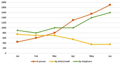
The provided line graph depicts the amount of proposals obtained by The Tourist Information Office in the town from January to Jube in 2011 by three types of communication.
Overall, it is clearly seen from the information that people enquired in person via telephone more than via letters or email. In addition, the ratio face to face illustrated dramatic increase during the entire period.
In the beginning of the first month, the choice to use telephone accounted for about 900, while the trend of letters/email and in person made up well under 800 and just below 400 relatively. Then, during the first three month population preferred to ask information by telephone and it March it comprised the same data with asking in person at 1000. In comparison, the proportion of sending messages revealed a moderate decrease to roughly 700 at the same month.
In the second half of the time line, the ratios of coming and calling to office elucidated a visible growth from 800 to approximately 1900 and from stagnation at 1000 to 1600 accordingly. Alternatively, nation less appealed to the organization via mail messages and indicated the lowest point at just under 400 in the end of the first month of the summer.
Word Count: 205
