🔥 Today Only: Save 30% on Premium — Offer Ends Soon! - Upgrade Now!
Line Graph

Band 5+: The graph below shows the number of tourists visiting a particular Caribbean island between 2010 and 2017. Summaries the information by selecting and reporting the main features, and make comparisons where relevant. Write at least 150 words

Image for topic: The graph below shows the number of tourists visiting a particular Caribbean island between 2010 and 2017. Summaries the information by selecting and reporting the main features, and make comparisons where relevant. Write at least 150 words
Our system will evaluate the answer based on this AI-generated description.
The image depicts tourists visiting a Caribbean island (2010-2017) with three data categories: 'Visitors staying on cruise ships' roughly below 0.5 million in 2010, plateauing at ~0.5 million from 2011-2012, slight increase in 2013 to just above 0.5 million, rising to around 1 million in 2014, maintaining 1 million in 2015, ~1.2 million in 2016 and further to ~2 million in 2017; 'Visitors staying on island' starts close to 0.7 million in 2010, slightly rises to 0.8 million in 2011, to near 1.2 million in 2012, keeps increasing to approximately 1.3 million in 2013, ~1.5 million in 2014, ~1.6 million in 2015, plateaus near 1.5 million in 2016, peaks around 1.5 million in 2017; 'Total' depicts accumulated data starting from just above 1 million in 2010, climbing steadily annually to near 1.3 million in 2011, ~1.8 million in 2012, ~1.9 million in 2013, ~2.5 million in 2014, ~2.8 million in 2015, angling up to ~2.9 million in 2016, and spiking to ~3.5 million in 2017.
Given the complexity of the image, the above description may not be entirely accurate.
Note: Both the topic and the answer were created by one of our users.

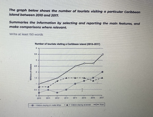
The chart represents the amont if tourists who visited a specific Caribbean island in 8 years from 2010 to 2017, as well as ,their mode of stay on island.

At first glance, it is clear that in first three years there was increase in number of visitors and in this time preference to stay on island increased ,while, a decline in interest was observed in second option.However, the ratio of tourists rose considerably further with the passage of time and from 2012 to 2015, their population reached to about 2.7 million.Wheras on that time a sharp growth was noted on aspect of visitors living on island .Meanwhile, with rapid rose of staying on cruise ship option ,it remained on second.

Upon closer examination it is evident that in last two years staying on cruise ship becamed most liked choice.However demand of spending time on island decreased.Whereas, tourist strength escalated dramatically from 2016 to 2017,accounting for 3.5 million visitors.

Overall what stands out from the information is that with the passage of time growth in ratio of tourists toward island was remarked .Furthermore, cruise ship attracted more tourists at the end

Word Count: 190

Answers On The Same Topic:

The graph below shows the number of tourists visiting a particular Caribbean island between 2010 and 2017. Summaries the information by selecting and reporting the main features, and make comparisons where relevant. Write at least 150 words

The graph illustrated the proportion of the number of tourists visiting a particular island named Caribbean Island between 2010 and 2017. In this graph, visitors who stayed on cruise ships marginally go up and down, peaked at 0.5 million of visitors between 2010 and 2013. In 2013, it started with 0.5 million of visitors rapidly […]

The graph below shows the number of tourists visiting a particular Caribbean island between 2010 and 2017. Summaries the information by selecting and reporting the main features, and make comparisons where relevant. Write at least 150 words

The number of people from other countries exploring a particular Caribbean island throughout 7 years is given in the data. It has 3 categories such as: the total number, people staying on the island and visitors staying on cruise. (The numbers are written in millions). Overall, the total number of tourists is dominant in the […]

The graph below shows the number of tourists visiting a particular Caribbean island between 2010 and 2017. Summaries the information by selecting and reporting the main features, and make comparisons where relevant. Write at least 150 words

The amount of people from other countries exploring an exact Caribbean island through out 7 years is given in the data. (The numbers are written in millions). Overall, the total number of tourists are dominant in the data and shows an upward trend. While the humans who are staying on cruise ships demonstrates an insufficient […]

The graph below shows the number of tourists visiting a particular Caribbean island between 2010 and 2017. Summaries the information by selecting and reporting the main features, and make comparisons where relevant. Write at least 150 words

The line graph demonstrates the number of visitors visiting a specific Caribbean island from 2010 to 2017 Overall,the total number of visitors has drastically increased by 2017 while visitors staying on island are mostly in constant number approximately 1.5 million.Moreover guests staying on cruise ships are more than staying on island. In 2010,total number of […]

See All

Other Topics:

The graph below shows the number of enquiries received by the Tourist Information Office in one city over a six-month period in 2011. Summarise the information by selecting and reporting the main features, and make comparisons where relevant.

The line graph illustrates the number of inquiries received by the Tourist Information Office in a single city over six months in 2011. Overall, the number of inquiries received by two methods (‘in person’ and ‘by telephone’) generally increased throughout the period. However, the number of inquiries via letter and email declined. In-person inquiries surpassed […]

The line graph illustrates the amount of spreads consumed from 1981 to 2007, in grams

The line graph illustrates changes in the amount of three types of spreads consumption – margarine, reduced – fat reduced spreads, and butter – between 1981 and 2007. Overall, all the figures showed a downward trend over the given period. It is also clear that although the consumption of butter was the highest at first, […]

The line graph shows the change in population of 5 countries from 1800 to 2020.

The given line graph provides data regarding 5 countries’ change in population between 1800 and 2020. Overall, what stands out from the graph is that there was a significant increase in population of China ad India, whereas the population of United States, Indonesia and Brazil saw a considerable upward trend too, but they had far […]

The graph shows average annual expenditures on cell phone and residential phone services between 2001 and 2010. Summarize the information by selecting and reporting the main features, and make comparisons where relevant.

The given chart illustrates the anual money spending tendecy on services of cell phones, marked with the red line and residential phones, represented in green, from 2001 to 2010. For starters, in the first analized year it is clearly visible that the difference between residential and cell phones services si almost 500 dollers. Residential phones […]

the graph below gives information on the number of participants for different activities at one social centre.

The line graph demonstrate the information on the number of people participating in different activities at a particular social centre in two cities from 2000 to 2020. Overall, the graph reflects the participants of the people from the year 2000 to 2020, where it can be clearly visible that people are more likely to involve […]

The graph below shows the percentage of people in one country who accessed the news from four sources between 1995 and the present, with projections to 2025.

The line graph provides information about the proportion of citizens in a country who using several media such as TV, Radio, Newspaper, and Internet for accessed news between 1995 and 2020, with predictions for 2025. Units are measured in percentage. Overall, the percentage of people who used radio and newspaper generally decrease within the period, […]

See All
We have detected unusual activity on your device.
Please verify your identity to continue.
Note: This verification step won't sign you in. If you have a premium account, please log in to access the service as usual.
Google/Gmail Verification
Or verify using Email/Code
We've sent a verification code to:
youremail@gmail.com (Not your email?)
Enter it below to complete the verification process.
Ensure your email address is correct, your inbox is not full, and you check your spam folder. If no email arrives, consider using an alternative email.
You will need a Premium plan to perform your action!
Note: If you already have a premium account, please log in to access our services as usual.

Plans & Pricing

Our mission is to make quality education accessible for everyone.
However, to keep our hardworking team running and this service alive, we genuinely need your support!
By opting for a premium plan, not only do you sustain us in achieving the mission, but you also unlock advanced features to enrich your learning experience.

Free

For learners who aren't pressed for time

What's included on Free
100+ Cambridge IELTS Tests
Instant IELTS Writing Task 1 & 2 Evaluation (2 times/month)
Instant IELTS Speaking Part 1, 2, & 3 Evaluation (5 times/month)
Instant IELTS Writing Task 1 & 2 Essay Generator (2 times/month)
500+ Dictation & Shadowing Exercises
100+ Pronunciation Exercises
Flashcards
Other Advanced Tools

Premium

For those serious about advancing their English proficiency, and for IELTS candidates aspiring to boost their band score by 1-2 points (especially in writing & speaking) in just 30 days or less

What's included on Premium
Save Your IELTS Test Progress
Unlock All Courses & IELTS Tests
Unlimited AI Conversations
Unlimited AI Writing Enhancement Exercises
Unlimited IELTS Writing Task 1 & 2 Evaluation
Unlimited IELTS Speaking Part 1, 2, & 3 Evaluation
Checked Answers Will Not Be Published
Unlimited IELTS Writing Task 1 & 2 Essay Generator
Unlimited IELTS Speaking Part 1, 2, & 3 Sample Generator
Unlimited Usage Of Advanced Tools
Priority Support within 24h (12-month plan only)

Due to the nature of our service and the provided free trials, payments are non-refundable.
Nếu bạn là người Việt Nam và không có hoặc không muốn trả bằng credit/debit cards, bạn có thể thanh toán bằng phương thức chuyển khoản:


Chọn gói:
419,000₫ 277,000 ₫ cho gói 1 tháng (chỉ 9,233₫/ngày)
1,239,000₫ 597,000 ₫ cho gói 3 tháng (chỉ 6,633₫/ngày)
2,469,000₫ 1,027,000 ₫ cho gói 6 tháng (chỉ 5,706₫/ngày)
4,929,000₫ 1,417,000 ₫ cho gói 12 tháng (chỉ 3,936₫/ngày)


Sau khi chuyển khoản, vui lòng đợi trình duyệt tự động điều hướng bạn trở lại Engnovate và bạn sẽ ngay lập tức nhận được mã kích hoạt tài khoản premium.
Nếu có lỗi xảy ra, bạn có thể liên hệ với team thông qua một trong các phương thức: email đến helloengnovate@gmail.com hoặc nhắn tin qua facebook.com/engnovate.
Vì toàn bộ công cụ trên website đều có thể sử dụng thử miễn phí, Engnovate không hỗ trợ hoàn tiền.