🔥 Today Only: Save 30% on Premium — Offer Ends Soon! - Upgrade Now!
Bar Chart

Band 6+: The graph below shows the percentage change in places where students lived over five decades. Summarise the information by selecting and reporting the main features, and make comparisons where relevant

Image for topic: The graph below shows the percentage change in places where students lived over five decades. Summarise the information by selecting and reporting the main features, and make comparisons where relevant
Our system will evaluate the answer based on this AI-generated description.
The image depicts a bar chart illustrating student accommodation preferences in percentage from the 1960s to the 2000s. In the 1960s "At home with own family" stands at 68%, "Students hall of residence" at 22%, "Paying guest with a host family" is 8%, "Room in a shared house or flat with other students" is approximately 2%. The 1970s show "At home with own family" decreasing slightly to around 63%, "Students hall of residence" drops to 17%, "Paying guest with a host family" marginally increases to 9%, and "Room in a shared house or flat with other students" rises to around 11%. During the 1980s, a significant shift occurs with "At home with own family" plummeting to 48%, "Students hall of residence" increases to 26%, while "Paying guest with a host family" decreases slightly to 7%, and "Room in a shared house or flat with other students" surges to nearly 19%. In the 1990s, "At home with own family" continues to decrease to 43%, "Students hall of residence" sees a slight drop to 24%, "Paying guest with a host family" remains stable at 7%, and "Room in a shared house or flat with other students" increases to approximately 26%. In the 2000s, "At home with own family" slightly rises around 45%, "Students hall of residence" increases to 27%, "Paying guest with a host family" again remains stable at 7%, and "Room in a shared house or flat with other students" sees a small increase to just above 26%.
Given the complexity of the image, the above description may not be entirely accurate.
Note: Both the topic and the answer were created by one of our users.

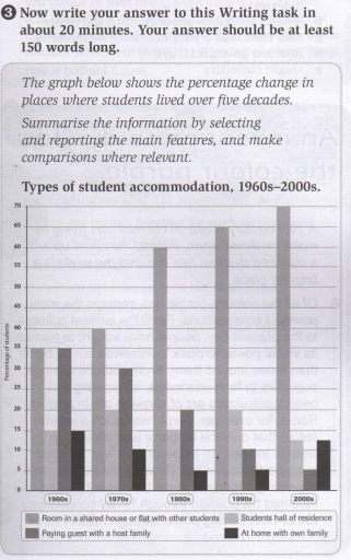
The graph gives information about different types of accommodation for students between the 1960s and 2000s.

In the 1960s, shared houses or flats and guest houses were the most popular, with 35% of the students opting for this type of accommodation. However, in the 2000s, while sharing houses maintained their popularity by increasing their number to 70%, the guest house popularity plummeted to 5%. It is clear that these two types of accommodation experienced a different trend over the given period.

The students’ preference for shared houses increased consistently from 35% to 60% in the 1980s. After that, the numbers rose significantly and peaked at 70% in the final year. In contrast, paying guest houses with a host family number saw a consistent fall, reaching 5% in the 2000s.

On the other hand, students’ halls of residence and living at home with family were less popular. Both started at 15% in the 1960s, and their number fluctuated during the period. Despite this fluctuation, the number of students living with families did not drop significantly (only by about 3%) as those who live with host families dropped by 10% in the final year.

In conclusion, the popularity of the types of accommodation has changed over the years. Meanwhile, a shared house or flat was the only one with a positive trend, which increased exponentially over the years.

Word Count: 226

Answers On The Same Topic:

The graph below shows the percentage change in places where students lived over five decades. Summarise the information by selecting and reporting the main features, and make comparisons where relevant

The graph illustrates changes in student accommodation preferences from the 1960s to the 2000s, showing the percentage of students in four types of living arrangements. The most striking trend is the sharp rise in students choosing to live as paying guests with host families. This figure almost doubled, from 40% in the 1960s to 75% […]

The graph below shows the percentage change in places where students lived over five decades. Summarise the information by selecting and reporting the main features, and make comparisons where relevant

The given bar bar chart illustrates the number of changes in some different types of accommodation chosen by students over a period of five decades. As can be seen, the majority of learners are more likely to live in a shared house or flat with other friends, as opposed to a downward tendency of three […]

The graph below shows the percentage change in places where students lived over five decades. Summarise the information by selecting and reporting the main features, and make comparisons where relevant

The graph a percentage changes in different types of accomodation between 1960 and 2000. Overall, the percentage of living in room or flat with other students grew every decade while the percenrage of other places where students lived decreased by 2000. In the middle of 19th century, living with other students was at the same […]

The graph below shows the percentage change in places where students lived over five decades. Summarise the information by selecting and reporting the main features, and make comparisons where relevant

The bar chart compares the proportion of students’ housing preferences between 1960s and 2000s. Overall, most categories experienced a steady decrease in popularity, with the only notable exception being shared houses with other students, which rose dramaticcaly. While both staying at home and living in the hall of residence showed minor fluctuations, the proportion of […]

The graph below shows the percentage change in places where students lived over five decades. Summarise the information by selecting and reporting the main features, and make comparisons where relevant

The graph illustrates the trends in students’ accommodation preferences over a span of five decades. Overall, the proportion of students opting to live in shared houses or flats with peers saw a significant rise, while the percentage of those staying as paying guests with host families declined considerably. Meanwhile, the figures for students living in […]

See All

Other Topics:

The bar chart below shows the percentage of adults by age group in the UK who used the internet every day in the years 2003-2006. Summarise the information by selecting and reporting the main features, and make comparisons where relevant.

The bar chart illustrates the proportion of adults in different age groups in the UK who used the Internet on a daily basis between 2003 and 2006. Overall, the younger age groups consistently recorded the highest proportions of daily Internet users, whereas those aged 65 and over had the lowest figures throughout the period. It […]

The chart below shows the proportion of survey respondents that showed interest in particular sports in three different years in the UK. Summarise the information by selecting and reporting the main features, and make comparisons where relevant.

The bar chart illustrates the percentage of survey participants who were interested in football, swimming, snooker, tennis, and golf between 1995 and 2005. Overall, it can be observed that except for football and tennis, the proportion of people showing interest in all the given sports recorded a fluctuating trend. Additionally, football remained the most popular […]

The bar charts and line graph below show the results of a survey conducted over a three-year period to discover what people who live in London think of the city. Summarize the information by selecting and reporting the main features and make comparisons where relevant.

The bar chart illustrates how the opinions of London residents changed over a three-year period. Overall, the range of shops was the most common response throughout this period, while job opportunities and the diversity of people nearly shared equal proportions, securing second place. Other factors showed slight variations over the three years, but they still […]

The bar charts and line graph below show the results of a survey conducted over a three-year period to discover what people who live in London think of the city. Summarize the information by selecting and reporting the main features and make comparisons where relevant.

The bar chart illustrates data on the share of how the opinion of London residents changed over a three-year period. Overall, the range of shops was most frequent answer throughout the period,while both job opportunities and mixture of people had almost the same proportion and shared second place. The others were slightly changing over the […]

The bar charts and line graph below show the results of a survey conducted over a three-year period to discover what people who live in London think of the city. Summarize the information by selecting and reporting the main features and make comparisons where relevant.

The bar chart illustrates data on the share of how did the opinion of london residents changed over a three-year period. Overall, the range of shops was most often answer throughout the period,while both job opportunities and mixture of people had almost the same proportion and shared the second place. The others were slightly changing […]

The bar charts and line graph below show the results of a survey conducted over a three-year period to discover what people who live in London think of the city. Summarize the information by selecting and reporting the main features and make comparisons where relevant.

The bar chart illustrates the thoughts of London people about life in their city over three years examined. Overall, there was a decrease in the proportion of how people think about the range of shops, job opportunities, the diversity of population, and nightlife, while the opposite trends were seen in the remaining two categories. In […]

See All
We have detected unusual activity on your device.
Please verify your identity to continue.
Note: This verification step won't sign you in. If you have a premium account, please log in to access the service as usual.
Google/Gmail Verification
Or verify using Email/Code
We've sent a verification code to:
youremail@gmail.com (Not your email?)
Enter it below to complete the verification process.
Ensure your email address is correct, your inbox is not full, and you check your spam folder. If no email arrives, consider using an alternative email.
You will need a Premium plan to perform your action!
Note: If you already have a premium account, please log in to access our services as usual.

Plans & Pricing

Our mission is to make quality education accessible for everyone.
However, to keep our hardworking team running and this service alive, we genuinely need your support!
By opting for a premium plan, not only do you sustain us in achieving the mission, but you also unlock advanced features to enrich your learning experience.

Free

For learners who aren't pressed for time

What's included on Free
100+ Cambridge IELTS Tests
Instant IELTS Writing Task 1 & 2 Evaluation (2 times/month)
Instant IELTS Speaking Part 1, 2, & 3 Evaluation (5 times/month)
Instant IELTS Writing Task 1 & 2 Essay Generator (2 times/month)
500+ Dictation & Shadowing Exercises
100+ Pronunciation Exercises
Flashcards
Other Advanced Tools

Premium

For those serious about advancing their English proficiency, and for IELTS candidates aspiring to boost their band score by 1-2 points (especially in writing & speaking) in just 30 days or less

What's included on Premium
Save Your IELTS Test Progress
Unlock All Courses & IELTS Tests
Unlimited AI Conversations
Unlimited AI Writing Enhancement Exercises
Unlimited IELTS Writing Task 1 & 2 Evaluation
Unlimited IELTS Speaking Part 1, 2, & 3 Evaluation
Checked Answers Will Not Be Published
Unlimited IELTS Writing Task 1 & 2 Essay Generator
Unlimited IELTS Speaking Part 1, 2, & 3 Sample Generator
Unlimited Usage Of Advanced Tools
Priority Support within 24h (12-month plan only)

Due to the nature of our service and the provided free trials, payments are non-refundable.
Nếu bạn là người Việt Nam và không có hoặc không muốn trả bằng credit/debit cards, bạn có thể thanh toán bằng phương thức chuyển khoản:


Chọn gói:
419,000₫ 277,000 ₫ cho gói 1 tháng (chỉ 9,233₫/ngày)
1,239,000₫ 597,000 ₫ cho gói 3 tháng (chỉ 6,633₫/ngày)
2,469,000₫ 1,027,000 ₫ cho gói 6 tháng (chỉ 5,706₫/ngày)
4,929,000₫ 1,417,000 ₫ cho gói 12 tháng (chỉ 3,936₫/ngày)


Sau khi chuyển khoản, vui lòng đợi trình duyệt tự động điều hướng bạn trở lại Engnovate và bạn sẽ ngay lập tức nhận được mã kích hoạt tài khoản premium.
Nếu có lỗi xảy ra, bạn có thể liên hệ với team thông qua một trong các phương thức: email đến helloengnovate@gmail.com hoặc nhắn tin qua facebook.com/engnovate.
Vì toàn bộ công cụ trên website đều có thể sử dụng thử miễn phí, Engnovate không hỗ trợ hoàn tiền.