🔥 Today Only: Save 30% on Premium — Offer Ends Soon! - Upgrade Now!
Line Graph

Band 5+: the graph below shows the population of India and china from the year 2000 to the present day with projects for growth to the year 2050

Image for topic: the graph below shows the population of India and china from the year 2000 to the present day with projects for growth to the year 2050
Our system will evaluate the answer based on this AI-generated description.
The image depicts a line graph titled "Changes in the population of India and China 2000-2050", contrasting the populations of India and China from 2000 with forecasts up to 2050. The x-axis indicates years at 10-year intervals from 2000 to 2050, whereas the y-axis measures population in millions from 1,000 to 1,700 in increments of 100. India’s population starts at approximately 1,050 million in 2000, climbing gradually to about 1,200 million by 2010, then to around 1,350 million by 2020, and is projected to reach about 1,500 million by 2030, close to 1,600 million by 2040, and roughly 1,700 million by 2050. China’s population begins at about 1,250 million in 2000, increases slightly to around 1,350 million by 2010, remains near this level by 2020, is forecasted to start a downward trend to approximately 1,320 million by 2030, about 1,280 million by 2040, and approximately about 1,250 million by 2050. The graph clearly projects India's ascending trajectory surpassing China around 2030, where China’s population peaks and then declines.
Given the complexity of the image, the above description may not be entirely accurate.
Note: Both the topic and the answer were created by one of our users.

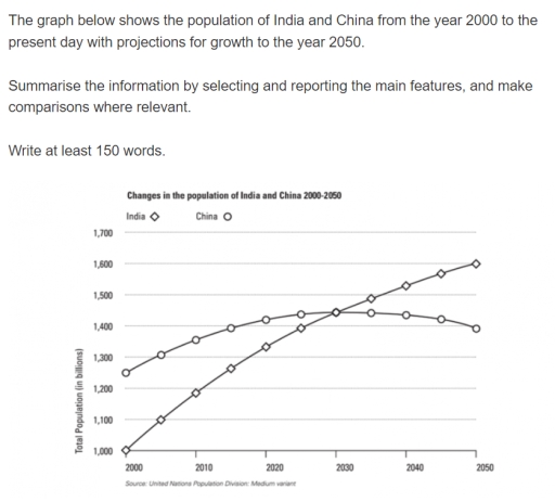
The line graph depicts the changes and predictions in the population of India and China from 2000 to 2050.

It is immediately noticeable that both populations rose since the past (2000) to the present (2024), but while the population of India is predicted to keep skyrocketing to the end of the period (2050), the population of China is predicted to start drop slightly from 2030.

In 2000, India’s population began at 1000 billions, which was one-eighth less that the population of the China (appoximately 1250 billions). However, it kept increase dramatically throughout the past to almost 1400 billions in the persent. By the estimation of this graph creator, the number of India’s population seem to keep grow, pecking at the end of the predicted period at 1500 billions in 2050.

On the other hand, although China population started at much larger population than India’s, it experieced much more moderated rate in rising, which not only resulting in just over 1400 at the present, but also estimated to go through a downward rebounding after has the same number of population with India’s in 2030.

Word Count: 183

Answers On The Same Topic:

the graph below shows the population of India and china from the year 2000 to the present day with projects for growth to the year 2050

The line graph displays the number of people living in China and India since the year 2000 and predicts future trends. Overall, it is evident that the Chinese population was relatively bigger in the past but is expected to fall in the future. India’s, on the other hand, is continuously growing and is expected to […]

the graph below shows the population of India and china from the year 2000 to the present day with projects for growth to the year 2050

The chart illustrates the population of India and China between 2000 to present day with predictions for the trend in population in the year 2050. India experienced a linear growth in population throughout the review period. In the year 2000, 1 billion people called India home. The figures rose to 1.2 billion in 2010, a […]

the graph below shows the population of India and china from the year 2000 to the present day with projects for growth to the year 2050

The line graph below demonstrates the number of people living in China and India from 2000 up to 2025, including predictions until 2050. Overall, the population of the two given countries showed a steady increase over the period provided. At the start of the timeline, the population of China was noticeably higher than the number […]

the graph below shows the population of India and china from the year 2000 to the present day with projects for growth to the year 2050

The line graph compares the total number of citizens in billions of two countries from the year 2000 to current day with a prediction for growth until year 2050. Overall, India starts off with least change change in population. meanwhile, China ends with lowest change in population.. In more detail, Total Population of India starts […]

the graph below shows the population of India and china from the year 2000 to the present day with projects for growth to the year 2050

The graph below shows the population of India and china from the year 2000 to the present day with projections for growth to the year 2050. The graph below displays the number of people in India and china from the year 2000 upto today with predictions for increase to the year 2050. Overall, the population […]

See All

Other Topics:

The graph below shows changes in young adult unemployment rates in England between 1993 and 2012. Summarise the information by selecting and reporting the main features, and make comparisons where relevant.

The graph illustrates the percentages of unemployed young adult in the UK across a 19-year period from 1993 to 2012. Overall, all catergories experienced a considerable fluctuation in unemployment figures among youth individuals. Notably, the 16-24 aged people in London was seen the highest rank after many years of variation. In 1993, the number of […]

The graph below gives information from a 2008 report about energy consumption in the USA since 1980, with projections until 2030. Summarise the information by selecting and reporting the main features and making comparisons where relevant.

The line graph displays the data projection for 2030 about particular energy sources (measured in quadrillion units) in The USA, with the historical year between 1980 and 2008. Overall, throughout the period, Petrol and Oil stood as the highest number, while Hydropower remained relatively unchanged as the lowest amount of material used. In the first […]

The multiple line graph shows cell phone usage among males and females in Anytowne during the period from 1996 to 2002. Summarize the information by selecting and reporting the main features and make comparisons where relevant

The line graph shows cell phone use among men, women and both sexes in Brazil from 1996 to 2002. Overall, cell phone use increased among both men and women over the period. The total number of users was always much higher than the number of male or female users separately, and it reached its highest […]

The multiple line graph shows cell phone usage among males and females in Anytowne during the period from 1996 to 2002. Summarize the information by selecting and reporting the main features and make comparisons where relevant

First of all, the organization of the research decided to do the investigation over the basic categories without any interchanged sexes, for instance gay or lesbian etc. Therefore, the data on the graph can be evaluated from the observer for the graph is that there is a women and men genders who are users. As […]

The graph shows children by age group as a percentage of the young population in the United Kingdom between 1990 and 2001.

The line graph illustrates children by age team as a percentage of the young population in UK between 1990 and 2001. Generally, we see some eye-catching movements especially between age 15 to 19 as is shown the line is fluctuating by the time . More than that the group age between 10 and 14 is […]

The line graph shows the percentages of travels by 4 transportsin one country between 1985 and 2015

The line graph illustrates the percentages of travels by 4 transportsin one country such as Bus, Car, Rail and Others over a period from 1985 to 2015. Overall, it is clear that the ‘Car’ category was the highest in the chart over a period, while the ‘Others’ was the lowest figure in comparison with ‘Bus’ […]

See All
We have detected unusual activity on your device.
Please verify your identity to continue.
Note: This verification step won't sign you in. If you have a premium account, please log in to access the service as usual.
Google/Gmail Verification
Or verify using Email/Code
We've sent a verification code to:
youremail@gmail.com (Not your email?)
Enter it below to complete the verification process.
Ensure your email address is correct, your inbox is not full, and you check your spam folder. If no email arrives, consider using an alternative email.
You will need a Premium plan to perform your action!
Note: If you already have a premium account, please log in to access our services as usual.

Plans & Pricing

Our mission is to make quality education accessible for everyone.
However, to keep our hardworking team running and this service alive, we genuinely need your support!
By opting for a premium plan, not only do you sustain us in achieving the mission, but you also unlock advanced features to enrich your learning experience.

Free

For learners who aren't pressed for time

What's included on Free
100+ Cambridge IELTS Tests
Instant IELTS Writing Task 1 & 2 Evaluation (2 times/month)
Instant IELTS Speaking Part 1, 2, & 3 Evaluation (5 times/month)
Instant IELTS Writing Task 1 & 2 Essay Generator (2 times/month)
500+ Dictation & Shadowing Exercises
100+ Pronunciation Exercises
Flashcards
Other Advanced Tools

Premium

For those serious about advancing their English proficiency, and for IELTS candidates aspiring to boost their band score by 1-2 points (especially in writing & speaking) in just 30 days or less

What's included on Premium
Save Your IELTS Test Progress
Unlock All Courses & IELTS Tests
Unlimited AI Conversations
Unlimited AI Writing Enhancement Exercises
Unlimited IELTS Writing Task 1 & 2 Evaluation
Unlimited IELTS Speaking Part 1, 2, & 3 Evaluation
Checked Answers Will Not Be Published
Unlimited IELTS Writing Task 1 & 2 Essay Generator
Unlimited IELTS Speaking Part 1, 2, & 3 Sample Generator
Unlimited Usage Of Advanced Tools
Priority Support within 24h (12-month plan only)

Due to the nature of our service and the provided free trials, payments are non-refundable.
Nếu bạn là người Việt Nam và không có hoặc không muốn trả bằng credit/debit cards, bạn có thể thanh toán bằng phương thức chuyển khoản:


Chọn gói:
419,000₫ 277,000 ₫ cho gói 1 tháng (chỉ 9,233₫/ngày)
1,239,000₫ 597,000 ₫ cho gói 3 tháng (chỉ 6,633₫/ngày)
2,469,000₫ 1,027,000 ₫ cho gói 6 tháng (chỉ 5,706₫/ngày)
4,929,000₫ 1,417,000 ₫ cho gói 12 tháng (chỉ 3,936₫/ngày)


Sau khi chuyển khoản, vui lòng đợi trình duyệt tự động điều hướng bạn trở lại Engnovate và bạn sẽ ngay lập tức nhận được mã kích hoạt tài khoản premium.
Nếu có lỗi xảy ra, bạn có thể liên hệ với team thông qua một trong các phương thức: email đến helloengnovate@gmail.com hoặc nhắn tin qua facebook.com/engnovate.
Vì toàn bộ công cụ trên website đều có thể sử dụng thử miễn phí, Engnovate không hỗ trợ hoàn tiền.