🔥 Today Only: Save 30% on Premium — Offer Ends Soon! - Upgrade Now!
Bar Chart

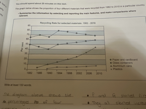
Band 5+: The graph below shows the proportion of four different materials that were recycled from 1982 to 2010 in a particular country.

Image for topic: The graph below shows the proportion of four different materials that were recycled from 1982 to 2010 in a particular country.
Our system will evaluate the answer based on this AI-generated description.
The image is a line graph titled "Recycling Rate for selected materials: 1982 - 2010" with the x-axis representing years from 1982 to 2010 and the y-axis representing recycling rate percentages from 0 to 90%. Four lines represent paper and cardboard, glass containers, aluminium cans, and plastics. In 1982, paper and cardboard had a recycling rate of approximately 20%, glass containers 55%, aluminium cans around 5%, and plastics nearly 0%. In 2010, paper and cardboard increased to about 75%, glass containers to 50%, aluminium cans to 70%, and plastics to almost 20%. Paper and cardboard show a steady increase over the years, with a slight dip between 1990 and 1994. Glass containers saw a gradual decrease over time, with slight fluctuations. Aluminium cans started the lowest but saw significant growth and surpassed other materials by 2010. Plastics began at nearly 0% and had a slower, gradual increase throughout the years.
Given the complexity of the image, the above description may not be entirely accurate.
Note: Both the topic and the answer were created by one of our users.

The line graph illustrates the proportion of paper and cardboard, Glass containers, aluminium cans and plastics that Were reclaimed from 1982 to 2070 in a specific nation

Overall, The Recovering rate for all four different materials were increased significantly in given tenure with the exception of paper and cardboard. paper and card board was the most significant Recycled materials in particular country whereas plastics was the least.

In 1982, about 65% of paper and Cardboard was recycled , rising to nearly four-fifths and reached at seven – tenths. Glass containers began at about 50%. Then It was decreased and reached at Two-fifths in 1990. Moreover It was gradually increased and reach to Three-fifths in 2010.

Additionally, aluminium Cans start later and It was only 5% in 1986. It was dramatically grew up over the period and reached at 45% in 2010. After Aluminium cans, plastics Recycling method was established. However, there was very low recycling rate for plastics. It was increased over the period around 3% to 2%.

Word Count: 168

Answers On The Same Topic:

The graph below shows the proportion of four different materials that were recycled from 1982 to 2010 in a particular country.

The chart illustrates the recycling percentage of four different materials (paper and cardboard, glass containers, aluminium cans, and plastics) over a period between 1982 and 2010, with data provided for one particular country. Overall, all materials were recycled more by the end of the period, but the pattern divides them into two groups. While plastics […]

The graph below shows the proportion of four different materials that were recycled from 1982 to 2010 in a particular country.

The chart illustrates the recycling percentage of four different materials(paper and cardboard, glass containers, aluminium cans and plastics) in a period between 1982 to 2010, with data provided for one particular country. Overall, all materials were recycled more by the end of the period, but the patern divide them into two groups. While plastics and […]

The graph below shows the proportion of four different materials that were recycled from 1982 to 2010 in a particular country.

The following line graph displays the proportion of four different materials that were recycled from the years 1982 to 2010 in a specific country. Generally, the trends shown in all four lines follow an increase, with slight fluctuations. Paper and cardboard is recycled the most in comparison to other materials, although it displays the largest […]

The graph below shows the proportion of four different materials that were recycled from 1982 to 2010 in a particular country.

The line graph illustrates the recycling rates of four materials – paper and cardboard, glass containers, aluminium cans, and plastics – in a particular country from 1982 to 2010. Overall, paper and cardboard had the highest recycling percentages throughout the period, although their rate experienced fluctuations. In contrast, plastics consistently showed the lowest recycling rate, […]

See All

Other Topics:

The graph below gives information about the preferred leisure activities of Australian children.

The bar chart illustrates the percentages of Australian children who like to do five different activities in their free time. In general, Watching TV or videos was the most popular activity for both genders. In addtion, it is clearly apparent thay boys recorded higher participation rates in Electronic or computer games, Bike riding and Skateboarding […]

The bar chart shows the percentage of students in Country X who participated in football, basketball, tennis, and swimming in 2010 and 2020.

The bar chart demonstrates the changes in the proportion of the students that participate in various types of sport-football, basketball, tennis, and swimming -over the course of 10 years starting from 2010. Looking from all perspectives, it is crystally clear that the percentage of participation in football and basketball underwent general declines, whereas tennis and […]

the bar chart gives information about the phone usage among different age groups in a country from 1998 to 2000.

The bar chart compares people using mobile phones according to age groups in one country from 1998 to 2000. Overall, people from 31-50, and especially those between 16 – 30 were the primary user demographic in all years despite a noticeable fall in the figures. In contrast, there was an increase in the proportion of […]

The chart below shows the aid from six developed countries to developing countriesfrom 2008-2010. Summarize the information by selecting and reporting the mainfeatures, and make comparisons where relevant.

The bar chart illustrates the amount of aid provided by six prosperous countries to developing nations between 2008 and 2010, measured in billions of dollars. Overall, the US contributed by far the largest amount of aid throughout the period, while Sweden consistently provided the least. Most countries experienced fluctuations in their aid contributions over the […]

The bar chart shows clothing import prices to the EU from six countries in 1993 and 2003.

The bar chart indicated clothing import prices to the EU from six countries in 1993 and 2003. Overall, Argentina showed a highest rise in both years, followed by Brazil, while,China, India, along with Bangladesh the lowest positions, whereas Japen increased significantly afterwards. In 1993, the clothing import prices Argentina were the most well-known, cournty around […]

The bar chart shows clothing import prices to the EU from six countries in 1993 and 2003.

The bar chart indicated clothing import prices to the EU from six countries in 1993 and 2003. Overall, Argentina shown a highetst rose in both years, follwed by Brazill, while, China, India, along with Bangladesh the lowest position, wheres Japen increased significantly afterwards. In 1993, the clothing import prices Argentina was is the most well-know […]

See All
We have detected unusual activity on your device.
Please verify your identity to continue.
Note: This verification step won't sign you in. If you have a premium account, please log in to access the service as usual.
Google/Gmail Verification
Or verify using Email/Code
We've sent a verification code to:
youremail@gmail.com (Not your email?)
Enter it below to complete the verification process.
Ensure your email address is correct, your inbox is not full, and you check your spam folder. If no email arrives, consider using an alternative email.
You will need a Premium plan to perform your action!
Note: If you already have a premium account, please log in to access our services as usual.

Plans & Pricing

Our mission is to make quality education accessible for everyone.
However, to keep our hardworking team running and this service alive, we genuinely need your support!
By opting for a premium plan, not only do you sustain us in achieving the mission, but you also unlock advanced features to enrich your learning experience.

Free

For learners who aren't pressed for time

What's included on Free
100+ Cambridge IELTS Tests
Instant IELTS Writing Task 1 & 2 Evaluation (2 times/month)
Instant IELTS Speaking Part 1, 2, & 3 Evaluation (2 times/month)
Instant IELTS Writing Task 1 & 2 Essay Generator (2 times/month)
500+ Dictation & Shadowing Exercises
100+ Pronunciation Exercises
Flashcards
Other Advanced Tools

Premium

For those serious about advancing their English proficiency, and for IELTS candidates aspiring to boost their band score by 1-2 points (especially in writing & speaking) in just 30 days or less

What's included on Premium
Save Your IELTS Test Progress & Analyze Mistakes By Question Type
Save Your Own Flashcard Sets & Use Them On Any Device
Unlock All Courses, IELTS Tests, Section & Part Practice
Unlimited AI Conversations
Unlimited AI Writing Enhancement Exercises
Unlimited IELTS Writing Task 1 & 2 Evaluation
Unlimited IELTS Speaking Part 1, 2, & 3 Evaluation
Checked Answers Will Not Be Published
Unlimited IELTS Writing Task 1 & 2 Essay Generator
Unlimited IELTS Speaking Part 1, 2, & 3 Sample Generator
Unlimited Usage Of Advanced Tools & AI Features
Priority Support within 24h (12-month plan only)

Due to the nature of our service and the provided free trials, payments are non-refundable.