🔥 Today Only: Save 30% on Premium — Offer Ends Soon! - Upgrade Now!
Line Graph

Band 4+: The graph below shows the stock price of four technology companies between 2011 and 2016. Summaries the information by selecting and reporting the main features, and make comparisons where relevant.

Image for topic: The graph below shows the stock price of four technology companies between 2011 and 2016. Summaries the information by selecting and reporting the main features, and make comparisons where relevant.
Our system will evaluate the answer based on this AI-generated description.
The image displays a line graph with four different lines, each representing Facebook, Google, Apple, and Yahoo from the years 2011 to 2016. The vertical axis ranges from 0 to 35,000 with increments of 5,000, while the horizontal axis lists the years 2011 through 2016. In 2011, Facebook, Google, and Apple start at 0, while Yahoo starts around 12,000. In 2012, Facebook jumps to over 30,000, Google remains close to 0, Apple increases to around 2,000, and Yahoo drops to about 6,000. By 2013, Facebook drops below 5,000, Google increases to around 5,000, Apple rises to nearly 10,000, and Yahoo decreases to almost 0. In 2014, Facebook remains under 5,000, Google climbs to nearly 20,000, Apple approaches 15,000, and Yahoo stays close to 0. In 2015, Facebook is still below 5,000, Google exceeds 20,000, Apple surpasses 15,000, and Yahoo remains around 0. Finally, in 2016, Facebook stays under 5,000, Google maintains above 20,000, Apple continues to increase exceeding 20,000, and Yahoo stays near 0.
Given the complexity of the image, the above description may not be entirely accurate.
Note: Both the topic and the answer were created by one of our users.

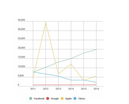
The line chart presents what the stock price of Apple, Yahoo, Google and Facebook tech-corporations was during the years 2011 and 2016.

Overall, only Facebook’s stock value experienced increase, while the Yahoo’s decreased. Apple’s stock even with heavy fluctiations ramained relatively the same, and Google’s cost of stock went through almost zero changes.

Price of Facebook’s share started at around 8000 and rose with same speed untill the 2016 reaching almost 20000, and securing highest value among four. Apple’s cost of company share undergoes through huge spike in 2012 increasing by close to 7 times from 5000. However, next year it drops to little more than 7000, and for next 3 years fluctuates finishing the period with well over 5000.

Yahoo’s stock price in five years consistently diminishes, by the end its value is less than half of beginning, roughly 3000. Google’s cost of company share remains ar around 1000, and it holds last place among all of the corporations for whole time period.

Word Count: 164

Answers On The Same Topic:

The graph below shows the stock price of four technology companies between 2011 and 2016. Summaries the information by selecting and reporting the main features, and make comparisons where relevant.

The provided graph delineates the fluctuations in stock prices of four prominent technology companies – Facebook, Google, Apple, and Yahoo – from the year 2011 to 2016. A comprehensive evaluation reveals divergent trends among the companies, with Facebook exhibiting resilience despite its initially low stock price, while Yahoo experienced a continual decline. In 2011, Facebook, […]

The graph below shows the stock price of four technology companies between 2011 and 2016. Summaries the information by selecting and reporting the main features, and make comparisons where relevant.

The bar chart illustrates the top 4 tech companies regarding the stock price during the span of 6 years from 2011 to 2016. This chart includes companies like google, Facebook, Apple and yahoo. Facebook has a steady growth throughout all these years. Starting approximately from 7500 in 2011 to 20000 in 2016. In contrast to […]

The graph below shows the stock price of four technology companies between 2011 and 2016. Summaries the information by selecting and reporting the main features, and make comparisons where relevant.

The bar graph depicts the stock prices of four technological companies namely Facebook,Google,Apple and Yahoo between the years 2011 to 2016. Overall Apple has shown a tremendous increase in the year 2012 which crossed over 30,000 ,whereas Google has managed to reamin the lowest all throughout . There is a steady increase in Facebook stocks […]

The graph below shows the stock price of four technology companies between 2011 and 2016. Summaries the information by selecting and reporting the main features, and make comparisons where relevant.

The line graph illustrates the stock market performance of four prominent technology companies—Facebook, Yahoo, Apple, and Google—over a six-year period from 2011 to 2016. Overall, Facebook experienced a consistent upward trend in its stock value, whereas Yahoo’s shares declined steadily. Apple’s stock price exhibited significant volatility, and Google’s shares remained relatively stable throughout the period. […]

See All

Other Topics:

The line graph shows the number of people who used different communication services in the world.

The line graph illustrates, the proportion of individuals using 5 different types of communication from 1998 to 2008. Overall, it can be seen that, the figure for cellular phone service was about on same proportion with internet service. However, the figure for cellular phone service hit the list with biggest gap. Although, for other proportion […]

The graph shows data about the annual earnings of three bakeries in Calgary from 2000-2010. Summarise the information by selecting and reporting the main features, and make comparisons where relevant.

The line graph provides information about the amount of profit of three bakeries per year in Calgary between 2000 and 2010. Overall, it is evident that the figure for the Amandine Bakery and Bolo Cakery experienced significant increases whereas Mari Bakeshop followed marked decline during the given period. It is also noteworthy that Mari Bakeshop […]

The graph shows information about the number of people in Australia who used Chinese, Arabic, Italian, and Greek as their first language.

The graph shows information about people in Australia who usefour languages as their mother-tongue . In general, Greek and Chinese languages were the most usable languages in Australia, with Chinese leading the pack. While Arabic and Italian were not as usable languages among people who live in Australia as Chinese and Greek. Notably, Greek and […]

The graph gives information about advertising sources in one country from 2010 to 2040.

The provided line graph compares and contrasts data regarding the changes in proportion of money spent marketing from 2010 to 2040. The units are measured as a percentage. An overarching observation from the shedule clearly depicts that newspaper, magazines and radio have an downward trend, while inthernet has an increasing tendeNcy. Notably, TV has some […]

The graph below shows changes in young adult unemployment rates in England between 1993 and 2012. Summarise the information by selecting and reporting the main features, and make comparisons where relevant.

The graph illustrates the percentages of unemployed young adult in the UK across a 19-year period from 1993 to 2012. Overall, all catergories experienced a considerable fluctuation in unemployment figures among youth individuals. Notably, the 16-24 aged people in London was seen the highest rank after many years of variation. In 1993, the number of […]

The graph below gives information from a 2008 report about energy consumption in the USA since 1980, with projections until 2030. Summarise the information by selecting and reporting the main features and making comparisons where relevant.

The line graph displays the data projection for 2030 about particular energy sources (measured in quadrillion units) in The USA, with the historical year between 1980 and 2008. Overall, throughout the period, Petrol and Oil stood as the highest number, while Hydropower remained relatively unchanged as the lowest amount of material used. In the first […]

See All
We have detected unusual activity on your device.
Please verify your identity to continue.
Note: This verification step won't sign you in. If you have a premium account, please log in to access the service as usual.
Google/Gmail Verification
Or verify using Email/Code
We've sent a verification code to:
youremail@gmail.com (Not your email?)
Enter it below to complete the verification process.
Ensure your email address is correct, your inbox is not full, and you check your spam folder. If no email arrives, consider using an alternative email.
You will need a Premium plan to perform your action!
Note: If you already have a premium account, please log in to access our services as usual.

Plans & Pricing

Our mission is to make quality education accessible for everyone.
However, to keep our hardworking team running and this service alive, we genuinely need your support!
By opting for a premium plan, not only do you sustain us in achieving the mission, but you also unlock advanced features to enrich your learning experience.

Free

For learners who aren't pressed for time

What's included on Free
100+ Cambridge IELTS Tests
Instant IELTS Writing Task 1 & 2 Evaluation (2 times/month)
Instant IELTS Speaking Part 1, 2, & 3 Evaluation (5 times/month)
Instant IELTS Writing Task 1 & 2 Essay Generator (2 times/month)
500+ Dictation & Shadowing Exercises
100+ Pronunciation Exercises
Flashcards
Other Advanced Tools

Premium

For those serious about advancing their English proficiency, and for IELTS candidates aspiring to boost their band score by 1-2 points (especially in writing & speaking) in just 30 days or less

What's included on Premium
Save Your IELTS Test Progress
Unlock All Courses & IELTS Tests
Unlimited AI Conversations
Unlimited AI Writing Enhancement Exercises
Unlimited IELTS Writing Task 1 & 2 Evaluation
Unlimited IELTS Speaking Part 1, 2, & 3 Evaluation
Checked Answers Will Not Be Published
Unlimited IELTS Writing Task 1 & 2 Essay Generator
Unlimited IELTS Speaking Part 1, 2, & 3 Sample Generator
Unlimited Usage Of Advanced Tools
Priority Support within 24h (12-month plan only)

Due to the nature of our service and the provided free trials, payments are non-refundable.
Nếu bạn là người Việt Nam và không có hoặc không muốn trả bằng credit/debit cards, bạn có thể thanh toán bằng phương thức chuyển khoản:


Chọn gói:
419,000₫ 277,000 ₫ cho gói 1 tháng (chỉ 9,233₫/ngày)
1,239,000₫ 597,000 ₫ cho gói 3 tháng (chỉ 6,633₫/ngày)
2,469,000₫ 1,027,000 ₫ cho gói 6 tháng (chỉ 5,706₫/ngày)
4,929,000₫ 1,417,000 ₫ cho gói 12 tháng (chỉ 3,936₫/ngày)


Sau khi chuyển khoản, vui lòng đợi trình duyệt tự động điều hướng bạn trở lại Engnovate và bạn sẽ ngay lập tức nhận được mã kích hoạt tài khoản premium.
Nếu có lỗi xảy ra, bạn có thể liên hệ với team thông qua một trong các phương thức: email đến helloengnovate@gmail.com hoặc nhắn tin qua facebook.com/engnovate.
Vì toàn bộ công cụ trên website đều có thể sử dụng thử miễn phí, Engnovate không hỗ trợ hoàn tiền.