🔥 Today Only: Save 30% on Premium — Offer Ends Soon! - Upgrade Now!
Line Graph

Band 7+: The graph below shows the stock price of four technology companies between 2011 and 2016. Summaries the information by selecting and reporting the main features, and make comparisons where relevant.

Image for topic: The graph below shows the stock price of four technology companies between 2011 and 2016. Summaries the information by selecting and reporting the main features, and make comparisons where relevant.
Our system will evaluate the answer based on this AI-generated description.
The image displays a line graph with four different lines, each representing Facebook, Google, Apple, and Yahoo from the years 2011 to 2016. The vertical axis ranges from 0 to 35,000 with increments of 5,000, while the horizontal axis lists the years 2011 through 2016. In 2011, Facebook, Google, and Apple start at 0, while Yahoo starts around 12,000. In 2012, Facebook jumps to over 30,000, Google remains close to 0, Apple increases to around 2,000, and Yahoo drops to about 6,000. By 2013, Facebook drops below 5,000, Google increases to around 5,000, Apple rises to nearly 10,000, and Yahoo decreases to almost 0. In 2014, Facebook remains under 5,000, Google climbs to nearly 20,000, Apple approaches 15,000, and Yahoo stays close to 0. In 2015, Facebook is still below 5,000, Google exceeds 20,000, Apple surpasses 15,000, and Yahoo remains around 0. Finally, in 2016, Facebook stays under 5,000, Google maintains above 20,000, Apple continues to increase exceeding 20,000, and Yahoo stays near 0.
Given the complexity of the image, the above description may not be entirely accurate.
Note: Both the topic and the answer were created by one of our users.

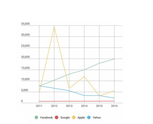
The graph precisely depicts the stock values of four major high-tech corporations in the USA from 2011 to 2016.

Looking from an overall perspective, it is readily apparent that Apple’s value significantly oscillated throughout the period. Furthermore, the figures of Facebook witnessed an upward trend, while there was a downward trend of Yahoo’s representative numbers.

Getting back to more details, the stock prices of Facebook and Yahoo started at around $7,500 in 2011, and the former kept rising gradually in the next five years to a value of almost three times higher than in 2016 ($20,000). In contrast, the latter experienced a downward trend, showing the lowest stock price in 2016, which was vanishingly about $1,000 million.

Moreover, it is explicitly observed that Apple’s stock started tediously less than $5,000, which rocketed dramatically to just under $35,000 after a year before plummeting to roughly $6,000 in 2013. However, it recovered in the next year to more or less $10,000; nevertheless, it again illustrated a rapid dip in 2015. There are empirical impulses to assert that the stock prices of Google remained unchanged in the given period, representing a minuscule contribution to stock sales (around $1,000 million).

Word Count: 196

Answers On The Same Topic:

The graph below shows the stock price of four technology companies between 2011 and 2016. Summaries the information by selecting and reporting the main features, and make comparisons where relevant.

The provided graph delineates the fluctuations in stock prices of four prominent technology companies – Facebook, Google, Apple, and Yahoo – from the year 2011 to 2016. A comprehensive evaluation reveals divergent trends among the companies, with Facebook exhibiting resilience despite its initially low stock price, while Yahoo experienced a continual decline. In 2011, Facebook, […]

The graph below shows the stock price of four technology companies between 2011 and 2016. Summaries the information by selecting and reporting the main features, and make comparisons where relevant.

The line chart presents what the stock price of Apple, Yahoo, Google and Facebook tech-corporations was during the years 2011 and 2016. Overall, only Facebook’s stock value experienced increase, while the Yahoo’s decreased. Apple’s stock even with heavy fluctiations ramained relatively the same, and Google’s cost of stock went through almost zero changes. Price of […]

The graph below shows the stock price of four technology companies between 2011 and 2016. Summaries the information by selecting and reporting the main features, and make comparisons where relevant.

The bar chart illustrates the top 4 tech companies regarding the stock price during the span of 6 years from 2011 to 2016. This chart includes companies like google, Facebook, Apple and yahoo. Facebook has a steady growth throughout all these years. Starting approximately from 7500 in 2011 to 20000 in 2016. In contrast to […]

The graph below shows the stock price of four technology companies between 2011 and 2016. Summaries the information by selecting and reporting the main features, and make comparisons where relevant.

The bar graph depicts the stock prices of four technological companies namely Facebook,Google,Apple and Yahoo between the years 2011 to 2016. Overall Apple has shown a tremendous increase in the year 2012 which crossed over 30,000 ,whereas Google has managed to reamin the lowest all throughout . There is a steady increase in Facebook stocks […]

The graph below shows the stock price of four technology companies between 2011 and 2016. Summaries the information by selecting and reporting the main features, and make comparisons where relevant.

The line graph illustrates the stock market performance of four prominent technology companies—Facebook, Yahoo, Apple, and Google—over a six-year period from 2011 to 2016. Overall, Facebook experienced a consistent upward trend in its stock value, whereas Yahoo’s shares declined steadily. Apple’s stock price exhibited significant volatility, and Google’s shares remained relatively stable throughout the period. […]

See All

Other Topics:

The given graph shows the past and projected figures of the government spending as a percentage of GDP for the years 2000 to 2025 in three areas. Summarise the information by selecting and reporting the main features and make comparisons where relevant.

The three line graph illustrates information about discreet statistics of the authority expenditure as a proportion of GDP between 2000 and 2025 in three operations. Overall, it is evident that the Health shows an increasing trend over the period.However, Education,Roads and Rallways shows decreasing slightly trend except for fluctuation. In beginning,Health in 2000 started with […]

The line graph below shows information about the number of people who visited a museum in a city and the types of exhibits they saw, in 2010 and 2020. Summarise the information by selecting and reporting the main features, and make comparisons where relevant.

The line graph illustrates the number of people who visited a museum in a city and the types of exhibits they saw during the period from 2010 to 2020. Overall,the number of people who visited the museum in all four different ages increased over the period. Group age 18 to 30 remained the most popular […]

tourists visiting caribbean island and their preference of staying on island or cruise ships

The line graph above depicts the number of travelers on a particular Caribbean island between 2010 and 2017. Overall, the linear representation shows an increase in total visitors throughout the years. The visitors staying on the island mostly exhibit stable growth throughout the period with a higher total of tourists. Meanwhile, albeit possessing a generally […]

the line graph below shows the household recycling rates in three different countries between 2005 and 2015. Summarize the information by selecting and reporting the main feature and make comparison where relevant .

The line graph below displays the household recycling rate in UK, France, Germany between 2005 and 2015. Overall, UK and Germany household recycling increased significantly, meanwhile France decreased gradually throughout the period and a little bit rose by the end of the time. Germany was the the second biggest consumer of household recycling in 2005 […]

The line graph below shows the average weekly consumption of four types of drinks in a European country between 1980 and 2020. Summarise the information by selecting and reporting the main features, and make comparisons where relevant.

The line graph illustrates the typical weekly usage of four types of drinks, namely milk, coffee, tea and juice in a country in Europe over the period from 1980 to 2020. Overall, the consumption of milk and coffee declined over the period, whereas tea and juice increased its popularity noticeably. Milk was the most consumed […]

The graph below shows life expectancy in different regions of the world from 1950 to 2020. Summarise the information by selecting and reporting the main features, and make comparisons where relevant.

The line graph compares life expectancy in four regions (A to D) from 1950 to 2020. Overall, life expectancy rose in every region over the seventy years, and the gap between the highest and lowest regions narrowed, although the ranking never changed. In 1950, Region A had the highest figure at 65 years, followed by […]

See All
We have detected unusual activity on your device.
Please verify your identity to continue.
Note: This verification step won't sign you in. If you have a premium account, please log in to access the service as usual.
Google/Gmail Verification
Or verify using Email/Code
We've sent a verification code to:
youremail@gmail.com (Not your email?)
Enter it below to complete the verification process.
Ensure your email address is correct, your inbox is not full, and you check your spam folder. If no email arrives, consider using an alternative email.
You will need a Premium plan to perform your action!
Note: If you already have a premium account, please log in to access our services as usual.

Plans & Pricing

Our mission is to make quality education accessible for everyone.
However, to keep our hardworking team running and this service alive, we genuinely need your support!
By opting for a premium plan, not only do you sustain us in achieving the mission, but you also unlock advanced features to enrich your learning experience.

Free

For learners who aren't pressed for time

What's included on Free
100+ Cambridge IELTS Tests
Instant IELTS Writing Task 1 & 2 Evaluation (2 times/month)
Instant IELTS Speaking Part 1, 2, & 3 Evaluation (2 times/month)
Instant IELTS Writing Task 1 & 2 Essay Generator (2 times/month)
500+ Dictation & Shadowing Exercises
100+ Pronunciation Exercises
Flashcards
Other Advanced Tools

Premium

For those serious about advancing their English proficiency, and for IELTS candidates aspiring to boost their band score by 1-2 points (especially in writing & speaking) in just 30 days or less

What's included on Premium
Save Your IELTS Test Progress & Analyze Mistakes By Question Type
Save Your Own Flashcard Sets & Use Them On Any Device
Unlock All Courses, IELTS Tests, Section & Part Practice
Unlimited AI Conversations
Unlimited AI Writing Enhancement Exercises
Unlimited IELTS Writing Task 1 & 2 Evaluation
Unlimited IELTS Speaking Part 1, 2, & 3 Evaluation
Checked Answers Will Not Be Published
Unlimited IELTS Writing Task 1 & 2 Essay Generator
Unlimited IELTS Speaking Part 1, 2, & 3 Sample Generator
Unlimited Usage Of Advanced Tools & AI Features
Priority Support within 24h (12-month plan only)

Due to the nature of our service and the provided free trials, payments are non-refundable.