Our system will evaluate the answer based on this AI-generated description.
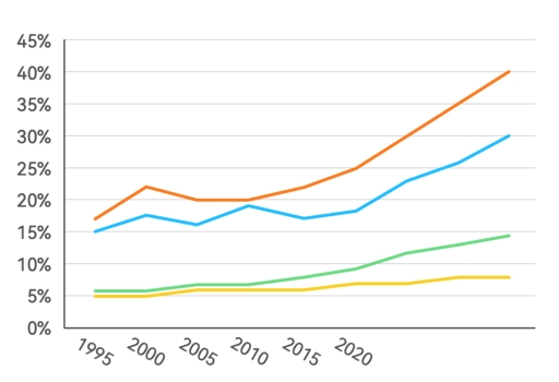
The image shows a line chart with four lines representing different data trends plotted against years 1995, 2000, 2005, 2010, 2015, 2020 on the x-axis and percentages ranging from 0% to 45% on the y-axis; the topmost line starts just above 15% in 1995, increases steadily to just under 25% by 2005, follows a steeper incline to almost 35% by 2010, and continues the rise to surpass 40% by 2020; the second-highest line begins just below 15% in 1995, experiences a slight dip to above 10% by 2000, ascends to just over 20% by 2010 and finishes near 30% by 2020; the third line, starting near 5%, progresses modestly to approach 10% in 2010 and concludes near 15% by 2020; the lowest line also commences at approximately 5%, shows a gradual incline to 10% by 2010, and reaches above 10% by 2020; no specific data points are labeled or marked on any lines.
Given the complexity of the image, the above description may not be entirely accurate.
Skyrocket your IELTS band score by 1-2 points in under a month with our premium plan!
Note: Both the topic and the answer were created by one of our users.
The given diagram displays the statistics about the quantity of European community of variety age groups who usually take part in gym from 1990 to 2010.
In general, most of people participate in gym to workout is youth. In contrast, older people go to gym tend to keep good health and lifespan stable and not count too much.
First of all, it can be seen clearly that people im age groups 18 to 23 and 24 to 33 have overwhelming the percentage than the older group. Teenager in group 18-23 did not remained stable in the period time, started at 15% in 1990 and the had a notable strongly increased in 2006 at 25% compared to 1990 more than 10%. The aged group 24-33 standing top one at beginning, remained from 1990 to 2010 and just lost the younger group about 1% in 2006.
The aged group 34-43 and 44-53 categories had a similar line graph, but the aged group 34-43 was higher than the other. The yellow line aged group had started at approximately 6% and grandually grew up at 10% in 2010. Meanwhile, the last aged group rose a little bit from 5% to 6% in 1998 and remained stable to 2010.
Word Count: 204