🔥 Today Only: Save 30% on Premium — Offer Ends Soon! - Upgrade Now!
Multiple Graphs

Band 6+: The graph gives information about the number of yearly visits from France and North America for holiday and business. Summarise the information by selecting and reporting the main features, and make comparisons where relevant.

Image for topic: The graph gives information about the number of yearly visits from France and North America for holiday and business. Summarise the information by selecting and reporting the main features, and make comparisons where relevant.
Our system will evaluate the answer based on this AI-generated description.
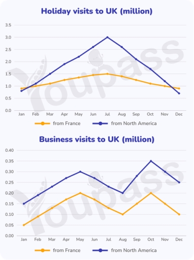
The image presents two line graphs detailing monthly visits to the UK in millions. The first graph, titled "Holiday visits to UK (million)", shows data from France and North America. For France, the monthly visit figures are: Jan 0.9, Feb 1.0, Mar 1.1, Apr 1.2, May 1.3, Jun 1.4, Jul 1.5, Aug 1.4, Sep 1.3, Oct 1.2, Nov 1.0, and Dec 0.9. For North America, the figures are: Jan 0.8, Feb 1.2, Mar 1.6, Apr 2.0, May 2.3, Jun 2.7, Jul 3.0, Aug 2.7, Sep 2.3, Oct 1.8, Nov 1.3, and Dec 0.7. The second graph, "Business visits to UK (million)", displays monthly data for the same regions. For France, the figures are: Jan 0.05, Feb 0.10, Mar 0.15, Apr 0.18, May 0.20, Jun 0.15, Jul 0.12, Aug 0.10, Sep 0.15, Oct 0.20, Nov 0.15, and Dec 0.10. For North America, the figures are: Jan 0.15, Feb 0.20, Mar 0.25, Apr 0.28, May 0.30, Jun 0.25, Jul 0.22, Aug 0.20, Sep 0.28, Oct 0.35, Nov 0.30, and Dec 0.25.
Given the complexity of the image, the above description may not be entirely accurate.
Note: Both the topic and the answer were created by one of our users.

The two given graphs illustrate numbers of trips being taken from France and from North America to UK for holiday and business yearly.

Overall, it could be seen that both rate of people coming from France and North America shared similarities trends in both graphs. Prominently, July is the busiest month for holiday trips and October is the most popular month to travel for business reasons.

Regarding the vists to UK for holiday, the number of people coming for holiday from North America rapidly rises from merely 0.8 million in January to its peak at 3 million in July and then dramatically deteriorated to 0.6 million in December. Similarly, the figure of france also hit its peak in July, however with a much lower numbers at half of the figure of North America.

Turning to trips to UK in regard of business, both parties show a fluctuative trend throughout the year with the North America’s individuals dominating the graph at its peak of 0.35 million visits in October. While, the highest number of trip from France to UK reaches 0.15 million trips in two month May and October.

Word Count: 188

Answers On The Same Topic:

The graph gives information about the number of yearly visits from France and North America for holiday and business. Summarise the information by selecting and reporting the main features, and make comparisons where relevant.

The two given line graphs compare the number of trips made to the UK for 2 different purposes from France and North America across the 12 months. Overall, what stand out from the two line is that the proportion for North America was consistently higher than that for France in both types of visits. Additionally, […]

The graph gives information about the number of yearly visits from France and North America for holiday and business. Summarise the information by selecting and reporting the main features, and make comparisons where relevant.

The listed graphs illustrate the number of visitors coming from France and North America for either vacation or business over one year. Overall, each visit purpose has a different pattern. On the one hand, holiday trips reach their peak in July of the summer. On the other hand, the business pattern is divided into two […]

The graph gives information about the number of yearly visits from France and North America for holiday and business. Summarise the information by selecting and reporting the main features, and make comparisons where relevant.

The two line graphs compare the number of visits to the UK from France and North America for holiday and business purposes over the course of a year. Overall, holiday travel attracted substantially more visitors than business travel throughout the year. Holiday visits showed much greater fluctuations, whereas business travel remained comparatively stable, with North […]

The graph gives information about the number of yearly visits from France and North America for holiday and business. Summarise the information by selecting and reporting the main features, and make comparisons where relevant.

The two graphs illustrate the number of visits from France and North America to the Uk for holiday and business purposes. Overall, French and North America visitors share similar trends in relation to two different purposes. While holiday season shows a single peak in July, the pattern for business trips fluctuates more considerably and records […]

The graph gives information about the number of yearly visits from France and North America for holiday and business. Summarise the information by selecting and reporting the main features, and make comparisons where relevant.

The two line graphs illustrate the annual number of trips from France and North America to the UK for both holiday and business purposes. Overall, it is evident that visitors from both regions followed similar seasonal patterns. Notably, July stands out as the busiest month for holidaymakers, whereas October is the most popular time for […]

See All

Other Topics:

The pie chart below shows the types of waste collected from households in one city in 2020. The bar chart shows the percentage of each type of waste that was recycled in 2000 and 2020. Summarise the information by selecting and reporting the main features, and make comparisons where relevant.

The pie chart illustrates the different types of household waste collected in one city in 2020, while the bar chart compares the percentages of waste recycled in 2000 and 2020. Overall, food waste accounted for the largest proportion of household waste, whereas metals made up the smallest proportion. Regarding recycling, glass had the highest rate […]

The charts below show the physical activity levels of adult men and women in one country from 2018 to 2019, and the activities they participated in. Summarise the information in both charts by selecting and reporting the main features, and make comparisons where relevant.

These charts illustrate a trend of people engaged in sports and their chosen activities in one country from 2018 to 2019. There were more people who exercised more than 150 minutes a week. Besides the choice of activities was not really different. The first bar chart shows that men were quite more interested in exercising […]

The charts below show the information about a US bus company between 1999 and 2003. Summarise the information by selecting and reporting the main features, and make comparisons where relevant.

The two bar charts demonstrate some statistics about a US bus company during the period from 1999 to 2003, including each year’s number of passenger complaints and a comparison of actual and target punctuality rates for buses’ arrival. Overall, actual and target rates of bus punctuality were both highest in 1999. The rate of actual […]

The charts below show the density of people in 2003, and the change of population from 2003 to 2005. Summarise the information by selecting and reporting the main features, and make comparisons where relevant.

The bar chart gives information about the figure of people in 2003 and the change of population between 2003 and 2005. Overall, Japan was by far the most crowded country among the surveyed countries in 2003, which stood in contrast to Sweden, where the population was the least dense country. In addition, Australia showed the […]

Task 1 The pie charts below show the breakdown of household expenditures in capital cities of the UAE, Turkey and Russia, in 2023. Summarize the information by selecting and reporting the main features, and make comparisons where relevant.

The pie charts provide key infromation about the expenditures of household breakdown for five sectors in Dubia, Istanbal and Moscow in 2023. The figures are measured in percentages. Overall, it is clear from the graphs that housing recorded the highest proportion in Dubia and Istanbal, while food appeared the most consumed in Moscow. In addition, […]

the chart and table below give information about online shopping by Australia and New Zealand customers in 2012

The table and chart illustrates data in Australia and New Zealand customers in terms of online shopping in 2012. Overall, it is clear that both countries high amount of people used local websites and both overseas while the major reason for online shopping is that lower prices than in store in both countries. However, the […]

See All
We have detected unusual activity on your device.
Please verify your identity to continue.
Note: This verification step won't sign you in. If you have a premium account, please log in to access the service as usual.
Google/Gmail Verification
Or verify using Email/Code
We've sent a verification code to:
youremail@gmail.com (Not your email?)
Enter it below to complete the verification process.
Ensure your email address is correct, your inbox is not full, and you check your spam folder. If no email arrives, consider using an alternative email.
You will need a Premium plan to perform your action!
Note: If you already have a premium account, please log in to access our services as usual.

Plans & Pricing

Our mission is to make quality education accessible for everyone.
However, to keep our hardworking team running and this service alive, we genuinely need your support!
By opting for a premium plan, not only do you sustain us in achieving the mission, but you also unlock advanced features to enrich your learning experience.

Free

For learners who aren't pressed for time

What's included on Free
100+ Cambridge IELTS Tests
Instant IELTS Writing Task 1 & 2 Evaluation (2 times/month)
Instant IELTS Speaking Part 1, 2, & 3 Evaluation (2 times/month)
Instant IELTS Writing Task 1 & 2 Essay Generator (2 times/month)
500+ Dictation & Shadowing Exercises
100+ Pronunciation Exercises
Flashcards
Other Advanced Tools

Premium

For those serious about advancing their English proficiency, and for IELTS candidates aspiring to boost their band score by 1-2 points (especially in writing & speaking) in just 30 days or less

What's included on Premium
Save Your IELTS Test Progress & Analyze Mistakes By Question Type
Save Your Own Flashcard Sets & Use Them On Any Device
Unlock All Courses, IELTS Tests, Section & Part Practice
Unlimited AI Conversations
Unlimited AI Writing Enhancement Exercises
Unlimited IELTS Writing Task 1 & 2 Evaluation
Unlimited IELTS Speaking Part 1, 2, & 3 Evaluation
Checked Answers Will Not Be Published
Unlimited IELTS Writing Task 1 & 2 Essay Generator
Unlimited IELTS Speaking Part 1, 2, & 3 Sample Generator
Unlimited Usage Of Advanced Tools & AI Features
Priority Support within 24h (12-month plan only)

Due to the nature of our service and the provided free trials, payments are non-refundable.