Our system will evaluate the answer based on this AI-generated description.
The image depicts a line graph showing the yearly income of three different bakeries from 2000 to 2010. Amandine Bakery is represented by a green line, Mari Bakeshop by a blue line, and Bolo Cakery by a yellow line. Amandine Bakery's income starts at around $55,000 in 2000, decreases slightly to around $53,000 in 2001, jumps to around $85,000 in 2002, remains steady until 2005, dips to around $83,000 in 2006, then steadily increases to reach its peak of around $105,000 in 2009 before dipping to around $100,000 in 2010. Mari Bakeshop's income starts at around $45,000 in 2000, steadily increases to around $50,000 in 2002, drops to around $45,000 in 2003, jumps to around $65,000 in 2004, decreases to around $63,000 in 2005, then steadily increases to reach its peak of around $85,000 in 2009 before decreasing slightly to around $80,000 in 2010. Bolo Cakery's income starts at around $30,000 in 2000, steadily increases to around $40,000 in 2004, jumps to around $50,000 in 2005, then steadily increases to reach its peak of around $70,000 in 2009 before decreasing slightly to around $68,000 in 2010.
Given the complexity of the image, the above description may not be entirely accurate.
Skyrocket your IELTS band score by 1-2 points in under a month with our premium plan!
Note: Both the topic and the answer were created by one of our users.
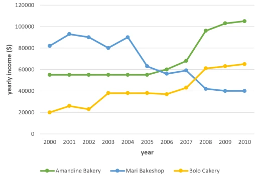
The graph gives information about three bakeries’ income during 10 years.
As can be seen from the graph Amandine Bakery’s benefit stable in the course of five years.From 2006 to 2010 has shown a sharp increase in earnings. In Bolo Cakery financial reports showed fluctuations during three years.After that, approximately 2000 dollars went up in utility.In the last four years income rocketed.
On the other hand Mari Bakeshop’s income in contrast has shown fluctuations increases and decreases in annual year. The first three years demonstrate an increase.However after five years income significantly plummeted.
To sum up, what stands out from the graph is that two bakery shops utility increased while another get went down.
Word Count: 114