Our system will evaluate the answer based on this AI-generated description.
The image depicts commuting methods in London from 1970 to 2010 via five modes: by car, by bus, by subway, by bicycle, and on foot, with corresponding percentage points. In 1970, commuting by car was approximately 38%, bus was near 22%, subway about 28%, bicycle around 3%, and on foot slightly under 3%. In 1980, commuting by car rose to 44%, bus dropped to about 20%, subway moved to roughly 27%, bicycle increased to 6%, and on foot nearly 7%. In 1990, car usage peaked at about 48%, bus slid to around 18%, subway was stable at 27%, bicycle grew to roughly 8%, and on foot remained about 8%. By 2000, car dropped to roughly 39%, bus was about 15%, subway grew to 31%, bicycle observed a slight rise to nearly 11%, and on foot held at 11%. In 2010, car decreased to around 36%, bus was near 15%, subway inclined to above 30%, bicycle reached almost 12%, and on foot rose to about 13%.
Given the complexity of the image, the above description may not be entirely accurate.
Skyrocket your IELTS band score by 1-2 points in under a month with our premium plan!
Note: Both the topic and the answer were created by one of our users.
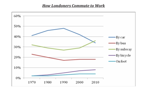
The line graph illustrates the percentage of Londoners using different means of commuting to work from 1970 to 2010.
Commuting by car was the most popular mode throughout the entire period despite its decline in 1990. In contrast, the proportion of people using the subway has increased, surpassing the usage of cars in 2010, which is approximately 2 percent greater than that of cars.
In the beginning, only about 2 percent of Londoners preferred commuting by bicycle and foot. However, this gradually increased to 5 percent and 9 percent, respectively, while commuting by bus decreased gradually.
The year 1990 is significant because it accounts for the major change in the modes of commuting among Londoners. The decline in the usage of cars and the increase in the popularity of the subway happened in this particular year, 1990.
In summary, the car was the most popular mode of transport until the subway replaced it in 2010. Commuting by bus has significantly declined, whereas cycling and walking have increased but remain the least common modes of transport.
Word Count: 175