🔥 Today Only: Save 30% on Premium — Offer Ends Soon! - Upgrade Now!
Multiple Graphs

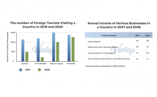
Band 7+: The graph shows the number of foreign tourists visiting country X in 2019 and 2020.

Image for topic: The graph shows the number of foreign tourists visiting country X in 2019 and 2020.
Our system will evaluate the answer based on this AI-generated description.
The image contains two sections; the left section is labeled "The number of Foreign Tourists Visiting x Country in 2019 and 2020," displaying a bar graph comparing the number of tourists in thousands from Europe, U.S & Canada, China & Japan, Australia for years 2007 and 2008 with the following data: Europe (2007=2500, 2008=3000), U.S & Canada (2007=1500, 2008=2000), China & Japan (2007=1000, 2008=1500), Australia (2007=500, 2008=1000). The right section is labeled "Annual Income of Various Businesses in x Country in 2007 and 2008," displaying a table with categories and corresponding annual income for the years 2019 and 2020 in million dollars: Tourism Industry (2019=20, 2020=5), Hotel & Resort (2019=35, 2020=25), Restaurant, Bar & Souvenir shops (2019=24, 2020=12), Transportation & Travel Agent (2019=12, 2020=4), Tour Guides, Small Vendors, and Other Services (2019=14, 2020=13).
Given the complexity of the image, the above description may not be entirely accurate.
Note: Both the topic and the answer were created by one of our users.

The presented bar chart illustrates the total foreign tourists visiting Europe, US & Canada, China & Japan, and Australia in 2019 and 2020 while the given table displays the annual income generated by certain businesses in the tourism industry in the same year.

Overall, both the number of visits and annual income showed varying degrees of reductions, with the US & Canada region and the Hotel & Resort sector having the steepest drop. On the other hand, the figures declined marginally for the Australian region and Tour Guides, Small Vendors, and Other services. It is worth noticing that the ranking among each category was altered significantly.

Regarding the tourist count, in 2019, China & Japan received the most visits at three million, followed by Australia (roughly 2.8 million), US & Canada (around 2.3 million), and Europe (just above two million). However, in 2020, all regions observed considerable decreases.

Word Count: 148

Answers On The Same Topic:

The graph shows the number of foreign tourists visiting country X in 2019 and 2020.

The bar chart and table illustrate the information for the number of visitors arriving in Country. The number of tourists is measured in thousands and annual revenue is calculated in million dollars. Overall,it is clear that Europe, China, Japan, and Australia contributed the most visitors followed by the U.S. and Canada. Despite its steady growth […]

The graph shows the number of foreign tourists visiting country X in 2019 and 2020.

The bar chart and table illustreates the infrmation for the number of visitors arriving in XCountry.Number of tourist is measured in thousands and annual revenue is calculated in million dollars. Overall,it is clear that Europe,China,Japan, and Auatralia contributed the most visitors followed by the U.S and Canada. Despite it steady growth in 2007 its number […]

The graph shows the number of foreign tourists visiting country X in 2019 and 2020.

The bar chart compares the number of foreign tourists visiting XCountry from four regions in 2007 and 2008, while the table presents the annual income of various tourism-related businesses in 2019 and 2020. Overall, tourist arrivals declined across all regions in 2008 compared with the previous year, with the most significant fall observed among visitors […]

The graph shows the number of foreign tourists visiting country X in 2019 and 2020.

The given bar chart depicts information about how much foreign tourists had been visiting Xcountry in two year period in 2019 and 2020. The table, however, displays data about yearly salary of different businesses in country in 2007 and 2008. Overall among four categories of country China and Japan was dominated the first year. Whilst, […]

The graph shows the number of foreign tourists visiting country X in 2019 and 2020.

The bar chart and table present data on the annual income generated by various tourism-related sectors and the number of international tourists visiting XCountry, respectively, in 2007 and 2008. Overall, both the number of foreign visitors and the total revenue declined sharply in 2008, indicating a severe contraction across all areas of the tourism industry. […]

See All

Other Topics:

percentage of full workers holding a university degree and average salary of graduates

The line graph compares the proportions of Math graduates and all university graduates who obtained full-time employment in Australia between 2004 and 2012, while the table illustrates the average annual salaries of the two groups over the same period. Overall, the proportion of graduates in full-time employment fluctuated considerably, with both groups reaching their highest […]

the charts below give information about annual spending in Springfield college in three years

The provided pie charts illustrate data about annual expenditure in Springfield college in 1990, 2000 and 2010. Overall, teacher’s salaries made up the largest shares in three years. Technology’s proportion was the smallest at the beginning of the period, but expanded the share to the second largest proportion by the ending of the period, while […]

The three charts below show the value in Australian dollars of Australian trade with three different countries from 2004 to 2009. Write a report for a university lecturer describing the information below.

The three line graphs compare the value of Australian imports and exports with China, India, and the USA between 2004 and 2009, measured in billions of Australian dollars. Overall, import values were consistently higher than export values in all three countries throughout the period examined. Of particular note is that China experienced by far the […]

The chart below illustrates the percentages of sales of one bookseller in 1970, 1997 and 2012. Summarise the information by selecting and reporting the main features, and make comparisons where relevant.

The pie charts provided illustrate the proportion of sales of one bookseller for the years between 1970 and 2012. Overall, both adult fiction and children’s fiction witnessed an overall upward trend over the period, while biography and others section experienced a dramatic decline throughout the period. Meanwhile, the travel section showed a sharp fall, despite […]

The chart below illustrates the percentages of sales of one bookseller in 1970, 1997 and 2012. Summarise the information by selecting and reporting the main features, and make comparisons where relevant.

The pie charts demonstrate the proportions of sales of one bookseller in three different years in 1972, 1992 and 2012. Overall, it is clear that the figure for others had the largest figure while the travel had the lowest proportion in 1972. However, Adult fiction became one of the most popular sales over the next […]

The chart below illustrates the percentages of sales of one bookseller in 1970, 1997 and 2012. Summarise the information by selecting and reporting the main features, and make comparisons where relevant.

The pie charts provided illustrate the percentage of sales of different genres at one bookseller in 1972, 1992 and 2012. Looking from an overall perspective, it is clear that adult fiction and children’s fiction showed an upward trend over the four decades, while the categories of bibliography and others witnessed a downward trend. The only […]

See All
We have detected unusual activity on your device.
Please verify your identity to continue.
Note: This verification step won't sign you in. If you have a premium account, please log in to access the service as usual.
Google/Gmail Verification
Or verify using Email/Code
We've sent a verification code to:
youremail@gmail.com (Not your email?)
Enter it below to complete the verification process.
Ensure your email address is correct, your inbox is not full, and you check your spam folder. If no email arrives, consider using an alternative email.
You will need a Premium plan to perform your action!
Note: If you already have a premium account, please log in to access our services as usual.

Plans & Pricing

Our mission is to make quality education accessible for everyone.
However, to keep our hardworking team running and this service alive, we genuinely need your support!
By opting for a premium plan, not only do you sustain us in achieving the mission, but you also unlock advanced features to enrich your learning experience.

Free

For learners who aren't pressed for time

What's included on Free
100+ Cambridge IELTS Tests
Instant IELTS Writing Task 1 & 2 Evaluation (2 times/month)
Instant IELTS Speaking Part 1, 2, & 3 Evaluation (2 times/month)
Instant IELTS Writing Task 1 & 2 Essay Generator (2 times/month)
500+ Dictation & Shadowing Exercises
100+ Pronunciation Exercises
Flashcards
Other Advanced Tools

Premium

For those serious about advancing their English proficiency, and for IELTS candidates aspiring to boost their band score by 1-2 points (especially in writing & speaking) in just 30 days or less

What's included on Premium
Save Your IELTS Test Progress & Analyze Mistakes By Question Type
Save Your Own Flashcard Sets & Use Them On Any Device
Unlock All Courses, IELTS Tests, Section & Part Practice
Unlimited AI Conversations
Unlimited AI Writing Enhancement Exercises
Unlimited IELTS Writing Task 1 & 2 Evaluation
Unlimited IELTS Speaking Part 1, 2, & 3 Evaluation
Checked Answers Will Not Be Published
Unlimited IELTS Writing Task 1 & 2 Essay Generator
Unlimited IELTS Speaking Part 1, 2, & 3 Sample Generator
Unlimited Usage Of Advanced Tools & AI Features
Priority Support within 24h (12-month plan only)

Due to the nature of our service and the provided free trials, payments are non-refundable.