🔥 Today Only: Save 30% on Premium — Offer Ends Soon! - Upgrade Now!
Multiple Graphs

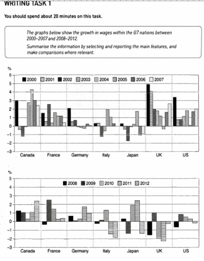
Band 6+: the graphs below show the growth in wages within the G7 nations between 2000-2007 and 2008-2012

Image for topic: the graphs below show the growth in wages within the G7 nations between 2000-2007 and 2008-2012
Our system will evaluate the answer based on this AI-generated description.
The image shows wage growth percentage data for six countries across two time periods, 2000-2007 and 2008-2012. In Canada from 2000-2007, growth rates are 0.5%, 1%, 0.3%, 1%, -1%, 0.7%, 1.5% respectively, while 2008-2012 rates are -0.8%, 0.9%, 0.6%, 1%, 1.5%. In France for 2000-2007, rates are -1.5%, 1%, 0.3%, 1%, -1.3%, -1%, -0.2%, and for 2008-2012, 0%, -1%, 0.5%, 0.2%, 0.2%. In Germany for 2000-2007, rates are -1.5%, -0.5%, 0%, -1.5%, -0.8%, 1%, -0.3%; for 2008-2012, -1%, 1.5%, -0.8%, 0.5%, 0%. Italy from 2000-2007 shows rates -1%, -2%, -1.3%, -0.5%, -0.6%, -0.5%, -2%, and for 2008-2012, -3%, -3.5%, -3%, 0.5%, -2%. Japan's 2000-2007 rates are -2%, -2%, 0%, -0.5%, 0%, 2%, 3.5%, and 2008-2012 are -3%, -0.5%, -1%, 0.5%, 1.5%. UK shows rates of 2.5%, -1.5%, -3%, 0%, -1%, 2%, 5.5% from 2000-2007, and 4%, -2.5%, 1%, 1.5%, -0.8% for 2008-2012. US data for 2000-2007 is 2%, 2%, 1%, -3%, 1%, 4%, 3.5%, and for 2008-2012, -2%, 0.8%, 0%, 0%, 0.5%.
Given the complexity of the image, the above description may not be entirely accurate.
Note: Both the topic and the answer were created by one of our users.

The graphs below illustrate the growth in wages across seven nations between 2000-2007 and 2008-2012. The first bar graph shows that countries such as Canada, the UK, and the US reached their highest wage levels in 2000. However, in the following year, almost all G7 nations experienced a decline in wage statistics. Countries like Germany, Japan, and Italy struggled with their budgets for the next few years, as clearly demonstrated in the graph.

When considering the second graph, it is hard to overlook how sharply the economies of these countries declined. Only Japan made noticeable progress in their wages during this period. In contrast, the UK and the US faced significant challenges.

Overall, the outcomes of these two graphs indicate that the economy cannot remain unchanged regardless of the country or the era.

Word Count: 133

Answers On The Same Topic:

the graphs below show the growth in wages within the G7 nations between 2000-2007 and 2008-2012

The provided graphs illustrate the percentage growth in wages across six G7 nations for two distinct time periods: 2000-2007 and 2008-2012. Overall, the data reveals varying trends in wage growth across the G7 countries, with notable fluctuations in both periods. In the earlier period of 2000-2007, the United Kingdom and the United States exhibited the […]

the graphs below show the growth in wages within the G7 nations between 2000-2007 and 2008-2012

The bar graphs illustrate the salary growth in G7 nations in the span of 7 and 5 years, from 2000 to 2007 and from 2008 to 2012. Overall, it is noticed that all countries experienced fluctuating trends and witnessed a decline in the second period. The UK was the highest salary growth country in 2000 […]

the graphs below show the growth in wages within the G7 nations between 2000-2007 and 2008-2012

The bar charts compare the increase in incomes within the G7 countries from 2000 to 2007 and from 2008 to 2012. In general, the UK growth dominated the rests at the beginning at the period, while Canada showed an impressive performance at the end of the period. Looking at the details, the UK outperformed other […]

the graphs below show the growth in wages within the G7 nations between 2000-2007 and 2008-2012

The pictures illustrate the salary growth in the G7 nations in the span of 7 and 5 years, from 2000 to 2007 and from 2008 to 2012. In general, every country experienced fluctuating trends with a noticeable decline in the second period. The country with the highest average salary growth between 2000-2007 was the UK, […]

See All

Other Topics:

The charts give information about the average amount of time per day spend two common leisure ...

The bar chart compares average spending time (minutes per day) on two free time activities – reading for pleasure and listening to music – among various age groups of people in New Zealand. Overall, the average amount of time spent on reading for pleasure increases steadily with age, whereas the amount of time spent listening […]

The topic is about the job employement of Australian people in different years.

The bar chart illustrates percentage in comparing age group of men and women who was employed in three various years such as 1984, 2001 and in 2014 Overall, while the number of 35-44 was always on top with highest percentage of employment in men group. Also should notice that in men group 2 times 15-19 […]

The pie charts below show the percentage of time working adults spent on different activities in a particular country in 1958 and 2008. Summarize the information by selecting and reporting the main features and make comparisons where relevant.

The given diagrams indicate the fraction of time which was spent by employed adults on various activities in a specific country in 1958 and 2008. The most striking feature is that people started to dedicate more time to work rather than going out with friends and family, which also affected the sleeping schedule. The percentage […]

The given pie charts compare the expenses in 7 different categories in 1966 and by 1996 American citizens

Two pie charts illustrates the proportional expenses among seven major categories by American citizenz between two years (1966 and 1996). Overall, food and cars accounted for the highest proportion in both years, whereas computer contributed the lowest quantity over the period. However, petrol category remained relatively almost stable throughout the period. Looking at the details, […]

The charts below show information about the primary devices used by adults in the UK to access the internet, and the average weekly hours they spent online, for the years 2015 and 2020. Summarise the information by selecting and reporting the main features, and make comparisons where relevant.

The tables present the data about the main devices used by adults in the UK to access the internet, and the average weekly hours they spent online, in the years 2015 and 2020. Overall, it is clear that smartphones were the only category became more popelar in 2020 than 2015, and adults spent longest hours […]

The charts give information about the average amount of time per day spend two common leisure ...

The provided charts compare the mean amount of time that New Zealand people of various age categories devoted to two popular recreational pursuits. Overall, people at the age of 55+ spent by far the most minutes for reading per day among every age groups, whereas the reverse was true for individuals whose age is between […]

See All
We have detected unusual activity on your device.
Please verify your identity to continue.
Note: This verification step won't sign you in. If you have a premium account, please log in to access the service as usual.
Google/Gmail Verification
Or verify using Email/Code
We've sent a verification code to:
youremail@gmail.com (Not your email?)
Enter it below to complete the verification process.
Ensure your email address is correct, your inbox is not full, and you check your spam folder. If no email arrives, consider using an alternative email.
You will need a Premium plan to perform your action!
Note: If you already have a premium account, please log in to access our services as usual.

Plans & Pricing

Our mission is to make quality education accessible for everyone.
However, to keep our hardworking team running and this service alive, we genuinely need your support!
By opting for a premium plan, not only do you sustain us in achieving the mission, but you also unlock advanced features to enrich your learning experience.

Free

For learners who aren't pressed for time

What's included on Free
100+ Cambridge IELTS Tests
Instant IELTS Writing Task 1 & 2 Evaluation (2 times/month)
Instant IELTS Speaking Part 1, 2, & 3 Evaluation (2 times/month)
Instant IELTS Writing Task 1 & 2 Essay Generator (2 times/month)
500+ Dictation & Shadowing Exercises
100+ Pronunciation Exercises
Flashcards
Other Advanced Tools

Premium

For those serious about advancing their English proficiency, and for IELTS candidates aspiring to boost their band score by 1-2 points (especially in writing & speaking) in just 30 days or less

What's included on Premium
Save Your IELTS Test Progress & Analyze Mistakes By Question Type
Save Your Own Flashcard Sets & Use Them On Any Device
Unlock All Courses, IELTS Tests, Section & Part Practice
Unlimited AI Conversations
Unlimited AI Writing Enhancement Exercises
Unlimited IELTS Writing Task 1 & 2 Evaluation
Unlimited IELTS Speaking Part 1, 2, & 3 Evaluation
Checked Answers Will Not Be Published
Unlimited IELTS Writing Task 1 & 2 Essay Generator
Unlimited IELTS Speaking Part 1, 2, & 3 Sample Generator
Unlimited Usage Of Advanced Tools & AI Features
Priority Support within 24h (12-month plan only)

Due to the nature of our service and the provided free trials, payments are non-refundable.