🔥 Today Only: Save 30% on Premium — Offer Ends Soon! - Upgrade Now!
Multiple Graphs

Band 7+: The graphs below show the number of medals won by the top five countries in the summer and winter Olympics. Summarise the information by selecting and reporting the main features, and make comparisons where relevant.

Image for topic: The graphs below show the number of medals won by the top five countries in the summer and winter Olympics. Summarise the information by selecting and reporting the main features, and make comparisons where relevant.
Our system will evaluate the answer based on this AI-generated description.
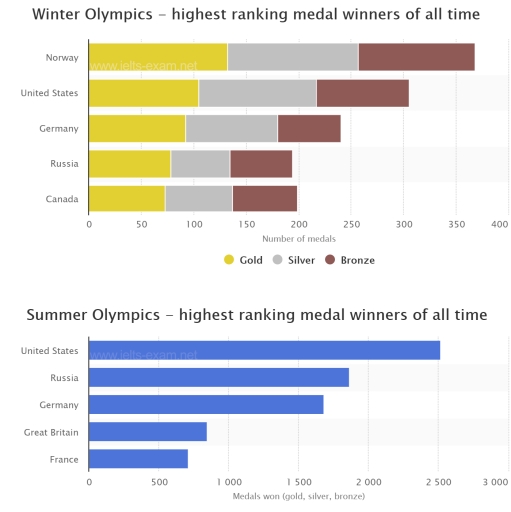
The image consists of two bar charts depicting the highest ranking medal winners of all time in the Winter and Summer Olympics. The Winter Olympics chart displays Norway with approximately 368 medals (132 gold, 125 silver, 111 bronze), the United States with around 305 medals (105 gold, 112 silver, 88 bronze), Germany with approximately 240 medals (92 gold, 88 silver, 60 bronze), Russia with about 234 medals (81 gold, 64 silver, 89 bronze), and Canada with around 199 medals (73 gold, 64 silver, 62 bronze). The Summer Olympics chart shows the United States with over 2,500 medals (1022 gold, 795 silver, 706 bronze), Russia with around 1,865 medals (590 gold, 486 silver, 489 bronze), Germany with approximately 1,346 medals (428 gold, 444 silver, 474 bronze), Great Britain with about 883 medals (263 gold, 295 silver, 325 bronze), and France with around 780 medals (248 gold, 276 silver, 256 bronze).
Given the complexity of the image, the above description may not be entirely accurate.
Note: Both the topic and the answer were created by one of our users.

The indices of numbers of medals won in Olympics by top five distinct countries are depicted on the two bar charts representing the data about the winter and summer Olympics. Overall, unsurprisingly, Norwegian sportsmen won more medals in the winter Olympics than any other country’s sportsmen. Similarly, United States is the country with highest ranking summer Olympics medal winner of all time.

In detail, with approximately 120 golden, 120 silver, and 120 bronze medals won, reaching a significant number of 360 medals, Norwegian sportsmen possess the highest number of winter Olympics medals. Countries such as United States, Germany, and Canada have acquired only approximately 300, 245, and 200 winter medals, respectively. Interestingly, despite the fact that Russians won less winter medals that Canadians, Russians won more golden ones.

Furthermore, indicated by the number of medals, the graph representing the top five summer Olympics countries is illustrated as well. Undoubtedly, the indicator of the United States shows the significant index of 2500 medals. In contrast, France only has a little above 600 medals.

Word Count: 172

Answers On The Same Topic:

The graphs below show the number of medals won by the top five countries in the summer and winter Olympics. Summarise the information by selecting and reporting the main features, and make comparisons where relevant.

The diagram illustrates the number of medals won by the top five countries in the Summer and Winter Olympics. Overall, Norway is the country with the highest number of medals in the Winter Olympics, whereas the USA leads in the Summer Olympics by a considerable margin. Notably, more medals are won in the Summer Olympics […]

The graphs below show the number of medals won by the top five countries in the summer and winter Olympics. Summarise the information by selecting and reporting the main features, and make comparisons where relevant.

The bar charts compare the total number of medals won by the top five countries in the Winter and Summer Olympic Games. Overall, Norway dominated the Winter Olympics in terms of total medals, while the United States was by far the most successful nation in the Summer Olympics. In general, medal totals were significantly higher […]

The graphs below show the number of medals won by the top five countries in the summer and winter Olympics. Summarise the information by selecting and reporting the main features, and make comparisons where relevant.

The graphs show the number of medals won by the top five countries in the Summer and Winter Olympics. Overall, Norway won the highest number of medals in the Winter Olympics, while the United States was the top country in the Summer Olympics. In the Winter Olympics, Norway ranked first with around 370 medals in […]

The graphs below show the number of medals won by the top five countries in the summer and winter Olympics. Summarise the information by selecting and reporting the main features, and make comparisons where relevant.

The graphs compare the total number of medals won by the top five countries in the Winter and Summer Olympics throughout history. Overall, the United States is the dominant nation in the Summer Olympics, while Norway leads in the Winter Games. Another noticeable trend is that medal counts in the Summer Olympics are significantly higher […]

The graphs below show the number of medals won by the top five countries in the summer and winter Olympics. Summarise the information by selecting and reporting the main features, and make comparisons where relevant.

The graphs illustrate the amount for total medals won by the most winners countries in the summer and winter Olympics. Overall, the most noticeable trend is accounted for three countries that each one is present in both summer and winter Olympics. These countries are: United States, Germany and Russia. Winter Olympics are dominated by Norway […]

See All

Other Topics:

The chart below shows the average time UK workers spent travelling to work and their methods of transportation in 2009.

The charts show how much time employees in the UK spend travelling to work and how they travel in 2009. Overall, the majority of employees spend relatively less time traveling to work. While cars were the most popular method of transportation with both workers in London and other parts of the UK, almost nobody used […]

The pie charts below show the percentage of students on one adult education center taking various courses offered in 1985 and this year. Summarise the information by selecting and reporting the main features, and make comparisons where relevant.

The pie charts show the percentage of students on one adult education center taking several cources in 1985 and this year. The courses mentioned in the 1985 chart are art, modern languages, fitness and dance, cookery, music appreciation and local history. Local history and music appreciation have been left out in this year’s chart and […]

The charts below show the main sources of funding for wildlife conservation in Africa and South America for the years 2010 and 2020. Summarise the information by selecting and reporting the main features, and make comparisons where relevant.

The graphs illustrate the major sources of wildlife conservation funding in Africa and South America in 2010 and 2020. The sources mentioned in the chart are: government grants, private donations, corporate sponsorships, and tourism revenue. In Africa, government grants were a major source of funds in 2010(120) and it had a marginal gain in 2020, […]

The charts below shows the performance of a bus company in terms of punctuality, both actual and target (what actually happened compared to what the company was trying to achieve), and the number of complaints from passengers. Summarize the information by selecting and reporting the main features, and make comparisons where relevant.

WRITING TASK 1 The bar chart on the top of this page show the comparison of services arriving on time what actually happened and what they are trying to achieve. The most chart below show the amount of complaints they received. Interestingly, in the year 1997 and 2002, they were gaining both the higher line […]

The charts below show the main reasons for study among students of different age groups and the amount of support they received from employers. Summarise the information by selecting and reporting the main features, and make comparisons where relevant.

The bar chart compares the main reasons for study among different age groups. Overall, people under 26 recorded the highest figure for career, whereas the oldest cohort got enrolled in studies mainly due to interest. The intrest for studies increased with the age, while the popularity of studies mainly to build career decreased with the […]

The pie graphs below show the result of a survey of children's activities. The first graph shows the cultural and leisure activities that boys participate in, whereas the second graph shows the activities in which the girls participate. Write at least 150 words.

The pie graph illustrate the information about the statistic of children’s activities. The first graph depict boys cultural and leisure activities and in the second graph tasks where girls participate in. Overall, it is clear that, listening to music have the same interest in youngest, while computer games and reading have different hight of result. […]

See All
We have detected unusual activity on your device.
Please verify your identity to continue.
Note: This verification step won't sign you in. If you have a premium account, please log in to access the service as usual.
Google/Gmail Verification
Or verify using Email/Code
We've sent a verification code to:
youremail@gmail.com (Not your email?)
Enter it below to complete the verification process.
Ensure your email address is correct, your inbox is not full, and you check your spam folder. If no email arrives, consider using an alternative email.
You will need a Premium plan to perform your action!
Note: If you already have a premium account, please log in to access our services as usual.

Plans & Pricing

Our mission is to make quality education accessible for everyone.
However, to keep our hardworking team running and this service alive, we genuinely need your support!
By opting for a premium plan, not only do you sustain us in achieving the mission, but you also unlock advanced features to enrich your learning experience.

Free

For learners who aren't pressed for time

What's included on Free
100+ Cambridge IELTS Tests
Instant IELTS Writing Task 1 & 2 Evaluation (2 times/month)
Instant IELTS Speaking Part 1, 2, & 3 Evaluation (2 times/month)
Instant IELTS Writing Task 1 & 2 Essay Generator (2 times/month)
500+ Dictation & Shadowing Exercises
100+ Pronunciation Exercises
Flashcards
Other Advanced Tools

Premium

For those serious about advancing their English proficiency, and for IELTS candidates aspiring to boost their band score by 1-2 points (especially in writing & speaking) in just 30 days or less

What's included on Premium
Save Your IELTS Test Progress & Analyze Mistakes By Question Type
Save Your Own Flashcard Sets & Use Them On Any Device
Unlock All Courses, IELTS Tests, Section & Part Practice
Unlimited AI Conversations
Unlimited AI Writing Enhancement Exercises
Unlimited IELTS Writing Task 1 & 2 Evaluation
Unlimited IELTS Speaking Part 1, 2, & 3 Evaluation
Checked Answers Will Not Be Published
Unlimited IELTS Writing Task 1 & 2 Essay Generator
Unlimited IELTS Speaking Part 1, 2, & 3 Sample Generator
Unlimited Usage Of Advanced Tools & AI Features
Priority Support within 24h (12-month plan only)

Due to the nature of our service and the provided free trials, payments are non-refundable.