🔥 Today Only: Save 30% on Premium — Offer Ends Soon! - Upgrade Now!
Multiple Graphs

Band 5+: The graphs below show the percentage of men and women aged 60-64 who were employed in four countries in 1970 and 2000. Summarise the information by selecting and reporting the main features and make comparisons where relevant.

Image for topic: The graphs below show the percentage of men and women aged 60-64 who were employed in four countries in 1970 and 2000. Summarise the information by selecting and reporting the main features and make comparisons where relevant.
Our system will evaluate the answer based on this AI-generated description.
The image contains two bar graphs, comparing the percentage of employed men and women in four countries, namely Belgium, the USA, Japan, and Indonesia in 1970 and 2000. In 1970, the USA had the highest employment rate with 86% males and 78% females doing jobs. Indonesia came in second with 83% and 65% employed men and women respectively. In Japan, 76% males and 65% females were employed, and in Belgium, 78% males and 63% females were doing jobs. In 2000, the USA had the lowest employment rate with 78% males and 75% females employed. Meanwhile, Japan had 81% males and 62% females employed, Indonesia had 78% males and 59% females, and Belgium had 76% males and 63% females. Overall, the employment rate decreased for both men and women, with the USA seeing the most significant drop among men by 8% and among women by 33%. Indonesia witnessed a decrease in employment among men by 5% and among women by 6%. Japan saw a decrease of 5% among men and an increase of 3% among women. In Belgium, the employment rate among men dropped by 2% and among women by 27%.
Given the complexity of the image, the above description may not be entirely accurate.
Note: Both the topic and the answer were created by one of our users.

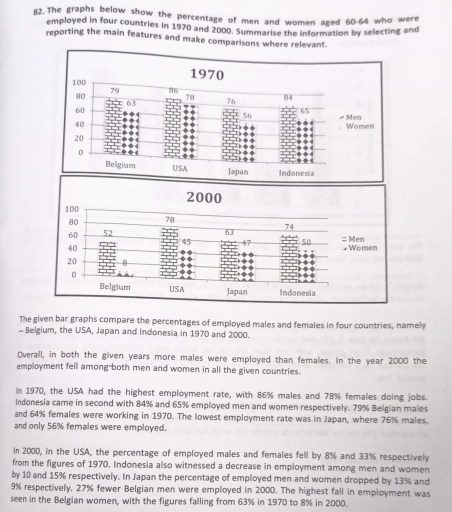
the given bar graphs compare the percentace of employed males and females in four countries, namely belgium, the usa, japan, and indonesia in 1970 and 2000

overall, in both the given years more males were employed than females. in the years 2000 the employment fell among both men and women in all the given countries.

in 970, the usa had the highest employment rate, with 86% males and 78% females doing jobs. indonesia came in second with 84% and 65% employement men and women respictively. 79% belgium males and 65% females were working in 197. the lowest employment rate was jepan, where 76% males and only 56% females were empoyed.

In 2000, in the USA, the percentage of employed males and females fell by 8% and 33% respectively from the figures of 1970. Indonesia also witnessed a decrease in employment among men and womenby 10 and 15% respectively. In Japan the percentage of employed men and women dropped by 13% and9% respectively. 27% fewer Belgian men were employed in 2000. The highest fall in employment wasseen in the Belgian women, with the figures falling from 63% in 1970 to 8% in 2000

Word Count: 192

Answers On The Same Topic:

The graphs below show the percentage of men and women aged 60-64 who were employed in four countries in 1970 and 2000. Summarise the information by selecting and reporting the main features and make comparisons where relevant.

The graphs compare the proportion of both genders aged between 60 and 64 who were hired in four developed countries among 1970 and 2000. Overall, it is noticeable that in both given years males were involved more in workforce rather than females, especially in Belgium women participation in job showed its lowest point compared with […]

The graphs below show the percentage of men and women aged 60-64 who were employed in four countries in 1970 and 2000. Summarise the information by selecting and reporting the main features and make comparisons where relevant.

The provided bar charts compare the proportion of employed males and females in four nations, namely- Belgium, the USA, Japan, and Indonesia in 1970 and 2000. After a detailed analysis bar charts, in 1970, the USA had the highest number of proportion employed ratio in males respectively. In contrast, lowest number of percentage women employed […]

See All

Other Topics:

IELTS Writing Task 1: You should spend about 20 minutes on this task. The graphs show figures relating to hours worked and stress levels amongst professionals in eight groups. Describe the information shown to a university or college lecturer. Write at least 150 words

The bar graph illustrate on hours worked and stress levels within 8 different types of professionals including writters, doctors, chefts, lectures, lawyers, movie producers, programmers, and businessmen. Overall, businessmen has the highest average number of hours worked per week resulting in total of 70 hours. Meanwhile, in contrast, the bar graph shows that lectures has […]

The pie charts below show global Internet users' favourite social media platform from 2011 to 2013.

The pie charts below show preferred social networking platforms between 2011 and 2013 Looking from an overall perspective,it is readily apparent that,Facebook is the most popular platform during the three years,with Twitter coming next.Whereas,Pinterest is less likely than other social networks. In 2011,Facebook has favourite app among users by 59% and next years it is […]

The chart below shows the amount of money (in pence) per week spent on fast foods in Britain in 1990. The graph shows the trends in consumption of fast foods. Write a report for a university lecturer describing the information shown below.

The chart illustrates the figure for money spent per week on fast food in Britain in 1990 and the consumption of three types of fast over a 20- year period. Overall, it is clear that people in high income group used most money on fast food, while those in the low-income group paid the least. […]

The pie charts illustrate total European's expenditure on commodities and services in 1957 and 2008.

The pie charts represent the percentage related to European’s expenses on commodities and services in 1957 and 2008. Overall, there were significant changes in the percentages; clothing, travel/ transport and entertainment decreased, while all the others grew. Firstly, clothing fell from 32% to 12%, it started as the most relevant expense and it became one […]

The chart below shows the percentages of school-aged girls and boys who were at secondary school in four regions of the world in 2000. The second chart shows the percentages of college-aged men and women in higher education in the same year.

The bar charts demonstrate the portion of school-aged males and females who were engaged in secondary education or higher education in four regions of the world in 2000. Overall, a higher percentage of the college-aged population attended secondary schools than colleges or universities. Europe was a leader in both categories of education, while Sub-Saharan Africa […]

The charts below give information on the ages of the populations of Yemen and Italy in 2000 and projections for 2050. Summarise the information by selecting and reporting the main features, and make comparisons where relevant. Write at least 150 words.

The supplied pie chart delineates how old the people in Yemen and Italy were in 2000, and also how old they probably will be in 2050. Honestly, these two countries look almost like opposites, which makes it kind of interesting to compare. It can be clearly seen that in Yemen back in 2000, half of […]

See All
We have detected unusual activity on your device.
Please verify your identity to continue.
Note: This verification step won't sign you in. If you have a premium account, please log in to access the service as usual.
Google/Gmail Verification
Or verify using Email/Code
We've sent a verification code to:
youremail@gmail.com (Not your email?)
Enter it below to complete the verification process.
Ensure your email address is correct, your inbox is not full, and you check your spam folder. If no email arrives, consider using an alternative email.
You will need a Premium plan to perform your action!
Note: If you already have a premium account, please log in to access our services as usual.

Plans & Pricing

Our mission is to make quality education accessible for everyone.
However, to keep our hardworking team running and this service alive, we genuinely need your support!
By opting for a premium plan, not only do you sustain us in achieving the mission, but you also unlock advanced features to enrich your learning experience.

Free

For learners who aren't pressed for time

What's included on Free
100+ Cambridge IELTS Tests
Instant IELTS Writing Task 1 & 2 Evaluation (2 times/month)
Instant IELTS Speaking Part 1, 2, & 3 Evaluation (2 times/month)
Instant IELTS Writing Task 1 & 2 Essay Generator (2 times/month)
500+ Dictation & Shadowing Exercises
100+ Pronunciation Exercises
Flashcards
Other Advanced Tools

Premium

For those serious about advancing their English proficiency, and for IELTS candidates aspiring to boost their band score by 1-2 points (especially in writing & speaking) in just 30 days or less

What's included on Premium
Save Your IELTS Test Progress & Analyze Mistakes By Question Type
Save Your Own Flashcard Sets & Use Them On Any Device
Unlock All Courses, IELTS Tests, Section & Part Practice
Unlimited AI Conversations
Unlimited AI Writing Enhancement Exercises
Unlimited IELTS Writing Task 1 & 2 Evaluation
Unlimited IELTS Speaking Part 1, 2, & 3 Evaluation
Checked Answers Will Not Be Published
Unlimited IELTS Writing Task 1 & 2 Essay Generator
Unlimited IELTS Speaking Part 1, 2, & 3 Sample Generator
Unlimited Usage Of Advanced Tools & AI Features
Priority Support within 24h (12-month plan only)

Due to the nature of our service and the provided free trials, payments are non-refundable.