🔥 Today Only: Save 30% on Premium — Offer Ends Soon! - Upgrade Now!
Multiple Graphs

Band 5+: The graphs below show the percentage of men and women aged 60-64 who were employed in four countries in 1970 and 2000. Summarise the information by selecting and reporting the main features and make comparisons where relevant.

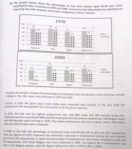
Image for topic: The graphs below show the percentage of men and women aged 60-64 who were employed in four countries in 1970 and 2000. Summarise the information by selecting and reporting the main features and make comparisons where relevant.
Our system will evaluate the answer based on this AI-generated description.
The image contains two bar graphs, comparing the percentage of employed men and women in four countries, namely Belgium, the USA, Japan, and Indonesia in 1970 and 2000. In 1970, the USA had the highest employment rate with 86% males and 78% females doing jobs. Indonesia came in second with 83% and 65% employed men and women respectively. In Japan, 76% males and 65% females were employed, and in Belgium, 78% males and 63% females were doing jobs. In 2000, the USA had the lowest employment rate with 78% males and 75% females employed. Meanwhile, Japan had 81% males and 62% females employed, Indonesia had 78% males and 59% females, and Belgium had 76% males and 63% females. Overall, the employment rate decreased for both men and women, with the USA seeing the most significant drop among men by 8% and among women by 33%. Indonesia witnessed a decrease in employment among men by 5% and among women by 6%. Japan saw a decrease of 5% among men and an increase of 3% among women. In Belgium, the employment rate among men dropped by 2% and among women by 27%.
Given the complexity of the image, the above description may not be entirely accurate.
Note: Both the topic and the answer were created by one of our users.

The provided bar charts compare the proportion of employed males and females in four nations, namely- Belgium, the USA, Japan, and Indonesia in 1970 and 2000.

After a detailed analysis bar charts, in 1970, the USA had the highest number of proportion employed ratio in males respectively. In contrast, lowest number of percentage women employed ratio nation by Japan. In addition, the USA had a both males and females remain constant working ratio in 1970. Furthermore, in 2000, Belgium had a lowest working ration of women compare to 1970.

Looking at the more detail from bar charts, the maximum percentage employed men from 1970 to 86% in the USA and the minimum employed ratio had 56% women in Japan. Furthermore, in 2000, 78% men working ration in the USA. The least proportion working ratio women in 8% from Belgium.

The sum up, both years 1970 and 2000 in four nations women working ratio had lowest rather than men.

Word Count: 158

Answers On The Same Topic:

The graphs below show the percentage of men and women aged 60-64 who were employed in four countries in 1970 and 2000. Summarise the information by selecting and reporting the main features and make comparisons where relevant.

the given bar graphs compare the percentace of employed males and females in four countries, namely belgium, the usa, japan, and indonesia in 1970 and 2000 overall, in both the given years more males were employed than females. in the years 2000 the employment fell among both men and women in all the given countries. […]

The graphs below show the percentage of men and women aged 60-64 who were employed in four countries in 1970 and 2000. Summarise the information by selecting and reporting the main features and make comparisons where relevant.

The graphs compare the proportion of both genders aged between 60 and 64 who were hired in four developed countries among 1970 and 2000. Overall, it is noticeable that in both given years males were involved more in workforce rather than females, especially in Belgium women participation in job showed its lowest point compared with […]

See All

Other Topics:

The table and chart provide a breakdown of the total expenditure and the average of money spent by students per week while studying abroad in four countries

The given table and the chart illustrate the data of overall expenditure and the average spendings by schoolers in a week during the studies abroad from 4 countries. Overall, the maximum figure of total expenditure among countries is in country A, while spendings on living cost shows the highest amount of money spent on by […]

Writing Task 1 You should spend about 20 minutes on this task. The charts below show the protein and calorie intakes of people in different parts of the world.Summarise the information by selecting and reporting the main features, and make comparisons where relevant. You should write at least 150 words.

The following bar graph illustrates the protein and calorie intakes of individuals in various parts of countries india, east africa, latin america and north america of the world. Overall, the both other protein and animals protein are increased respectevily. The heighest number of protein in north america. whereas the lowest in india. consiquently, east africa […]

the Pie Charts illustrate the percentage distribution of specific commodities across 4 countries and it's consumption in different regions of the world.write an essay summarising the information by selecting and reporting the main features and make comparisons higher relevant

We can see that the circle chart demonstrates the principal production nations and the world’s leading consumers. Overall, South Africa is the production leader around the world with 44% in contrast with Europe leading by 41% consumer market. We can assume that most of the consumers of South Africa products are Europeans and the rest […]

The chart below shows the changes in ownership of electrical appliances and amount of time spend doing homework in households in one country between 1920 and 2019 in one country.

The diagramms illustrate the percentage of households with electrical appliances and the number of hours of housework per week between 1920 and 2019 in a particular country. Overall, the percentage of ownership of electrical appliances increased, while the amount of time that people spend on cleaning decreased throughout the given period. In the beginning, the […]

Pie charts below show the average household expenditures between 2000 and 2025

The pie chart illustrates the percentage of houshold expenses in Japan and Malaysia in 2010. Overall, other goods and services were the most popular means of expenditures in Japan, while the housing expenses were the most costable in Malaysia in the given period of time. Whereas the proportion of health care spending was the least […]

The charts show the proportion of different modes of transportation used by city residents in 2010 and 2020. Summarise the information by selecting and reporting the main features, and make comparisons where relevant.

The two pie charts compare the proportion of different vehicle used by citizens in 2010 with that in 2020 Overall, car accounted for the largest percentage of the chart in both years, whereas others category remained the smallest figure. Meanwhile, public transport had increasingly been preferred by citizens over time. In terms of car and […]

See All
We have detected unusual activity on your device.
Please verify your identity to continue.
Note: This verification step won't sign you in. If you have a premium account, please log in to access the service as usual.
Google/Gmail Verification
Or verify using Email/Code
We've sent a verification code to:
youremail@gmail.com (Not your email?)
Enter it below to complete the verification process.
Ensure your email address is correct, your inbox is not full, and you check your spam folder. If no email arrives, consider using an alternative email.
You will need a Premium plan to perform your action!
Note: If you already have a premium account, please log in to access our services as usual.

Plans & Pricing

Our mission is to make quality education accessible for everyone.
However, to keep our hardworking team running and this service alive, we genuinely need your support!
By opting for a premium plan, not only do you sustain us in achieving the mission, but you also unlock advanced features to enrich your learning experience.

Free

For learners who aren't pressed for time

What's included on Free
100+ Cambridge IELTS Tests
Instant IELTS Writing Task 1 & 2 Evaluation (2 times/month)
Instant IELTS Speaking Part 1, 2, & 3 Evaluation (2 times/month)
Instant IELTS Writing Task 1 & 2 Essay Generator (2 times/month)
500+ Dictation & Shadowing Exercises
100+ Pronunciation Exercises
Flashcards
Other Advanced Tools

Premium

For those serious about advancing their English proficiency, and for IELTS candidates aspiring to boost their band score by 1-2 points (especially in writing & speaking) in just 30 days or less

What's included on Premium
Save Your IELTS Test Progress & Analyze Mistakes By Question Type
Save Your Own Flashcard Sets & Use Them On Any Device
Unlock All Courses, IELTS Tests, Section & Part Practice
Unlimited AI Conversations
Unlimited AI Writing Enhancement Exercises
Unlimited IELTS Writing Task 1 & 2 Evaluation
Unlimited IELTS Speaking Part 1, 2, & 3 Evaluation
Checked Answers Will Not Be Published
Unlimited IELTS Writing Task 1 & 2 Essay Generator
Unlimited IELTS Speaking Part 1, 2, & 3 Sample Generator
Unlimited Usage Of Advanced Tools & AI Features
Priority Support within 24h (12-month plan only)

Due to the nature of our service and the provided free trials, payments are non-refundable.