🔥 Today Only: Save 30% on Premium — Offer Ends Soon! - Upgrade Now!
Line Graph

Band 7+: the line chart shows the per capita meat consumption in four different countries (USA, UK, India, Brazil) from1985 to 2019

Image for topic: the line chart shows the per capita meat consumption in four different countries (USA, UK, India, Brazil) from1985 to 2019
Our system will evaluate the answer based on this AI-generated description.
The image shows a line graph with four lines, each representing a different country. The x-axis shows years from 1985 to 2019 at five-year intervals, and the y-axis shows numerical values from 0 to 140 at 20-unit intervals. The line for the USA starts at approximately 40 in 1985 and ends at approximately 120 in 2019, showing a steady increase over time. The UK line starts at approximately 35 in 1985, reaching a value of just over 100 in 2019, also showing a steady increase. Brazil's line begins at approximately 15 in 1985 and ends at roughly 30 in 2019, indicating a slower and less significant growth. India's line starts at approximately 10 in 1985 and ends at just under 40 in 2019, showing a steady but modest increase. The lines do not display any sharp peaks or drops and maintain consistent trajectories throughout the years. The data points on each line are marked by dots.
Given the complexity of the image, the above description may not be entirely accurate.
Note: Both the topic and the answer were created by one of our users.

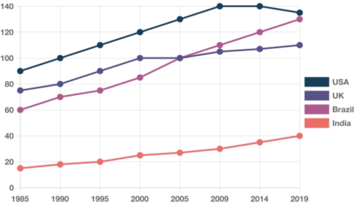
The line graph presents the data on the average amount of meat consumed in 4

seperate nations: USA, UK, Brazil and India between 1985 and 2019.

Overall, there existed an upward pattern in meat consumption of all regions over the whole period. While the USA was the major consumer, Indians ate much less meat than 3 other countries.

Starting at the largest statistic with approximately 90 in 1985, the meat consumption of the USA continued to increase significantly to 140 in 2009. However, the figure decreased slightly in the next century, ending up at roughly 135. Meanwhile, Indians consumed a much smaller amount of meat. Though witnessing a growth, the meat consumption of the country was just under 50 over the period.

While Brazil was the third cosumer in 1985 (60) and the UK consumed a larger meat amount at nearly 80, the meat consumption of Brazil experienced a much more marginal growth. The meat consumption of Brazil climbed to 100 and took over the UK after 20 years, followed by a similar upward pattern ending at around 130, which was close to the UK and 110, respectively.

Word Count: 188

Answers On The Same Topic:

the line chart shows the per capita meat consumption in four different countries (USA, UK, India, Brazil) from1985 to 2019

The line chart delineates the changes in per capita meat consumption across four countries (the USA, the UK, Brazil, and India) over a 34-year period starting from 1985, at five-year intervals. Overall, the period was characterized by divergent trends. While the USA and the UK experienced relatively steady growth, Brazil witnessed a much sharper rise, […]

the line chart shows the per capita meat consumption in four different countries (USA, UK, India, Brazil) from1985 to 2019

The line graph provides a breakdown of the changes in the per capita meat consumption across four categories in four different countries (USA, UK, India, Brazil) spanning 34-year period starting from 1985, at 5-year intervals. Overall, it is manifest that the meat consumption rate in all surveyed categories followed an upward trajectory. Notably, USA maintained […]

the line chart shows the per capita meat consumption in four different countries (USA, UK, India, Brazil) from1985 to 2019

The line chart delineates the changes in the per capita meat consumption across four categories spanning a 34-year period starting from 1985,at 1985-year intervals. Overall, it is manifest that average meat consumption per person in all surveyed categories followed an upward trajectory. Notably, the USA maintains its status as the leader, while India was the […]

the line chart shows the per capita meat consumption in four different countries (USA, UK, India, Brazil) from1985 to 2019

The line chart dlineates the changes in meat consumption across 4 categories consumption in four different countries (USA, UK, India, Brazil) spanning a 34- year period starting from 1985, at 5- year intervals. Overall, it is manifest that the per capita in all surveyed categoris followed an upward trajectory. Notably. Usa maintained its status as […]

the line chart shows the per capita meat consumption in four different countries (USA, UK, India, Brazil) from1985 to 2019

The given line graph illustrates the amount of meat consumed per capita across four certain nations, namely the USA, the UK, India, and Brazil between 1985 and 2019. Overview, throughout the 34-year period, all the four countries witnessed an upward trend in the per capita meat consumption. Notably, meat consumption in the USA consistently remained […]

See All

Other Topics:

The graph below shows the total revenue of three pizza places in Vietnam. The figures were taken in 2017.

The line graph provides the data about the total income of three well-known pizzerias in Vietnam in 2017. All the money is in millions of dollars. Overall, it is evident that there are slight upward trends for both Domino’s Pizza and The Pizza Company, whereas the earnings of Pizza Hut witnessed a notable decline over […]

The graph below shows the number of undergraduate students in thousands in four counties between 1995 and 2015.

The given line graph presents the quantity of undergraduate students in certain four countries during the period from 1995 to 2015. Overall, from the beginning of the period it is observed that the most significant number of undergraduates was in Sweden, whereas the lowest number of students studied at universities in Greece. But by the […]

The line graph shows the number of overseas tourists (in million) who visited to France, Spain and Japan between 1990 and 2020.

The line graph illustrates the number of foreign travellers who went to three different countries – France, Spain, and Japan – between 1990 and 2020. Overall, although attendance in both France and Spain showed an upward trend, that for Japan tourists experienced a downward trend. Notably, France remained by far the largest group throughout the […]

The graph below gives information about then number of jobs in four sectors of the economy in the US between 1960 and 2020.

The bar chart illustrates info about amought of the economy jobs in four sectors in the US from 1960 to 2020 Overall, It’s clear that Retail and Healthcare had the highest number of jobs. While Manufacturing came next and agriculture showed the lowest significative. Retail and Healthcare showed the rapid increase over the given period, […]

please check this writing task 1 example and give appropriate feedbacks

The line graph illustrates information one the numbers of members for various activities at one social centre in Melbourne Australia throughout period 2000 and 2020. As an overall trend,it can be seen that film club presents highest number,and martial arts shows flactuation line.Amateur dramatics declined ones in a while in addition table tennis increased after […]

The graph below shows the price of different kinds of bread, in dollars, from 2001 to 2005. Summarise the information by selecting and reporting the main features and make comparisons where relevant.

The graph below depicts the price of different kinds of bread in dollars between 2001 and 2005. Overall, prices of the White and Brown bread are higher in comparison with the Wholergian and Rye. Brown, White and Rye breads started at the same price, which was equal 0,6 dollars, while Wholergian had a higher start […]

See All
We have detected unusual activity on your device.
Please verify your identity to continue.
Note: This verification step won't sign you in. If you have a premium account, please log in to access the service as usual.
Google/Gmail Verification
Or verify using Email/Code
We've sent a verification code to:
youremail@gmail.com (Not your email?)
Enter it below to complete the verification process.
Ensure your email address is correct, your inbox is not full, and you check your spam folder. If no email arrives, consider using an alternative email.
You will need a Premium plan to perform your action!
Note: If you already have a premium account, please log in to access our services as usual.

Plans & Pricing

Our mission is to make quality education accessible for everyone.
However, to keep our hardworking team running and this service alive, we genuinely need your support!
By opting for a premium plan, not only do you sustain us in achieving the mission, but you also unlock advanced features to enrich your learning experience.

Free

For learners who aren't pressed for time

What's included on Free
100+ Cambridge IELTS Tests
Instant IELTS Writing Task 1 & 2 Evaluation (2 times/month)
Instant IELTS Speaking Part 1, 2, & 3 Evaluation (5 times/month)
Instant IELTS Writing Task 1 & 2 Essay Generator (2 times/month)
500+ Dictation & Shadowing Exercises
100+ Pronunciation Exercises
Flashcards
Other Advanced Tools

Premium

For those serious about advancing their English proficiency, and for IELTS candidates aspiring to boost their band score by 1-2 points (especially in writing & speaking) in just 30 days or less

What's included on Premium
Save Your IELTS Test Progress
Unlock All Courses & IELTS Tests
Unlimited AI Conversations
Unlimited AI Writing Enhancement Exercises
Unlimited IELTS Writing Task 1 & 2 Evaluation
Unlimited IELTS Speaking Part 1, 2, & 3 Evaluation
Checked Answers Will Not Be Published
Unlimited IELTS Writing Task 1 & 2 Essay Generator
Unlimited IELTS Speaking Part 1, 2, & 3 Sample Generator
Unlimited Usage Of Advanced Tools
Priority Support within 24h (12-month plan only)

Due to the nature of our service and the provided free trials, payments are non-refundable.
Nếu bạn là người Việt Nam và không có hoặc không muốn trả bằng credit/debit cards, bạn có thể thanh toán bằng phương thức chuyển khoản:


Chọn gói:
419,000₫ 277,000 ₫ cho gói 1 tháng (chỉ 9,233₫/ngày)
1,239,000₫ 597,000 ₫ cho gói 3 tháng (chỉ 6,633₫/ngày)
2,469,000₫ 1,027,000 ₫ cho gói 6 tháng (chỉ 5,706₫/ngày)
4,929,000₫ 1,417,000 ₫ cho gói 12 tháng (chỉ 3,936₫/ngày)


Sau khi chuyển khoản, vui lòng đợi trình duyệt tự động điều hướng bạn trở lại Engnovate và bạn sẽ ngay lập tức nhận được mã kích hoạt tài khoản premium.
Nếu có lỗi xảy ra, bạn có thể liên hệ với team thông qua một trong các phương thức: email đến helloengnovate@gmail.com hoặc nhắn tin qua facebook.com/engnovate.
Vì toàn bộ công cụ trên website đều có thể sử dụng thử miễn phí, Engnovate không hỗ trợ hoàn tiền.