🔥 Today Only: Save 30% on Premium — Offer Ends Soon! - Upgrade Now!
Line Graph

Band 8+: The line graph below illustrates the proportion of electricity generated from renewable sources in five different countries (USA, Germany, China, Brazil, and India) between 2000 and 2020. Summarize the information by selecting and reporting the main features, and make comparisons where relevant.

Image for topic: The line graph below illustrates the proportion of electricity generated from renewable sources in five different countries (USA, Germany, China, Brazil, and India) between 2000 and 2020. Summarize the information by selecting and reporting the main features, and make comparisons where relevant.
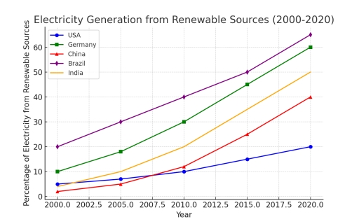
Our system will evaluate the answer based on this AI-generated description.
The image depicts a line graph illustrating electricity generation from renewable sources from 2000 to 2020 for USA, Germany, China, Brazil, and India. For USA, percentages are 6% (2000), approximately 6.2% (2002.5), 6.4% (2005), approximately 7% (2007.5), 7.5% (2010), 8% (2012.5), approximately 8.5% (2015), 9% (2017.5), and 9% (2020); for Germany, percentages are 5% (2000), approximately 6.5% (2002.5), 9% (2005), 11% (2007.5), 16% (2010), 21% (2012.5), 30% (2015), 33% (2017.5), and 39% (2020); for China, percentages are approximately 15% (2000), 16.5% (2002.5), 17% (2005), 18% (2007.5), 19% (2010), 20% (2012.5), 23% (2015), approximately 25.5% (2017.5), and 27% (2020); for Brazil, percentages are 80% (2000), approximately 80% (2002.5), 80% (2005), 81% (2007.5), 82% (2010), 83% (2012.5), 81% (2015), approximately 81% (2017.5), and 82% (2020); for India, percentages are 9% (2000), approximately 9.3% (2002.5), 10% (2005), 11% (2007.5), 13% (2010), approximately 14.5% (2012.5), approximately 16.5% (2015), 18% (2017.5), and 22% (2020).
Given the complexity of the image, the above description may not be entirely accurate.
Note: Both the topic and the answer were created by one of our users.

The provided line graph delineates the proportion of electricity produced from renewable resources in five specific nations over a six-year period, commencing in 2020.

Overall, a unidirectional upward trend was observed across all surveyed countries, reflecting a global shift toward sustainable energy. Germany consistently emerged as the frontrunner, while Brazil, despite starting at a lower baseline, exhibited the most pronounced acceleration in its green energy transition by the end of the period.

Regarding the leading nations, Germany began the decade with approximately 40% of its power sourced from renewables, a figure that gradually climbed to reach a peak of 55% in 2025. China followed a similar trajectory, though it started at a lower 30%. However, China’s growth was more exponential, eventually surpassing 45% by the final year, narrowing the gap with Germany.

In contrast, the United States and India showed more modest gains. Both nations hovered around the 20% mark in 2020. While the US saw a marginal increase to 28% by 2025, India’s growth was more sporadic, ending the period just shy of 25%. Brazil, meanwhile, witnessed a significant surge starting in 2023, jumping from 15% to 35% in just two years, thereby overtaking both the US and India in its renewable output.

Word Count: 204

Answers On The Same Topic:

The line graph below illustrates the proportion of electricity generated from renewable sources in five different countries (USA, Germany, China, Brazil, and India) between 2000 and 2020. Summarize the information by selecting and reporting the main features, and make comparisons where relevant.

The graph provides information about amplitude of chages in claiming electricity from recycled things from five countries on the 21 years. Overall, All countries in picture had a growth in making electricity, obviously. Four countries such as USA, Germany, India and China had a similar trajectory of increase. However, the best in this sphere is […]

See All

Other Topics:

The line graph shows the number of first marriages, remarriages, and all marriages in thousands from 1951 to 2001.

The line graph illustrates the number of first marriages, remarriages and total marriages, measured in thousands, between 1951 and 2001. Overall, all three figures increased steadily until 1981 before declining afterwards. First marriages consistently made up the largest proportion, whereas remarriages remained the least common throughout the period. In 1951, there were about 450 thousand […]

The chart below shows the price in Euros of 800 grams of four types of bread in one European country from 2001 to 2006

The line graph shows the price fluctuations of four different types of bread – wholegrain bread, brown bread, white bread, and rye bread – calculated per 800-gram serving in a European country from 2001 to 2005. Overall, the prices of brown bread and white bread tended to increase significantly, while wholegrain bread experienced considerable volatility. […]

Summarize the formation by selecting and reporting the main feature and make comparisons where relevant.

The provided line graph compares a production rate of various fuels in UK between 1981 and 2000 Overall, what stands out is that the amount of production Petroleum and Natural gas are increased through out given perod. While reverse could be said about Coal. Of paricular note is that petroleum remained the most produced fuel […]

The line graph shows the average monthly temperature in 3 cities between January and December summarise information by selecting and reporting the main features and make comparison where relevant

The provided linear chart illustrates the temperature of Dubai, London and New York during all months. Moving towards the detail of chart, Dubai temperature is highest from January to December, which accounts as 20°C in January. Afterwards the temperature surges rapidly and is on its peak in July at 38°C. However, after this period significant […]

: The graph below gives information about one company's unit sales of 5 different types of jam from 2009 to 2014

The provided line graph illustrates one company’s unit sales of 5 several kinds of jam between 2009 and 2014. Overall, it is clear that albeit to degrees, all figures experienced an upward trend except for plum trade. Turning to the details, starting at just under 3 unit in 2009, sale of strawberry increased steadily to […]

The graph show the different types of fast food eaten by British teenagers over a 35-year period. Summarise the information by selecting and reporting the main features, and maike comparions where relevant.

The line graph illustrates information about the changes in the different types of fast food, namely fish and chips, hamburgers, and pizza, eaten by British teenagers over the period from 1980 to 2015. Overall, it is immediately apparent that pizza experienced the most significant growth, whereas fish and chips showed a noticeable decline throughout the […]

See All
We have detected unusual activity on your device.
Please verify your identity to continue.
Note: This verification step won't sign you in. If you have a premium account, please log in to access the service as usual.
Google/Gmail Verification
Or verify using Email/Code
We've sent a verification code to:
youremail@gmail.com (Not your email?)
Enter it below to complete the verification process.
Ensure your email address is correct, your inbox is not full, and you check your spam folder. If no email arrives, consider using an alternative email.
You will need a Premium plan to perform your action!
Note: If you already have a premium account, please log in to access our services as usual.

Plans & Pricing

Our mission is to make quality education accessible for everyone.
However, to keep our hardworking team running and this service alive, we genuinely need your support!
By opting for a premium plan, not only do you sustain us in achieving the mission, but you also unlock advanced features to enrich your learning experience.

Free

For learners who aren't pressed for time

What's included on Free
100+ Cambridge IELTS Tests
Instant IELTS Writing Task 1 & 2 Evaluation (2 times/month)
Instant IELTS Speaking Part 1, 2, & 3 Evaluation (5 times/month)
Instant IELTS Writing Task 1 & 2 Essay Generator (2 times/month)
500+ Dictation & Shadowing Exercises
100+ Pronunciation Exercises
Flashcards
Other Advanced Tools

Premium

For those serious about advancing their English proficiency, and for IELTS candidates aspiring to boost their band score by 1-2 points (especially in writing & speaking) in just 30 days or less

What's included on Premium
Save Your IELTS Test Progress
Unlock All Courses & IELTS Tests
Unlimited AI Conversations
Unlimited AI Writing Enhancement Exercises
Unlimited IELTS Writing Task 1 & 2 Evaluation
Unlimited IELTS Speaking Part 1, 2, & 3 Evaluation
Checked Answers Will Not Be Published
Unlimited IELTS Writing Task 1 & 2 Essay Generator
Unlimited IELTS Speaking Part 1, 2, & 3 Sample Generator
Unlimited Usage Of Advanced Tools
Priority Support within 24h (12-month plan only)

Due to the nature of our service and the provided free trials, payments are non-refundable.
Nếu bạn là người Việt Nam và không có hoặc không muốn trả bằng credit/debit cards, bạn có thể thanh toán bằng phương thức chuyển khoản:


Chọn gói:
419,000₫ 277,000 ₫ cho gói 1 tháng (chỉ 9,233₫/ngày)
1,239,000₫ 597,000 ₫ cho gói 3 tháng (chỉ 6,633₫/ngày)
2,469,000₫ 1,027,000 ₫ cho gói 6 tháng (chỉ 5,706₫/ngày)
4,929,000₫ 1,417,000 ₫ cho gói 12 tháng (chỉ 3,936₫/ngày)


Sau khi chuyển khoản, vui lòng đợi trình duyệt tự động điều hướng bạn trở lại Engnovate và bạn sẽ ngay lập tức nhận được mã kích hoạt tài khoản premium.
Nếu có lỗi xảy ra, bạn có thể liên hệ với team thông qua một trong các phương thức: email đến helloengnovate@gmail.com hoặc nhắn tin qua facebook.com/engnovate.
Vì toàn bộ công cụ trên website đều có thể sử dụng thử miễn phí, Engnovate không hỗ trợ hoàn tiền.