24 Hours Only: Get 39% OFF on Our Premium Plan - Check Out Now!
Line Graph

Band 6+: The line graph below shows demographic trends in Scotland. Summarise the information by selecting and reporting the main features.

Image for topic: The line graph below shows demographic trends in Scotland. Summarise the information by selecting and reporting the main features.
Our system will evaluate the answer based on this AI-generated description.
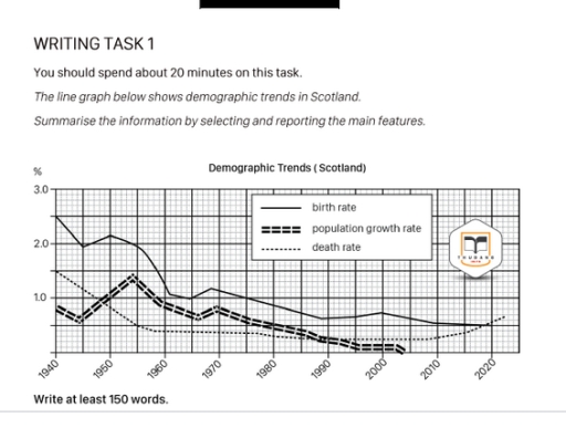
The image shows a line graph detailing demographic trends in Scotland from 1940 to 2020 with three indicators: birth rate, population growth rate, and death rate, measured in percentages. In 1940, birth rate is approximately 2.7%, population growth rate is around 0.5%, and death rate is near 1.5%. In 1950, birth rate peaks at 3%, population growth rate slightly over 1%, and death rate approximately 1%. By 1960, birth rate is around 2.4%, population growth rate about 0.8%, and death rate around 0.9%. In 1970, birth rate drops to about 1.9%, population growth rate to approximately 0.4%, and death rate at 0.8%. By 1980, birth rate decreases to around 1.6%, population growth rate slightly over 0%, and death rate under 0.7%. In 1990, birth rate is about 1.5%, population growth rate approaches 0%, and death rate about 0.6%. In 2000, birth rate is roughly 1.4%, population growth rate slightly negative, and death rate about 0.55%. By 2010, birth rate is near 1.3%, population growth rate slightly above 0%, and death rate under 0.5%. In 2020, birth rate is around 1.3%, population growth rate approximately 0.2%, and death rate just above 0.4%.
Given the complexity of the image, the above description may not be entirely accurate.
Note: Both the topic and the answer were created by one of our users.

The given chart illustrates demographic trends such as birth rate, population growth rate and death rate in Scotland over the eighty-year period between 1940 and 2020.

Overall, the figures share the same downward trend with some fluctuation. It is depicted that the birth rate has the highest percentage of all three throughout the eighty-year period.

In the very beginning, in 1940, the birth rate was 2,5% and saw a significant fall to 1% in 1965. At the same time, population growth rate decreased from a bit less that one percent in 1940 to almost a half percent in 1945, then it peaked at around 1,5% in 1955. The death rate, however, had 1,5 percent as the starting point in 1940 and then experienced a decrease to less than half a percent in 1960.

After that, the birth rate line has a steady decreasing trend with the minimum of 0.5% in 2020. The population growth rate’s line also decreases and even reaches 0% in the early 2000-s. Meanwhile death rate levels off at the 0.5% and gained slight upward trend in 2010 intersecting birth rate’s line at 0.5% in 2020.

Word Count: 189

Answers On The Same Topic:

The line graph below shows demographic trends in Scotland. Summarise the information by selecting and reporting the main features.

The graph illustrates demographic patterns of Scotland from 1940 to 2020. Overall, the birth pace was the highest for most of the time while the death figure and the population rate were changing ranks. However, the mortality rate was unique in that it experienced a gradual regrowth after declining. The pace of population expansion remained […]

The line graph below shows demographic trends in Scotland. Summarise the information by selecting and reporting the main features.

The line graph illustrates the changes in Demographic trends in Scotland over the period from 1940 to 2020. Overall, it is clear that birth rate, while death rate underwent a comparately significant change. Overall, the data shows a clear downward trend across the period. Notably, death rate experienced a steep decline, whereas birth rate followed […]

The line graph below shows demographic trends in Scotland. Summarise the information by selecting and reporting the main features.

The given chart illustrates such demographic trends as birth rate, population growth rate and death rate in Scotland in the eighty-year period between 1940 and 2020. Overall, the figures share the same downward trend with some fluctuation. It is depicted that birth rate has the biggest percent of all three throughout the eighty-year period of […]

The line graph below shows demographic trends in Scotland. Summarise the information by selecting and reporting the main features.

The demonstrated picture gives information about demograghic changes in Scotland during many years. As can be seen at this line graph there is only decreasing rates on various demographic sphere: birth rate, population growth and death rate. The most figure that it was is a birth rate, which extremely falls during many years. The second […]

See All

Other Topics:

The chart below shows the borrowing preferences of people, by genre, in a rural bookshop. Summarize the information by selecting and reporting the main features, and make comparisons where relevant.

The graph shows information about the borrowing advantage of people, by genre, in a country-side bookstore from 1980 to 2045. Overall, what stands out from the graph is that there were considerable upward trends in the taking a loan preferences of textbooks and workbooks, while the taking of biographies and mystery saw a considerable fall […]

The chart below shows the percentage of households in different income groups that owned a car in 2010 and 2020 in a European country. Summarize the information by selecting and reporting the main features, and make comparisons where relevant. Write at least 150 words.

The bar chart illustrates the amount of households in different income groups that owned a car in 2010 and 2020 in a European country. From an overall perspective, it is evident that car owners in 2020 accounted for the largest proportion, whereas car owners in 2010 made up the smallest share. Upon initial observation, In […]

The graph below gives information on the number of participants for different activities at one social center in Melbourne, Australia, for the period 2000 to 2020. Summarize the information by selecting and reporting the main features and making comparisons where relevant.

The line graph illustrates information on the number of players for various activities, including Film Club, Martial Arts, Amateur Dramatics, Table Tennis, and Musical Performances, at a particular social center in Melbourne, Australia, over a 20-year period from 2000 to 2020. Overall, a significant number of players attended the Film Club throughout the period. While […]

You should spend about 20 minutes on this task. The graph below shows the number of tourists visiting a particular Caribbean island between 2010 and 2017. Summarise the information by selecting and reporting the main features, and make comparisons where relevant.

The given line graph illustrates the number of tourists visiting a specific Caribbean island between 2010 and 2017, categorising them into 3 distinct groups.Overall, it is clear that there was a slight increase in the total number of visitors, while visitors who were staying on the cruise ship and on the island both experienced a […]

The line chart compares the percentage of people in three countries who used the Internet between 1999 and 2009

The line graph compares the amount of people using internet in three major countries – USA, Canada and Mexico – froom 1999 to 2009. Overall, what stands out from the graph is that there were considerable upward trend in both countries: USA and Canada, while Mexico represented modest growth of individuals utilising internet over the […]

Summarise the infomaion by selecting and reporting the main features, and make comparisons where relevant

The graph shows the comparison of birth rates between china and USA from the year 1920 to 2000. Overall, both countries experienced a considerable fluctuations during the first half century , followed by a general downward trend there after. Notably, china showed a dramatic variation, including a sharp peak in 1950, while USA showed a […]

See All
We have detected unusual activity on your device.
Please verify your identity to continue.
Note: This verification step won't sign you in. If you have a premium account, please log in to access the service as usual.
Google/Gmail Verification
Or verify using Email/Code
We've sent a verification code to:
youremail@gmail.com (Not your email?)
Enter it below to complete the verification process.
Ensure your email address is correct, your inbox is not full, and you check your spam folder. If no email arrives, consider using an alternative email.
You will need a Premium plan to perform your action!
Note: If you already have a premium account, please log in to access our services as usual.

Plans & Pricing

Our mission is to make quality education accessible and free for everyone.
However, to keep our hardworking team running and this service alive, we genuinely need your support!
By opting for a premium plan, not only do you sustain us in achieving the mission, but you also unlock advanced features to enrich your learning experience.

Free

For learners who aren't pressed for time

What's included on Free
1000+ IELTS Tests & Samples
Instant IELTS Writing Task 1 & 2 Evaluation (2 times/month)
Instant IELTS Speaking Part 1, 2, & 3 Evaluation (5 times/month)
Instant IELTS Writing Task 1 & 2 Essay Generator (2 times/month)
500+ Dictation & Shadowing Exercises
100+ Pronunciation Exercises
Flashcards
Other Advanced Tools

Premium

For those serious about advancing their English proficiency, and for IELTS candidates aspiring to boost their band score by 1-2 points (especially in writing & speaking) in just 30 days or less

What's included on Premium
Save Your IELTS Test Progress
Unlock All Courses & Content
Unlimited AI Conversations
Unlimited AI Writing Enhancement Exercises
Unlimited IELTS Writing Task 1 & 2 Evaluation
Unlimited IELTS Speaking Part 1, 2, & 3 Evaluation
Checked Answers Will Not Be Published
Unlimited IELTS Writing Task 1 & 2 Essay Generator
Unlimited IELTS Speaking Part 1, 2, & 3 Sample Generator
Unlimited Usage Of Advanced Tools

Due to the nature of our service and the provided free trials, payments are non-refundable.
Nếu bạn là người Việt Nam và không có hoặc không muốn trả bằng credit/debit cards, bạn có thể thanh toán bằng phương thức chuyển khoản:


Chọn gói:
279,000₫ 157,000 ₫ cho gói 1 tháng (chỉ 5,233₫/ngày)
819,000₫ 397,000 ₫ cho gói 3 tháng (chỉ 4,411₫/ngày)
1,649,000₫ 667,000 ₫ cho gói 6 tháng (chỉ 3,706₫/ngày)
3,299,000₫ 857,000 ₫ cho gói 12 tháng (chỉ 2,381₫/ngày)


Sau khi chuyển khoản, vui lòng đợi trình duyệt tự động điều hướng bạn trở lại Engnovate và bạn sẽ ngay lập tức nhận được mã kích hoạt tài khoản premium.
Nếu có lỗi xảy ra, bạn có thể liên hệ với team thông qua một trong các phương thức: email đến helloengnovate@gmail.com hoặc nhắn tin qua facebook.com/engnovate.
Vì toàn bộ công cụ trên website đều có thể sử dụng thử miễn phí, Engnovate không hỗ trợ hoàn tiền.