🔥 Today Only: Save 30% on Premium — Offer Ends Soon! - Upgrade Now!
Line Graph

Band 4+: The line graph below shows demographic trends in Scotland. Summarise the information by selecting and reporting the main features.

Image for topic: The line graph below shows demographic trends in Scotland. Summarise the information by selecting and reporting the main features.
Our system will evaluate the answer based on this AI-generated description.
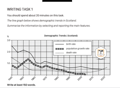
The image shows a line graph detailing demographic trends in Scotland from 1940 to 2020 with three indicators: birth rate, population growth rate, and death rate, measured in percentages. In 1940, birth rate is approximately 2.7%, population growth rate is around 0.5%, and death rate is near 1.5%. In 1950, birth rate peaks at 3%, population growth rate slightly over 1%, and death rate approximately 1%. By 1960, birth rate is around 2.4%, population growth rate about 0.8%, and death rate around 0.9%. In 1970, birth rate drops to about 1.9%, population growth rate to approximately 0.4%, and death rate at 0.8%. By 1980, birth rate decreases to around 1.6%, population growth rate slightly over 0%, and death rate under 0.7%. In 1990, birth rate is about 1.5%, population growth rate approaches 0%, and death rate about 0.6%. In 2000, birth rate is roughly 1.4%, population growth rate slightly negative, and death rate about 0.55%. By 2010, birth rate is near 1.3%, population growth rate slightly above 0%, and death rate under 0.5%. In 2020, birth rate is around 1.3%, population growth rate approximately 0.2%, and death rate just above 0.4%.
Given the complexity of the image, the above description may not be entirely accurate.
Note: Both the topic and the answer were created by one of our users.

The demonstrated picture gives information about demograghic changes in Scotland during many years.

As can be seen at this line graph there is only decreasing rates on various demographic sphere: birth rate, population growth and death rate. The most figure that it was is a birth rate, which extremely falls during many years. The second line, which had some fluctuated trends is a population growth rate, but it also falls close to the end of analys. Therefore, the last death rate had an extremely deacrease on the start, had been stable during the half of this graph. However, the figures of death rate become to increasing the last years.

The population growth rate has the most amont of fluctuations between from 0% to the 1.5% during from 1940 to the approximately 2005. The most figure (1,5%) that it was can be seen on the 1955. In contrast, the least amount of population growth was in 2000, and then become to falls more and more.

Word Count: 164

Answers On The Same Topic:

The line graph below shows demographic trends in Scotland. Summarise the information by selecting and reporting the main features.

The graph illustrates demographic patterns of Scotland from 1940 to 2020. Overall, the birth pace was the highest for most of the time while the death figure and the population rate were changing ranks. However, the mortality rate was unique in that it experienced a gradual regrowth after declining. The pace of population expansion remained […]

The line graph below shows demographic trends in Scotland. Summarise the information by selecting and reporting the main features.

The line graph illustrates the changes in Demographic trends in Scotland over the period from 1940 to 2020. Overall, it is clear that birth rate, while death rate underwent a comparately significant change. Overall, the data shows a clear downward trend across the period. Notably, death rate experienced a steep decline, whereas birth rate followed […]

The line graph below shows demographic trends in Scotland. Summarise the information by selecting and reporting the main features.

The given chart illustrates demographic trends such as birth rate, population growth rate and death rate in Scotland over the eighty-year period between 1940 and 2020. Overall, the figures share the same downward trend with some fluctuation. It is depicted that the birth rate has the highest percentage of all three throughout the eighty-year period. […]

The line graph below shows demographic trends in Scotland. Summarise the information by selecting and reporting the main features.

The given chart illustrates such demographic trends as birth rate, population growth rate and death rate in Scotland in the eighty-year period between 1940 and 2020. Overall, the figures share the same downward trend with some fluctuation. It is depicted that birth rate has the biggest percent of all three throughout the eighty-year period of […]

See All

Other Topics:

The multiple line graph shows cell phone usage among males and females in Anytowne during the period from 1996 to 2002. Summarize the information by selecting and reporting the main features and make comparisons where relevant

The line graph shows cell phone use among men, women and both sexes in Brazil from 1996 to 2002. Overall, cell phone use increased among both men and women over the period. The total number of users was always much higher than the number of male or female users separately, and it reached its highest […]

The multiple line graph shows cell phone usage among males and females in Anytowne during the period from 1996 to 2002. Summarize the information by selecting and reporting the main features and make comparisons where relevant

First of all, the organization of the research decided to do the investigation over the basic categories without any interchanged sexes, for instance gay or lesbian etc. Therefore, the data on the graph can be evaluated from the observer for the graph is that there is a women and men genders who are users. As […]

The graph shows children by age group as a percentage of the young population in the United Kingdom between 1990 and 2001.

The line graph illustrates children by age team as a percentage of the young population in UK between 1990 and 2001. Generally, we see some eye-catching movements especially between age 15 to 19 as is shown the line is fluctuating by the time . More than that the group age between 10 and 14 is […]

The line graph shows the percentages of travels by 4 transportsin one country between 1985 and 2015

The line graph illustrates the percentages of travels by 4 transportsin one country such as Bus, Car, Rail and Others over a period from 1985 to 2015. Overall, it is clear that the ‘Car’ category was the highest in the chart over a period, while the ‘Others’ was the lowest figure in comparison with ‘Bus’ […]

The graph below shows the average number of American commuters travelling each day by car, bus or train between 1980 and 2040

The figure represents transportation by Americans communters each day throughout 1980 to 2040. And it also illustrates the average number of transport by car, bus and train. Overall, bus transportation has declined steadily whereas car and train travel have dropped, peaked and increased over the years. In the year 1980, four million Amercians depended on […]

The line graph shows the number of first marriages, remarriages, and all marriages in thousands from 1951 to 2001.

The line graph illustrates the number of first marriages, remarriages and total marriages, measured in thousands, between 1951 and 2001. Overall, all three figures increased steadily until 1981 before declining afterwards. First marriages consistently made up the largest proportion, whereas remarriages remained the least common throughout the period. In 1951, there were about 450 thousand […]

See All
We have detected unusual activity on your device.
Please verify your identity to continue.
Note: This verification step won't sign you in. If you have a premium account, please log in to access the service as usual.
Google/Gmail Verification
Or verify using Email/Code
We've sent a verification code to:
youremail@gmail.com (Not your email?)
Enter it below to complete the verification process.
Ensure your email address is correct, your inbox is not full, and you check your spam folder. If no email arrives, consider using an alternative email.
You will need a Premium plan to perform your action!
Note: If you already have a premium account, please log in to access our services as usual.

Plans & Pricing

Our mission is to make quality education accessible for everyone.
However, to keep our hardworking team running and this service alive, we genuinely need your support!
By opting for a premium plan, not only do you sustain us in achieving the mission, but you also unlock advanced features to enrich your learning experience.

Free

For learners who aren't pressed for time

What's included on Free
100+ Cambridge IELTS Tests
Instant IELTS Writing Task 1 & 2 Evaluation (2 times/month)
Instant IELTS Speaking Part 1, 2, & 3 Evaluation (5 times/month)
Instant IELTS Writing Task 1 & 2 Essay Generator (2 times/month)
500+ Dictation & Shadowing Exercises
100+ Pronunciation Exercises
Flashcards
Other Advanced Tools

Premium

For those serious about advancing their English proficiency, and for IELTS candidates aspiring to boost their band score by 1-2 points (especially in writing & speaking) in just 30 days or less

What's included on Premium
Save Your IELTS Test Progress
Unlock All Courses & IELTS Tests
Unlimited AI Conversations
Unlimited AI Writing Enhancement Exercises
Unlimited IELTS Writing Task 1 & 2 Evaluation
Unlimited IELTS Speaking Part 1, 2, & 3 Evaluation
Checked Answers Will Not Be Published
Unlimited IELTS Writing Task 1 & 2 Essay Generator
Unlimited IELTS Speaking Part 1, 2, & 3 Sample Generator
Unlimited Usage Of Advanced Tools
Priority Support within 24h (12-month plan only)

Due to the nature of our service and the provided free trials, payments are non-refundable.
Nếu bạn là người Việt Nam và không có hoặc không muốn trả bằng credit/debit cards, bạn có thể thanh toán bằng phương thức chuyển khoản:


Chọn gói:
419,000₫ 277,000 ₫ cho gói 1 tháng (chỉ 9,233₫/ngày)
1,239,000₫ 597,000 ₫ cho gói 3 tháng (chỉ 6,633₫/ngày)
2,469,000₫ 1,027,000 ₫ cho gói 6 tháng (chỉ 5,706₫/ngày)
4,929,000₫ 1,417,000 ₫ cho gói 12 tháng (chỉ 3,936₫/ngày)


Sau khi chuyển khoản, vui lòng đợi trình duyệt tự động điều hướng bạn trở lại Engnovate và bạn sẽ ngay lập tức nhận được mã kích hoạt tài khoản premium.
Nếu có lỗi xảy ra, bạn có thể liên hệ với team thông qua một trong các phương thức: email đến helloengnovate@gmail.com hoặc nhắn tin qua facebook.com/engnovate.
Vì toàn bộ công cụ trên website đều có thể sử dụng thử miễn phí, Engnovate không hỗ trợ hoàn tiền.