🔥 Today Only: Save 30% on Premium — Offer Ends Soon! - Upgrade Now!
Line Graph

Band 9: The line graph below shows the amount of energy (in terawatt-hours) generated from six different renewable sources in a European country between 2000 and 2020, with projections un til 2040.

Image for topic: The line graph below shows the amount of energy (in terawatt-hours) generated from six different renewable sources in a European country between 2000 and 2020, with projections un til 2040.
Our system will evaluate the answer based on this AI-generated description.
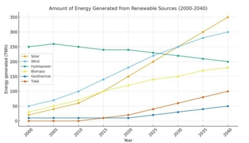
The image shows a line graph titled 'Amount of Energy Generated from Renewable Sources (2000-2040)', with the y-axis labeled 'Energy generated (TWh)' ranging from 0 to 350, and the x-axis labeled 'Year' from 2000 to 2040. Data points in TWh are approximately as follows: Solar - 2000: 20, 2005: 40, 2010: 65, 2015: 100, 2020: 155, 2025: 225, 2030: 270, 2035: 310, 2040: 350; Wind - 2000: 50, 2005: 70, 2010: 100, 2015: 140, 2020: 180, 2025: 230, 2030: 255, 2035: 280, 2040: 300; Hydropower - 2000: 250, 2005: 260, 2010: 250, 2015: 240, 2020: 240, 2025: 230, 2030: 220, 2035: 210, 2040: 200; Biomass - 2000: 30, 2005: 50, 2010: 70, 2015: 100, 2020: 120, 2025: 140, 2030: 155, 2035: 170, 2040: 180; Geothermal - 2000: 10, 2005: 10, 2010: 10, 2015: 15, 2020: 20, 2025: 25, 2030: 30, 2035: 40, 2040: 50; Tidal - 2000: 0, 2005: 0, 2010: 0, 2015: 10, 2020: 20, 2025: 40, 2030: 60, 2035: 80, 2040: 100.
Given the complexity of the image, the above description may not be entirely accurate.
Note: Both the topic and the answer were created by one of our users.

The line graph shows information about energy generated from different renewable sources between 2000 and 2040, measured in terawatt-hours (TWh).

Looking from an overall perspective, it is clear that solar, wind, biomass, and tidal energy increased significantly over the period, while hydropower declined gradually. In addition, solar recorded the fastest and most dramatic growth among all sources.

In detail, solar, wind, biomass, and tidal energy all showed a strong upward trend. Solar rose from 20 TWh in 2000 to 350 TWh in 2040, while wind increased from 50 TWh to 300 TWh over the same period. Similarly, biomass climbed steadily from 30 TWh to 180 TWh. Tidal energy, which started at zero, rose sharply after 2015 and reached 100 TWh by 2040.

On the other hand, hydropower showed a different pattern. It decreased gradually from 250 TWh in 2000 to 200 TWh in 2040. Meanwhile, geothermal energy remained relatively low throughout the period, staying at 10 TWh until 2010 before increasing slowly to 50 TWh by 2040.

Word Count: 167

Answers On The Same Topic:

The line graph below shows the amount of energy (in terawatt-hours) generated from six different renewable sources in a European country between 2000 and 2020, with projections un til 2040.

The provided line chart illustrates the figure for power (in terawatt-hours) production from six various renewable sources in a European nation from 2000 to 2020 and predictions until 2040. Overall, upward trends are viewed in the figures for solar, wind, biomass, geothermal and tidal energy, while the opposite is true for hydropower energy over the […]

The line graph below shows the amount of energy (in terawatt-hours) generated from six different renewable sources in a European country between 2000 and 2020, with projections un til 2040.

The line graph illustrates how much electricity was produced from six distinct renewable sources in a nation in Europe from 2000 to 2020, and the forcasts extending to 2040. Overall, it is clear that hydropower, which currently generates the largest share, is predicted to decreased gradually, while the amount of electricity produced by other sources […]

See All

Other Topics:

The graph shows the total number of books sold at three bookshops in Bayside City last year. Summarize the information by selecting and reporting the main features, and make comparisons where relevant.

The line graph illustrates the number of books in total, which was sold at three different bookshops, namely Barnes & Noble, Cozy Corner and Frugai Muse, in a city named Bayside the previous year. Overall, it is clear that all three bookshops recorded an upward trend, while Cozy Corner experienced a volatile trajectory in the […]

The number of dog and cat owners in the UK.

The line chart illustrates the number of dog and cat owners in the UK. Overall, dog and cat owners adhered to rising trends, albeit to varying degrees. Dog owners experienced a higher number in the initial year, but cat owners surpassed them by the end of the year. The dog owners started with 15 million […]

The graph below shows the amount of time taken to produce a vehicle by four US-based car manufacturers in the years 1998 to 2002. Summarise the information by selecting and reporting the main features, and make comparisons where relevant.

The line graph compares four different US-based car producers in terms of vehicle manufacturing time between 1998 and 2002, at one-year intervals. Overall, throughout the period, all vehicle manufacturers experienced declines in car production time, albeit to varying degrees. Despite starting the period at an all-time high production time, Nissan witnessed noticeable drops over the […]

The graph below shows the average house prices in three countries between the years 1997 and 2014.

The line graph illustrates the average house prices in three different nations over a 17-year period from 1997 to 2014. Overall, it is clear that all nations experienced a clear upward trend throughout the period. In addition, Country A was the highest figure in the first year, whereas Country B overtook Country A in the […]

The graph below shows consumers’ average annual expenditure on cell phone, national and international fixed-line and services in America between 2001 and 2010.

The line graph illustrates the average yearly spending by consumers in America on three types of telephone services: cell phone services, national fixed-line services, and international fixed-line services between 2001 and 2010. Overall, expenditure on cell phone services increased significantly over the period, while spending on national fixed-line services declined steadily. In contrast, expenditure on […]

The line graph below shows the number of serious crimes that occurred in London between 2003 and 2012.

The line graph compares the number of serious crimes in London from 2003 to 2012, divided into armed robbery, assault and murder. Overall, armed robbery fell dramatically over the period, despite being the most common crime at the beginning. By contrast, assault showed a general upward trend and became the leading category from 2007 onwards. […]

See All
We have detected unusual activity on your device.
Please verify your identity to continue.
Note: This verification step won't sign you in. If you have a premium account, please log in to access the service as usual.
Google/Gmail Verification
Or verify using Email/Code
We've sent a verification code to:
youremail@gmail.com (Not your email?)
Enter it below to complete the verification process.
Ensure your email address is correct, your inbox is not full, and you check your spam folder. If no email arrives, consider using an alternative email.
You will need a Premium plan to perform your action!
Note: If you already have a premium account, please log in to access our services as usual.

Plans & Pricing

Our mission is to make quality education accessible for everyone.
However, to keep our hardworking team running and this service alive, we genuinely need your support!
By opting for a premium plan, not only do you sustain us in achieving the mission, but you also unlock advanced features to enrich your learning experience.

Free

For learners who aren't pressed for time

What's included on Free
100+ Cambridge IELTS Tests
Instant IELTS Writing Task 1 & 2 Evaluation (2 times/month)
Instant IELTS Speaking Part 1, 2, & 3 Evaluation (5 times/month)
Instant IELTS Writing Task 1 & 2 Essay Generator (2 times/month)
500+ Dictation & Shadowing Exercises
100+ Pronunciation Exercises
Flashcards
Other Advanced Tools

Premium

For those serious about advancing their English proficiency, and for IELTS candidates aspiring to boost their band score by 1-2 points (especially in writing & speaking) in just 30 days or less

What's included on Premium
Save Your IELTS Test Progress
Unlock All Courses & IELTS Tests
Unlimited AI Conversations
Unlimited AI Writing Enhancement Exercises
Unlimited IELTS Writing Task 1 & 2 Evaluation
Unlimited IELTS Speaking Part 1, 2, & 3 Evaluation
Checked Answers Will Not Be Published
Unlimited IELTS Writing Task 1 & 2 Essay Generator
Unlimited IELTS Speaking Part 1, 2, & 3 Sample Generator
Unlimited Usage Of Advanced Tools
Priority Support within 24h (12-month plan only)

Due to the nature of our service and the provided free trials, payments are non-refundable.
Nếu bạn là người Việt Nam và không có hoặc không muốn trả bằng credit/debit cards, bạn có thể thanh toán bằng phương thức chuyển khoản:


Chọn gói:
419,000₫ 277,000 ₫ cho gói 1 tháng (chỉ 9,233₫/ngày)
1,239,000₫ 597,000 ₫ cho gói 3 tháng (chỉ 6,633₫/ngày)
2,469,000₫ 1,027,000 ₫ cho gói 6 tháng (chỉ 5,706₫/ngày)
4,929,000₫ 1,417,000 ₫ cho gói 12 tháng (chỉ 3,936₫/ngày)


Sau khi chuyển khoản, vui lòng đợi trình duyệt tự động điều hướng bạn trở lại Engnovate và bạn sẽ ngay lập tức nhận được mã kích hoạt tài khoản premium.
Nếu có lỗi xảy ra, bạn có thể liên hệ với team thông qua một trong các phương thức: email đến helloengnovate@gmail.com hoặc nhắn tin qua facebook.com/engnovate.
Vì toàn bộ công cụ trên website đều có thể sử dụng thử miễn phí, Engnovate không hỗ trợ hoàn tiền.