🔥 Today Only: Save 30% on Premium — Offer Ends Soon! - Upgrade Now!
Line Graph

Band 5+: The line graph below shows the international student enrolment numbers at De Salle University from 1980 to 2020. Summarise the information by selecting and reporting the main features, and make comparisons where relevant

Image for topic: The line graph below shows the international student enrolment numbers at De Salle University from 1980 to 2020. Summarise the information by selecting and reporting the main features, and make comparisons where relevant
Our system will evaluate the answer based on this AI-generated description.
The image is a line graph showing International Student Enrollment Numbers at De Salle University from 1980 to 2020 for five different countries. India starts at roughly 1000 in 1980, rises to approximately 2000 in 1990, then surges to around 11,000 in 2000, before escalating to just over 14,000 by 2020. Vietnam starts at about 350 in 1980, increases moderately to nearly 500 in 1990, jumps to over 2000 in 2000, and peaks at around 9000 by 2020. Nepal begins at approximately 300 in 1980, remains stable until 2000 at around 300, and climbs to just below 4000 by 2020. Indonesia initiates at nearly 250 in 1980, progresses to about 400 in 1990, sees a significant rise to over 3000 in 2000, and reaches almost 6000 by 2020. Colombia starts at around 200 in 1980, shows a slight increase to nearly 350 in 1990, grows to about 1000 in 2000, and attains nearly 1500 by 2020. Note: All numbers are approximate estimations, as the graph does not provide precise figures.
Given the complexity of the image, the above description may not be entirely accurate.
Note: Both the topic and the answer were created by one of our users.

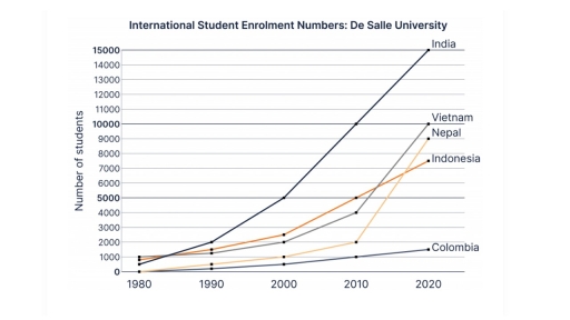
The line graph compared the numbers of international students, who are from five various countries including India, Nepal, Indonesia, Colombia, and Vietnam enrolled in De Salle university during for decades. Overall, the university experienced a significant increase in enrolment of all international students.

In 1980, a large number of student population were from India, Vietnam, and Indonesia under 1000, while a few students came from Nepal and Colombia.

During this period, the number of Indian students dramatically increased to 15000, which means this population became 15 times during forty years.

In 1980 to 2010, this university saw a slight rise in international students coming from Vietnam, Nepal, Indonesia to 5000, 4000, 2000 respectively, but Colombian students were about 1000.

In the last decade, Indians still were dominant and reached a peak of 15000, while Colombian students grew to 1500 and remained the lowest population. The number of students from three other nationalities went up sharply to 1000, 9000, and 7000.

Word Count: 160

Answers On The Same Topic:

The line graph below shows the international student enrolment numbers at De Salle University from 1980 to 2020. Summarise the information by selecting and reporting the main features, and make comparisons where relevant

The provided line graph illustrates, in thousands, the number of international students enrolled at De Salle University, between 1980 and 2020. As can be seen clearly from the graph, the most notable feature is the rapid increase of Indian students over the years. More specifically, in 1980 only about 1,000 Indians enrolled in De Salle […]

The line graph below shows the international student enrolment numbers at De Salle University from 1980 to 2020. Summarise the information by selecting and reporting the main features, and make comparisons where relevant

The following line chart illustrates the number of overseas students enrolled at De Salle University from five countries: India, Vietnam, Nepal, Indonesia, and Colombia, from 1980 to 2020. The numbers are measured in thousands. At a glance, the most significant growth was shown by Indian students over the given period, while Colombian students had the […]

The line graph below shows the international student enrolment numbers at De Salle University from 1980 to 2020. Summarise the information by selecting and reporting the main features, and make comparisons where relevant

This line graph illustrates the number of international students enrolled in De salle University from five different countries in the years between 1980 and 2020. Overall, the number of Indian students enrolled increased significantly to surpass all other countries, whereas Colombian students continuously accounted for the least number of enrollments. Indian students had the most […]

The line graph below shows the international student enrolment numbers at De Salle University from 1980 to 2020. Summarise the information by selecting and reporting the main features, and make comparisons where relevant

The line graph given illustrates the number of international students enrolled at De Salle University between 1980 to 2020. Overall, the number of student enrollment from India has been the maximum during the period 1980 to 2020. Vietnam holds the second most number of enrollment at university followed by Nepal then comes Indonesia and the […]

See All

Other Topics:

The line graph shows the percentage of people living in cities in four countries (Philippines, Malaysia, Thailand and Indonesia) from 1970 to 2020.

The given graph chart illustrates information on data on the population in four Asian countries living in cities over a period from 1918 to 2020, with predictions for 2030 and 2040. It is evident that there was an upward trend in the percentage of the population in four Asian countries living in cities and this […]

The graph below shows how people in one city in Australia buy music from 2015 to 2020.

The line graph illustrates how individual in one city bought music in Australia from 2015 between 2020 Overall, it is clear percentage of total music sales by method, there are three percentage it is streams, downloads, CDs purchased. Leader was streams it have highly increased line by the follow downloads line was flactuating and CDs […]

The given chart shows the proportion of residents of America (in millions) living in different regions between 2015 and 2020.Summarize the information by selecting and reporting the main features and make comparisons where relevant. Write at least 150 words.

The given chart illustrates the proportion of residents in America, measured in millions, who lived in different regions from 2015 to 2020. Overall, the population of all regions experienced some changes during the period. While certain regions showed a steady increase in the number of residents, others witnessed slight fluctuations. It is clear that one […]

The chart below shows the percentage of households in one country that owned a car, a computer, and a mobile phone from 1995 to 2015. Summarise the information by selecting and reporting the main features, and make comparisons where relevant. Write at least 150 words.

The line graph compares three different types of households’ properties (a car, a computer and a mobile phone) in one country between 1995 and 2015. Units are measured in percentages. Overall, it is noticeable that all categories only upward trend were observed over the period, albeit wity varying levels. Of particular note is mobile phones, […]

The graph below shows the production of three forest industry products in a European country, namely timber, pulp, and paper, from 1980 to 2000. Summarise the information by selecting and reporting the main features, and make Icomparison where relevant. Write at least 150 words.

The chart illustrates the development of forest industry production for the period 1980-2000, focusing on the processing of pulp, timber and paper. Overall, the amount of produced paper demonstrates almost linear improvement throughout the years, whilst pulp and timber appear rather wavery as significant ups and downs are evident in the production rate. What is […]

how teenagers (aged 12-19) in one state in the United States communicated with each other.

The line graph provides comprehensive data about what types of communication teenagers used throughout 3 years. Overall, it is notable that text messages were the most common way to communicate. However, interacting through email showed the lowest interest. To begin with, text messages started at 30% of all teenagers and increased slightly between 2006 and […]

See All
We have detected unusual activity on your device.
Please verify your identity to continue.
Note: This verification step won't sign you in. If you have a premium account, please log in to access the service as usual.
Google/Gmail Verification
Or verify using Email/Code
We've sent a verification code to:
youremail@gmail.com (Not your email?)
Enter it below to complete the verification process.
Ensure your email address is correct, your inbox is not full, and you check your spam folder. If no email arrives, consider using an alternative email.
You will need a Premium plan to perform your action!
Note: If you already have a premium account, please log in to access our services as usual.

Plans & Pricing

Our mission is to make quality education accessible for everyone.
However, to keep our hardworking team running and this service alive, we genuinely need your support!
By opting for a premium plan, not only do you sustain us in achieving the mission, but you also unlock advanced features to enrich your learning experience.

Free

For learners who aren't pressed for time

What's included on Free
100+ Cambridge IELTS Tests
Instant IELTS Writing Task 1 & 2 Evaluation (2 times/month)
Instant IELTS Speaking Part 1, 2, & 3 Evaluation (5 times/month)
Instant IELTS Writing Task 1 & 2 Essay Generator (2 times/month)
500+ Dictation & Shadowing Exercises
100+ Pronunciation Exercises
Flashcards
Other Advanced Tools

Premium

For those serious about advancing their English proficiency, and for IELTS candidates aspiring to boost their band score by 1-2 points (especially in writing & speaking) in just 30 days or less

What's included on Premium
Save Your IELTS Test Progress
Unlock All Courses & IELTS Tests
Unlimited AI Conversations
Unlimited AI Writing Enhancement Exercises
Unlimited IELTS Writing Task 1 & 2 Evaluation
Unlimited IELTS Speaking Part 1, 2, & 3 Evaluation
Checked Answers Will Not Be Published
Unlimited IELTS Writing Task 1 & 2 Essay Generator
Unlimited IELTS Speaking Part 1, 2, & 3 Sample Generator
Unlimited Usage Of Advanced Tools
Priority Support within 24h (12-month plan only)

Due to the nature of our service and the provided free trials, payments are non-refundable.
Nếu bạn là người Việt Nam và không có hoặc không muốn trả bằng credit/debit cards, bạn có thể thanh toán bằng phương thức chuyển khoản:


Chọn gói:
419,000₫ 277,000 ₫ cho gói 1 tháng (chỉ 9,233₫/ngày)
1,239,000₫ 597,000 ₫ cho gói 3 tháng (chỉ 6,633₫/ngày)
2,469,000₫ 1,027,000 ₫ cho gói 6 tháng (chỉ 5,706₫/ngày)
4,929,000₫ 1,417,000 ₫ cho gói 12 tháng (chỉ 3,936₫/ngày)


Sau khi chuyển khoản, vui lòng đợi trình duyệt tự động điều hướng bạn trở lại Engnovate và bạn sẽ ngay lập tức nhận được mã kích hoạt tài khoản premium.
Nếu có lỗi xảy ra, bạn có thể liên hệ với team thông qua một trong các phương thức: email đến helloengnovate@gmail.com hoặc nhắn tin qua facebook.com/engnovate.
Vì toàn bộ công cụ trên website đều có thể sử dụng thử miễn phí, Engnovate không hỗ trợ hoàn tiền.