24 Hours Only: Get 39% OFF on Our Premium Plan - Check Out Now!
Multiple Graphs

Band 6+: The line graph below shows the population size, birth rate and the death rate of England and Wales from 1700 to 2000. Summarise the information by selecting and reporting the main features and make comparisons where relevant.

Image for topic: The line graph below shows the population size, birth rate and the death rate of England and Wales from 1700 to 2000. Summarise the information by selecting and reporting the main features and make comparisons where relevant.
Our system will evaluate the answer based on this AI-generated description.
The image is a graph with two y-axes, the left one representing population size in millions, from 0 to 55 in increments of 5, and the right one representing birth and death rate per 1,000 people, from 0 to 55 in increments of 5. The x-axis represents the years 1700 to 2000 in increments of 50. There are three lines, one solid and two dotted, representing population size, birth rate, and death rate, respectively. The solid line indicates population size remains steady at 5 million from 1700 to 1750, then rises gradually to 10 million by 1800, reaches 15 million in 1850, and then increases sharply reaching 30 million by 1900, 45 million by 1950, and peak over 50 million by 2000. The dotted lines indicate birth and death rates, with the birth rate starting around 40 per 1,000 people in 1700, increasing to 45 around 1750, then declining to 35 by 1800, fluctuating between 35 and 40 until 1900, then dropping sharply to slightly above 15 in 1950 and stabilizing around 10 in 2000. The death rate starts at 35 per 1,000 people in 1700, rises to 45 in 1750, then drops steeply to slightly above 20 by 1800, fluctuates between 20 and 25 until 1900, then declines sharply to approximately 10 in 1950 and maintains a consistent 10 in 2000.
Given the complexity of the image, the above description may not be entirely accurate.
Note: Both the topic and the answer were created by one of our users.

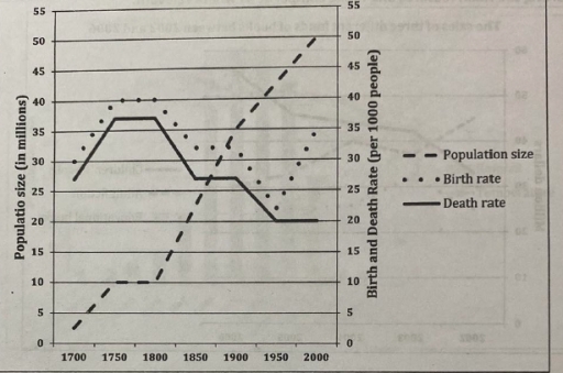
The line graph illustrates the demographic size, birth and mortality rate of England and Wales between 1700 and 2000.

Overall, the total population grew significantly over the period, while natality fluctuated before rising and death rate moderately decreased.

In the 1700s, around 3 million peoples were recorded as the population size. This figure gradually increased over 50 years, reaching 10 million citizens, which then the number halved to around 4 million. Consequently, following two centuries the total population size rocketed to 50 million at the end of the period given.

Regarding to birth and death rate, they started at 30 persons and approximately 25 people, respectively. This rates consistently raised for almost 50 years until plateaued in another half century at 40 people for natality and nearly 38 people for mortality. Subsequently, in 150 years death rate dropped significantly to 20 people per 1000 people in 1950 and remained stable until the end of the period. On the other hand, despite birth rate falling to just under 21 person in 1950, the figure then rose sharply to nearly 33 people.

Word Count: 180

Answers On The Same Topic:

The line graph below shows the population size, birth rate and the death rate of England and Wales from 1700 to 2000. Summarise the information by selecting and reporting the main features and make comparisons where relevant.

The line graph below illustrates the population including birth rate and the death rate in England and Wales starting from the 18th century until the 21st century. The information is divided into 3 groups which mention the number of population size, birth rate and death rate per 1000 people. Overall, population size in both countries […]

The line graph below shows the population size, birth rate and the death rate of England and Wales from 1700 to 2000. Summarise the information by selecting and reporting the main features and make comparisons where relevant.

The line graph illustrates the population size, birth rate, and the death rate of 2 distinct countries in the UK across three centuries. Information is divided between a 50 year period. We can see a steady incline in population size from the two countries which peaked in the year 2000, showing signs of continuous growth. […]

The line graph below shows the population size, birth rate and the death rate of England and Wales from 1700 to 2000. Summarise the information by selecting and reporting the main features and make comparisons where relevant.

The given line elucidates the population rate, fertility rate, and the mortality rate of England and Wales throughout the period from 1700 to 2000. Overall, the most striking aspect shown in this figure is that the figure of population size increased, whereas there was a downward trend in the figure for fertility rate and mortality […]

The line graph below shows the population size, birth rate and the death rate of England and Wales from 1700 to 2000. Summarise the information by selecting and reporting the main features and make comparisons where relevant.

The given graph illustrates the information about population size and compares the birth rate and mortality rate in England and Wales over a 300-year period from 1700 to 2000. Overall, it is clear that the population of England and Wales showed an upward trend and reached at peak in 2000 which was 50 million while […]

The line graph below shows the population size, birth rate and the death rate of England and Wales from 1700 to 2000. Summarise the information by selecting and reporting the main features and make comparisons where relevant.

The bar illustrates population size, and death and birth rate in 1700 to 2000. Overall, it can be seen that population size experienced a dramatic increase where birth rate increased slightly despite sharp fluctuation. However, the death rate declined over the period. Look into more details, the size in 1700 stood at around 3 million; […]

See All

Other Topics:

The graphs below compare the number of cosmetic procedures performed on males and females in Korea in 2004. Summarize the information by selecting and reporting the main features, and make comparisons where relevant.

The bar chart illustrate the comparision of different cosmetic procedure on males and females in 2024 in South Korea. Overall, hair transplant was the most common in both gender in South Korea, whereas facelt was less common procedure among them. To be more specific, hair transplant are more common in South Korea. around Sixty Thousands […]

The graphs below show the number of drivers in Britain who have been caught driving too fast by speed cameras placed on roads, and the numbe of people killed in road accidents, over an eight-year period since the introduction of speed cameras. The tables show the results of a survey on people's opinion on speed cameras. Write a report for a university lecturer describing the information below

The graph illustrates the amount of drivers of spending offenses detected by cameras in Britian and the average of people who was killed by road accident, over an eight-year period. Additionally, given table presents the results about survey. Overall, the munber of people, who caught provide significantly grow, while the total number of deaths remain […]

Understanding the Relationship Between GDP per Capita and Average Temperature

The scatter plot illustrates the relationship between GDP per capita and average temperature across various countries. Overall, there is a clear negative correlation, indicating that countries with higher average temperatures tend to have lower GDP per capita, while those with cooler climates generally enjoy higher income levels. From the graph, nations with average temperatures below […]

The bar charts show forecasts for the yearly reforestation rate in selected regions and worldwide The pie chart shows the current interest in reforestation.

The bar charts illustrate predictions for the annual reforestation rate in four regions and worldwide, while the pie chart gives information about current attention to reforestation. Overall, all regions are expected to experience an increase. Ireland is predicted to have the highest percentage, while Hungary will have the lowest from start to end. Meanwhile, the […]

The chart belowe shows the value of one country's exports in various categories during 2015 and 2016.

The bar chart illustrates the 5 categories that considered as an export earnings of unspecified country, and table depicts growth of the each category from 2015 to 2016. Overall, there was an upward trend in the earnings of engineered goods, while the opposite is true for gems and jewelry. In the bar chart, petroleum illustrates […]

The charts show information about the percentage of men and women aged 60-64 who were employed in four countries in 1970 and 2000.

The bar chart indicates statistical data related to the rate of men and women aged 60-64 employed in four different countries from 1970 to 2000. Overall, it is apparent that the figures demonstrate differences in almost all categories, but the most distinctive feature is that the USA is the most popular country to work. Looking […]

See All
We have detected unusual activity on your device.
Please verify your identity to continue.
Note: This verification step won't sign you in. If you have a premium account, please log in to access the service as usual.
Google/Gmail Verification
Or verify using Email/Code
We've sent a verification code to:
youremail@gmail.com (Not your email?)
Enter it below to complete the verification process.
Ensure your email address is correct, your inbox is not full, and you check your spam folder. If no email arrives, consider using an alternative email.
You will need a Premium plan to perform your action!
Note: If you already have a premium account, please log in to access our services as usual.

Plans & Pricing

Our mission is to make quality education accessible and free for everyone.
However, to keep our hardworking team running and this service alive, we genuinely need your support!
By opting for a premium plan, not only do you sustain us in achieving the mission, but you also unlock advanced features to enrich your learning experience.

Free

For learners who aren't pressed for time

What's included on Free
1000+ IELTS Tests & Samples
Instant IELTS Writing Task 1 & 2 Evaluation (2 times/month)
Instant IELTS Speaking Part 1, 2, & 3 Evaluation (5 times/month)
Instant IELTS Writing Task 1 & 2 Essay Generator (2 times/month)
500+ Dictation & Shadowing Exercises
100+ Pronunciation Exercises
Flashcards
Other Advanced Tools

Premium

For those serious about advancing their English proficiency, and for IELTS candidates aspiring to boost their band score by 1-2 points (especially in writing & speaking) in just 30 days or less

What's included on Premium
Save Your IELTS Test Progress
Unlock All Courses & Content
Unlimited AI Conversations
Unlimited AI Writing Enhancement Exercises
Unlimited IELTS Writing Task 1 & 2 Evaluation
Unlimited IELTS Speaking Part 1, 2, & 3 Evaluation
Checked Answers Will Not Be Published
Unlimited IELTS Writing Task 1 & 2 Essay Generator
Unlimited IELTS Speaking Part 1, 2, & 3 Sample Generator
Unlimited Usage Of Advanced Tools

Due to the nature of our service and the provided free trials, payments are non-refundable.
Nếu bạn là người Việt Nam và không có hoặc không muốn trả bằng credit/debit cards, bạn có thể thanh toán bằng phương thức chuyển khoản:


Chọn gói:
279,000₫ 157,000 ₫ cho gói 1 tháng (chỉ 5,233₫/ngày)
819,000₫ 397,000 ₫ cho gói 3 tháng (chỉ 4,411₫/ngày)
1,649,000₫ 667,000 ₫ cho gói 6 tháng (chỉ 3,706₫/ngày)
3,299,000₫ 857,000 ₫ cho gói 12 tháng (chỉ 2,381₫/ngày)


Sau khi chuyển khoản, vui lòng đợi trình duyệt tự động điều hướng bạn trở lại Engnovate và bạn sẽ ngay lập tức nhận được mã kích hoạt tài khoản premium.
Nếu có lỗi xảy ra, bạn có thể liên hệ với team thông qua một trong các phương thức: email đến helloengnovate@gmail.com hoặc nhắn tin qua facebook.com/engnovate.
Vì toàn bộ công cụ trên website đều có thể sử dụng thử miễn phí, Engnovate không hỗ trợ hoàn tiền.