🔥 Today Only: Save 30% on Premium — Offer Ends Soon! - Upgrade Now!
Line Graph

Band 7+: The line graph gives data about the number of users of five different communication services worldwide from 1998 to 2008.

Image for topic: The line graph gives data about the number of users of five different communication services worldwide from 1998 to 2008.
Our system will evaluate the answer based on this AI-generated description.
The image is a line graph depicting the number of users for five different communication services worldwide from 1998 to 2008. In 1998, landline service users were around 20 per 100 inhabitants, internet service and cellular phone service users were below 10 per 100 inhabitants, with fixed broadband and mobile broadband users being negligible or around 0 per 100 inhabitants. By 2008, mobile broadband users skyrocketed to above 60 per 100 inhabitants, with cellular phone service users also showing significant growth to around 40 per 100 inhabitants. Fixed broadband users demonstrated a steady increase over the years, reaching just above 20 per 100 inhabitants. Internet service users grew moderately to around 25 per 100 inhabitants. Landline service users showed the least growth, reaching just below 25 per 100 inhabitants. All services, except landline, show an upward trend, with mobile broadband showing the most significant exponential growth.
Given the complexity of the image, the above description may not be entirely accurate.
Note: Both the topic and the answer were created by one of our users.

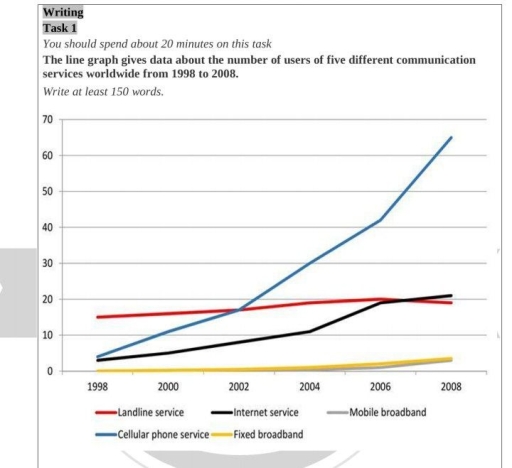
The provided line graph illustrates the percentage of five different networking services used globally commencing from 1998 to 2008.

Overall, cellular phone service saw the most dramatic rise in users, while fixed and mobile broadband remained relatively unchanged during the surveyed timeframe. At the same time, communication through the internet and landline experienced considerable growth.

In 1998, landline and cellular phone services had the highest user percentages, with landline service starting at around 15% and cellular phone service at 10% lower. However, while landline service showed only a modest increase over time, only rising by 10%, cellular phone service grew rapidly, outshining all other services and reaching nearly 70% by 2008. The same upward trend can be seen with internet service whose data also started at around 5% in 1998 and barely exceeded that of landline service by a narrow margin in 2008.

Meanwhile, mobile and fixed broadband attracted close to no users at the beginning of the period as their data was roughly 0% at the time. Their figures began rising slightly in 2004 and reached a mere 4% in 2008.

Word Count: 182

Answers On The Same Topic:

The line graph gives data about the number of users of five different communication services worldwide from 1998 to 2008.

The line graph illustrates the amount of worldwide communications through several ways, over a decade between1998 and 2008. Overall, it is clear that cellular phone service was the dominant among others whose amount incerased, while landline service experienced the opposite. Notably, fixed broadband remained the lowest throughout the period. In 1998, around 15% of people […]

The line graph gives data about the number of users of five different communication services worldwide from 1998 to 2008.

The line graph illustrates details concerning the number of customers of five various information media globally within the period of 1998 to 2008. Generally, the most significant facts to emerge from the graph are that there was a dramatic increase in the utilization of cellular phone service, while fixed broadband had the least usage. In […]

The line graph gives data about the number of users of five different communication services worldwide from 1998 to 2008.

The line chart illustrates the proportions of users with access to five different communication services over a 10-year period. Overall, there were marginal growths among all categories, except for cellular phones which recorded a dramatic increase. It is also noticeable that cellular phone service accounted for the highest percentage, with mobile broadband representing the lowest. […]

The line graph gives data about the number of users of five different communication services worldwide from 1998 to 2008.

The diagram illustrates the number of individuals who used five distinct communication services worldwide between 1998 and 2008. Overall, the proportion of cellular phone service users ranked first throughout the period, while the number of users of mobile and fixed broadbands stood last. Besides, all figures experienced some rises over the decade. The popularity of […]

See All

Other Topics:

the line graph below gives informTION BOUT THE NUMBER OF JOBS IN FOUR SECTORS OF THE ECONOMY IN THE US BETWEEN 1960 AND 2020

The given line graph illustrates the number of professions in four sectors of the economy in the US from 1960 to 2020. Overall, it can be clearly observed that healthcare and retail indicated the highest rate while agriculture represented the lowest level. According to the given data, at the beginning of the period manufacturing showed […]

The graph below gives information about the number of jobs in four sectors of the economy in the US between 1960 and 2020. Summarise the information by selecting and reporting the main features, and make comparisons where relevant.

The given line graph demonstrates the details about the amount of career opportunities in four sectors of the economy in United States from 1960 to 2020. Overall, while two trends had the highest figures over the given period, the number of jobs in manufacturing and agriculture recorded the lowest proportion throughout the period. In addition, […]

The graph shows monthly trends of three product of tablets, laptop, desktop.

The figure shows monthly trends of three product of tablets, laptop, desktop. Overall, the highest level among the products were tablets over the five-month period. They rose consistently without any decline. The lowest figure is the desktop, it was showed a continuous downward trend. Looking at the diagram, the sales of tablets commenced in January […]

The graph below shows the gross domestic products (GDP) in four selected countries between 2010 and 2015

the graph provides the gross domestic products among four countries over a 5 years of period, from 2010 to 2015. Overall, it is evident that the USA experienced the highest amount of products, while the UK recorded the lowest figures. It witnessed that the USA and China showed a significant upward trend throughout the period. […]

The chart below gives information about how many European citizens of various age groups frequently went to the gym from 1990 to 2010.

The line graph provides information about the total number of different age of people in Europe who likely to go to the gym between 1990 and 2010. On the chart, there are several different age of groups, including 18-23, 24-33, 34-43, and 44-53. Age of group from 24-33 rose rapidly and reached its peak in […]

the chart below shows the changes in car ownership in Great Britain between 1961 and 2001

the chart shows percentage the modify in car ownership in Great Britain country from 1961 to 2001 . ovrall , the percentage individuals with 2 or more cars increaded dramatically while people no car dropped sharply . one- car household became the remained stable from 1961 to 2001 the household had 2 or more cars […]

See All
We have detected unusual activity on your device.
Please verify your identity to continue.
Note: This verification step won't sign you in. If you have a premium account, please log in to access the service as usual.
Google/Gmail Verification
Or verify using Email/Code
We've sent a verification code to:
youremail@gmail.com (Not your email?)
Enter it below to complete the verification process.
Ensure your email address is correct, your inbox is not full, and you check your spam folder. If no email arrives, consider using an alternative email.
You will need a Premium plan to perform your action!
Note: If you already have a premium account, please log in to access our services as usual.

Plans & Pricing

Our mission is to make quality education accessible for everyone.
However, to keep our hardworking team running and this service alive, we genuinely need your support!
By opting for a premium plan, not only do you sustain us in achieving the mission, but you also unlock advanced features to enrich your learning experience.

Free

For learners who aren't pressed for time

What's included on Free
100+ Cambridge IELTS Tests
Instant IELTS Writing Task 1 & 2 Evaluation (2 times/month)
Instant IELTS Speaking Part 1, 2, & 3 Evaluation (5 times/month)
Instant IELTS Writing Task 1 & 2 Essay Generator (2 times/month)
500+ Dictation & Shadowing Exercises
100+ Pronunciation Exercises
Flashcards
Other Advanced Tools

Premium

For those serious about advancing their English proficiency, and for IELTS candidates aspiring to boost their band score by 1-2 points (especially in writing & speaking) in just 30 days or less

What's included on Premium
Save Your IELTS Test Progress
Unlock All Courses & IELTS Tests
Unlimited AI Conversations
Unlimited AI Writing Enhancement Exercises
Unlimited IELTS Writing Task 1 & 2 Evaluation
Unlimited IELTS Speaking Part 1, 2, & 3 Evaluation
Checked Answers Will Not Be Published
Unlimited IELTS Writing Task 1 & 2 Essay Generator
Unlimited IELTS Speaking Part 1, 2, & 3 Sample Generator
Unlimited Usage Of Advanced Tools
Priority Support within 24h (12-month plan only)

Due to the nature of our service and the provided free trials, payments are non-refundable.
Nếu bạn là người Việt Nam và không có hoặc không muốn trả bằng credit/debit cards, bạn có thể thanh toán bằng phương thức chuyển khoản:


Chọn gói:
419,000₫ 277,000 ₫ cho gói 1 tháng (chỉ 9,233₫/ngày)
1,239,000₫ 597,000 ₫ cho gói 3 tháng (chỉ 6,633₫/ngày)
2,469,000₫ 1,027,000 ₫ cho gói 6 tháng (chỉ 5,706₫/ngày)
4,929,000₫ 1,417,000 ₫ cho gói 12 tháng (chỉ 3,936₫/ngày)


Sau khi chuyển khoản, vui lòng đợi trình duyệt tự động điều hướng bạn trở lại Engnovate và bạn sẽ ngay lập tức nhận được mã kích hoạt tài khoản premium.
Nếu có lỗi xảy ra, bạn có thể liên hệ với team thông qua một trong các phương thức: email đến helloengnovate@gmail.com hoặc nhắn tin qua facebook.com/engnovate.
Vì toàn bộ công cụ trên website đều có thể sử dụng thử miễn phí, Engnovate không hỗ trợ hoàn tiền.