🔥 Today Only: Save 30% on Premium — Offer Ends Soon! - Upgrade Now!
Line Graph

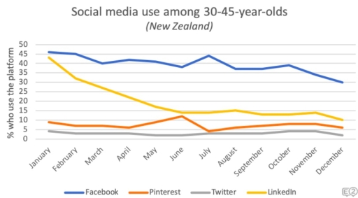
Band 5+: The line graph shows social media use among 30-45 year-olds in New Zealand in 2018. Summarise the information by selecting and reporting the main features, and make comparisons where relevant.

Image for topic: The line graph shows social media use among 30-45 year-olds in New Zealand in 2018. Summarise the information by selecting and reporting the main features, and make comparisons where relevant.
Our system will evaluate the answer based on this AI-generated description.
The image is a line chart showing social media use among 30-45-year-olds in New Zealand. Four platforms are displayed, Facebook, Pinterest, Twitter, and LinkedIn, with the following percentage usage by month: January - Facebook 45%, Pinterest 25%, Twitter 15%, LinkedIn 10%; February - Facebook 43%, Pinterest 26%, Twitter 15%, LinkedIn 12%; March - Facebook 42%, Pinterest 25%, Twitter 15%, LinkedIn 13%; April - Facebook 40%, Pinterest 24%, Twitter 16%, LinkedIn 13%; May - Facebook 38%, Pinterest 23%, Twitter 17%, LinkedIn 12%; June - Facebook 37%, Pinterest 22%, Twitter 18%, LinkedIn 12%; July - Facebook 35%, Pinterest 22%, Twitter 19%, LinkedIn 12%; August - Facebook 33%, Pinterest 21%, Twitter 20%, LinkedIn 12%; September - Facebook 32%, Pinterest 21%, Twitter 19%, LinkedIn 13%; October - Facebook 33%, Pinterest 22%, Twitter 18%, LinkedIn 14%; November - Facebook 34%, Pinterest 23%, Twitter 17%, LinkedIn 13%; December - Facebook 36%, Pinterest 24%, Twitter 16%, LinkedIn 12%. Facebook has the highest usage every month, decreasing from January to August and increasing afterward, while LinkedIn has the lowest usage, moderately increasing from January to October and slightly decreasing toward December. Twitter and Pinterest usage fluctuate with a slight overall decrease for Pinterest and increase for Twitter.
Given the complexity of the image, the above description may not be entirely accurate.
Note: Both the topic and the answer were created by one of our users.

The line graph compares the percentage of using social medias such as Facebook, Pinterest, Twitter and LInkedin among 30-45 years old in New Zealand in 2018.

Overall, what stands out from the graph is that Facebook platfrom had the highest proportion of users;furthermore, it remained the largest sector. Conversely, Twitter is not provided a significant percentage and become the lowest. Meanwhile, Pinterst and Linkedin had nearly the same proportion of users at the end of period.

In detail, the proportion of people who used the Facebook initially was highest that constituted 45, but despite a steady reduce in November the percentage comprised 35 and it remained the largest plarfrom. However, Twitter platfrom fluctuated steadily, but starting point with 5% and ending point with almost 3% made it the lowest.

By contrast, in January Linkedin platform roughly reached the same percentage as Facebook, but a subsequent drop until June comprised 15. The percentage in January was as three as high as in June, at the end of span the proportion reduced sharply with 10. Meanwhile, Pinterest remained steady throughout the entire period, there was a dramatic growth with almost 12%.

Word Count: 189

Answers On The Same Topic:

The line graph shows social media use among 30-45 year-olds in New Zealand in 2018. Summarise the information by selecting and reporting the main features, and make comparisons where relevant.

The line graph compares the percentage of people using social media platforms such as Facebook, Pinterest, Twitter, and LinkedIn among 30-45 year olds in New Zealand in 2018. Overall, what stands out from the graph is that the Facebook platform had the highest proportion of users; furthermore, it remained the largest sector. Conversely, Twitter did […]

The line graph shows social media use among 30-45 year-olds in New Zealand in 2018. Summarise the information by selecting and reporting the main features, and make comparisons where relevant.

The line graph illustrates the percentage of 30-45-year-olds in New Zealand who used Facebook, LinkedIn, Pinterest and Twitter throughout 2018. Overall, Facebook was the most popular platform throughout the year, despite some fluctuations and an overall decline towards December. LinkedIn was the second most widely used platform at the beginning of the year but experienced […]

The line graph shows social media use among 30-45 year-olds in New Zealand in 2018. Summarise the information by selecting and reporting the main features, and make comparisons where relevant.

The given graph illustrates digital interaction in people communities 30-45 year-olds in New Zealand in the period of 2018. Firstly, at the bedinning of the year in New Zealend , Facebook was leading in popularity ,showing the over 45 percentages, among other social medias, such as, Pinterest, Twitter, Linkedin. Secondly the gragh depicts thet the […]

The line graph shows social media use among 30-45 year-olds in New Zealand in 2018. Summarise the information by selecting and reporting the main features, and make comparisons where relevant.

The line graph illustrates the percentage of using social media between ages 35-45 in New Zealand in 2018. Overall, using Facebook show an upward trend through a 1 year period, while Unkedin show downward trajectory. All of the social media’s statistics is changed over the period apart from Twitter. Social persuits, such as watching Unkedin […]

See All

Other Topics:

Writing task 1 The line graph illustrates the amount of spreads consumed from 1981 to 2007, in grams per person per week

The line graph shows the data consumption of three spreads over to almost three decades between 1981 until 2007. Overall the trends was fluctuated. The highest consumption was butter in the beginning but later people switched to used low fat & reduce spreads. In addition the lowest consumption when it’s started and later was margarine. […]

The line graph shows the percentage of people commuting to work by car, bus and bicycle in a city from 2000 to 2020. Summarise the information by selecting and reporting the main features, and make comparisons where relevant.

The line graph illustrates the percentage of people who commuted to work by bicycle, car and bus in a city between 2000 and 2020. Overall, car use declined steadily throughout the period, while bicycle use increased significantly. The percentage of bus users rose slightly before falling back to its initial level, matching the figure for […]

The graph compares employment rates in the 3 sectors of economy. In the UK, 2000-2010. Summarize information by selecting and reporting the main features, and make comparisons where relevant.

The graph illustrates the proportion of people employed across three distinct sectors in the UK’s public, private, and self-employed over a ten-year period. Overall, there was a substantial increase in both public sector staff and independent workers. Conversely, the figure for the private sector followed a remarkable decline trend. In terms of the public sector […]

The line graph highlights that the production of the world oil in four regions namely: middle east, africa, north america, asia, in four decades. Units measured in million barrels per day.

The line graph illustrates changes in daily oil production in four regions, namely the Middle East, Africa, North America and Asia, between 1960 and 2000. The figures are measured in millions of barrels per day. Overall, oil production increased in all four regions over the period. The Middle East experienced the most significant growth and […]

See All
We have detected unusual activity on your device.
Please verify your identity to continue.
Note: This verification step won't sign you in. If you have a premium account, please log in to access the service as usual.
Google/Gmail Verification
Or verify using Email/Code
We've sent a verification code to:
youremail@gmail.com (Not your email?)
Enter it below to complete the verification process.
Ensure your email address is correct, your inbox is not full, and you check your spam folder. If no email arrives, consider using an alternative email.
You will need a Premium plan to perform your action!
Note: If you already have a premium account, please log in to access our services as usual.

Plans & Pricing

Our mission is to make quality education accessible for everyone.
However, to keep our hardworking team running and this service alive, we genuinely need your support!
By opting for a premium plan, not only do you sustain us in achieving the mission, but you also unlock advanced features to enrich your learning experience.

Free

For learners who aren't pressed for time

What's included on Free
100+ Cambridge IELTS Tests
Instant IELTS Writing Task 1 & 2 Evaluation (2 times/month)
Instant IELTS Speaking Part 1, 2, & 3 Evaluation (2 times/month)
Instant IELTS Writing Task 1 & 2 Essay Generator (2 times/month)
500+ Dictation & Shadowing Exercises
100+ Pronunciation Exercises
Flashcards
Other Advanced Tools

Premium

For those serious about advancing their English proficiency, and for IELTS candidates aspiring to boost their band score by 1-2 points (especially in writing & speaking) in just 30 days or less

What's included on Premium
Save Your IELTS Test Progress & Analyze Mistakes By Question Type
Save Your Own Flashcard Sets & Use Them On Any Device
Unlock All Courses, IELTS Tests, Section & Part Practice
Unlimited AI Conversations
Unlimited AI Writing Enhancement Exercises
Unlimited IELTS Writing Task 1 & 2 Evaluation
Unlimited IELTS Speaking Part 1, 2, & 3 Evaluation
Checked Answers Will Not Be Published
Unlimited IELTS Writing Task 1 & 2 Essay Generator
Unlimited IELTS Speaking Part 1, 2, & 3 Sample Generator
Unlimited Usage Of Advanced Tools & AI Features
Priority Support within 24h (12-month plan only)

Due to the nature of our service and the provided free trials, payments are non-refundable.