🔥 Today Only: Save 30% on Premium — Offer Ends Soon! - Upgrade Now!
Line Graph

Band 5+: The line graph shows social media use among 30-45 year-olds in New Zealand in 2018. Summarise the information by selecting and reporting the main features, and make comparisons where relevant.

Image for topic: The line graph shows social media use among 30-45 year-olds in New Zealand in 2018. Summarise the information by selecting and reporting the main features, and make comparisons where relevant.
Our system will evaluate the answer based on this AI-generated description.
The image is a line chart showing social media use among 30-45-year-olds in New Zealand. Four platforms are displayed, Facebook, Pinterest, Twitter, and LinkedIn, with the following percentage usage by month: January - Facebook 45%, Pinterest 25%, Twitter 15%, LinkedIn 10%; February - Facebook 43%, Pinterest 26%, Twitter 15%, LinkedIn 12%; March - Facebook 42%, Pinterest 25%, Twitter 15%, LinkedIn 13%; April - Facebook 40%, Pinterest 24%, Twitter 16%, LinkedIn 13%; May - Facebook 38%, Pinterest 23%, Twitter 17%, LinkedIn 12%; June - Facebook 37%, Pinterest 22%, Twitter 18%, LinkedIn 12%; July - Facebook 35%, Pinterest 22%, Twitter 19%, LinkedIn 12%; August - Facebook 33%, Pinterest 21%, Twitter 20%, LinkedIn 12%; September - Facebook 32%, Pinterest 21%, Twitter 19%, LinkedIn 13%; October - Facebook 33%, Pinterest 22%, Twitter 18%, LinkedIn 14%; November - Facebook 34%, Pinterest 23%, Twitter 17%, LinkedIn 13%; December - Facebook 36%, Pinterest 24%, Twitter 16%, LinkedIn 12%. Facebook has the highest usage every month, decreasing from January to August and increasing afterward, while LinkedIn has the lowest usage, moderately increasing from January to October and slightly decreasing toward December. Twitter and Pinterest usage fluctuate with a slight overall decrease for Pinterest and increase for Twitter.
Given the complexity of the image, the above description may not be entirely accurate.
Note: Both the topic and the answer were created by one of our users.

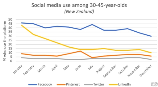
The given graph illustrates digital interaction in people communities 30-45 year-olds in New Zealand in the period of 2018.

Firstly, at the bedinning of the year in New Zealend , Facebook was leading in popularity ,showing the over 45 percentages, among other social medias, such as, Pinterest, Twitter, Linkedin. Secondly the gragh depicts thet the period from january to april was in terms of quite stable for majority of social apps. However the Twitter’s number of uses demonstrates the severe decline , while the Pinterest’s indicators reached their peak and succesfully were able to be align with Linkedin. Thirdly, since the month june, the line gragh indicates slight fluctations in the number of users. Facebook had a rough increase from june to july, but suddenly right after were found a downsize. Furthermore, the quentity of use indicators by Pinterest reflects the significant fall in one month from june to july, afterwards the measures were raising in moderation.

Overall, based on the given line graph, there were not any considerable increases in social media uses during the year, except uses of Pinterest.

Word Count: 181

Answers On The Same Topic:

The line graph shows social media use among 30-45 year-olds in New Zealand in 2018. Summarise the information by selecting and reporting the main features, and make comparisons where relevant.

The line graph illustrates the percentage of using social media between ages 35-45 in New Zealand in 2018. Overall, using Facebook show an upward trend through a 1 year period, while Unkedin show downward trajectory. All of the social media’s statistics is changed over the period apart from Twitter. Social persuits, such as watching Unkedin […]

The line graph shows social media use among 30-45 year-olds in New Zealand in 2018. Summarise the information by selecting and reporting the main features, and make comparisons where relevant.

The graph depicts the number of people in New Zealand from the age of 30 to 45 who use social media in 2018. Facebook is the most prominent social media app used by New Zealanders, while twitter is the least used app. LinkedIn and Facebook have had a decrease in the amount of people who […]

The line graph shows social media use among 30-45 year-olds in New Zealand in 2018. Summarise the information by selecting and reporting the main features, and make comparisons where relevant.

The given graph compares the different types of socail media used by people who are between 30 and 45 years old in New Zealand in 2018. Overall, it is clear that the usage of all social media platforms namely Facebook, Pinterest, Twitter and LinkedIn tend to decrease over the period of time. Looking in more […]

See All

Other Topics:

The line graph below shows the production of paper, wood pulp and sawn-wood in the UK from 1980 to 2000.

The line graph compares the production of paper, wood pulp and sawn-wood in the UK between 1980 and 2000. Taken as a whole, the production of paper witnessed an upward trend, meanwhile the opposite was true for wood pulp and sawn-wood. Additionally, the production of paper was the highest thoughout the period. Regarding the period […]

The line graph below shows the cost of four types of bread for 800 grams of in one European country from 2001 to 2007.

The chart illustrates the expenses of four types of bread for 800 grams in one European country between 2001 and 2007. Overall, black bread was the most expensive type throughout the given period except in 2001. Moreover, except for wholemeal bread, the cost for the others increased generally. In detail, the expense of black bread […]

The graph below shows the number of tourists visiting a particular Caribbean island between 2010 and 2017. Summaries the information by selecting and reporting the main features and make comparisons where relavant.

The line graph demonstrates the number of tourists visiting a Caribbean island from 2010 to 2017. Overall, the total number of tourists increased significantly over the period. In addition, visitors staying on cruise ships showed a considerable rise, while the number of tourists staying on the island remained relatively stable after 2013. The first group […]

The line graph below shows change in the number of participants in four different sports between 2021 and 2025

The line graph shows the changes in the number of participants in the four diffrent activties (Football, Basketball, Tennis, swimming) between the year of 2021 and 2025. In 2021, Tennis registered 110 particpants which was the highest of all sports, Swimming had a 100 participants and Fotball had 75 participants, while Basketball had the lowest […]

The graph below shows average carbon dioxide (CO2) emissions per person in the Uk, sweden, portugal and italy

The line graph depicts the total amount of emissions released by carbon dioxide (CO2) each person in four different European countries from 1967 to 2007. Overall, while others experienced varying tonnes, the UK maintained its dominance in the quantity of CO2 emissions despite following a moderate decline at the end. Although the amount of emissions […]

The line graph below gives information about the rates of unemployment between 1991 and 2005 in three different countries. The table shows the percentage of men and women in the workforce in the three countries. Summarize the information by selecting and reporting the main features, and make comparisons where relevant.

The statistical representation of the rates of unemployment in Spain, Germany and Italy between 1991 and 2005 is delineated by the given line chart. It is readily apparent that Germany and Italy exhibited an accretive trajectory . However, a significant drop was noticeable in Spain. In terms of 1991, the percentage of unemployment from Spain […]

See All
We have detected unusual activity on your device.
Please verify your identity to continue.
Note: This verification step won't sign you in. If you have a premium account, please log in to access the service as usual.
Google/Gmail Verification
Or verify using Email/Code
We've sent a verification code to:
youremail@gmail.com (Not your email?)
Enter it below to complete the verification process.
Ensure your email address is correct, your inbox is not full, and you check your spam folder. If no email arrives, consider using an alternative email.
You will need a Premium plan to perform your action!
Note: If you already have a premium account, please log in to access our services as usual.

Plans & Pricing

Our mission is to make quality education accessible for everyone.
However, to keep our hardworking team running and this service alive, we genuinely need your support!
By opting for a premium plan, not only do you sustain us in achieving the mission, but you also unlock advanced features to enrich your learning experience.

Free

For learners who aren't pressed for time

What's included on Free
100+ Cambridge IELTS Tests
Instant IELTS Writing Task 1 & 2 Evaluation (2 times/month)
Instant IELTS Speaking Part 1, 2, & 3 Evaluation (5 times/month)
Instant IELTS Writing Task 1 & 2 Essay Generator (2 times/month)
500+ Dictation & Shadowing Exercises
100+ Pronunciation Exercises
Flashcards
Other Advanced Tools

Premium

For those serious about advancing their English proficiency, and for IELTS candidates aspiring to boost their band score by 1-2 points (especially in writing & speaking) in just 30 days or less

What's included on Premium
Save Your IELTS Test Progress
Unlock All Courses & IELTS Tests
Unlimited AI Conversations
Unlimited AI Writing Enhancement Exercises
Unlimited IELTS Writing Task 1 & 2 Evaluation
Unlimited IELTS Speaking Part 1, 2, & 3 Evaluation
Checked Answers Will Not Be Published
Unlimited IELTS Writing Task 1 & 2 Essay Generator
Unlimited IELTS Speaking Part 1, 2, & 3 Sample Generator
Unlimited Usage Of Advanced Tools
Priority Support within 24h (12-month plan only)

Due to the nature of our service and the provided free trials, payments are non-refundable.
Nếu bạn là người Việt Nam và không có hoặc không muốn trả bằng credit/debit cards, bạn có thể thanh toán bằng phương thức chuyển khoản:


Chọn gói:
419,000₫ 277,000 ₫ cho gói 1 tháng (chỉ 9,233₫/ngày)
1,239,000₫ 597,000 ₫ cho gói 3 tháng (chỉ 6,633₫/ngày)
2,469,000₫ 1,027,000 ₫ cho gói 6 tháng (chỉ 5,706₫/ngày)
4,929,000₫ 1,417,000 ₫ cho gói 12 tháng (chỉ 3,936₫/ngày)


Sau khi chuyển khoản, vui lòng đợi trình duyệt tự động điều hướng bạn trở lại Engnovate và bạn sẽ ngay lập tức nhận được mã kích hoạt tài khoản premium.
Nếu có lỗi xảy ra, bạn có thể liên hệ với team thông qua một trong các phương thức: email đến helloengnovate@gmail.com hoặc nhắn tin qua facebook.com/engnovate.
Vì toàn bộ công cụ trên website đều có thể sử dụng thử miễn phí, Engnovate không hỗ trợ hoàn tiền.