🔥 Today Only: Save 30% on Premium — Offer Ends Soon! - Upgrade Now!
Line Graph

Band 6+: The line graph shows social media use among 30-45 year-olds in New Zealand in 2018. Summarise the information by selecting and reporting the main features, and make comparisons where relevant.

Image for topic: The line graph shows social media use among 30-45 year-olds in New Zealand in 2018. Summarise the information by selecting and reporting the main features, and make comparisons where relevant.
Our system will evaluate the answer based on this AI-generated description.
The image is a line chart showing social media use among 30-45-year-olds in New Zealand. Four platforms are displayed, Facebook, Pinterest, Twitter, and LinkedIn, with the following percentage usage by month: January - Facebook 45%, Pinterest 25%, Twitter 15%, LinkedIn 10%; February - Facebook 43%, Pinterest 26%, Twitter 15%, LinkedIn 12%; March - Facebook 42%, Pinterest 25%, Twitter 15%, LinkedIn 13%; April - Facebook 40%, Pinterest 24%, Twitter 16%, LinkedIn 13%; May - Facebook 38%, Pinterest 23%, Twitter 17%, LinkedIn 12%; June - Facebook 37%, Pinterest 22%, Twitter 18%, LinkedIn 12%; July - Facebook 35%, Pinterest 22%, Twitter 19%, LinkedIn 12%; August - Facebook 33%, Pinterest 21%, Twitter 20%, LinkedIn 12%; September - Facebook 32%, Pinterest 21%, Twitter 19%, LinkedIn 13%; October - Facebook 33%, Pinterest 22%, Twitter 18%, LinkedIn 14%; November - Facebook 34%, Pinterest 23%, Twitter 17%, LinkedIn 13%; December - Facebook 36%, Pinterest 24%, Twitter 16%, LinkedIn 12%. Facebook has the highest usage every month, decreasing from January to August and increasing afterward, while LinkedIn has the lowest usage, moderately increasing from January to October and slightly decreasing toward December. Twitter and Pinterest usage fluctuate with a slight overall decrease for Pinterest and increase for Twitter.
Given the complexity of the image, the above description may not be entirely accurate.
Note: Both the topic and the answer were created by one of our users.

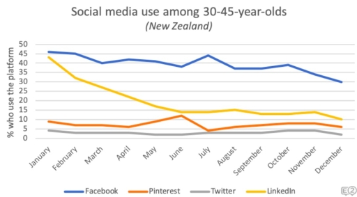
The given graph compares the different types of socail media used by people who are between 30 and 45 years old in New Zealand in 2018.

Overall, it is clear that the usage of all social media platforms namely Facebook, Pinterest, Twitter and LinkedIn tend to decrease over the period of time.

Looking in more detail, it can be seen that Facebook and LinkedIn are the most popular platform among 30-45 years old at the beginning of the period, accounting for around 45% and roughly 43% respectively. After that, while Facebook saw a steady drop to 30% at the end of the year, the number of LinkedIn usages plummeted by more than two thirds.

Over the same period of time, despite a significant increase in June, Pinterest’s figure has marginally decreased, starting from approximately 10% to ending at 5% in December. A similar trend has been seen in Twitter even though the figure is minor difference. In fact, it started at about 5% before decreasing to 3%.

Word Count: 167

Answers On The Same Topic:

The line graph shows social media use among 30-45 year-olds in New Zealand in 2018. Summarise the information by selecting and reporting the main features, and make comparisons where relevant.

The given graph illustrates digital interaction in people communities 30-45 year-olds in New Zealand in the period of 2018. Firstly, at the bedinning of the year in New Zealend , Facebook was leading in popularity ,showing the over 45 percentages, among other social medias, such as, Pinterest, Twitter, Linkedin. Secondly the gragh depicts thet the […]

The line graph shows social media use among 30-45 year-olds in New Zealand in 2018. Summarise the information by selecting and reporting the main features, and make comparisons where relevant.

The line graph illustrates the percentage of using social media between ages 35-45 in New Zealand in 2018. Overall, using Facebook show an upward trend through a 1 year period, while Unkedin show downward trajectory. All of the social media’s statistics is changed over the period apart from Twitter. Social persuits, such as watching Unkedin […]

The line graph shows social media use among 30-45 year-olds in New Zealand in 2018. Summarise the information by selecting and reporting the main features, and make comparisons where relevant.

The graph depicts the number of people in New Zealand from the age of 30 to 45 who use social media in 2018. Facebook is the most prominent social media app used by New Zealanders, while twitter is the least used app. LinkedIn and Facebook have had a decrease in the amount of people who […]

See All

Other Topics:

The line graph shows the percentage of people living in cities in four countries (Philippines, Malaysia, Thailand and Indonesia) from 1970 to 2020.

The given graph chart illustrates information on data on the population in four Asian countries living in cities over a period from 1918 to 2020, with predictions for 2030 and 2040. It is evident that there was an upward trend in the percentage of the population in four Asian countries living in cities and this […]

The graph below shows how people in one city in Australia buy music from 2015 to 2020.

The line graph illustrates how individual in one city bought music in Australia from 2015 between 2020 Overall, it is clear percentage of total music sales by method, there are three percentage it is streams, downloads, CDs purchased. Leader was streams it have highly increased line by the follow downloads line was flactuating and CDs […]

The given chart shows the proportion of residents of America (in millions) living in different regions between 2015 and 2020.Summarize the information by selecting and reporting the main features and make comparisons where relevant. Write at least 150 words.

The given chart illustrates the proportion of residents in America, measured in millions, who lived in different regions from 2015 to 2020. Overall, the population of all regions experienced some changes during the period. While certain regions showed a steady increase in the number of residents, others witnessed slight fluctuations. It is clear that one […]

The chart below shows the percentage of households in one country that owned a car, a computer, and a mobile phone from 1995 to 2015. Summarise the information by selecting and reporting the main features, and make comparisons where relevant. Write at least 150 words.

The line graph compares three different types of households’ properties (a car, a computer and a mobile phone) in one country between 1995 and 2015. Units are measured in percentages. Overall, it is noticeable that all categories only upward trend were observed over the period, albeit wity varying levels. Of particular note is mobile phones, […]

The graph below shows the production of three forest industry products in a European country, namely timber, pulp, and paper, from 1980 to 2000. Summarise the information by selecting and reporting the main features, and make Icomparison where relevant. Write at least 150 words.

The chart illustrates the development of forest industry production for the period 1980-2000, focusing on the processing of pulp, timber and paper. Overall, the amount of produced paper demonstrates almost linear improvement throughout the years, whilst pulp and timber appear rather wavery as significant ups and downs are evident in the production rate. What is […]

how teenagers (aged 12-19) in one state in the United States communicated with each other.

The line graph provides comprehensive data about what types of communication teenagers used throughout 3 years. Overall, it is notable that text messages were the most common way to communicate. However, interacting through email showed the lowest interest. To begin with, text messages started at 30% of all teenagers and increased slightly between 2006 and […]

See All
We have detected unusual activity on your device.
Please verify your identity to continue.
Note: This verification step won't sign you in. If you have a premium account, please log in to access the service as usual.
Google/Gmail Verification
Or verify using Email/Code
We've sent a verification code to:
youremail@gmail.com (Not your email?)
Enter it below to complete the verification process.
Ensure your email address is correct, your inbox is not full, and you check your spam folder. If no email arrives, consider using an alternative email.
You will need a Premium plan to perform your action!
Note: If you already have a premium account, please log in to access our services as usual.

Plans & Pricing

Our mission is to make quality education accessible for everyone.
However, to keep our hardworking team running and this service alive, we genuinely need your support!
By opting for a premium plan, not only do you sustain us in achieving the mission, but you also unlock advanced features to enrich your learning experience.

Free

For learners who aren't pressed for time

What's included on Free
100+ Cambridge IELTS Tests
Instant IELTS Writing Task 1 & 2 Evaluation (2 times/month)
Instant IELTS Speaking Part 1, 2, & 3 Evaluation (5 times/month)
Instant IELTS Writing Task 1 & 2 Essay Generator (2 times/month)
500+ Dictation & Shadowing Exercises
100+ Pronunciation Exercises
Flashcards
Other Advanced Tools

Premium

For those serious about advancing their English proficiency, and for IELTS candidates aspiring to boost their band score by 1-2 points (especially in writing & speaking) in just 30 days or less

What's included on Premium
Save Your IELTS Test Progress
Unlock All Courses & IELTS Tests
Unlimited AI Conversations
Unlimited AI Writing Enhancement Exercises
Unlimited IELTS Writing Task 1 & 2 Evaluation
Unlimited IELTS Speaking Part 1, 2, & 3 Evaluation
Checked Answers Will Not Be Published
Unlimited IELTS Writing Task 1 & 2 Essay Generator
Unlimited IELTS Speaking Part 1, 2, & 3 Sample Generator
Unlimited Usage Of Advanced Tools
Priority Support within 24h (12-month plan only)

Due to the nature of our service and the provided free trials, payments are non-refundable.
Nếu bạn là người Việt Nam và không có hoặc không muốn trả bằng credit/debit cards, bạn có thể thanh toán bằng phương thức chuyển khoản:


Chọn gói:
419,000₫ 277,000 ₫ cho gói 1 tháng (chỉ 9,233₫/ngày)
1,239,000₫ 597,000 ₫ cho gói 3 tháng (chỉ 6,633₫/ngày)
2,469,000₫ 1,027,000 ₫ cho gói 6 tháng (chỉ 5,706₫/ngày)
4,929,000₫ 1,417,000 ₫ cho gói 12 tháng (chỉ 3,936₫/ngày)


Sau khi chuyển khoản, vui lòng đợi trình duyệt tự động điều hướng bạn trở lại Engnovate và bạn sẽ ngay lập tức nhận được mã kích hoạt tài khoản premium.
Nếu có lỗi xảy ra, bạn có thể liên hệ với team thông qua một trong các phương thức: email đến helloengnovate@gmail.com hoặc nhắn tin qua facebook.com/engnovate.
Vì toàn bộ công cụ trên website đều có thể sử dụng thử miễn phí, Engnovate không hỗ trợ hoàn tiền.