🔥 Today Only: Save 30% on Premium — Offer Ends Soon! - Upgrade Now!
Line Graph

Band 6+: The line graph shows the amount of three kinds of exports in a country between 2000 and 2010, measured in metric tons.

Image for topic: The line graph shows the amount of three kinds of exports in a country between 2000 and 2010, measured in metric tons.
Our system will evaluate the answer based on this AI-generated description.
The image illustrates export metrics from 2000 to 2010 in three categories: Agricultural, Industrial, Others, measured in metric tons. In 2000, Agricultural exports were 3 metric tons, Industrial exports were 1 metric ton, and Others were 2 metric tons. By 2001, Agricultural increased to 5, Industrial to 2, and Others to 2. For 2002, Agricultural was 4, Industrial reached 3, and Others slightly declined to 3. In 2003, Agricultural dropped back to 3, Industrial was at 4, and Others also at 3. By 2004, Agricultural plummeted to 1, Industrial held steady at 4, Others at 4. In 2005, Agricultural was at 1, Industrial raised to 5, Others went to 5. For 2006, Agricultural saw a rise to 3, Industrial remained at 5, Others fell to 3. In 2007, Agricultural increased to 4, Industrial decreased to 4, Others dropped to 2. In 2008, Agricultural exports were 3, Industrial's were consistent at 5, and Others at 2. By 2009, Agricultural decreased further to 2, Industrial reached 7, Others were stable at 2. Finally, in 2010, Agricultural exports dropped to 1, Industrial surged to 8, and Others slightly decreased to 1 metric ton.
Given the complexity of the image, the above description may not be entirely accurate.
Note: Both the topic and the answer were created by one of our users.

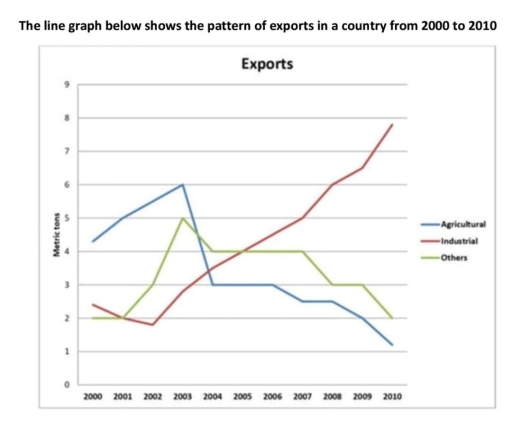
The graph illustrates the volume of exports in one country between 2000 and 2010.

Even though, industrial export was one of the less volume-recorded phases, it has witnessed a sharp growth until 2010. However, agricultural export was the highest exported volume, which decreased steadily by the end of the decade.

In 2000, industrial export showed 2.5 in metric tons. Nevertheless, it declined a little in 2002 to just under the two. Following to this, it increased sharply to 7.9 from 2002 to 2010.

In contrast, the other groups showed significant decreases. At the start, agricultural export reported 4.2. It went up to six in 2003 before going down next year. Notably, there was not any change between 2004 and 2006. Then, it dived slightly from three to 1.1 during the next four years. Other phases was two in the initial year and did not showed a change during a year. However, it then grew to five before going down to four. Between 2004 and late 2007 export of the other sectors stayed unchangeable. Finally, it decreased step by step from 2007 to 2010.

Word Count: 183

Answers On The Same Topic:

The line graph shows the amount of three kinds of exports in a country between 2000 and 2010, measured in metric tons.

The line graph illustrates the figure of exports among the nation between 2000 to 2010. It is clear that the industrial depicts the highest proportion of exports throughout the pattern. Overall, it can be seen that the highest number of expoted from industrial market, eventually, second possition for others export and than Agriculture from the […]

The line graph shows the amount of three kinds of exports in a country between 2000 and 2010, measured in metric tons.

The graph compares three kinds of exports in a country over ten years, from 2000 to 2010. It can be seen that the proportion of agricultural exports increases dramatically and sharply falls in 2004, and still decreases until the end of the graph. Industry’s numbers also rise gradually during the same time period. Thegreen line, […]

The line graph shows the amount of three kinds of exports in a country between 2000 and 2010, measured in metric tons.

The graph compares three kind of exports in a country over ten-year from 2000 to 2010 It can be seen that the proportion of Agricultural increses dramatically and sharply fall in 2004 and still decreases until the end of the graph . Industry’s number also rise gradually . During the same time period the green […]

The line graph shows the amount of three kinds of exports in a country between 2000 and 2010, measured in metric tons.

The line graph illustrates the methods of exports namely, agricultural, industrial and other exports in a country in 2000 and 2010.Overall, other exports remained constant in terms of exports despite noticeable upward and downward trends, while agricultural and industrial exports showed pronounced variations. Notably, the figure for industrial had the highest exports over the period […]

See All

Other Topics:

The chart below shows the percentage of Australian people who were born in different places of the world.

Tha graph illustrate the data about percentage of Australian flok where were born in different areas of the world in the given period which is from 1976 to 2011 Overall, there are four places where Australians were born, which is uk, asia, total amount of borns and other areas. There are three places in the […]

The line graph below shows the number of overseas tourists (in millions) who visited France, Spain, and Japan between 1990 and 2020. Summarise the information by selecting and reporting the main features, and make comparisons where relevant.

The provided line graph illustrates the total number of tourists exploring three different foreign countries over the period of 30 years, from 1990 to 2020. Overall, the number of visitors in Spain and France surged significantly, whereas Japan increased slightly until 2000 and then declined throughout the period. Furthermore, France remained the dominant destination over […]

The graph below shows the percentage of people who accessed news in the USA between 2012 and 2015.

The line graph illustrates the percentage of people in the USA who accessed news through four types of media, namely websites, TV, print newspapers and social media, between 2012 and 2015. Overall, online news had the highest percentage throughout the period, while TV news remained relatively stable. By contrast, print news declined significantly, whereas social […]

The chart below shows the number of four different species of fish between 1982 and 2007. Summarize the information by selecting and reporting the main features, and make comparisons where relevant.

The line graph illustates four different types of fishes from 1982 to 2007. In general, while the figure for Atlantic Cod and Yellow fin Tuna showed great competition, others two did not demonstrated changes. Focusing first on bigger numbers, the number of Atlantic Cod was around 2,25,000 in 1982, and this was followed by considerable […]

The graph below gives information about the percentage of people living in Australia who were born in Asia, the UK, and other regions.

This graph shows description about The proportion of citizen living in Australia who were born and growth in Asia, UK & other regions. As we can see, Asian in Australia has been increased significantly from 1976 until 2011. The increase reached 15 percent in 2011. Data reveals a high interest among the Asian population in […]

the line graph shows the percentage of people who used five different communication methods between 1998 and 2008.

The line graph delineates the proportions of individuals utilizing five distinct communication methods over a decade, from 1998 to 2008. In summary, while all communication methods, barring landline services, experienced a notable increase in usage, cellular phone services emerged as the predominant choice by the end of the period. In 1998, the proportion of individuals […]

See All
We have detected unusual activity on your device.
Please verify your identity to continue.
Note: This verification step won't sign you in. If you have a premium account, please log in to access the service as usual.
Google/Gmail Verification
Or verify using Email/Code
We've sent a verification code to:
youremail@gmail.com (Not your email?)
Enter it below to complete the verification process.
Ensure your email address is correct, your inbox is not full, and you check your spam folder. If no email arrives, consider using an alternative email.
You will need a Premium plan to perform your action!
Note: If you already have a premium account, please log in to access our services as usual.

Plans & Pricing

Our mission is to make quality education accessible for everyone.
However, to keep our hardworking team running and this service alive, we genuinely need your support!
By opting for a premium plan, not only do you sustain us in achieving the mission, but you also unlock advanced features to enrich your learning experience.

Free

For learners who aren't pressed for time

What's included on Free
100+ Cambridge IELTS Tests
Instant IELTS Writing Task 1 & 2 Evaluation (2 times/month)
Instant IELTS Speaking Part 1, 2, & 3 Evaluation (5 times/month)
Instant IELTS Writing Task 1 & 2 Essay Generator (2 times/month)
500+ Dictation & Shadowing Exercises
100+ Pronunciation Exercises
Flashcards
Other Advanced Tools

Premium

For those serious about advancing their English proficiency, and for IELTS candidates aspiring to boost their band score by 1-2 points (especially in writing & speaking) in just 30 days or less

What's included on Premium
Save Your IELTS Test Progress
Unlock All Courses & IELTS Tests
Unlimited AI Conversations
Unlimited AI Writing Enhancement Exercises
Unlimited IELTS Writing Task 1 & 2 Evaluation
Unlimited IELTS Speaking Part 1, 2, & 3 Evaluation
Checked Answers Will Not Be Published
Unlimited IELTS Writing Task 1 & 2 Essay Generator
Unlimited IELTS Speaking Part 1, 2, & 3 Sample Generator
Unlimited Usage Of Advanced Tools
Priority Support within 24h (12-month plan only)

Due to the nature of our service and the provided free trials, payments are non-refundable.
Nếu bạn là người Việt Nam và không có hoặc không muốn trả bằng credit/debit cards, bạn có thể thanh toán bằng phương thức chuyển khoản:


Chọn gói:
419,000₫ 277,000 ₫ cho gói 1 tháng (chỉ 9,233₫/ngày)
1,239,000₫ 597,000 ₫ cho gói 3 tháng (chỉ 6,633₫/ngày)
2,469,000₫ 1,027,000 ₫ cho gói 6 tháng (chỉ 5,706₫/ngày)
4,929,000₫ 1,417,000 ₫ cho gói 12 tháng (chỉ 3,936₫/ngày)


Sau khi chuyển khoản, vui lòng đợi trình duyệt tự động điều hướng bạn trở lại Engnovate và bạn sẽ ngay lập tức nhận được mã kích hoạt tài khoản premium.
Nếu có lỗi xảy ra, bạn có thể liên hệ với team thông qua một trong các phương thức: email đến helloengnovate@gmail.com hoặc nhắn tin qua facebook.com/engnovate.
Vì toàn bộ công cụ trên website đều có thể sử dụng thử miễn phí, Engnovate không hỗ trợ hoàn tiền.