🔥 Today Only: Save 30% on Premium — Offer Ends Soon! - Upgrade Now!
Line Graph

Band 4+: The line graph shows the changes i. Population size, birth rate and a thread overy period of 1700 to 2000. Summarise information by selecting and reporting me features and make comparisons where relevant.

Image for topic: The line graph shows the changes i. Population size, birth rate and a thread overy period of 1700 to 2000. Summarise information by selecting and reporting me features and make comparisons where relevant.
Our system will evaluate the answer based on this AI-generated description.
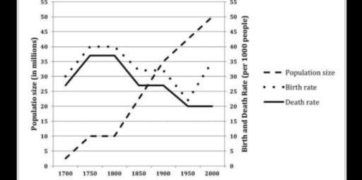
The image is a graph with two y-axes, showing population size (in millions) on the left and birth and death rate (per 1,000 people) on the right, plotted across a timeline from 1700 to 2000 on the x-axis. Three lines represent population size (dashed), birth rate (dotted), and death rate (solid). Population size starts at approximately 5 million in 1700, rises to just over 10 million around 1750, drops below 10 million by 1800, then climbs steadily to reach 30 million by 1850, around 40 million by 1900, and exceeds 50 million by 2000. Birth rate begins at about 30 per 1,000 people in 1700, fluctuates between 30 to just over 40 until 1850 where it peaks close to 50, then steeply declines to below 20 by 2000. Death rate starts just above 40 per 1,000 people in 1700, peaks at around 45 by 1750, drops to 20 by 1800, rises back to around 30 by 1850, and then falls to below 10 by 2000.
Given the complexity of the image, the above description may not be entirely accurate.
Note: Both the topic and the answer were created by one of our users.

The line graph illustrates changed ,namely the population size, birth rate and the death rate in England and Wales, between 1700 and 2000.

Overall, the number of population size stood at the lowest at the beginning, while it increased dramatically at the end of the survey. However, the figure for birth rate fluctuated over a period, while death rate gradually decreased at the final year.

At the beginning, the number of birth rate stood at 30 per in 1700. The figure for it increased significantly at 40 per in 1750, and remined relatively unchanged until 1800. The number of birth rate dropped substantially at around 22 per in 1950, before upward trent to 34 per in 2000. Similarly, the death rate followed a similar trend to the birth rate until 1900. After that, it decreased slightly to 20 per in 1950, and remained stable untül the end of the survey.

Finally, the figure for polulation size stood at about 3 per in 1700. And after that, it rose slowly to 10 per in 1750 and stayed stabil until 1800. The number of population size was upward trent, reaching 50 per in 200.

Word Count: 192

Answers On The Same Topic:

The line graph shows the changes i. Population size, birth rate and a thread overy period of 1700 to 2000. Summarise information by selecting and reporting me features and make comparisons where relevant.

The line graph provides information about how the population size, birth and death rates changed in two countries England and Wales between 1700 and 2000. It can be seen from the graph that, the population size experienced an upward trend, whereas both birth rate and death rate followed a considerable fluctuating pattern throughout the period. […]

The line graph shows the changes i. Population size, birth rate and a thread overy period of 1700 to 2000. Summarise information by selecting and reporting me features and make comparisons where relevant.

The line chart elucidates the changes in population size, birth rate, and death rate per 1000 people in the year of 1700 to 2000. In general, the population size experienced rise sharply until the end of period. Although the number population of birth rate and date rate increased in the early year of 1700, both […]

The line graph shows the changes i. Population size, birth rate and a thread overy period of 1700 to 2000. Summarise information by selecting and reporting me features and make comparisons where relevant.

The line graph compares changes in population size, birth rate and death rate in England and Wales between 1700 and 2000. Overall, the population rose dramatically over the period, especially after the mid-nineteenth century, while both birth and death rates showed long-term declines despite some fluctuations. Birth rates were consistently higher than death rates, which […]

The line graph shows the changes i. Population size, birth rate and a thread overy period of 1700 to 2000. Summarise information by selecting and reporting me features and make comparisons where relevant.

The line graph illustrates changes in population size, birth rate and death rate in England and Wales from 1700 to 2000. Overall, the population increased sharply over the period, particularly after 1800, while both birth and death rates generally declined. At all times, the birth rate remained higher than the death rate, contributing to sustained […]

See All

Other Topics:

the graph below shows information about the recruitment of teachers in Ontario in 2001 and 2007

Well, the graph shows the percentage of English-language and French-language teachers who got regular teaching jobs from 2001 to 2007. overall, the percentage of English teachers went down a lot, while the percentage of fench teachers stayed quite stabl. In 2007, about 10% of English teachers got regular jobs. this number fell to around 38% […]

You should spend about 20 minutes on this task. The line chart below shows the results of a survey giving the reasons why people moved to the capital city of a particular country. Summarise the information by selecting and reporting the main features, and make comparisons where relevant. Write at least 150 words

The line chart illustrates the outcome of a research, individuals relocated to the urban area of a certain nation between 2000 and 2025. Overall, it is clear that the most important purpose why people leave from their hometown was due to study. AIM addition, family-related reason and adventure accounted for the lowest figure on the […]

Production levels of the main fuels in the UL between 1981 and 2000

The line graph compares the production levels of petroleum, coal, and natural gas in the United Kingdom between 1981 and 2000. Overall, petroleum and natural gas production both showed significant increases over the period, despite some fluctuations in petroleum levels. In 1981, petroleum production started at around 90 energy units and rose sharply to nearly […]

The graph shows the income of four restaurants in Cambridge in 2016.

The given line graph illustrates the variations in the income of four different restaurants, namely the Grosvenor, the Old Hall, the Pizza House, and the Taj Mahal in 2016 in Cambridge. Overall, it is evident that the Pizza House and the Taj Mahal saw a significant increase in profits by end of the year, whereas […]

Task 1: (The line graph shows the percentages of Australian exports with four countries. Summarize the information by selecting and reporting the main features and make comparisons where relevant You should write at least 150 words.)

The line graph illustrates the proportion of Australian exports sent to four nations from 1990 to 2012. Overall, while Japan was initially the main destination for Australian goods, China experienced dramatic growth to become the leading trade partner by the end of the period. Additionally, exports to the US and India remained at lower levels […]

See All
We have detected unusual activity on your device.
Please verify your identity to continue.
Note: This verification step won't sign you in. If you have a premium account, please log in to access the service as usual.
Google/Gmail Verification
Or verify using Email/Code
We've sent a verification code to:
youremail@gmail.com (Not your email?)
Enter it below to complete the verification process.
Ensure your email address is correct, your inbox is not full, and you check your spam folder. If no email arrives, consider using an alternative email.
You will need a Premium plan to perform your action!
Note: If you already have a premium account, please log in to access our services as usual.

Plans & Pricing

Our mission is to make quality education accessible for everyone.
However, to keep our hardworking team running and this service alive, we genuinely need your support!
By opting for a premium plan, not only do you sustain us in achieving the mission, but you also unlock advanced features to enrich your learning experience.

Free

For learners who aren't pressed for time

What's included on Free
100+ Cambridge IELTS Tests
Instant IELTS Writing Task 1 & 2 Evaluation (2 times/month)
Instant IELTS Speaking Part 1, 2, & 3 Evaluation (2 times/month)
Instant IELTS Writing Task 1 & 2 Essay Generator (2 times/month)
500+ Dictation & Shadowing Exercises
100+ Pronunciation Exercises
Flashcards
Other Advanced Tools

Premium

For those serious about advancing their English proficiency, and for IELTS candidates aspiring to boost their band score by 1-2 points (especially in writing & speaking) in just 30 days or less

What's included on Premium
Save Your IELTS Test Progress & Analyze Mistakes By Question Type
Save Your Own Flashcard Sets & Use Them On Any Device
Unlock All Courses, IELTS Tests, Section & Part Practice
Unlimited AI Conversations
Unlimited AI Writing Enhancement Exercises
Unlimited IELTS Writing Task 1 & 2 Evaluation
Unlimited IELTS Speaking Part 1, 2, & 3 Evaluation
Checked Answers Will Not Be Published
Unlimited IELTS Writing Task 1 & 2 Essay Generator
Unlimited IELTS Speaking Part 1, 2, & 3 Sample Generator
Unlimited Usage Of Advanced Tools & AI Features
Priority Support within 24h (12-month plan only)

Due to the nature of our service and the provided free trials, payments are non-refundable.