🔥 Today Only: Save 30% on Premium — Offer Ends Soon! - Upgrade Now!
Line Graph

Band 8+: The line graph shows the number of XYZ radio station listeners from 1940 to 2030, including future projectionsSummarise the information by selecting and reporting main features, and make comparisons where relevant.

Image for topic: The line graph shows the number of XYZ radio station listeners from 1940 to 2030, including future projectionsSummarise the information by selecting and reporting main features, and make comparisons where relevant.
Our system will evaluate the answer based on this AI-generated description.
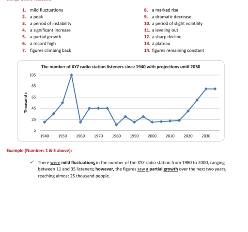
The image contains a line graph titled "The number of XYZ radio station listeners since 1940 with projections until 2030" with a y-axis in "Thousands" and an x-axis showing years. The data points for (year, thousands of listeners) are approximately: (1940, 22), (1950, 55), (~1956, 105), (1960, 20), (~1965, 45), (1970, 45), (~1978, 45), (1980, 15), (~1984, 32), (1990, 22), (~1995, 33), (2000, 20), (2010, 23), (2020, 50), (~2028, 80), and (2030, 80). Also shown are two numbered lists: 1. mild fluctuations, 2. a peak, 3. a period of instability, 4. a significant increase, 5. a partial growth, 6. a record high, 7. figures climbing back, and 8. a marked rise, 9. a dramatic decrease, 10. a period of slight volatility, 11. a leveling out, 12. a sharp decline, 13. a plateau, 14. figures remaining constant. An example text related to numbers 1 and 5 states that from 1980 to 2000, the number of listeners ranged between 11 and 35, and a subsequent partial growth reached almost 25 thousand people.
Given the complexity of the image, the above description may not be entirely accurate.
Note: Both the topic and the answer were created by one of our users.

The line graph shows the number of XYZ radio station listeners from 1940 to 2030, including future projections.

Overall, the number of listeners had a lot of changes. There was a record high in the middle of the period, but after that the figures went down sharply and then showed some recovery again in recent years.

In 1940, the number of listeners was quite low, around 20 thousand. After that, there was a marked rise between 1940 and 1955, reaching about 50 thousand. Then the figures increased very fast and reached a peak of around 105 thousand in 1960.

However, after this peak, there was a dramatic decrease and the number dropped to nearly 20 thousand. From 1960 to 1980, the graph shows some mild fluctuations and a period of instability, staying mostly between 20 and 45 thousand.

Later, from 1980 to 2000, the numbers were quite low with small ups and downs, showing a leveling out around 15-25 thousand. After 2010, there was again a significant increase, and the figures are expected to keep rising, reaching about 80 thousand by 2030.

Word Count: 182

Answers On The Same Topic:

The line graph shows the number of XYZ radio station listeners from 1940 to 2030, including future projectionsSummarise the information by selecting and reporting main features, and make comparisons where relevant.

The line graph shows the number of XYZ radio station listeners from 1940 to 2030, including future projections. Overall, the number of listeners had a lot of changes. There was a record high in the middle of the period, but after that the figures went down sharply and then showed some recovery again in recent […]

The line graph shows the number of XYZ radio station listeners from 1940 to 2030, including future projectionsSummarise the information by selecting and reporting main features, and make comparisons where relevant.

The line graph illustrates the changes in the number of listeners for the XYZ radio station between 1940 and 2024, with projected figures leading up to 2030. Overall, the listener count has experienced a period of instability over the decades. While the station saw a significant peak in the mid-1950s followed by a sharp decline, […]

See All

Other Topics:

The chart shows the percentage of tourists to Scotland who visited four different types of attractions from 1980 to 2010.

The given line graph illustrates the fraction of foreign visitors in attractions in different sites such as aquarium, castle, zoo and festival in Edinburgh, Scotland. In overall, there is sligh increment and decrement of visitors in attractions. In two places, visitors increased throughout the year whereas decreased in two. Aquarium and castle shows the most […]

The line graph below shows the population size, birth rate and the death rate of England and Wales from 1700 to 2000. Summarise the information by selecting and reporting the main features and make comparisons where relevant.

The line graph illustrates the information about three demographics (population size, the birth rate and death rate) of English and Wales between 1700 and 2000. Overall, it can be clearly seen that throughout the given period the birth was more than death rate. Also, the population size rose with time, while the death rate and […]

the line graph below gives informTION BOUT THE NUMBER OF JOBS IN FOUR SECTORS OF THE ECONOMY IN THE US BETWEEN 1960 AND 2020

The given line graph illustrates the number of professions in four sectors of the economy in the US from 1960 to 2020. Overall, it can be clearly observed that healthcare and retail indicated the highest rate while agriculture represented the lowest level. According to the given data, at the beginning of the period manufacturing showed […]

The graph below gives information about the number of jobs in four sectors of the economy in the US between 1960 and 2020. Summarise the information by selecting and reporting the main features, and make comparisons where relevant.

The given line graph demonstrates the details about the amount of career opportunities in four sectors of the economy in United States from 1960 to 2020. Overall, while two trends had the highest figures over the given period, the number of jobs in manufacturing and agriculture recorded the lowest proportion throughout the period. In addition, […]

The graph shows monthly trends of three product of tablets, laptop, desktop.

The figure shows monthly trends of three product of tablets, laptop, desktop. Overall, the highest level among the products were tablets over the five-month period. They rose consistently without any decline. The lowest figure is the desktop, it was showed a continuous downward trend. Looking at the diagram, the sales of tablets commenced in January […]

The graph below shows the gross domestic products (GDP) in four selected countries between 2010 and 2015

the graph provides the gross domestic products among four countries over a 5 years of period, from 2010 to 2015. Overall, it is evident that the USA experienced the highest amount of products, while the UK recorded the lowest figures. It witnessed that the USA and China showed a significant upward trend throughout the period. […]

See All
We have detected unusual activity on your device.
Please verify your identity to continue.
Note: This verification step won't sign you in. If you have a premium account, please log in to access the service as usual.
Google/Gmail Verification
Or verify using Email/Code
We've sent a verification code to:
youremail@gmail.com (Not your email?)
Enter it below to complete the verification process.
Ensure your email address is correct, your inbox is not full, and you check your spam folder. If no email arrives, consider using an alternative email.
You will need a Premium plan to perform your action!
Note: If you already have a premium account, please log in to access our services as usual.

Plans & Pricing

Our mission is to make quality education accessible for everyone.
However, to keep our hardworking team running and this service alive, we genuinely need your support!
By opting for a premium plan, not only do you sustain us in achieving the mission, but you also unlock advanced features to enrich your learning experience.

Free

For learners who aren't pressed for time

What's included on Free
100+ Cambridge IELTS Tests
Instant IELTS Writing Task 1 & 2 Evaluation (2 times/month)
Instant IELTS Speaking Part 1, 2, & 3 Evaluation (5 times/month)
Instant IELTS Writing Task 1 & 2 Essay Generator (2 times/month)
500+ Dictation & Shadowing Exercises
100+ Pronunciation Exercises
Flashcards
Other Advanced Tools

Premium

For those serious about advancing their English proficiency, and for IELTS candidates aspiring to boost their band score by 1-2 points (especially in writing & speaking) in just 30 days or less

What's included on Premium
Save Your IELTS Test Progress
Unlock All Courses & IELTS Tests
Unlimited AI Conversations
Unlimited AI Writing Enhancement Exercises
Unlimited IELTS Writing Task 1 & 2 Evaluation
Unlimited IELTS Speaking Part 1, 2, & 3 Evaluation
Checked Answers Will Not Be Published
Unlimited IELTS Writing Task 1 & 2 Essay Generator
Unlimited IELTS Speaking Part 1, 2, & 3 Sample Generator
Unlimited Usage Of Advanced Tools
Priority Support within 24h (12-month plan only)

Due to the nature of our service and the provided free trials, payments are non-refundable.
Nếu bạn là người Việt Nam và không có hoặc không muốn trả bằng credit/debit cards, bạn có thể thanh toán bằng phương thức chuyển khoản:


Chọn gói:
419,000₫ 277,000 ₫ cho gói 1 tháng (chỉ 9,233₫/ngày)
1,239,000₫ 597,000 ₫ cho gói 3 tháng (chỉ 6,633₫/ngày)
2,469,000₫ 1,027,000 ₫ cho gói 6 tháng (chỉ 5,706₫/ngày)
4,929,000₫ 1,417,000 ₫ cho gói 12 tháng (chỉ 3,936₫/ngày)


Sau khi chuyển khoản, vui lòng đợi trình duyệt tự động điều hướng bạn trở lại Engnovate và bạn sẽ ngay lập tức nhận được mã kích hoạt tài khoản premium.
Nếu có lỗi xảy ra, bạn có thể liên hệ với team thông qua một trong các phương thức: email đến helloengnovate@gmail.com hoặc nhắn tin qua facebook.com/engnovate.
Vì toàn bộ công cụ trên website đều có thể sử dụng thử miễn phí, Engnovate không hỗ trợ hoàn tiền.