🔥 Today Only: Save 30% on Premium — Offer Ends Soon! - Upgrade Now!
Line Graph

Band 7+: The line graph shows the prison population in a European country between 1911 and 2001

Image for topic: The line graph shows the prison population in a European country between 1911 and 2001
Our system will evaluate the answer based on this AI-generated description.
The image includes two line graphs labeled as "Male Prison Population 1911–2001" and "Female Prison Population 1911–2001" in a European country. The male graph shows prison population starting at approximately 4,000 in 1911, dropping to around 3,000 in 1921, slightly increasing to about 3,500 in 1931, decreasing again to around 3,000 in 1941, maintaining until 1951, jumping to approximately 5,000 in 1961, then to about 10,000 in 1971, spiking to around 30,000 in 1981, and reaching nearly 50,000 in 2001. The female graph shows prison population starting at roughly 200 in 1911, decreasing to about 100 in 1921, staying stable until 1931, increasing to around 200 in 1941, slightly decreasing in 1951, surging to about 600 in 1961, then to around 1,000 in 1971, dropping to approximately 800 in 1981, and finally increasing to nearly 3,500 in 2001.
Given the complexity of the image, the above description may not be entirely accurate.
Note: Both the topic and the answer were created by one of our users.

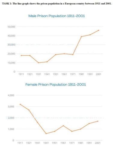
The given line graphs depict the criminal population in both genders in a European nation from 1911 to 2001.

It is clear that the number of male prisoners experienced an upward trend, the opposite was true for that of females. Additionally, the quantity of males exceeded their counterparts.

Regarding the first graph, in 1911, there were about 20,000 male prisoners and the number was still stabilized until 1921. In the next fifty years, the number of males declined to 10,000 before increasing to the same level of the year 1911 at 20,000 in 1971. From 1971 onwards, the figure witnessed a substantial rise to approximately 50,000 at the end of the period.

In terms of the remaining graph, in 1911, the quantity of female prisoners was around 3,000, much lower than that of males at the same time. Over three decades, the number of females plummeted to nearly 600 in 1941, followed by a marginal growth to 1,200 in 1961. In the following years, this figure dropped slightly to 900 before recovering up to about 1,800 in 2001.

Word Count: 178

Answers On The Same Topic:

The line graph shows the prison population in a European country between 1911 and 2001

The provided line graphs illustrate the number of million prisoners in both distinct genders in a particular European nation from 1911 to 2001. In general, the number of male prisoners saw a decrease, while the opposite was true for males. Additionally, men tend to commit a crime significantly more than women. Concerning male prisoners, in […]

The line graph shows the prison population in a European country between 1911 and 2001

The line graph shows the changes in the number of inmates in one prison in a certain European nation from 1911 to 2001. Overall, the number of male prisoners adhered to rising trends, while the reverse was true for females, with men in jail outnumbering their female counterparts throughout the period. The figure for men […]

The line graph shows the prison population in a European country between 1911 and 2001

The line graph illustartes the number of male and female prisoners one European country from 19991 to 2001 Overall, while the count of men behind the bars trended upward, that of women in prison followed an opposite trajectory, Additonally, there were always more male convict then their female counterparts. Looking first at the figures for […]

The line graph shows the prison population in a European country between 1911 and 2001

The two line graphs depict the number of male and female prisoners in a European country from 1911 to 2001. Overall, the male prison population showed a significant upward trend, particularly after 1981, whereas the female prison population remained considerably lower throughout the period, despite experiencing some fluctuations and gradual growth towards the end. In […]

See All

Other Topics:

The graph below compares changes in the birth rates of India and the USA between 1920 and 2000. Summarise the information by selecting and reporting the main features, and make comparisons where relevant.

The presented line graph illustrates changes in the birth rates of India and the USA between 1930 and 2000. Overall, the birth rates in the Indian showed rocketed in beginning time but declined slowly in the end of period. It can also seen that, USA birth rates showed rose steadily in beggining time get, dipped […]

The graph below compares changes in the birth rates of India and the USA between 1920 and 2000. Summarise the information by selecting and reporting the main features, and make comparisons where relevant.

The chart shows the changes of birth rates in India and the USA between 1920 and 2000. Both of the countries saw a rise before 1950 and reached the peak in that year. Since 1950, the birth rates in both countries has been declining. Between these 80 years, the birth rate in India has been […]

The graph below shows the number of inquiries received by the Tourist Information Office in one city over six months in 2011.

The line graph illustrates how much data accepted by the Tourist Information Office in a city during the six months period in 2011. Overall, enquires that had been received by letter had the highest rate in January, whereas it changed to in person in March. Meanwhile, the ones received by phone surpassed email enquiries. On […]

the graph below gives information on the number of participants for different activities at one social centre in Melbourne, Australia for the period 20000 to 2020

The line graph highlights data for social centre activities in Melbourne, Australia, for the period from 2000 to 2020. Overall, the graph illustrates 5 main trend activities, including film club, martial arts, amateur dramatics, table tennis and musical performances. The main trend is the Film Club. It contains the highest indicator of participants for the […]

The line graph below shows the percentage of tourists to England who visited four different attractions in Brighton.

The line graph illustrates how many percentages of travellers to England who visited Brighton attractions, between 1980 and 2010. Overall, it is evident that Pavilion increased at the beginning of the period but showed noticeable fluctuations. In contrast, Art gallery experienced experienced gradually declined. Looking at the details, people, who visited pavilion attraction began at […]

The graph below shows information about the use of public transport in one country, by age group and location of residence, in 2016. Summarise the information by selecting and reporting the main features, and make comparisons where relevant.

The graph displays proportion of public transport usage depends on the age and location of residence in one country in 2016. Overall, it can be seen that figure for middle-aged individuals who live in large cities is significantly higher in comparison with people who lives in other cities. The same trend can be seen with […]

See All
We have detected unusual activity on your device.
Please verify your identity to continue.
Note: This verification step won't sign you in. If you have a premium account, please log in to access the service as usual.
Google/Gmail Verification
Or verify using Email/Code
We've sent a verification code to:
youremail@gmail.com (Not your email?)
Enter it below to complete the verification process.
Ensure your email address is correct, your inbox is not full, and you check your spam folder. If no email arrives, consider using an alternative email.
You will need a Premium plan to perform your action!
Note: If you already have a premium account, please log in to access our services as usual.

Plans & Pricing

Our mission is to make quality education accessible for everyone.
However, to keep our hardworking team running and this service alive, we genuinely need your support!
By opting for a premium plan, not only do you sustain us in achieving the mission, but you also unlock advanced features to enrich your learning experience.

Free

For learners who aren't pressed for time

What's included on Free
100+ Cambridge IELTS Tests
Instant IELTS Writing Task 1 & 2 Evaluation (2 times/month)
Instant IELTS Speaking Part 1, 2, & 3 Evaluation (5 times/month)
Instant IELTS Writing Task 1 & 2 Essay Generator (2 times/month)
500+ Dictation & Shadowing Exercises
100+ Pronunciation Exercises
Flashcards
Other Advanced Tools

Premium

For those serious about advancing their English proficiency, and for IELTS candidates aspiring to boost their band score by 1-2 points (especially in writing & speaking) in just 30 days or less

What's included on Premium
Save Your IELTS Test Progress
Unlock All Courses & IELTS Tests
Unlimited AI Conversations
Unlimited AI Writing Enhancement Exercises
Unlimited IELTS Writing Task 1 & 2 Evaluation
Unlimited IELTS Speaking Part 1, 2, & 3 Evaluation
Checked Answers Will Not Be Published
Unlimited IELTS Writing Task 1 & 2 Essay Generator
Unlimited IELTS Speaking Part 1, 2, & 3 Sample Generator
Unlimited Usage Of Advanced Tools
Priority Support within 24h (12-month plan only)

Due to the nature of our service and the provided free trials, payments are non-refundable.
Nếu bạn là người Việt Nam và không có hoặc không muốn trả bằng credit/debit cards, bạn có thể thanh toán bằng phương thức chuyển khoản:


Chọn gói:
419,000₫ 277,000 ₫ cho gói 1 tháng (chỉ 9,233₫/ngày)
1,239,000₫ 597,000 ₫ cho gói 3 tháng (chỉ 6,633₫/ngày)
2,469,000₫ 1,027,000 ₫ cho gói 6 tháng (chỉ 5,706₫/ngày)
4,929,000₫ 1,417,000 ₫ cho gói 12 tháng (chỉ 3,936₫/ngày)


Sau khi chuyển khoản, vui lòng đợi trình duyệt tự động điều hướng bạn trở lại Engnovate và bạn sẽ ngay lập tức nhận được mã kích hoạt tài khoản premium.
Nếu có lỗi xảy ra, bạn có thể liên hệ với team thông qua một trong các phương thức: email đến helloengnovate@gmail.com hoặc nhắn tin qua facebook.com/engnovate.
Vì toàn bộ công cụ trên website đều có thể sử dụng thử miễn phí, Engnovate không hỗ trợ hoàn tiền.