🔥 Today Only: Save 30% on Premium — Offer Ends Soon! - Upgrade Now!
Multiple Graphs

Band 7+: The pie graphs show greenhouse gas emissions worldwide in 2002 and the forecast for 2030. The column chart shows carbon dioxide emissions around the world. Summarise the information by selecting and reporting the main features, and make comparisons where relevant.

Image for topic: The pie graphs show greenhouse gas emissions worldwide in 2002 and the forecast for 2030. The column chart shows carbon dioxide emissions around the world. Summarise the information by selecting and reporting the main features, and make comparisons where relevant.
Our system will evaluate the answer based on this AI-generated description.
The image contains two separate data representations on carbon dioxide emissions. The first part shows two pie charts for 2002 and 2030 with three categories: OECD, Transition economies, and Developing countries. In 2002, OECD has 52%, Transition economies 10%, and Developing countries 38%; in 2030, OECD has 43%, Transition economies 9%, and Developing countries 48%. The second part shows a bar graph titled "Worldwide Carbon Dioxide Emissions by sector" with two bars for each sector representing 2002 and 2030. Sectors include Other sectors, Waste combustion, Transportation, Consumer, and Industry. In 2002, Other sectors have less than 2 billion tons, Waste combustion around 1.5 billion tons, Transportation nearly 6 billion tons, Consumer over 2 billion tons, and Industry approximately 10 billion tons. By 2030, Other sectors increase to just under 4 billion tons, Waste combustion around 2 billion tons, Transportation nearly 10 billion tons, Consumer around 3.5 billion tons, and Industry close to 12 billion tons.
Given the complexity of the image, the above description may not be entirely accurate.
Note: Both the topic and the answer were created by one of our users.

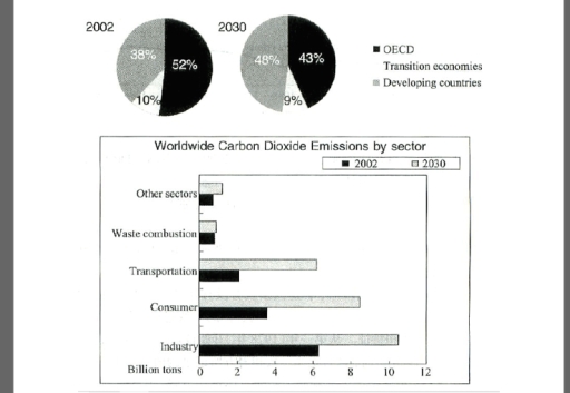
The diagram illustrates the percentage of greenhouse gas emissions, including OECD, transition economies, and developing countries between 2002 and 2030. The column indicates the worldwide carbon dioxide emissions by 6 various sector.

Overall, the OECD and transition economies had the highest percentage of gas emissions in both year. In 2030, global carbon dioxide emissions increased significantly, and industry contributed several billion tons.

In 2002, the developing countries accounted for 38% of gas emissions, which then suddenly increased by 10% to reach 48% compared to the previous year. However, the OECD experienced 52% of gas emissions, although it declined slightly by 2030. Furthermore, the transporation consisted of 2 billion tons before, when it relatively experienced the growth to 6 billion tons of carbon dioxide emissions. Other sectors and waste combustion made up smaller carbon dioxide emissions in the same position of pecent in both year. The consumer sector also contributed 4 billion tons at the beginning of the year, but this quickly increased by 8 billion tons in 2030.

Word Count: 168

Answers On The Same Topic:

The pie graphs show greenhouse gas emissions worldwide in 2002 and the forecast for 2030. The column chart shows carbon dioxide emissions around the world. Summarise the information by selecting and reporting the main features, and make comparisons where relevant.

The pie charts compare the proportions of greenhouse gas emissions produced by three groups of countries worldwide in 2002 and provide a forecast for 2030. The bar chart illustrates global carbon dioxide emissions across five sectors in billions of tons. Overall, the main contributors to CO₂ emissions in both 2002 and the prediction for 2030 […]

The pie graphs show greenhouse gas emissions worldwide in 2002 and the forecast for 2030. The column chart shows carbon dioxide emissions around the world. Summarise the information by selecting and reporting the main features, and make comparisons where relevant.

The pie charts illustrate data the percentage of three categories – OECD, transition economies, and developing in 2002 and 2030, while the bar provides details on the proportion of carbon dioxide emissions according to five different departments in the same time. Overall, both OECD, and transition economies experienced downward trends, albeit to varying degrees over […]

The pie graphs show greenhouse gas emissions worldwide in 2002 and the forecast for 2030. The column chart shows carbon dioxide emissions around the world. Summarise the information by selecting and reporting the main features, and make comparisons where relevant.

The pie charts provide data about greenhouse gas emissions in whole world in 2002 and up to 2030, while the bar charts demonstrate carbon dioxide emissions globally. Overall, it is evident that OCED and developing countries sectors showed the dominance in given period, whereas transition economies had the lowest emissions in both years. Moreover, there […]

The pie graphs show greenhouse gas emissions worldwide in 2002 and the forecast for 2030. The column chart shows carbon dioxide emissions around the world. Summarise the information by selecting and reporting the main features, and make comparisons where relevant.

The pie charts demonstrate greenhouse gas emission by OECD,Transition economies and developing countries, while bar chart illustrate CO2 emission around the world by different sectors between 2002 and 2030. Overall,in the past the most produced greenhouse output producer was OECD nevertheless the predictions show developing countries will be the most produced greenhouse gas. In bar […]

The pie graphs show greenhouse gas emissions worldwide in 2002 and the forecast for 2030. The column chart shows carbon dioxide emissions around the world. Summarise the information by selecting and reporting the main features, and make comparisons where relevant.

The pie graphs illustrate greenhouse gas emissions and forecasts from 2002 to 2030, while the column chart shows global carbon dioxide emissions. Overall, in 2002, emissions from developing countries accounted for around half, whereas by 2030, emissions from the OECD nations were approximately half. Transition economies had the lowest emissions in both 2002 and 2030. […]

See All

Other Topics:

The charts below show UK and USA energy consumption in 2000 and 2006. Summarise the information by selecting and reporting the main features, and make comparisons where relevant.

The given bar charts shows a comparision between of energy consumption by various sectors of two countries, in the year 2000 and 2006. overall charts illustrate that theboth countries are using more oil and coal energy as compare to the gas, nuclear power and others renewable sources. In the year 2000, USA consume nearly 38% […]

WRITING TASK 1 You should spend about 20 minutes on this task. The bar chart below describes some changes about the percentage of people were born in Australia and who were born outside Australia living in urban, rural and town between 1995 and 2010. Summarise the information by selecting and reporting the main features and make comparisons where relevant. You should write at least 150 words.

The given bar chart shows the percentage of individuals born in Australia and abroad who are residing in urban areas, rural areas and towns. This information has been collected in the years 1995 and 2010. Overall, cities have the greatest number of births in all considered years in Australia and other countries. Births in rural […]

The first chart below shows information about the consumers of water in Australia in 2004. The second chart gives details of residential water use in Australia in the same year. Summarise the information by selecting and reporting the main features, and make comparisons where relevant.

The pie chart illustrates the water consumers in Australia during 2004, while the bar chart depicts the usage of water for various residential purposes in this country in the same time span. In general, in 2004, resident dominated in using water in Australia. Notably, the residential water predominantly utilized for garden, while the figure for […]

The first chart below shows information about the consumers of water in Australia in 2004. The second chart gives details of residential water use in Australia in the same year. Summarise the information by selecting and reporting the main features, and make comparisons where relevant.

The pie chart depicts the percentage of consumers of different water sources in Australia in 2004, while the following bar chart delineates the consumption of residential water also recorded in Australia at the same time. Overall, it is noticeable that residential water users accounted for the overwhelming majority of total water consumers. Another noteworthy feature […]

The pie chart below shows the frequency of U.S. Adults' online purchasing habits in 2015, while the bar chart shows a further classification denoting online purchasing preferences. Summarise the data by selecting and reporting the main features and make comparisons where relevant. Write at least 150 words.

The given pie chart illustrates the figures of U.S adults’s habits of online shopping in 2015, whereas the bar chart expresses detailed data of online purchasing preferences. Overall, the two charts partly reflect same definition, which the adults who buy less online and more in physical stores tend to be the highest performers. Moreover, the […]

Task 1: The first chart below shows the percentage of school-aged girls and boys who were at secondary school in four regions of the world in 2000. The second chart shows the percentages of college-aged men and women in higher education in the same year.

The graphs provide information about the percentage of school-aged girls and boys who attended secondary school and higher education institutions, such as colleges and universities, in four regions of the world in the year 2000. The most noticeable feature is that in both graphs, the largest number of students is found in Europe. In the […]

See All
We have detected unusual activity on your device.
Please verify your identity to continue.
Note: This verification step won't sign you in. If you have a premium account, please log in to access the service as usual.
Google/Gmail Verification
Or verify using Email/Code
We've sent a verification code to:
youremail@gmail.com (Not your email?)
Enter it below to complete the verification process.
Ensure your email address is correct, your inbox is not full, and you check your spam folder. If no email arrives, consider using an alternative email.
You will need a Premium plan to perform your action!
Note: If you already have a premium account, please log in to access our services as usual.

Plans & Pricing

Our mission is to make quality education accessible for everyone.
However, to keep our hardworking team running and this service alive, we genuinely need your support!
By opting for a premium plan, not only do you sustain us in achieving the mission, but you also unlock advanced features to enrich your learning experience.

Free

For learners who aren't pressed for time

What's included on Free
100+ Cambridge IELTS Tests
Instant IELTS Writing Task 1 & 2 Evaluation (2 times/month)
Instant IELTS Speaking Part 1, 2, & 3 Evaluation (5 times/month)
Instant IELTS Writing Task 1 & 2 Essay Generator (2 times/month)
500+ Dictation & Shadowing Exercises
100+ Pronunciation Exercises
Flashcards
Other Advanced Tools

Premium

For those serious about advancing their English proficiency, and for IELTS candidates aspiring to boost their band score by 1-2 points (especially in writing & speaking) in just 30 days or less

What's included on Premium
Save Your IELTS Test Progress
Unlock All Courses & IELTS Tests
Unlimited AI Conversations
Unlimited AI Writing Enhancement Exercises
Unlimited IELTS Writing Task 1 & 2 Evaluation
Unlimited IELTS Speaking Part 1, 2, & 3 Evaluation
Checked Answers Will Not Be Published
Unlimited IELTS Writing Task 1 & 2 Essay Generator
Unlimited IELTS Speaking Part 1, 2, & 3 Sample Generator
Unlimited Usage Of Advanced Tools
Priority Support within 24h (12-month plan only)

Due to the nature of our service and the provided free trials, payments are non-refundable.
Nếu bạn là người Việt Nam và không có hoặc không muốn trả bằng credit/debit cards, bạn có thể thanh toán bằng phương thức chuyển khoản:


Chọn gói:
419,000₫ 277,000 ₫ cho gói 1 tháng (chỉ 9,233₫/ngày)
1,239,000₫ 597,000 ₫ cho gói 3 tháng (chỉ 6,633₫/ngày)
2,469,000₫ 1,027,000 ₫ cho gói 6 tháng (chỉ 5,706₫/ngày)
4,929,000₫ 1,417,000 ₫ cho gói 12 tháng (chỉ 3,936₫/ngày)


Sau khi chuyển khoản, vui lòng đợi trình duyệt tự động điều hướng bạn trở lại Engnovate và bạn sẽ ngay lập tức nhận được mã kích hoạt tài khoản premium.
Nếu có lỗi xảy ra, bạn có thể liên hệ với team thông qua một trong các phương thức: email đến helloengnovate@gmail.com hoặc nhắn tin qua facebook.com/engnovate.
Vì toàn bộ công cụ trên website đều có thể sử dụng thử miễn phí, Engnovate không hỗ trợ hoàn tiền.